36 Best Free Google Fonts for Web Design in 2025
Picture this: You’re staring at a blank canvas in Figma, your client’s brief sitting heavy on your desk. The design needs to feel modern, professional, and trustworthy—but your budget for typography? Zero dollars. You scroll through Google Fonts, overwhelmed by 1,500+ options, wondering which ones won’t make your portfolio look like a 2015 WordPress template.
Here’s the truth: Not all free fonts are created equal. While competitors throw together generic “best of” lists, this guide does something different. We’ve curated 36 professionally vetted Google Fonts that actually work in real projects—from SaaS dashboards to luxury e-commerce sites. Every font has been verified as active and current (As of: November 2025), includes specific use-case recommendations, and addresses the performance and pairing challenges real designers face daily.
What Are Google Fonts?
Google Fonts is an open-source library of over 1,500 professionally designed font families that can be freely used on websites, applications, and print materials without licensing restrictions. Launched in 2010 and maintained by Google, it delivers fonts through a fast, reliable global CDN that’s trusted by millions of websites worldwide.
Key Features:
- 100% free for personal and commercial use with no licensing headaches
- Optimized for web with fast loading times and cross-browser compatibility
- Easy implementation via simple HTML/CSS embed code or self-hosting options
- Massive selection including Sans-Serif, Serif, Display, Monospace, and Variable fonts
- Regular updates with new fonts added quarterly and existing fonts continuously improved
Why This Guide Is Different: Unlike outdated listicles that miss recent font updates like Inter v4.0 (August 2024) or ignore real user pain points like performance issues and overused choices, this article provides a comprehensive comparison table, project-type specific recommendations, and solutions to documented community frustrations from Reddit and design forums. We’ve filled the gaps competitors left behind.
See also
Sans-Serif Fonts: The Workhorses of Modern Web Design
Sans-serif fonts dominate modern web design for good reason: they’re clean, readable at small sizes, and project a contemporary aesthetic that works across industries. These 17 fonts represent the best Google Fonts has to offer for UI design, body text, and versatile branding applications.
Inter
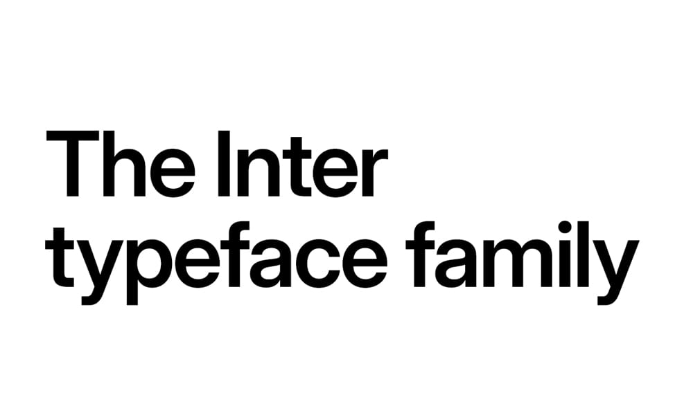
Inter has become the default choice for thousands of SaaS products—including Figma, Vercel, Linear, and Stripe—and for excellent reason. This neo-grotesque sans-serif was specifically designed for computer screens with exceptional legibility at small sizes.
Key Features:
- 9 weights (100-900) with true italics (updated in v4.0, August 2024)
- Variable font support with optical sizing axis
- Exceptional x-height for UI text at 12-16px
- Designed specifically for digital interfaces by Rasmus Andersson
- Optimized character spacing for dense information displays
Best For: SaaS dashboards, fintech applications, developer tools, complex UI with dense information, modern corporate websites requiring technical precision
Cost: Free
Main Limitations: None—actively maintained with regular updates
Last Updated: August 2024 (Inter v4.0)
Pro Tip: Enable optical sizing with font-optical-sizing: auto to let Inter automatically adjust character spacing and contrast based on font size. Use weight 450 for body text and 625 for subheadings to create a clear hierarchy without jarring weight jumps.
Important Note: Inter v4.0 (August 2024) introduced true italics and removed the slant axis. If you’re upgrading from v3.x, test thoroughly as this may affect existing designs.font-optical-sizing: auto
Roboto
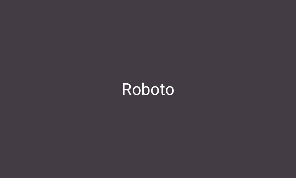
The undisputed champion of Google Fonts with 27+ trillion views (July 2023-July 2024), Roboto is Android’s system font and the backbone of Material Design. Its dual nature—mechanical skeleton with friendly curves—creates an approachable yet professional aesthetic.
Key Features:
- 12 weights including Thin, Light, Regular, Medium, Bold, Black (each with italics)
- Part of the larger Roboto family (Slab, Condensed, Mono variants available)
- Optimized for mobile-first responsive design
- Exceptional legibility across all screen sizes
- Most extensively tested font for cross-browser compatibility
Best For: Mobile applications, Material Design projects, blogs requiring high readability, corporate communications, projects needing universal appeal
Cost: Free
Main Limitations: Extremely popular—your design may feel generic without careful implementation
Last Updated: Continuously maintained
Pro Tip: Pair Roboto (body) with Roboto Slab (headlines) for a cohesive typographic system, or break the monotony by pairing with Playfair Display for editorial layouts. Stick to Regular (400) for body and Medium (500) or Bold (700) for headings—avoid Thin and Light for accessibility.
Manrope
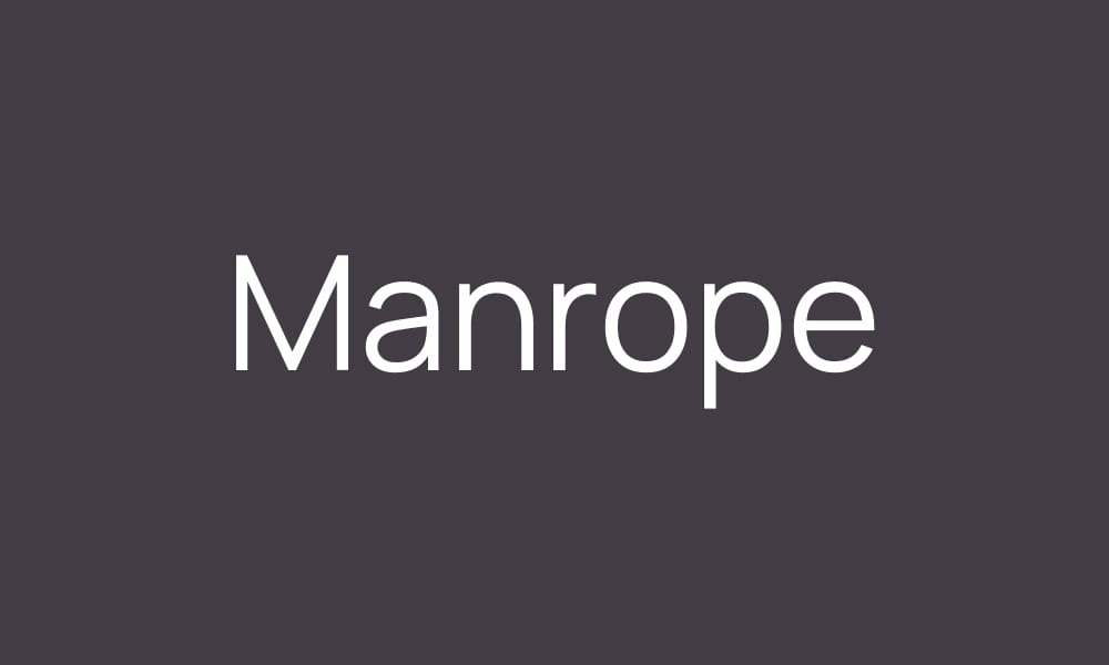
Manrope offers a perfect middle ground between geometric precision and humanist warmth. This modern sans-serif features closed apertures and a tall x-height, making it exceptionally readable while maintaining a contemporary aesthetic.
Key Features:
- 8 weights (200-800) available as both static and variable font
- Open-source with active development
- Balanced proportions ideal for UI and marketing content
- Clean, minimalist aesthetic without feeling sterile
- Variable font reduces file size significantly
Best For: Modern corporate websites, clean UI design, tech startups, minimalist portfolios, agency landing pages
Cost: Free
Main Limitations: Smaller language support compared to Roboto or Inter
Last Updated: Actively maintained (2025)
Pro Tip: Manrope shines at 16-24px for headlines and 14-16px for body text. Use the variable font version to fine-tune weight at 450 for optimal body text readability—slightly heavier than Regular (400) but lighter than Medium (500).
Work Sans
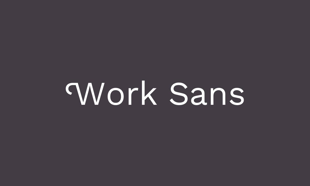
Originally designed for web headlines at medium sizes (14-48px), Work Sans has evolved into a versatile workhorse for modern marketing sites. Its slightly condensed letterforms maximize space efficiency without sacrificing readability.
Key Features:
- 9 weights (100-900) optimized for screen display
- Based on early Grotesques but refined for digital
- Slightly condensed proportions save horizontal space
- Excellent for multilingual content
- Strong performance in responsive layouts
Best For: Marketing websites, landing pages, UI labels and buttons, headlines requiring space efficiency, international projects
Cost: Free
Main Limitations: Can feel generic in all-caps headlines
Last Updated: Continuously maintained
Pro Tip: Work Sans excels in the 14-48px range as originally intended. Use Regular (400) for body text, Medium (500) for subheadings, and SemiBold (600) or Bold (700) for primary headlines. Avoid using it below 12px where Inter or Roboto perform better.
Poppins Font
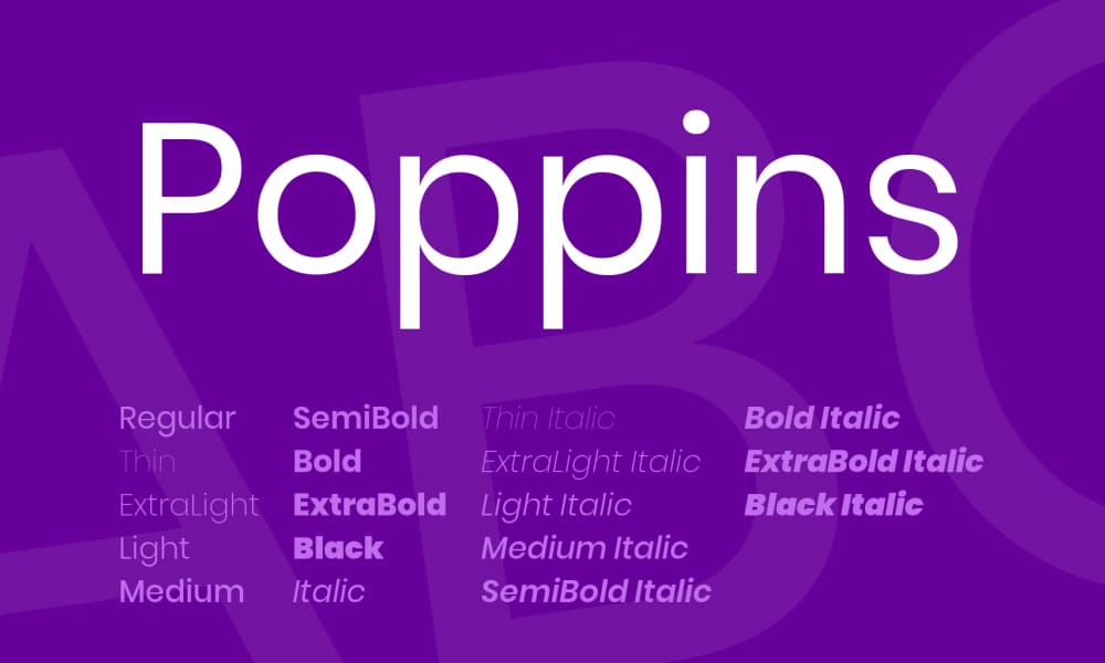
Poppins brings geometric precision with a distinctive rounded character that’s become synonymous with modern startup branding. With 18 weights and styles, it offers unprecedented flexibility for establishing visual hierarchy.
Key Features:
- 18 weights and styles (Thin to Black, each with italics)
- Geometric sans-serif with perfect circles in letters like O, D, Q
- Excellent for establishing strong typographic hierarchy
- Supports Devanagari and Latin scripts
- Tall ascenders create elegant, open typography
Best For: Creative portfolios, startup landing pages, modern e-commerce sites, headlines requiring geometric precision, projects targeting younger demographics
Cost: Free
Main Limitations: Overused in template designs—requires thoughtful implementation to stand out
Last Updated: Continuously maintained
Pro Tip: Poppins works best for display purposes. Use SemiBold (600) for headlines and Medium (500) for subheadings, but avoid it for long-form body text where the geometric structure reduces reading comfort. Pair with Merriweather or Lora for body text in content-heavy layouts.
Outfit
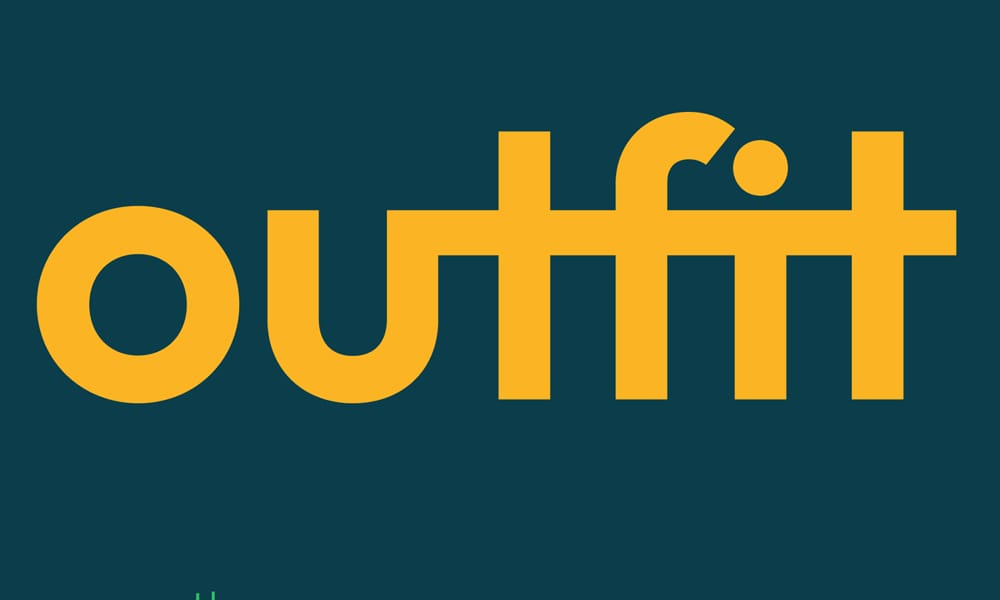
Outfit represents the new wave of Google Fonts—released in recent years with modern design sensibilities and variable font technology. This geometric sans-serif offers clean lines and contemporary appeal without the baggage of overexposure.
Key Features:
- 9 weights (100-900) available as variable font
- Based on Outfit by The Northern Block
- Clean geometric construction with subtle warmth
- Variable font technology for precise weight control
- Modern alternative to overused geometric fonts
Best For: Modern branding projects, geometric design systems, contemporary web apps, design-forward portfolios, projects seeking fresh alternatives to Montserrat
Cost: Free
Main Limitations: Relatively new—limited real-world examples for reference
Last Updated: Actively maintained (added 2021, updated 2025)
Pro Tip: Use Outfit’s variable font feature to dial in weights like 450 or 550 for more precise hierarchy than standard weight jumps allow. This font pairs beautifully with Instrument Serif for editorial layouts or works as a complete typographic system using varied weights.
Albert Sans
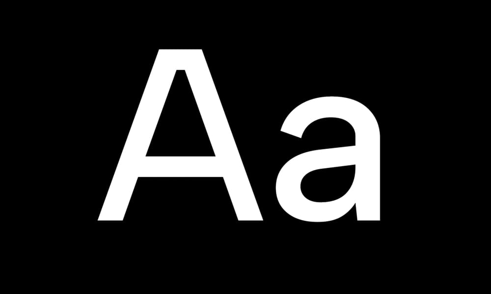
Albert Sans brings a contemporary humanist approach to web typography, offering warmth and approachability while maintaining professional credibility. As a newer addition to Google Fonts (2022-2023), it provides a fresh alternative to established classics.
Key Features:
- 8 weights (100-900) with variable font support
- Humanist proportions with open apertures
- Excellent readability across sizes
- Contemporary aesthetic without geometric rigidity
- Growing adoption in modern web projects
Best For: Contemporary corporate websites, human-centered brands, healthcare and education sites, projects requiring approachable professionalism, modern blogs
Cost: Free
Main Limitations: Still building recognition—less established than competitors
Last Updated: Actively maintained (2023-2025)
Pro Tip: Albert Sans works particularly well for brands emphasizing human connection and accessibility. Use Regular (400) for body text and SemiBold (600) for headlines. The variable font option allows for precise weight adjustments at 475 for slightly emphasized body text without jumping to Medium (500).
Open Sans
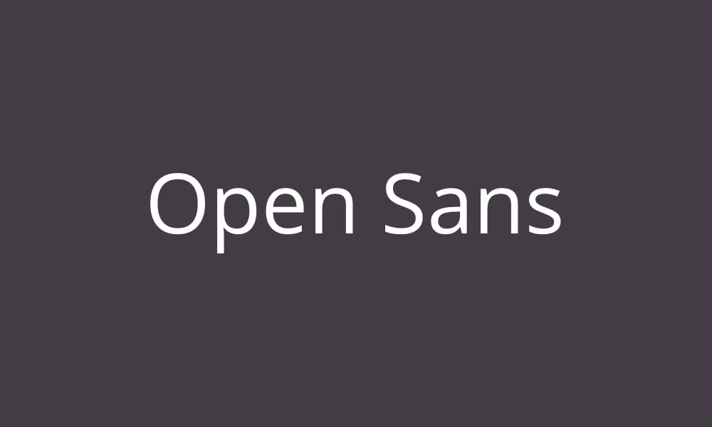
With 15+ trillion views, Open Sans ranks as the second most popular Google Font for valid reasons: exceptional legibility, humanist warmth, and near-universal appropriateness. Commissioned by Google and designed by Steve Matteson, it’s the safe choice that actually works.
Key Features:
- 10 weights and styles (Light to ExtraBold with italics)
- Humanist sans-serif optimized for print, web, and mobile
- Neutral appearance works across virtually all industries
- Excellent hinting for clear rendering on low-resolution screens
- Extensive language support including Greek and Cyrillic
Best For: Universal choice for body text, government and educational sites, corporate communications, blogs and publications, projects requiring maximum accessibility
Cost: Free
Main Limitations: Extremely common—lacks distinctive character for branding-focused projects
Last Updated: Continuously maintained
Pro Tip: Open Sans is your reliable play. When you need a font that won’t offend anyone and works everywhere, this is it. Use Regular (400) for body text and SemiBold (600) or Bold (700) for headings. Pair with a distinctive display font like Playfair Display or Abril Fatface to add personality where Open Sans stays neutral.
Lato
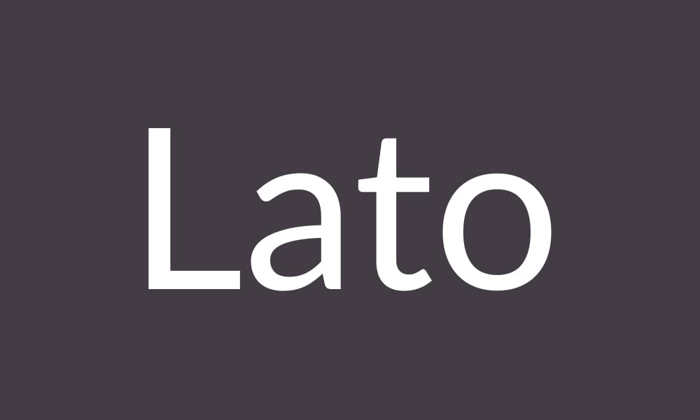
Lato (“Summer” in Polish) combines corporate polish with subtle warmth, ranking third in Google Fonts usage with 7.5+ trillion views. Its semi-rounded details soften the geometric structure, creating approachable professionalism perfect for business contexts.
Key Features:
- 10 weights and styles (Thin to Black with italics)
- Semi-rounded letters provide warmth without sacrificing professionalism
- Designed specifically for corporate and web use
- Strong stability in text with clear, recognizable letterforms
- Excellent for both display and body text applications
Best For: Corporate websites, professional services, business presentations, marketing materials requiring polish, financial services branding
Cost: Free
Main Limitations: Very common in corporate contexts—differentiation requires careful implementation
Last Updated: Continuously maintained
Pro Tip: Lato’s versatility makes it excellent for complete typographic systems. Use Light (300) for large display text, Regular (400) for body copy, and Bold (700) for emphasis. The subtle rounded details work particularly well at larger sizes—try it at 48px+ for headlines where the personality shines through.
Source Sans Pro
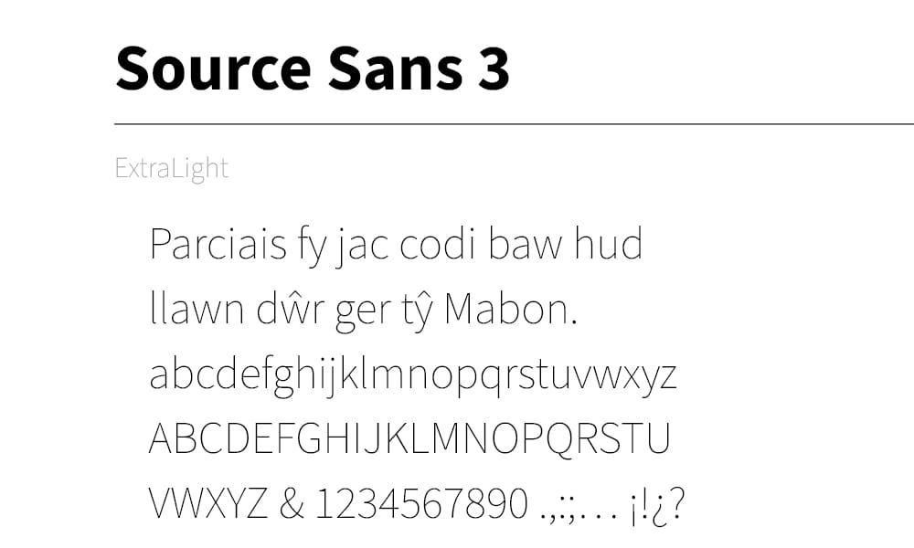
Formerly known as Source Sans Pro, Adobe’s first open-source typeface received a major update in 2020 and a name change to reflect its evolution. Designed by Paul D. Hunt, it brings professional-grade quality from Adobe’s type design heritage to the free font ecosystem.
Key Features:
- 12 weights and styles (ExtraLight to Black with italics)
- Variable font technology for precise weight control
- Designed to work seamlessly across Adobe’s ecosystem
- Excellent hinting for crisp rendering across devices
- Part of the larger Source family (Serif, Code Pro variants)
Best For: Projects using Adobe tools (XD, Illustrator), technical documentation, clean corporate websites, design systems requiring precision, developer-focused interfaces
Cost: Free
Main Limitations: Name change from “Source Sans Pro” may cause confusion in older resources
Last Updated: 2020-2021 (version 3.0)
Pro Tip: If you’re designing in Adobe XD or Illustrator, Source Sans 3 provides seamless consistency from design to development. Use the variable font version for fine-tuned weight control—try weight 380 for body text (between Light and Regular) or 550 for subheadings (between Regular and SemiBold). Pair with Source Serif for editorial layouts or Source Code Pro for technical content.
Important Note: This font was renamed from “Source Sans Pro” to “Source Sans 3” in 2020-2021. If you’re maintaining older projects, verify which version you’re using to avoid inconsistencies.
Fira Sans
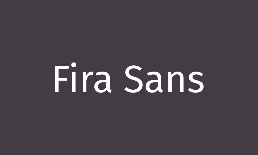
Originally commissioned by Mozilla for Firefox OS, Fira Sans brings humanist warmth specifically optimized for user interfaces. Its design prioritizes legibility on screens, making it a natural choice for web applications and digital products.
Key Features:
- 16 weights and styles (including Condensed variants)
- Designed specifically for Firefox OS interface typography
- Excellent screen optimization for UI text
- Part of the larger Fira family (Mono, Code variants)
- Strong performance in multilingual contexts
Best For: Web applications with Firefox-style aesthetics, open-source projects, UI design emphasizing readability, developer tools, tech-focused brands
Cost: Free
Main Limitations: Strong association with Firefox may not suit all brands
Last Updated: Continuously maintained
Pro Tip: Fira Sans excels at small UI text sizes (12-14px) where its generous x-height and open apertures maintain clarity. Use Regular (400) for body text, Medium (500) for form labels, and SemiBold (600) for primary actions. Pair with Fira Mono for code samples in technical documentation.
Cabin Font
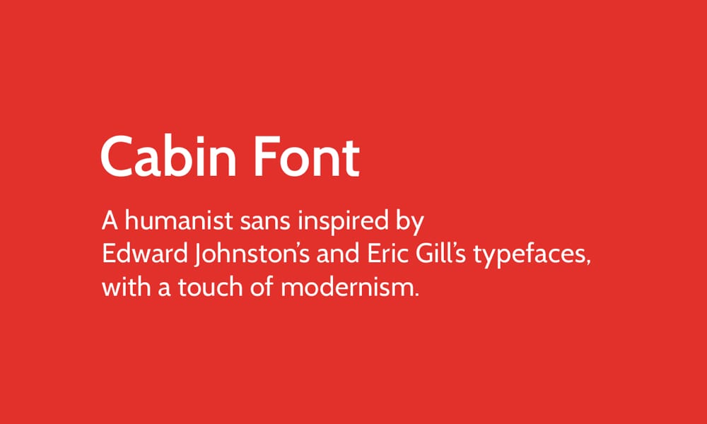
Inspired by Edward Johnston’s and Eric Gill’s humanist legacy, Cabin offers a friendly, accessible aesthetic perfect for brands prioritizing approachability. Its organic, handcrafted feel differentiates it from mechanical geometric sans-serifs.
Key Features:
- 8 weights and styles (Regular to Bold with italics, plus Condensed variants)
- Humanist sans-serif with organic character
- Inspired by early 20th-century masters (Johnston, Gill)
- Friendly appearance without sacrificing professionalism
- Works well in both text and display applications
Best For: Lifestyle brands, human-centered services, education and healthcare, community organizations, projects emphasizing approachability
Cost: Free
Main Limitations: Condensed variants have limited weight options
Last Updated: Continuously maintained
Pro Tip: Cabin’s humanist warmth makes it perfect for brands that want to feel human rather than corporate. Use Regular (400) for body text and Bold (700) for headlines. The Condensed variant works beautifully for secondary information, sidebar content, or when horizontal space is limited. Pair with a classic serif like Merriweather for editorial layouts.
Nunito Sans
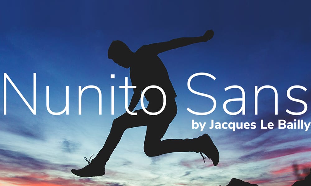
Nunito Sans combines the friendly, rounded character of its parent font Nunito with improved performance for extended reading. It’s rapidly growing in popularity for brands seeking approachable, modern typography without geometric coldness.
Key Features:
- 14 weights and styles (ExtraLight to Black with italics)
- Rounded terminals create friendly, approachable aesthetic
- Optimized for both display and text applications
- Balanced proportions improve reading comfort vs. original Nunito
- Growing adoption in modern web design (2023-2025)
Best For: Friendly brand interfaces, educational platforms, children’s content, modern service businesses, projects targeting warm, approachable tone
Cost: Free
Main Limitations: Rounded aesthetic may feel too casual for formal contexts
Last Updated: Actively maintained (2025)
Pro Tip: Nunito Sans works beautifully for complete typographic systems—use Light (300) for large display text, Regular (400) for body copy, and SemiBold (600) or Bold (700) for emphasis. The rounded terminals shine at larger sizes, so showcase them in headlines at 32px+. Avoid pairing with other rounded fonts; instead, contrast with a traditional serif like Lora.
Montserrat Font
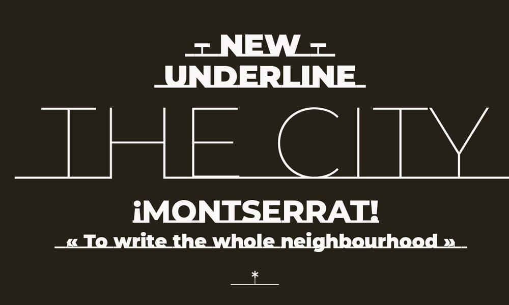
Inspired by the urban typography of Buenos Aires’ Montserrat neighborhood, this geometric sans-serif has become ubiquitous in modern web design. With 18 styles offering incredible flexibility, it’s the geometric choice for designers who need extensive weight options.
Key Features:
- 18 weights and styles (Thin to Black with italics)
- Geometric sans-serif with urban aesthetic
- Inspired by early 20th-century Buenos Aires signage
- Exceptional weight range for complex hierarchies
- Strong personality for branding applications
Best For: Urban and lifestyle brands, creative agencies, modern e-commerce, headline-focused designs, projects requiring extensive weight variation
Cost: Free
Main Limitations: Extremely overused—Reddit users note it’s “everywhere in advertising, logos, and websites.” Requires exceptional implementation to avoid generic appearance.
Last Updated: Continuously maintained
Pro Tip: If you use Montserrat, make it distinctive. Try unexpected weight combinations like Thin (100) for large display text paired with Bold (700) for buttons, creating dramatic contrast. Alternatively, consider less common alternatives like Outfit or Albert Sans for similar geometric aesthetics without the overexposure baggage.
Community Note: Design forums consistently cite Montserrat as one of the most overused Google Fonts. If you choose it, ensure your overall design system differentiates your project from the thousands of others using this font.
Rubik Font
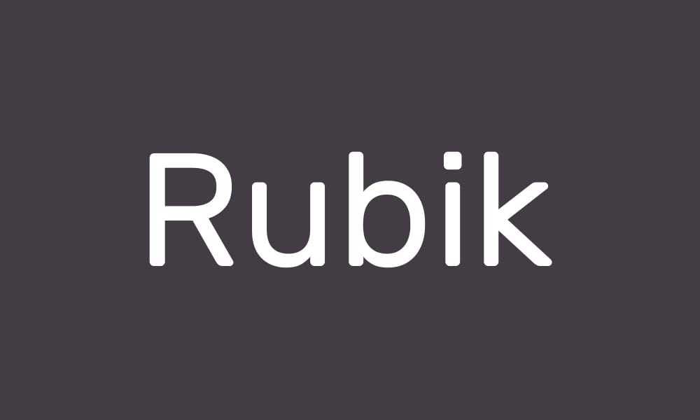
Rubik brings playful sophistication through slightly rounded corners and consistent geometry. Available as a variable font with 18 styles, it offers extensive flexibility for brands seeking friendly professionalism with contemporary flair.
Key Features:
- 18 weights and styles (Light to Black with italics)
- Variable font support for precise weight control
- Slightly rounded corners create approachable aesthetic
- Consistent geometry maintains professionalism
- Extensive language support including Hebrew and Latin
Best For: Playful yet professional brands, modern tech startups, consumer apps, children’s educational platforms, projects balancing friendly and credible
Cost: Free
Main Limitations: Rounded aesthetic may feel too casual for corporate or luxury contexts
Last Updated: Actively maintained (2025)
Pro Tip: Rubik’s variable font capability allows for micro-adjustments in weight that standard static fonts can’t achieve. Try weight 425 for body text (between Light and Regular) or 550 for subheadings (between Regular and Medium) to create a more nuanced hierarchy. Pair with a traditional serif like Lora or Merriweather for editorial layouts that balance playful and serious.
Raleway Font
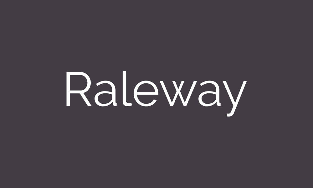
Raleway brings elegance to the geometric sans-serif category through refined proportions and consistent stroke weights. With 18 styles ranging from Thin to Black, it offers the weight flexibility needed for luxury branding without sacrificing readability.
Key Features:
- 18 weights and styles (Thin to Black with italics)
- Elegant geometric proportions with consistent stroke weights
- Display-oriented design that also functions for text
- Sophisticated aesthetic suitable for luxury contexts
- Originally designed for large display sizes
Best For: Luxury brands and high-end e-commerce, elegant portfolios, fashion and beauty sites, sophisticated corporate identities, headline-focused editorial layouts
Cost: Free
Main Limitations: Thin weights (100-200) sacrifice readability for aesthetics—use sparingly
Last Updated: Continuously maintained
Pro Tip: Raleway shines at display sizes (32px+) where its elegant proportions are most apparent. Use Thin (100) or ExtraLight (200) at 48px+ for dramatic, luxurious headlines, but stick to Regular (400) or Medium (500) for body text to maintain readability. Pair with Merriweather or Lora for a classic editorial combination, or use Playfair Display for maximum elegance in luxury contexts.
Quicksand
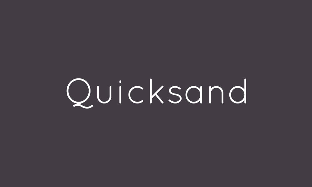
Quicksand delivers friendly, approachable typography through rounded letterforms and informal character. Updated as a variable font, it provides flexibility for projects prioritizing warmth and accessibility over corporate formality.
Key Features:
- 7 weights (300-700) available as variable font
- Rounded, friendly letterforms create informal aesthetic
- Open-source with active development
- Variable font reduces file size while offering weight flexibility
- Gentle, approachable personality
Best For: Children’s content and educational platforms, friendly service businesses, informal blogs and personal sites, projects targeting non-corporate audiences, creative portfolios with playful tone
Cost: Free
Main Limitations: Limited language support; informal aesthetic inappropriate for corporate or luxury contexts
Last Updated: Actively maintained (variable font added)
Pro Tip: Quicksand works best for short-form content and display purposes rather than extended reading. Use Regular (400) for body text and Bold (700) for headlines, but consider pairing with a more neutral font like Open Sans if your project includes long-form content. The rounded aesthetic works beautifully for UI elements like buttons and labels in friendly applications.
Serif Fonts: Elegance, Authority, and Readability
Serif fonts are experiencing a digital renaissance in 2024-2025, with designers rediscovering their ability to convey elegance, authority, and sophistication in digital contexts. These 9 fonts represent the best serif options on Google Fonts for editorial layouts, luxury branding, and long-form reading.
DM Serif
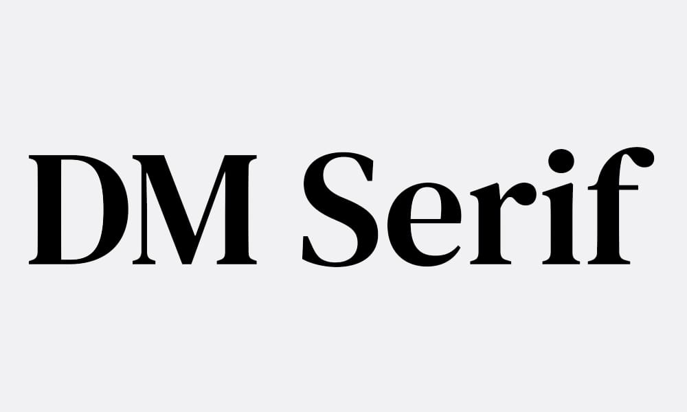
Designed by the prestigious Colophon Foundry, DM Serif Display brings high-contrast elegance perfect for luxury brands and editorial headlines. Its dramatic thick-to-thin stroke transitions create visual impact at large sizes.
Key Features:
- 2 weights (Regular and Italic)
- High-contrast strokes create dramatic visual impact
- Designed specifically for display applications (headlines, titles)
- Created by Colophon Foundry (also behind Space Mono)
- Sophisticated aesthetic suitable for luxury contexts
Best For: Luxury brand headlines, fashion and beauty editorial layouts, high-end e-commerce hero text, magazine-style layouts, sophisticated blog headers
Cost: Free
Main Limitations: Only 2 weights available; not suitable for body text due to high contrast
Last Updated: Continuously maintained
Pro Tip: DM Serif Display demands large sizes (36px+) where its high-contrast strokes create maximum impact. Pair it with a clean sans-serif like Inter or Source Sans 3 for body text to create classic editorial layouts. Use Regular for headlines and Italic sparingly for emphasis—the italic is particularly dramatic and beautiful for pull quotes or featured testimonials.
Merriweather
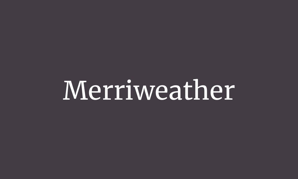
Merriweather was designed specifically for screen reading, making it one of the most readable serif fonts available on Google Fonts. Its slightly condensed letterforms maximize efficiency without sacrificing the warmth and authority serifs provide.
Key Features:
- 8 weights and styles (Light to Black with italics)
- Designed specifically for optimal screen readability
- Slightly condensed letterforms improve space efficiency
- Strong, sturdy serifs maintain character at small sizes
- Excellent for long-form reading contexts
Best For: Blogs and long-form content, news sites and online publications, professional portfolios with case studies, academic and educational content, any project prioritizing reading comfort
Cost: Free
Main Limitations: Slightly condensed proportions may feel cramped in very tight layouts
Last Updated: Continuously maintained
Pro Tip: Merriweather excels at body text sizes (16-18px) where it was specifically optimized. Use Regular (400) for body text, Bold (700) for subheadings, and Light (300) at larger sizes (24px+) for elegant section headers. It pairs beautifully with Open Sans, Lato, or Montserrat for a classic serif/sans-serif combination. Set line-height to 1.6-1.8 for optimal reading comfort.
Playfair Display
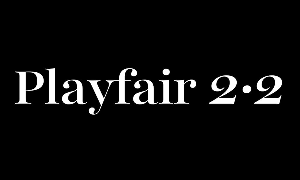
Playfair Display brings high-contrast, transitional design inspired by late 18th-century European typography. Now available as a variable font, it’s become the go-to choice for designers seeking elegance and sophistication in digital contexts.
Key Features:
- 12 weights and styles (Regular to Black with italics) plus variable font
- High-contrast transitional design (between old-style and modern serifs)
- Inspired by late 18th-century letterforms (Baskerville era)
- Variable font enables precise weight adjustments
- Dramatic, elegant aesthetic perfect for luxury contexts
Best For: Luxury brands and high-end e-commerce, editorial and magazine-style layouts, wedding and event websites, fashion and beauty industries, sophisticated blog designs
Cost: Free
Main Limitations: High contrast reduces readability at small sizes—best for display purposes
Last Updated: Actively maintained (variable font added)
Pro Tip: Playfair Display is a display font at heart—use it at 32px+ for headlines where its elegant high-contrast strokes shine. Pair with a neutral sans-serif like Roboto, Inter, or Source Sans 3 for body text to create classic editorial layouts. The variable font option lets you fine-tune weights between Regular (400) and Bold (700) for more precise hierarchy than standard weight jumps allow.
Instrument Serif
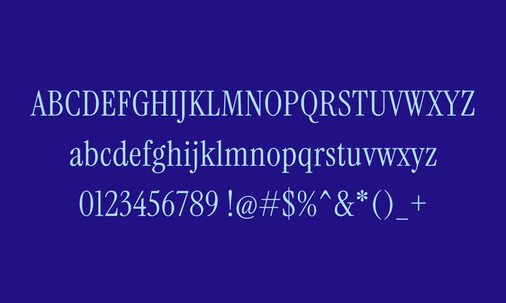
A rising star in the serif category, Instrument Serif represents the new wave of editorial typography designed specifically for modern branding and digital editorial contexts. Added to Google Fonts in 2023, it’s rapidly gaining adoption among design-forward brands.
Key Features:
- 2 weights (Regular and Italic)
- Modern serif design optimized for contemporary editorial
- Clean, refined letterforms with subtle personality
- Growing adoption in branding and editorial design (2023-2025)
- Fresh alternative to overused serif classics
Best For: Modern editorial layouts, contemporary branding projects, design-forward portfolios, luxury brands seeking modernity, magazine-style blog designs
Cost: Free
Main Limitations: Limited weights (only Regular and Italic); relatively new with fewer resources
Last Updated: Added 2023, actively maintained (2025)
Pro Tip: Instrument Serif provides a fresh alternative to Playfair Display for designers seeking elegance without the baggage of overuse. Use it for headlines at 28px+ and pair with a modern sans-serif like Inter, Outfit, or Manrope for clean, contemporary editorial layouts. The limited weight selection forces typographic simplicity—embrace it by using size and spacing for hierarchy rather than weight variation.
Trend Note: Typography blogs and design communities note Instrument Serif’s rapid rise in 2023-2024 as designers seek alternatives to overexposed classics. Get ahead of the curve by adopting it now before it reaches Playfair Display levels of ubiquity.
Lora
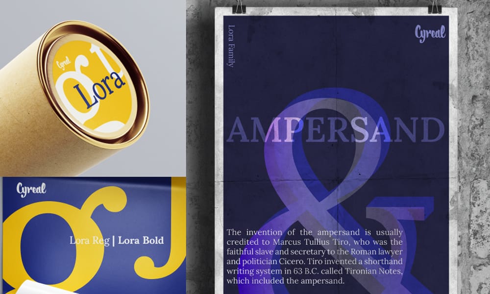
Lora balances brushed calligraphic curves with a contemporary serif structure, creating warmth and personality while maintaining excellent readability for body text. Available as a variable font, it offers flexibility rare among free serif options.
Key Features:
- 8 weights and styles (Regular to Bold with italics) plus variable font
- Brushed calligraphic details provide warmth and personality
- Optimized for both body text and display applications
- Variable font support for precise weight control
- Extensive language support including Cyrillic
Best For: Professional blogs and publications, body text in editorial layouts, brands balancing warmth and professionalism, personal portfolios with narrative content, literary and cultural websites
Cost: Free
Main Limitations: Calligraphic details may feel too decorative for minimalist or corporate contexts
Last Updated: Actively maintained (variable font added)
Pro Tip: Lora is one of the few serif fonts on Google Fonts that works beautifully for both body text and display purposes. Use Regular (400) at 16-18px for long-form reading with 1.6-1.8 line-height, and Bold (700) at 28px+ for section headers. The variable font option allows for weight 550 (between Regular and Bold) for subheadings—providing more nuanced hierarchy. Pair with Montserrat, Raleway, or Open Sans for classic serif/sans-serif combinations.
Libre Baskerville Font
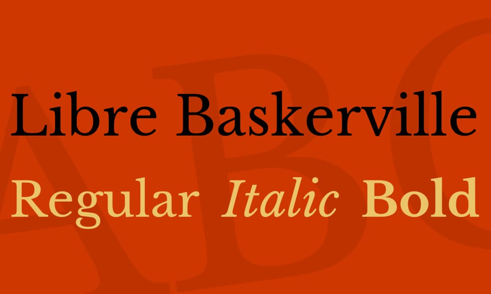
Libre Baskerville brings the classic elegance of 18th-century John Baskerville typography to the web, optimized for contemporary digital reading. This transitional serif offers traditional authority with digital optimization.
Key Features:
- 3 weights (Regular, Italic, Bold)
- Based on classic Baskerville design from the 1750s
- Optimized for body text in digital contexts
- Traditional aesthetic conveys authority and timelessness
- Higher contrast than most old-style serifs
Best For: Traditional and academic content, literary and publishing sites, professional services emphasizing heritage, formal corporate communications, projects requiring classical typography
Cost: Free
Main Limitations: Printing issues reported in 2019 (font rendering inconsistencies); only 3 weights available; limited language support
Last Updated: Continuously maintained
Pro Tip: Libre Baskerville works best for projects where traditional authority matters more than contemporary flair. Use Regular (400) for body text at 16-18px and Bold (700) for subheadings. Pair with a neutral sans-serif like Source Sans 3 or Lato for a timeless, professional combination. Due to reported printing issues, test thoroughly if your content will be printed or exported to PDF.
Quality Note: Design forums and GitHub issues document printing inconsistencies with Libre Baskerville (as of 2019). While still active on Google Fonts, consider testing thoroughly or choosing alternatives like Lora or Newsreader if print quality is critical.
Newsreader
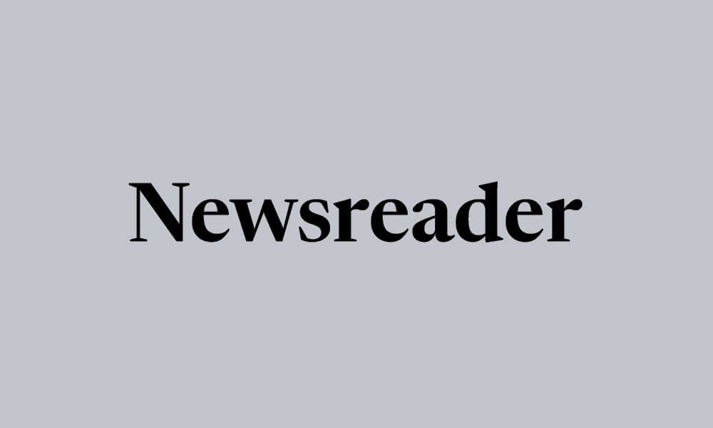
A newer addition to Google Fonts (2023-2024), Newsreader was designed specifically for online news and long-form digital reading. It represents modern serif design optimized for the realities of contemporary screen reading.
Key Features:
- 16 weights and styles (ExtraLight to ExtraBold with italics)
- Variable font technology for precise weight control
- Designed explicitly for news sites and editorial content
- Optimized for long-form digital reading comfort
- Extensive weight range enables complex information hierarchies
Best For: News sites and digital publications, long-form journalism and essays, content-heavy blogs, editorial platforms, any project prioritizing sustained reading comfort
Cost: Free
Main Limitations: Relatively new—limited adoption means fewer resources and examples
Last Updated: Added 2023-2024, actively maintained
Pro Tip: Newsreader’s extensive weight range (16 options!) provides unmatched flexibility for complex editorial hierarchies. Use Regular (400) for body text, Medium (500) for bylines and metadata, SemiBold (600) for subheadings, and Bold (700) for primary headlines. The variable font option enables even more precise control—try weight 550 for pull quotes that need emphasis without overwhelming the design. Pair with a clean sans-serif like Inter or Source Sans 3 for UI elements and navigation.
Alegreya Font
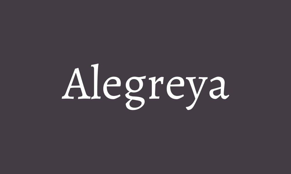
Alegreya (“joy” in Spanish) brings calligraphic warmth and literary sophistication to digital typography. Designed originally for literature and long-form reading, it provides personality without sacrificing readability.
Key Features:
- 10 weights and styles (Regular to Black with italics)
- Calligraphic construction with dynamic rhythm
- Designed specifically for literature and long-form reading
- Small caps and special characters for advanced typography
- Provides personality while maintaining reading comfort
Best For: Literary and cultural websites, scholarly publications and academic content, creative writing platforms, brands emphasizing intellectual sophistication, editorial projects with narrative focus
Cost: Free
Main Limitations: Calligraphic details may feel too decorative for corporate or minimalist contexts
Last Updated: Continuously maintained
Pro Tip: Alegreya shines in long-form reading contexts where its calligraphic rhythm creates visual interest without disruption. Use Regular (400) for body text at 16-18px with generous line-height (1.7-1.9), and Bold (700) or Black (900) for impactful headlines. The font includes small caps—use them for bylines, section intros, or subtle emphasis. Pair with Montserrat or Raleway for a sophisticated serif/sans-serif combination.
Spectral Font
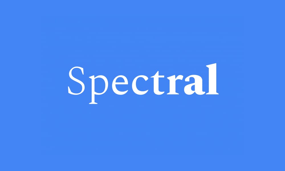
Spectral was designed specifically for Google Fonts by Production Type, blending classic serif proportions with digital-first optimization. Its variable stroke weights and elegant proportions make it ideal for sophisticated editorial contexts.
Key Features:
- 14 weights and styles (ExtraLight to ExtraBold with italics)
- Variable stroke weights create subtle visual interest
- Designed explicitly for digital editorial contexts
- Commissioned by Google for Fonts platform
- Elegant proportions suitable for sophisticated content
Best For: Digital magazines and editorial platforms, sophisticated blogs and publications, cultural and artistic content, brands emphasizing refined aesthetics, projects requiring elegant yet readable serif
Cost: Free
Main Limitations: Requires careful implementation to avoid feeling overly formal
Last Updated: Continuously maintained
Pro Tip: Spectral provides extensive weight options (14!) that enable nuanced typographic hierarchies. Use Light (300) at 18-20px for body text in light-background contexts, Regular (400) for standard body text, and Bold (700) or ExtraBold (800) for impactful headlines. The variable stroke weights create subtle visual texture—showcase this by using larger sizes (32px+) for headlines. Pair with Work Sans or Manrope for clean, contemporary serif/sans-serif combinations.
Display Fonts: Make a Bold Statement
Display fonts exist for one purpose: visual impact. These 5 fonts deliver drama, personality, and memorability for headlines, hero sections, and branding applications where subtlety takes a back seat to bold expression.
Oswald
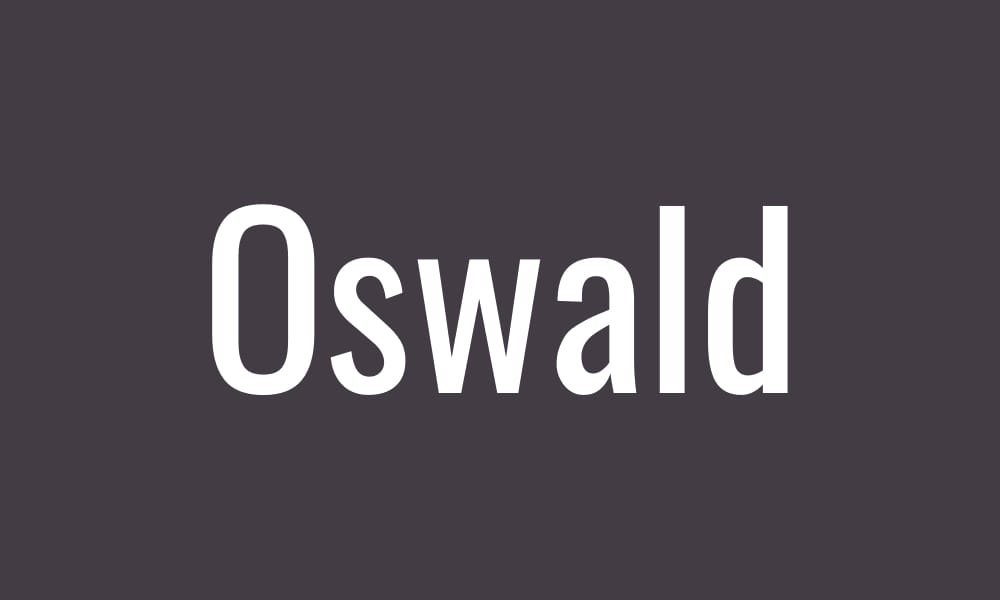
Oswald reimagines Gothic newspaper typography for the digital age, offering condensed, impactful letterforms perfect for headlines requiring authority and presence. Available as a variable font with 7 weights, it provides flexibility rare in display fonts.
Key Features:
- 7 weights (ExtraLight to Bold) plus variable font support
- Condensed proportions maximize space efficiency
- Reworked alternative to classic Gothic newspaper typography
- Strong vertical emphasis creates commanding presence
- Variable font enables precise weight adjustments
Best For: Bold headlines and hero sections, news sites and editorial headers, sports and fitness branding, impactful marketing materials, projects requiring space-efficient display type
Cost: Free
Main Limitations: Condensed proportions reduce readability at small sizes—display use only
Last Updated: Actively maintained (variable font added)
Pro Tip: Oswald demands large sizes (36px+) and all-caps treatments where its condensed, commanding presence creates maximum impact. Use Bold (700) for primary headlines and Light (300) or Regular (400) at even larger sizes (60px+) for dramatic hero text. Pair with a readable sans-serif like Open Sans or Roboto for body text. Never use Oswald for body copy—its condensed proportions sacrifice reading comfort for visual impact.
Anton Font
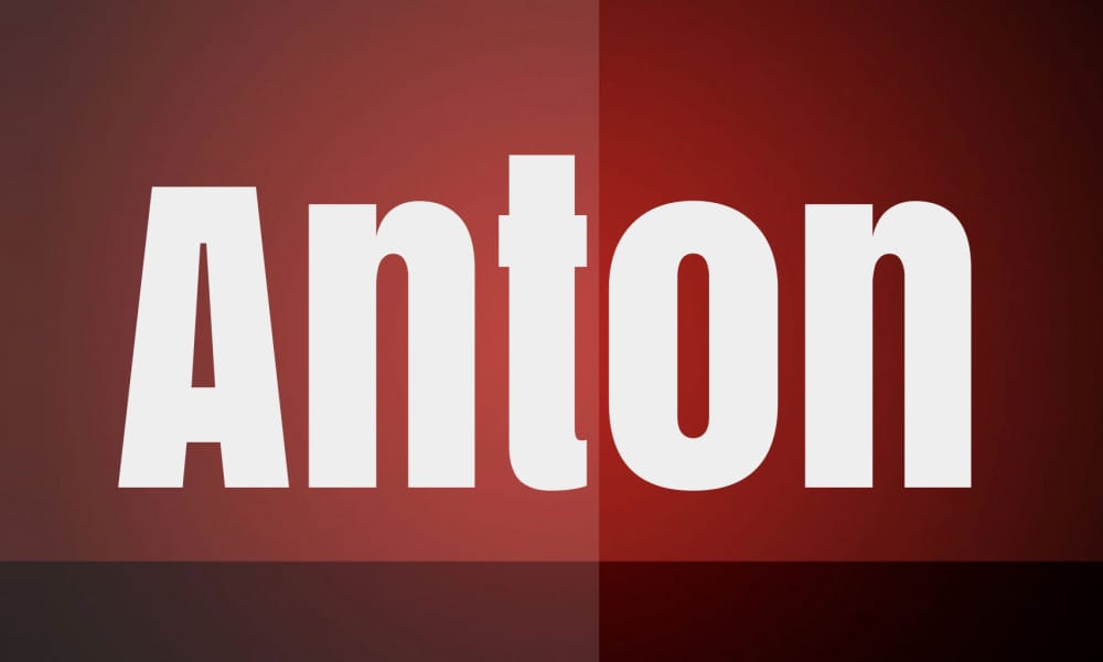
Anton delivers pure, uncompromising visual weight—a single bold style designed exclusively for maximum impact. When you need a headline that commands attention and nothing else will do, Anton answers the call.
Key Features:
- 1 weight (Regular—but exceptionally bold)
- Designed purely for display and poster applications
- Condensed proportions maximize presence
- Unapologetic boldness for impact-focused design
- Simple, straightforward implementation
Best For: Posters and promotional materials, high-impact website heroes, sports and event branding, bold headlines requiring immediate attention, projects where subtlety is not the goal
Cost: Free
Main Limitations: Only 1 weight available; basic language support; inappropriate for anything except large display purposes
Last Updated: Continuously maintained
Pro Tip: Anton exists for one thing: massive, bold headlines at 48px+. Use it sparingly—one or two instances per page maximum—where you need undeniable visual weight. It works beautifully for hero headlines, event announcements, and promotional banners. Always pair with a highly readable body font like Open Sans, Roboto, or Lato to provide balance. Never, ever use Anton for body text, subheadings, or anything below 32px.
Syne
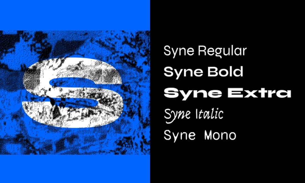
Syne brings contemporary versatility to the display category, offering 8 weights that bridge display and text applications. This modern sans-serif provides geometric precision with subtle character, making it more flexible than single-weight display fonts.
Key Features:
- 8 weights (Regular to ExtraBold) plus variable font support
- Geometric construction with contemporary flair
- More versatile than traditional display fonts
- Variable font enables precise weight control
- Growing adoption in modern branding (2023-2025)
Best For: Modern branding and identity projects, versatile display applications, contemporary web design, projects requiring display-to-text flexibility, design-forward portfolios
Cost: Free
Main Limitations: Geometric precision may feel cold for warm, human-centered brands
Last Updated: Actively maintained (variable font added)
Pro Tip: Syne’s 8 weights make it unusually versatile for a display font—use Bold (700) or ExtraBold (800) for impactful headlines at 36px+, but you can also use Regular (400) or Medium (500) for larger body text or subheadings in display-focused layouts. The variable font option allows for precise adjustments like weight 650 for slightly emphasized subheadings. Pair with Inter or Source Sans 3 for clean, contemporary designs.
Bebas Neue
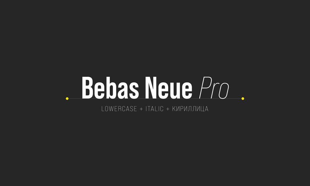
Bebas Neue has become synonymous with bold, tall headlines in sports, fashion, and contemporary branding. Its condensed all-caps aesthetic creates instant recognition and commanding presence.
Key Features:
- 1 weight (Regular) on Google Fonts
- Tall, condensed letterforms maximize vertical presence
- All-caps aesthetic creates consistent visual rhythm
- Iconic status in sports and fashion branding
- Clean, geometric construction
Best For: Sports branding and athletic content, fashion and streetwear sites, tall headlines in hero sections, modern posters and promotional materials, projects requiring iconic display typography
Cost: Free
Main Limitations: Only 1 weight available on Google Fonts (full family with 5 weights available from Fontfabric); all-caps only; basic language support
Last Updated: Continuously maintained
Pro Tip: Bebas Neue works exclusively as an all-caps display font—use it at 48px+ for maximum impact where its tall, condensed proportions command attention. It pairs beautifully with clean sans-serifs like Roboto, Lato, or Open Sans for body text. For more weight options (Thin, Light, Book, Regular, Bold), download the complete family directly from Fontfabric—Google Fonts only hosts the Regular weight.
Important Note: Google Fonts only includes 1 weight (Regular) of Bebas Neue. The complete family with 5 weights is available from the original designer at Fontfabric if your project requires more flexibility.
Abril Fatface
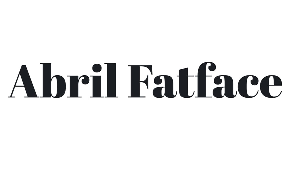
Abril Fatface brings dramatic high-contrast elegance inspired by 19th-century advertising typography. Its exaggerated thick-to-thin stroke transitions create instant visual drama perfect for magazine-style layouts and luxury branding.
Key Features:
- 1 weight (Regular—but exceptionally bold)
- High-contrast strokes create dramatic visual impact
- Inspired by 19th-century “fat face” advertising typography
- Designed for large display sizes exclusively
- Distinctive personality perfect for editorial contexts
Best For: Magazine covers and editorial headlines, luxury brand hero text, dramatic blog post titles, fashion and lifestyle branding, projects requiring theatrical elegance
Cost: Free
Main Limitations: Only 1 weight available; high contrast reduces readability at small sizes; display use only
Last Updated: Continuously maintained
Pro Tip: Abril Fatface demands large sizes (48px+) where its dramatic stroke contrast creates maximum impact—anything smaller looks muddy. Use it for single-word headlines or short phrases in hero sections, never for body text or even subheadings. Pair with a neutral serif like Lora or Merriweather for body text to create elegant editorial layouts. The high contrast also means you should avoid thin strokes on busy backgrounds—solid colors or subtle gradients work best.
Monospace Fonts: For Code, Terminals, and Technical Precision
Monospace fonts, where every character occupies identical horizontal space, are essential for code editors, technical documentation, and designs requiring mechanical precision. These 5 fonts represent the best monospace options on Google Fonts for developers and technical contexts.
JetBrains Mono
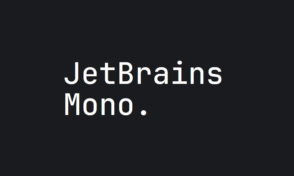
Designed specifically by JetBrains for developers, JetBrains Mono optimizes every detail for coding comfort during extended sessions. Its excellent ligature support and carefully tuned metrics make it the modern standard for developer tools.
Key Features:
- 12 weights and styles (ExtraLight to ExtraBold with italics) plus variable font
- Designed explicitly for developers and code editors
- Extensive programming ligatures (>=, !=, =>, etc.)
- Increased character height improves code scanning
- Carefully tuned spacing reduces eye strain during long sessions
Best For: Code editors and IDEs, technical documentation with code samples, developer tools and dashboards, programming tutorials and blogs, terminal interfaces
Cost: Free
Main Limitations: Programming ligatures may confuse non-technical audiences in general contexts
Last Updated: Actively maintained (2025)
Pro Tip: JetBrains Mono shines in coding contexts where ligatures improve code readability—make sure to enable ligatures in your editor or CSS (font-variant-ligatures: normal). Use Regular (400) for standard code and Medium (500) or SemiBold (600) for syntax highlighting emphasis. If you’re building a developer-focused product or documentation site, JetBrains Mono instantly signals you understand your audience. For even more monospace options, check out our guide to the
Source Code Pro
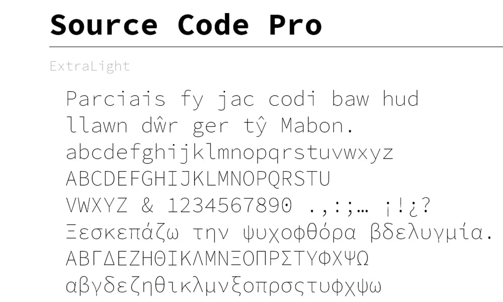
Adobe’s first open-source monospace font brings professional-grade quality from Adobe’s type design heritage to the developer community. Part of the larger Source family, it provides seamless integration with Source Sans 3 and Source Serif.
Key Features:
- 12 weights and styles (ExtraLight to Black with italics) plus variable font
- Part of Adobe’s Source family (Sans, Serif, Code Pro)
- Professional quality from Adobe type design team
- Optimized for coding and technical contexts
- Variable font enables precise weight adjustments
Best For: Technical documentation, code samples in Adobe ecosystem projects, developer-focused interfaces, programming blogs and tutorials, projects using Source Sans 3 requiring matching monospace
Cost: Free
Main Limitations: Slightly wider than some competitors—may fit less code per line
Last Updated: Actively maintained (variable font added)
Pro Tip: If you’re already using Source Sans 3 for UI or body text, Source Code Pro provides perfect typographic harmony for code samples and technical content. Use Regular (400) for standard code blocks and Medium (500) or SemiBold (600) for emphasized syntax or inline code within text. The variable font option allows for weight 450 for slightly emphasized inline code that doesn’t jump to Medium (500). The wider character spacing improves readability but fits fewer characters per line—consider this for terminal interfaces.
Inconsolata
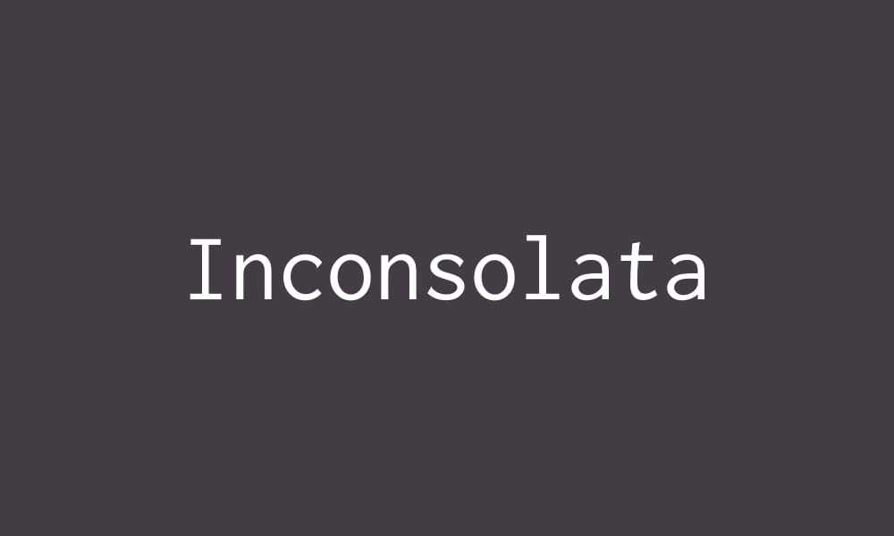
Inconsolata brings a slightly condensed, humanist approach to monospace typography. Originally designed by Raph Levien, it’s now available as a variable font with 18 styles, offering unprecedented flexibility for monospace applications.
Key Features:
- 18 weights and styles (ExtraLight to Black with italics) plus variable font
- Slightly condensed proportions fit more code per line
- Humanist touches improve character recognition
- Extensive weight range rare in monospace fonts
- Variable font technology for precise adjustments
Best For: Terminal interfaces and command-line tools, code editors preferring condensed spacing, technical writing with space constraints, retro-computing aesthetics, projects requiring monospace weight variation
Cost: Free
Main Limitations: Condensed proportions may reduce readability for some users
Last Updated: Actively maintained (variable font added)
Pro Tip: Inconsolata’s slightly condensed proportions make it ideal when you need to fit more code per line—perfect for terminal interfaces, code comparison views, or responsive code blocks that need to work on smaller screens. Use Regular (400) for standard code and SemiBold (600) or Bold (700) for emphasis. The extensive weight range (18 options with variable font support) provides unusual flexibility for monospace applications—try it for technical dashboards where monospace alignment matters but you also need hierarchy.
Space Mono
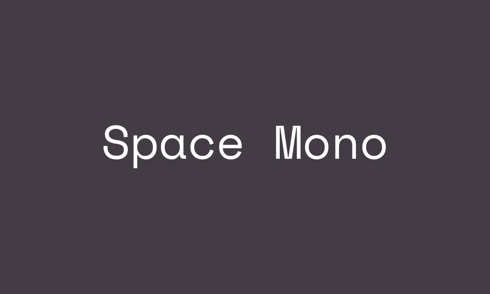
Designed by Colophon Foundry (the same studio behind DM Serif Display), Space Mono brings retro-futuristic personality to monospace typography. Its quirky character makes it perfect for projects embracing technological aesthetics.
Key Features:
- 4 weights (Regular and Bold, each with italics)
- Retro-futuristic aesthetic with personality
- Designed by prestigious Colophon Foundry
- Distinctive character differentiates from standard monospace
- Works for both code and display applications
Best For: Retro-futuristic and tech-themed projects, terminals with personality, code samples in design-forward contexts, brands embracing technological aesthetics, creative coding portfolios
Cost: Free
Main Limitations: Only 4 weights available; distinctive personality may not suit all contexts
Last Updated: Continuously maintained
Pro Tip: Space Mono works beautifully when you want monospace typography with personality rather than pure utility. Use it for code samples in portfolio sites, creative coding projects, or tech brands that want to stand out from standard developer tools. The quirky character shines in larger sizes—try it at 18-20px for code blocks rather than the standard 14-16px. Pair with modern sans-serifs like Inter or Outfit for contemporary tech aesthetics, or with geometric fonts like Montserrat for retro-futuristic vibes.
IBM Plex Mono
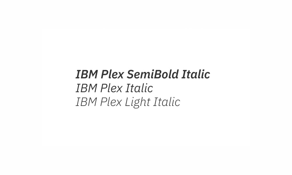
Part of IBM’s corporate open-source typeface family, IBM Plex Mono brings enterprise-grade quality and extensive language support to the monospace category. Used by 300,000+ IBM employees globally, it represents corporate monospace done right.
Key Features:
- 14 weights and styles (Thin to Bold with italics)
- Part of IBM’s Plex family (Sans, Serif, Mono variants)
- Used by 300,000+ IBM employees across 170 countries
- Extensive language support including non-Latin scripts
- Professional quality suitable for corporate contexts
Best For: Corporate developer tools and documentation, enterprise technical interfaces, projects requiring extensive language support, professional coding environments, brands seeking corporate credibility
Cost: Free
Main Limitations: IBM association may not suit all brand contexts
Last Updated: Actively maintained (2025)
Pro Tip: If your project has corporate or enterprise context, IBM Plex Mono instantly signals professional quality. Use Regular (400) for standard code, Medium (500) for emphasized inline code, and SemiBold (600) for syntax highlighting. The extensive Plex family (Sans, Serif, Mono) enables complete typographic systems—use IBM Plex Sans for UI, IBM Plex Serif for editorial content, and IBM Plex Mono for technical content, all within the same family for perfect typographic harmony.
Google Font Pairing Guide: Creating Harmonious Typography
Great typography isn’t just about individual fonts—it’s about how they work together. Follow this simple formula: Contrast + Compatibility + Hierarchy.
The Pairing Formula
Contrast: Pair fonts from different categories (Sans-Serif + Serif, or Display + Sans-Serif) to create visual distinction.
Compatibility: Choose fonts with similar proportions, x-heights, or era (geometric + geometric, humanist + humanist) for underlying harmony.
Hierarchy: Use weight, size, and category to establish clear information hierarchy—typically display/serif for headlines, sans-serif for body.
10 Proven Google Font Combinations
1. Inter + Playfair Display
Modern SaaS meets editorial elegance
Use Inter (400) for UI and body text, Playfair Display (700) for headlines. Perfect for fintech, SaaS marketing sites, and contemporary blogs.
2. Roboto + Merriweather
The most reliable combination
Roboto (400) for interface and short text, Merriweather (400) for long-form content. Ideal for blogs, publications, and content-heavy sites.
3. Montserrat + Lora
Geometric precision meets calligraphic warmth
Montserrat (600-700) for bold headlines, Lora (400) for approachable body text. Great for creative agencies and lifestyle brands.
4. Work Sans + DM Serif Display
Clean efficiency meets luxury drama
Work Sans (400-500) for clean UI, DM Serif Display for impactful headlines. Perfect for luxury e-commerce and high-end services.
5. Poppins + Merriweather
Startup energy meets reading comfort
Poppins (600) for energetic headlines, Merriweather (400) for readable body content. Excellent for startup landing pages with blog content.
6. Bebas Neue + Roboto
Bold impact meets universal readability
Bebas Neue for hero headlines (all-caps, 48px+), Roboto (400) for everything else. Sports sites, events, and bold marketing pages.
7. Raleway + Lora
Double elegance for sophisticated brands
Raleway (300-400) for refined headlines, Lora (400) for warm body text. Luxury brands, wedding sites, and elegant portfolios.
8. Source Sans 3 + Source Serif 4
Adobe family harmony
Keep it in the family for a seamless design-to-development workflow. Perfect for Adobe tool users and technical documentation.
9. Outfit + Instrument Serif
2020s modern aesthetic
Both fonts released recently—creates a contemporary editorial feel. Design-forward portfolios and modern publications.
10. JetBrains Mono + Inter
Developer-focused perfection
JetBrains Mono (400) for code samples, Inter (400-600) for documentation text. Developer tools, technical docs, and programming blogs.
Pro Tip: Limit your projects to 2-3 font families maximum. More than that creates visual chaos and hurts performance. If you need more variation, use different weights and sizes of the same fonts.
How to Add Google Fonts to Your Website
Implementing Google Fonts is straightforward—choose the method that matches your technical requirements and performance goals.
Method 1: Google Fonts CDN (Easiest)
Step 1: Visit
and select your fonts
Step 2: Copy the <link> code from the “Embed” panel
Step 3: Paste in your HTML <head>:
xml
<link rel="preconnect" href="https://fonts.googleapis.com">
<link rel="preconnect" href="https://fonts.gstatic.com" crossorigin>
<link href="https://cdn.cssauthor.com/easyio-fonts/css2?family=Inter:wght@400;600;700&display=swap" rel="stylesheet">
Step 4: Use in your CSS:
css
body {
font-family: 'Inter', sans-serif;
}
Pros: Simple, fast CDN delivery, automatic browser caching
Cons: External dependency, GDPR considerations (IP addresses sent to Google)
Method 2: Self-Hosting (Best Performance + Privacy)
Download font files from Google Fonts, host them on your server, and use @font-facedeclarations. This approach eliminates external requests, provides full control, and addresses GDPR concerns.
Performance Tip: Self-hosting can actually be faster than Google’s CDN if your server is geographically closer to your users or uses HTTP/2 push.
Method 3: CSS @import (Not Recommended)
While technically possible, @import blocks parallel downloads and slows performance. Always prefer <link> tags or self-hosting.
For more advanced typography options, explore our guide to for performance-optimized alternatives.
Performance Optimization: Making Google Fonts Fast
Google Fonts won’t slow down your site if implemented correctly. Follow these best practices to maintain performance while using custom typography.
1. Limit Font Weights and Styles
Bad: Loading 9 weights × 2 styles = 18 font files
Good: Loading 3 weights (Regular, SemiBold, Bold) = 3 font files
Each additional weight adds 15-50KB of download. Only load weights you actually use.
2. Use font-display: swap
Add &display=swap to your Google Fonts URL or use font-display: swap in your CSS. This shows fallback fonts immediately while custom fonts load in the background, preventing invisible text.
xml
<link href="https://cdn.cssauthor.com/easyio-fonts/css2?family=Inter:wght@400;600&display=swap" rel="stylesheet">
3. Preconnect to Google Fonts
Add preconnect hints to establish early connections to Google’s servers:
xml
<link rel="preconnect" href="https://fonts.googleapis.com">
<link rel="preconnect" href="https://fonts.gstatic.com" crossorigin>
This saves 100-500ms on font loading by establishing connections before the browser needs them.
4. Consider Variable Fonts
Variable fonts store multiple weights in a single file. Instead of loading Regular (400), SemiBold (600), and Bold (700) as three separate files, a variable font provides the entire weight range in one optimized file—reducing HTTP requests and total file size by 30-50%.
5. Self-Host for Maximum Control
For production sites prioritizing performance, download fonts and self-host them. This eliminates external requests, enables HTTP/2 push, and gives you full control over caching strategies.
Reality Check: According to web performance studies, properly implemented Google Fonts CDN adds approximately 100-200ms to initial page load. Self-hosting can reduce this to 50-100ms if configured optimally, but the difference is often negligible for most users.
Accessibility: Choosing Fonts for Everyone
Typography accessibility ensures your content is readable for users with visual impairments, dyslexia, cognitive differences, and those using assistive technologies. Follow WCAG 2.2 guidelines (the current standard as of 2025) for inclusive design.
Accessibility Best Practices
1. Font Size Minimum: Never use body text smaller than 16px (1rem). Users with visual impairments struggle with smaller sizes.
2. Contrast Ratios: WCAG 2.2 Level AA requires 4.5:1 contrast ratio for normal text, 3:1 for large text (18px+ or 14px+ bold). Level AAA requires 7:1 for normal text.
3. Line Height: Use 1.5-1.8 line-height for body text. Tighter spacing reduces readability for users with dyslexia or cognitive differences.
4. Line Length: Limit lines to 45-75 characters (approximately 600-800px width) for optimal reading comfort.
5. Avoid All-Caps Body Text: ALL-CAPS TEXT IS HARDER TO READ because words lose their distinctive shapes. Use all-caps sparingly for short headlines only.
Most Accessible Google Fonts
Inter, Roboto, Open Sans, Source Sans 3 all excel in accessibility due to:
- Clear letterform distinction (lowercase L vs. uppercase I vs. number 1)
- Open apertures (openings in letters like c, e, s)
- Generous x-height for character recognition
- Multiple weights for hierarchy without size changes
For Long-Form Reading: Merriweather, Lora, and Newsreader were designed specifically for extended screen reading comfort.
Special Note: While not on Google Fonts, Atkinson Hyperlegible (by Braille Institute) and OpenDyslexic are specifically designed for users with low vision and dyslexia. Consider these for projects prioritizing accessibility above all else.
What’s New in 2025: Font Updates & Typography Trends
Google Fonts continues evolving—here are the most significant updates and trends shaping web typography in 2024-2025.
Emerging Typography Trends
1. Variable Fonts Go Mainstream
Variable fonts store multiple weights/widths in a single file, dramatically reducing HTTP requests and file sizes. All major browsers now support variable fonts, and Google Fonts is rapidly expanding its variable font library. Expect 30-50% file size reductions compared to loading multiple static weights.
2. Experimental & Fluid Typography
Typography that shifts dynamically based on viewport size or user interactions. CSS clamp()function enables fluid type scaling, while variable fonts enable smooth transitions between weights and widths.
3. Serif Renaissance in Digital
Serif fonts are shedding their “print-only” reputation. Fonts like Instrument Serif, Newsreader, and DM Serif Display represent modern serifs designed specifically for screens, bringing elegance to digital contexts that have been dominated by sans-serifs for decades.
4. Brand Fonts Going Open-Source
Major companies are commissioning custom typefaces and releasing them to Google Fonts: IBM Plex (IBM), Reddit Sans (Reddit), Spline Sans (Spline), Atkinson Hyperlegible (Braille Institute). This trend provides free access to enterprise-quality typography previously reserved for large corporations.
5. Performance-First Typography
Growing emphasis on reducing font file sizes, minimizing HTTP requests, and reducing carbon footprint. Best practices now recommend 2-3 font maximum, variable fonts, and font subsetting for optimal performance.
For more cutting-edge typography options, explore our collection of that represent the future of web typography.
Choosing the Right Font for Your Project Type
Different projects have different typography needs. Use this matrix to find fonts optimized for your specific context.
SaaS Dashboards & Web Apps
Primary: Inter, Roboto, Source Sans 3
Why: Optimized for UI text at small sizes (12-16px), excellent weight ranges for hierarchy, neutral aesthetics that work across industries
Blogs & Long-Form Content
Headlines: Playfair Display, DM Serif Display, Instrument Serif
Body: Merriweather, Lora, Newsreader
Why: Serif body text improves reading comfort for extended content; contrasting display serifs create visual interest
E-Commerce & Product Sites
Luxury: Playfair Display + Source Sans 3
Modern: Poppins + Roboto
Corporate: Lato + Merriweather
Why: First pairing conveys elegance, second feels contemporary, third balances trust and readability
Creative Portfolios
Modern: Outfit + Instrument Serif
Bold: Bebas Neue + Lato
Elegant: Raleway + Lora
Why: Portfolio sites benefit from distinctive typography that showcases design sensibility
Developer Tools & Documentation
Code: JetBrains Mono, Source Code Pro
Body: Inter, Source Sans 3
Why: Developer-focused monospace fonts with excellent ligatures paired with clean, readable sans-serifs for documentation
Corporate & Professional Services
Traditional: Lato + Merriweather
Modern: Roboto + Playfair Display
Why: First pairing emphasizes stability and trust; second balances professionalism with contemporary aesthetics
Marketing & Landing Pages
Bold: Montserrat + Open Sans
Friendly: Poppins + Merriweather
Why: Strong display fonts grab attention while readable body fonts convert visitors
Pro Tip: Start with the use case that matches your project closest, then customize based on your brand personality. There’s no single “best” font—only the best font for your specific context.
Common Mistakes to Avoid
Learn from the most frequent Google Fonts implementation mistakes documented in design forums and user communities.
Mistake #1: Using Too Many Fonts
Problem: Loading 4-5 font families creates visual chaos and kills performance.
Solution: Limit to 2-3 font families maximum. Use weight and size variation within families instead.
Mistake #2: Loading Every Weight “Just in Case”
Problem: Loading all 9-18 weights when you only use 2-3 adds hundreds of KB of unnecessary downloads.
Solution: Audit your design and load only the weights you actually use. Most projects need only Regular, SemiBold, and Bold.
Mistake #3: Ignoring Font Performance
Problem: Google Fonts can add 200-500ms to page load if implemented poorly.
Solution: Use font-display: swap, preconnect hints, limit weights, and consider variable fonts or self-hosting.
Mistake #4: Using Trendy Fonts Without Differentiation
Problem: Montserrat, Poppins, and Playfair Display are everywhere. Using them without careful implementation makes your design generic.
Solution: If using popular fonts, differentiate through unique pairings, unexpected weight combinations, or thoughtful implementation. Alternatively, explore less common options like Outfit, Instrument Serif, or Manrope.
Mistake #5: Ignoring Accessibility
Problem: Using 12px body text, insufficient contrast ratios, or all-caps body text excludes users with visual impairments.
Solution: Follow WCAG 2.2 guidelines: 16px minimum for body text, 4.5:1 contrast ratio, 1.5-1.8 line-height, avoid all-caps except for short headlines.
Mistake #6: Not Testing Across Browsers
Problem: Fonts render differently across browsers and operating systems, especially italics and bold weights.
Solution: Test your typography in Chrome, Firefox, Safari, and Edge on both Windows and Mac. Set appropriate fallback font stacks.
Mistake #7: Mixing Too Many Categories
Problem: Using Display + Serif + Sans-Serif + Monospace creates typographic confusion.
Solution: Stick to 2 categories: Sans-Serif + Serif, or Display + Sans-Serif. Add Monospace only if showing code.
Mistake #8: Upgrading Fonts Without Testing
Problem: Font updates (like Inter v4.0) can cause layout shifts and design inconsistencies.
Solution: Self-host production fonts for version stability, or thoroughly test updates in staging before deploying. Subscribe to Google Fonts updates to stay informed.
Frequently Asked Questions
Are Google Fonts free for commercial use?
Yes, absolutely. All Google Fonts are released under open-source licenses (SIL Open Font License or Apache License 2.0) that explicitly permit commercial use with no restrictions. You can use them in client projects, commercial products, apps, websites, and even sell products featuring these fonts without paying royalties or requesting permission.
What is the most popular Google Font?
Roboto dominates with 27+ trillion views (July 2023-July 2024), followed by Open Sans (15+ trillion views) and Lato (7.5+ trillion views). Roboto’s popularity stems from being Android’s system font and the foundation of Material Design, ensuring billions of users see it daily.
Should I use Google Fonts CDN or self-host?
Google Fonts CDN is easiest—paste one line of code and you’re done. It’s fast, cached across sites, and maintained automatically. Self-hosting provides more control, eliminates external dependencies, addresses GDPR concerns (IP addresses not sent to Google), and can be slightly faster (50-100ms improvement) with proper optimization. For most projects, CDN is fine. For production apps prioritizing performance or privacy, self-host.
How many Google Fonts should I use on my website?
2-3 font families maximum. Typically: one sans-serif for UI/body text, one serif or display font for headlines, and optionally one monospace font if showing code. Each additional font family adds 15-50KB+ of downloads and increases visual complexity. Use weight and size variation within families to create hierarchy instead of adding more fonts.
Do Google Fonts slow down my website?
Only if implemented poorly. Properly implemented Google Fonts add approximately 100-200ms to initial page load. To minimize impact: (1) Use font-display: swap to show fallback fonts immediately, (2) Add preconnect hints, (3) Load only 2-3 weights you actually use, (4) Consider variable fonts for fewer HTTP requests, (5) Self-host for maximum control. Most users won’t notice the performance difference.
What are variable fonts and should I use them?
Variable fonts store multiple weights/widths in a single file rather than requiring separate files for each weight. They reduce file size by 30-50% and eliminate HTTP requests for additional weights. All major browsers support them as of 2023. Use variable fonts when you need multiple weights or want precise weight control (weight 450 instead of jumping from 400 to 500). Popular variable fonts on Google Fonts include Inter, Roboto, Manrope, and Source Sans 3.
Which Google Fonts are best for accessibility?
Inter, Roboto, Open Sans, Source Sans 3, Merriweather, Lora, and Newsreader excel in accessibility due to clear letterform distinction, open apertures, generous x-heights, and optimization for screen reading. Key accessibility practices: use 16px+ for body text, maintain 4.5:1 contrast ratio (WCAG 2.2), set 1.5-1.8 line-height, and avoid all-caps body text.
Can I mix serif and sans-serif fonts?
Yes—this is actually recommended. Mixing serif and sans-serif creates contrast that establishes visual hierarchy. Common combinations: sans-serif for body text + serif for headlines (modern look), or serif for body text + sans-serif for UI elements (editorial look). The pairing formula is Contrast + Compatibility + Hierarchy. Avoid mixing fonts from the same category (two different sans-serifs) unless they have clearly distinct purposes.
How do I pair Google Fonts effectively?
Follow the Contrast + Compatibility + Hierarchy formula: (1) Contrast: Choose fonts from different categories (sans-serif + serif, or display + sans-serif), (2) Compatibility: Ensure underlying harmony through similar proportions or era (geometric + geometric, humanist + humanist), (3) Hierarchy: Use category, weight, and size to establish clear information hierarchy. Start with proven combinations like Inter + Playfair Display, Roboto + Merriweather, or Montserrat + Lora.
Why do some designers say Google Fonts are “bad”?
Context matters. Professional designers critique overused fonts (Montserrat, Poppins) and generic implementations, not Google Fonts as a platform. Reddit discussions note that thoughtless Google Font usage creates generic designs, but “Google Fonts is perfectly acceptable and frequently utilized by professional designers” when implemented thoughtfully. The platform offers 1,500+ fonts including enterprise-quality options like IBM Plex and professional-grade fonts like Inter and Source Sans 3. The quality of your typography depends on your choices and implementation, not the platform itself.
Conclusion: Your Typography Journey Starts Here
You now have 36 professionally vetted Google Fonts, proven pairing formulas, performance optimization strategies, and accessibility guidelines—everything needed to make confident typography decisions for your next project.
Start with your project type. Building a SaaS dashboard? Try Inter. Creating a luxury e-commerce site? Playfair Display + Source Sans 3. Writing a blog? Merriweather + Roboto. Let your content and audience guide your choices.
Remember the fundamentals: Limit to 2-3 fonts maximum, load only necessary weights, use font-display: swap, follow WCAG 2.2 accessibility guidelines, and test across browsers. Great typography isn’t about exotic fonts—it’s about thoughtful implementation.
Spend 30 minutes this week exploring two font combinations from this guide. One will likely become your new go-to. All of these fonts are free and ready to use—bookmark this guide and return when you need typographic inspiration.
Your designs deserve better than default system fonts, but they also deserve better than thoughtlessly copied templates. Choose intentionally, implement carefully, and let typography elevate your work.
Ready to dive deeper? Explore our related guides on

