

Trending Sports Fonts for Free Download
Are you looking to add some flair and personality to your sports branding ? Look no further! The right font can make all the difference when it comes to grabbing attention and conveying the spirit of your brand. In the fitness industry, where motivation and energy are key, using trending and visually appealing fonts is essential.
Fonts play a crucial role in sports branding, as they contribute to the overall aesthetic of logos, websites, social media graphics, advertisements, and more. They have the power to evoke emotions, inspire action, and create a strong visual identity for fitness businesses.
When choosing a font for sports or fitness-related designs, it’s important to consider the unique characteristics that represent athleticism, strength, and agility. Whether you’re creating workout posters, athletic apparel logos, or gym signage, selecting the right font can enhance the overall impact of your visuals.
Overview of fitness fonts and their significance in the fitness industry
Fitness fonts play a crucial role in the fitness industry, as they contribute to the overall branding and visual identity of fitness businesses and sports-related designs. These fonts are specifically designed to evoke feelings of athleticism, strength, and energy.
The right fitness font can effectively communicate the spirit and message of a brand or design. It can add personality, Flyer, and motivation to various materials such as logos, websites, social media graphics, advertisements, and more. Fitness fonts have the power to grab attention and inspire action.
In the fitness industry, where motivation and energy are key factors in attracting customers and clients, using trending and visually appealing fonts is essential. Choosing a font that represents athleticism can create a strong association with sports and fitness. It adds professionalism and credibility to fitness-related materials.
Overall, fitness fonts are an important element in creating a cohesive and impactful visual representation for fitness brands. They contribute to the unique aesthetic that helps fitness businesses stand out from the competition and resonate with their target audience.
Importance of using trending and visually appealing fonts for fitness-related designs
Using trending and visually appealing fonts for fitness-related designs is of utmost importance in creating a strong impact on your target audience. These fonts have the ability to grab attention and instantly convey the message and energy of your brand or design.
By incorporating trendy fonts, you can ensure that your fitness materials stay up-to-date with current design trends. Trending fonts are popular for a reason – they are modern, eye-catching, and resonate with contemporary audiences. They add a fresh and stylish touch to your designs, making them stand out from the competition.
Additionally, visually appealing fonts contribute to the overall aesthetic of your fitness-related materials. When chosen wisely, these fonts can enhance the desired emotions associated with fitness – strength, motivation, and enthusiasm. They create a visual representation that aligns perfectly with the spirit of sports and fitness.
Furthermore, using visually appealing fonts adds professionalism and credibility to your brand. It shows that you have put thought into every aspect of your branding, including font choice. This attention to detail can help build trust among potential customers or clients in the competitive fitness industry.
In conclusion, staying on top of font trends and choosing visually appealing fonts for fitness-related designs is crucial for capturing attention, conveying the right message, and establishing a strong brand presence in the market.
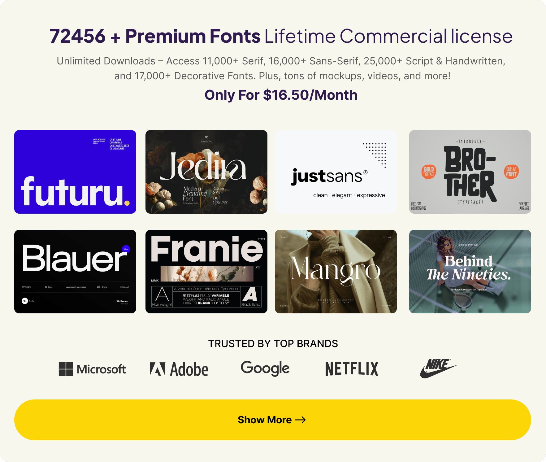
Commercial License for Sports Fonts
 When using any font for paid projects, confirm that you have the appropriate commercial rights. Using non-commercial fonts can lead to legal complications.
To avoid this, CSS Author recommends that you purchase a license or use a service like Envato or MyFonts for fully licensed sports fonts.
By purchasing your font license (doing the rigt thing), you not only support font creators but may also provide our team with royalties, helping us continue our work.
Browse at EnvatoBrowse at MyFonts
What font is used for sports ?
When it comes to sports, the font choice plays a significant role in conveying the energy and excitement associated with athletic activities. The most commonly used fonts for sports branding are bold, strong, and dynamic. These fonts are designed to evoke a sense of power, speed, and competitiveness.
Ultimately, the font used for sports should reflect the brand’s personality and complement its overall design aesthetics. Whether it’s bold and powerful or sleek and modern, the right font will enhance the visual impact of any sports-related design.
Tips for choosing the right fitness font based on brand identity and design requirements
When choosing a fitness font for your designs, it’s important to consider your brand identity and design requirements. Here are some tips to help you make the right choice.
Reflect your brand : Select a font that aligns with your brand personality. If your fitness brand is bold and energetic, go for a font with strong, impactful letterforms. If you want to convey a sense of elegance and sophistication, opt for a font with clean lines and sleek styling.
Consider readability : Ensure that the font you choose is easily legible, even at different sizes or when used in small spaces. Avoid fonts with overly decorative or complex letterforms that may be difficult to read.
Match the style : Consider the overall style of your design and choose a font that complements it. If you have a minimalist design, go for simple and modern fonts. For more playful or creative designs, consider fonts with unique or unconventional lettering styles.
Balance with other elements : Pay attention to how the font interacts with other visual elements in your design, such as icons or images. Make sure the font doesn’t overpower or clash with these elements but instead enhances their overall impact.
Test before finalizing : Don’t forget to test different fonts on various devices and platforms to ensure compatibility and consistent display across different mediums.
By following these tips, you can select the perfect fitness font that not only represents your brand identity but also enhances the overall aesthetics of your design.
To help you stay on top of the latest design trends in fitness fonts – we’ve compiled a list of best free fonts for sports that are perfect for sports enthusiasts. These fonts not only capture the essence of athleticism but also elevate the look and feel of any sports branding project.
See also
Houston Sports Font Family

Nitrogine

Draco Display Font

Randos – Sport Font

Facón Typeface

Playball Font

Norwill – Sport Font

Apex Mk3

Boge Font

Dream MMA

Palace of Sports

Sporty

Overtaking Font

Amagro Font

Furore

Strandhill Font

Promesh Font

Redwing Athletic Typeface

Fulbo

Mexcellent Font

Ammonite Font

Infinite Justice

Ferro Rosso Font

TemplateFC’s Sports Font

Some Top Google Fonts for Sports Design
Montserrat : This versatile and modern font is perfect for both headlines and body text, giving your designs a clean and professional look.
Raleway : With its thin and elegant letterforms, Raleway adds a touch of sophistication to any fitness-related design.
Lato : Lato’s rounded letterforms and balanced spacing make it an excellent choice for creating a friendly and approachable vibe.
Bangers : If you’re looking to add some fun and playfulness, Bangers’ bold letters and graffiti-inspired style will do the trick.
Open Sans : As a popular sans-serif font, Open Sans offers excellent legibility even at small sizes, making it ideal for informative fitness graphics.
Roboto Condensed : With its condensed letterforms, Roboto Condensed gives your designs a sleek and modern feel, perfect for conveying power and strength.
Oswald : Oswald’s bold and geometric letterforms make it a great choice for eye-catching headlines in fitness branding materials.
Playfair Display : This elegant serif font adds a touch of sophistication to your designs while maintaining readability and clarity.
Bebas Neue : Bebas Neue’s strong capitals create impact and drama, making it ideal for headlines or large-scale signage in fitness-related projects.
Anton : Anton’s bold strokes make it highly legible even at small sizes, making it a versatile choice for various fitness design applications.


