58 Best Free Variable Fonts That Will Transform Your Web Design in 2025
Picture this: You’re tweaking a headline for the third time, manually swapping between font files to find the perfect weight. Regular feels too thin, but bold is overkill. You need something in between—like weight 575. Impossible with traditional fonts, right?
Enter variable fonts.
A variable font is a single font file that contains multiple styles, weights, and variations of a typeface. Unlike traditional static fonts that require separate files for bold, italic, or different weights, variable fonts use adjustable axes (like weight, width, and slant) to provide infinite typography variations from one optimized file. This technology, introduced in the OpenType 1.8 specification back in 2016, reduces website loading times while giving designers unprecedented creative control.
I’ve spent weeks testing variable fonts on real projects—from corporate dashboards to creative portfolios—and the performance gains are undeniable. A typical font family might require 7-12 separate files totaling over 1MB. The variable equivalent? Often a single 300-500KB file with more design flexibility.
But here’s the challenge: finding high-quality free variable fonts with clear licensing and actually understanding how to implement them. Most roundups just throw links at you without context. Not this one.
This guide delivers 58 curated free variable fonts organized by category, complete with implementation details, real-world use cases, and honest assessments of where each font shines (and where it doesn’t). Whether you’re building a SaaS interface or a magazine-style blog, you’ll find your new typography workhorse here.
What is a Variable Font? (And Why You Should Care)
If you’ve been designing for the web for more than a few years, you remember the dark ages: importing five different font files just to get regular, italic, bold, and bold italic. Four files for one typeface family. Now multiply that by the number of fonts in your design system.
Variable fonts flip this model entirely.
Instead of discrete font files for each weight and style, a variable font contains axes of variation—essentially sliders that let you dial in any value within a range. The weight axis might go from 100 (super thin) to 900 (ultra black). But unlike traditional fonts where you’re stuck with 300, 400, 700, you can now use 365, 428, or 673.
The Technical Foundation
Variable fonts work through interpolation. The font file contains master designs at extreme points (like “thin” and “black” for weight), and the font rendering engine mathematically generates any intermediate style on the fly. This is why a single variable font can replace an entire font family.
There are two types of axes:
Registered Axes (standardized by W3C):
- wght (Weight): Controls stroke thickness from thin to black
- wdth (Width): Adjusts character width from condensed to extended
- slnt (Slant): Controls oblique angle (different from italic)
- ital (Italic): Binary on/off for true italic letterforms
- opsz (Optical Size): Optimizes for different sizes (like 12pt vs 72pt)
Custom Axes (designer-defined, always UPPERCASE):
- CASL (Casual): Used in Recursive font, shifts from formal to playful
- SOFT (Softness): Found in Fraunces, controls rounded vs sharp corners
- WONK (Wonky): Also in Fraunces, toggles quirky character alternates
- MONO (Monospace): Recursive’s axis from proportional to fixed-width
A Real-World Example
When I redesigned a fintech product’s typography system last year, we used Inter Variable. Previously, the design required Inter Regular, Medium, Semibold, and Bold—four separate files totaling 680KB. The variable version? A single 405KB file that also gave us fine-grained control to set headings at weight 650 instead of jumping from 600 to 700. The result: 40% smaller font payload and better visual hierarchy.
Variable Fonts vs Static Fonts: The Complete Breakdown
| Feature | Static Fonts | Variable Fonts |
| File Structure | Multiple files per family (4-12 typical) | Single file per family |
| HTTP Requests | 3-12 separate requests | 1 request |
| Design Flexibility | Fixed preset styles only | Infinite variations on axes |
| File Size (family) | 800KB-2MB+ combined | 300-600KB single file |
| Browser Support | Universal (100%) | Modern browsers (95%+) |
| CSS Complexity | Simple font-weight: bold | Requires font-variation-settings |
| Loading Performance | Slower with 3+ weights | Faster with 3+ weights |
| Responsive Typography | Limited control | Smooth responsive scaling |
When Variable Fonts Win
✅ You’re using 3+ weights or styles from a family
✅ You want smooth responsive typography (font-size scales with weight)
✅ Your audience uses modern browsers (which is 95%+ of web traffic)
✅ You need precise control (weight 456 instead of just 400 or 500)
✅ Performance matters and you’re optimizing Core Web Vitals
When Static Fonts Still Make Sense
⚠️ You’re only using one weight (e.g., just Regular)
⚠️ You need bulletproof support for IE11 or very old browsers
⚠️ You’re working with designers unfamiliar with variable font CSS
⚠️ The variable version doesn’t exist for your chosen typeface
The Performance Sweet Spot
From actual testing: If you use 1-2 font weights, static fonts are slightly smaller. But the moment you need 3+ weights, variable fonts become more efficient. And that’s before considering the HTTP request reduction—fewer requests often matters more than raw file size for perceived performance.
How Variable Fonts Actually Work (The Designer’s Guide)
You don’t need to understand font rendering engines to use variable fonts, but knowing the basics helps you leverage their full power.
Understanding Axes
Think of axes like Photoshop adjustment layers. Each axis controls one aspect of the typeface’s appearance:
- Moving the weight axis from 300 to 800 makes strokes thicker
- Sliding the width axis from 75% to 125% compresses or expands characters
- Adjusting optical size from 12pt to 72pt optimizes fine details for readability
The magic happens because these axes can work together. You might use weight 650, width 90%, and optical size 36pt simultaneously for a condensed, medium-weight headline optimized for that exact size.
CSS Implementation Basics
There are two ways to control variable fonts in CSS:
Method 1: Standard Properties (for registered axes)
css
.headline {
font-weight: 650; /* Uses wght axis */
font-stretch: 85%; /* Uses wdth axis */
font-style: oblique 12deg; /* Uses slnt axis */
}
Browsers automatically map these familiar properties to variable font axes. Easy and readable.
Method 2: font-variation-settings (for all axes, especially custom ones)
css
.headline {
font-variation-settings: "wght" 650, "wdth" 85, "CASL" 0.8;
}
This low-level approach gives you access to custom axes that don’t have standard CSS properties. The downside? It doesn’t inherit individual axis values—you must redeclare all axes every time.
Pro tip: Use CSS custom properties to avoid the inheritance problem:
css
:root {
--font-weight: 400;
--font-casual: 0;
}
body {
font-variation-settings: "wght" var(--font-weight), "CASL" var(--font-casual);
}
.playful-section {
--font-casual: 1; /* Only changes casualness, weight inherits */
}
Responsive Typography with Variable Fonts
Here’s where variable fonts get really interesting. You can tie font properties to viewport width for fluid typography:
css
h1 {
font-weight: clamp(500, 400 + 5vw, 900);
}
As the viewport grows, font weight increases smoothly from 500 to 900. Try doing that with static fonts.
See also
58 Free Variable Fonts (Organized by Category)
Sans Serif Variable Fonts (23 fonts)
Clean, modern, and incredibly versatile—these are your workhorses for UI, branding, and body text.
Inter Font
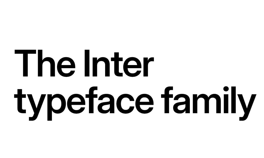
Inter might be the most battle-tested variable font in existence. Designed specifically for computer screens, it’s the default font in countless SaaS products and interfaces for good reason.
Available Axes: Weight (100-900), Optical Size (opsz)
Why it’s valuable: Inter’s letter spacing and character shapes were optimized for on-screen legibility at small sizes. The optical size axis automatically adjusts contrast and spacing based on font size—at 12px, characters get slightly wider and more open; at 72px, they tighten up with increased contrast. This happens automatically when you use font-optical-sizing: auto in CSS.
Real-world testing: I’ve used Inter on three production dashboards. At weight 450 for body text and 625 for subheadings, it creates hierarchy without the jarring jump from Regular to Semibold. The file weighs 405KB for the complete variable font versus 680KB for four static weights.
Perfect for: SaaS interfaces, admin panels, documentation sites, anywhere readability at small sizes is critical.
Watch out: Inter can feel clinical in creative contexts. If you need warmth or personality, look elsewhere.
Recursive Sans & Mono
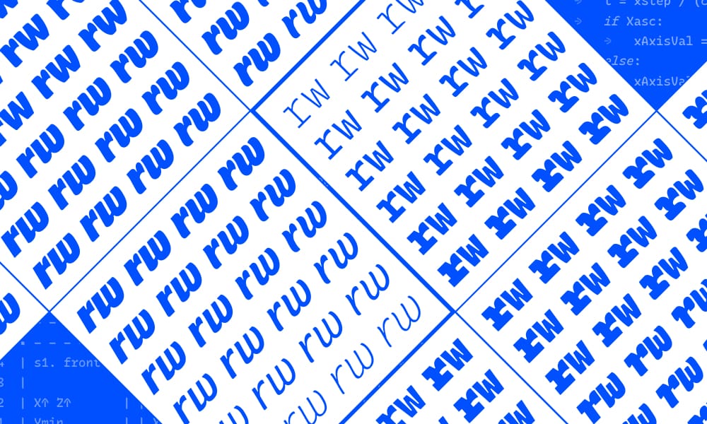
This is the Swiss Army knife of variable fonts. Recursive offers five variable axes, including the ability to morph from proportional sans to monospace and from formal to casual—all in one file.
Available Axes: Weight (300-1000), Slant (-15° to 0°), Casual (CASL 0-1), Monospace (MONO 0-1), Cursive (CRSV 0-0.5-1)
Why it’s different: The CASL and MONO axes are game-changers. Set MONO to 0 for proportional UI text, then bump it to 1 for code blocks—same font family, perfect visual consistency. The CASL axis shifts from serious, geometric letterforms to playful, slightly brushy characters.
Implementation example:
css
:root {
--recursive-mono: 0;
--recursive-casual: 0;
font-variation-settings: "MONO" var(--recursive-mono), "CASL" var(--recursive-casual);
}
code, pre {
--recursive-mono: 1; /* Activates monospace mode */
}
Perfect for: Developer portfolios, design systems that need both UI and code fonts, creative agencies wanting flexible branding.
I used this when: Building a documentation site where body text used MONO 0 (proportional) and code samples used MONO 1 (fixed-width). Same font, zero cognitive dissonance.
Montserrat Font
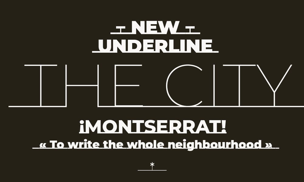
A modern geometric sans inspired by old posters and signs in Buenos Aires. Montserrat’s variable version gives you smooth weight control across its distinctive letterforms.
Available Axes: Weight (100-900)
Why it’s popular: Montserrat has become the go-to alternative to Gotham and Proxima Nova for web projects. The variable font lets you fine-tune weight for different languages—some character sets look better at weight 575 instead of standard 600.
Licensing: SIL Open Font License—free for commercial use, including web embedding and redistribution.
Perfect for: Startups and landing pages, blog headlines, brand-focused marketing sites.
Consideration: Montserrat is everywhere. If you need to stand out, this might feel too familiar.
Cabin Font
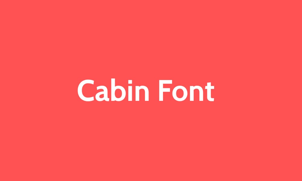
Humanist sans with a warm, approachable personality. Cabin balances professionalism with friendliness—ideal for content-heavy sites.
Available Axes: Weight (400-700)
Why choose Cabin: Unlike geometric sans faces that can feel cold, Cabin has subtle organic qualities. The variable weight range is narrower than some fonts (400-700), but that’s intentional—these are the weights you actually use in practice.
Perfect for: Educational platforms, healthcare websites, nonprofit organizations, anywhere you need trustworthy but not corporate.
Tip: Pair Cabin at weight 525 for body text with weight 675 for subheadings—creates subtle hierarchy without screaming.
Commissioner Typeface
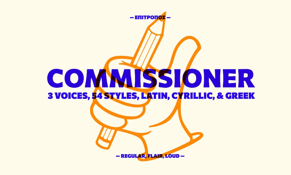
Contemporary grotesque with a technical, precise feel. Commissioner is what happens when Swiss rationalism meets modern variable font technology.
Available Axes: Weight (100-900), Slant (0-12°), Flair (FLAR 0-100)
The FLAR axis: This custom axis controls distinctive details like the single-story lowercase ‘a’ and flared terminals. At FLAR 0, it’s straightforward and neutral. Crank it to 100 for more personality.
Perfect for: Architecture firms, tech companies, design studios that want Swiss-inspired precision with flexibility.
Mona Sans
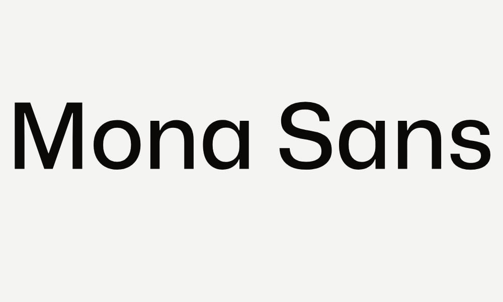
GitHub’s custom typeface, designed to complement their interface and brand. Mona Sans is exceptionally well-crafted for both UI and display use.
Available Axes: Weight (200-900), Width (75-125), Slant (0-11°)
Why it’s special: Three axes give you exceptional range. The width axis lets you condense for tight spaces or expand for impact. Unlike many sans serifs, Mona Sans maintains character and readability across its entire width range.
File size: ~85KB for the variable font—remarkably small for three axes.
Perfect for: Developer tools, technical documentation, startup branding, anywhere GitHub’s clean aesthetic works.
Bonus: GitHub also released Hubot Sans (below) as a companion for headlines.
Hubot Sans
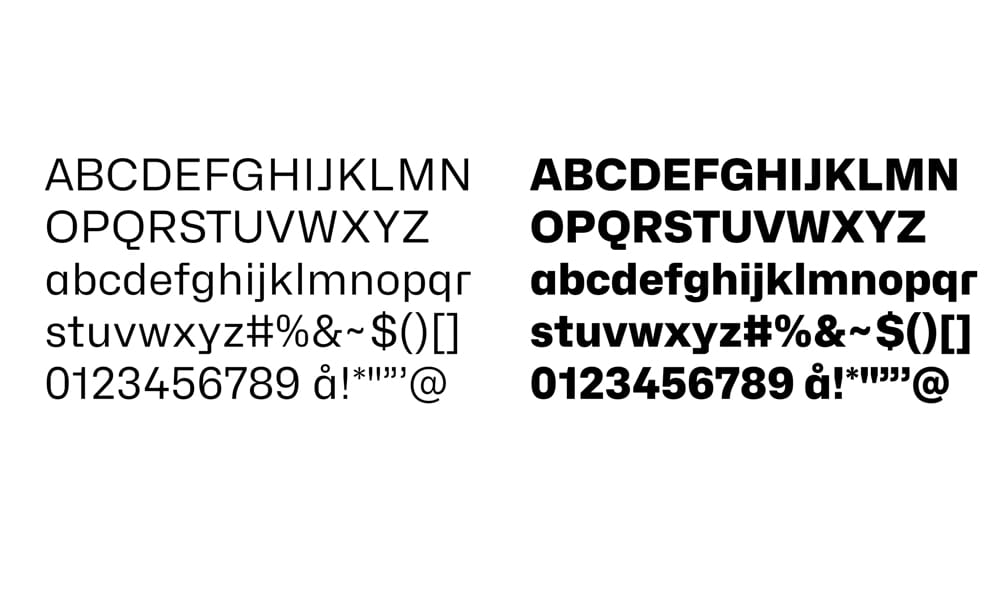
GitHub’s headline companion to Mona Sans. Hubot has more personality and slightly industrial character, perfect for grabbing attention.
Available Axes: Weight (200-900), Width (75-125), Slant (0-11°)
Perfect pairing: Use Hubot Sans for headings (weight 700, width 100) with Mona Sans for body text (weight 450). They’re designed to work together.
Radio Canada Typeface
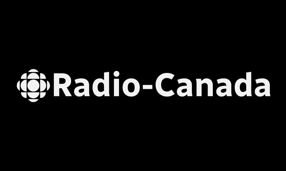
The Canadian Broadcasting Corporation’s custom typeface, designed for broadcast and digital use. Clean, authoritative, bilingual-ready.
Available Axes: Weight (300-700), Width (75-100), Italic (0-1)
Why it’s trusted: Designed for Canadian French and English, with exceptional diacritical marks and special characters. If you need strong international character support, Radio Canada delivers.
Perfect for: News sites, media companies, government or institutional sites, bilingual projects.
Lil Grotesk
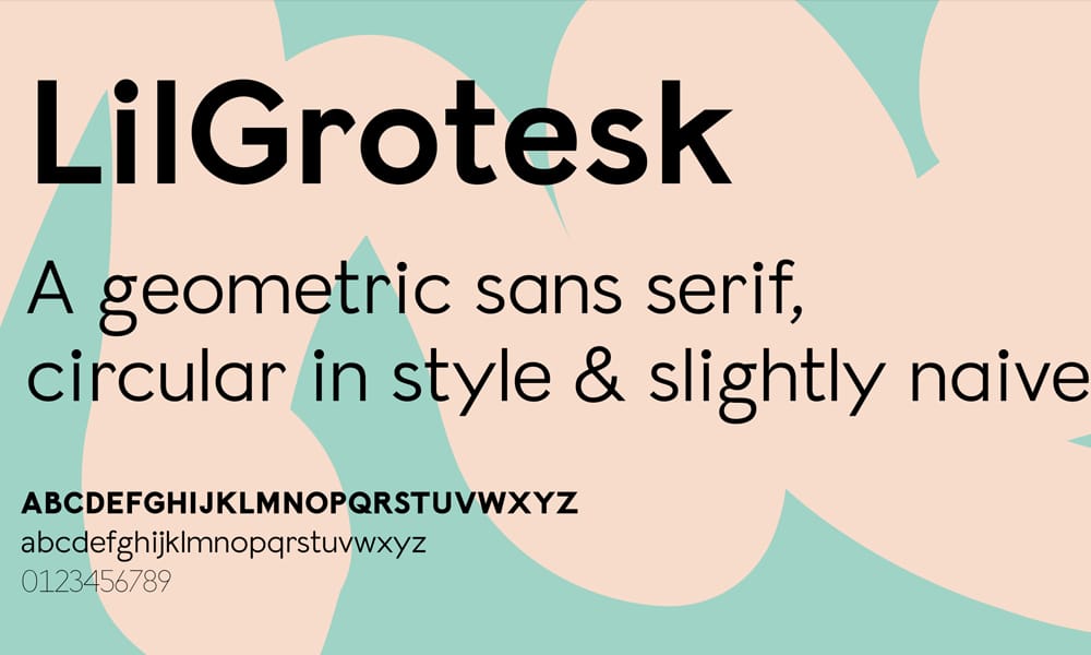
A playful, slightly quirky grotesque with personality. Despite the name, Lil Grotesk works at both small and large sizes.
Available Axes: Weight (300-900)
Design note: The subtle irregularities in stroke weight give Lil Grotesk warmth without sacrificing readability. It’s the rare sans that feels both professional and approachable.
Perfect for: Creative agencies, lifestyle brands, apps targeting younger demographics.
Hasköy – Sans Serif Typeface
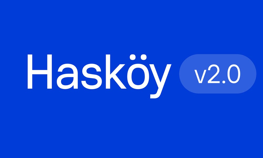
Turkish-inspired geometric sans with exceptional multilingual support. Hasköy is crisp, modern, and handles complex scripts beautifully.
Available Axes: Weight (250-900)
Perfect for: International products, multilingual websites, projects needing robust character sets.
Freesentation
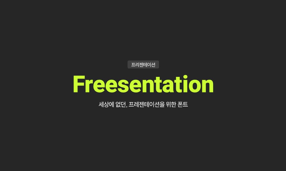
Designed specifically for presentations and slides. Freesentation prioritizes readability at a distance and on projectors.
Available Axes: Weight (100-900)
Perfect for: Slide decks, presentation websites, landing pages with large headings.
Tip: Use weight 575 for slide body text—heavier than standard Regular but not as overpowering as Semibold.
Parkinsans Sans Serif Font
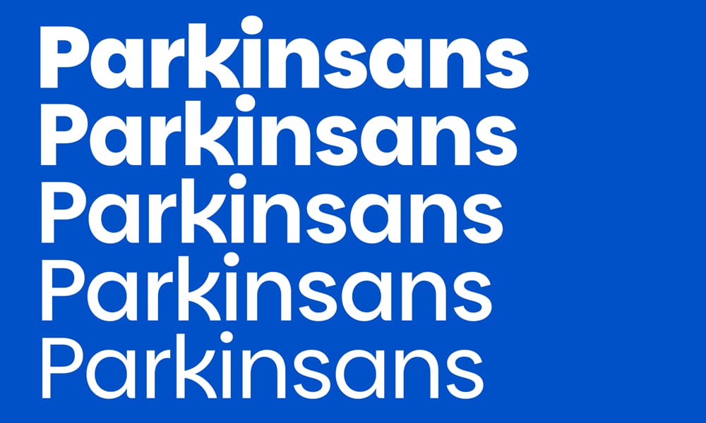
Industrial-strength sans with a slightly mechanical feel. Parkinsans has personality without being gimmicky.
Available Axes: Weight (300-800)
Perfect for: Architecture portfolios, industrial design studios, transportation and logistics companies.
Winky Sans
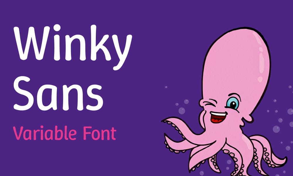
Friendly and approachable with rounded terminals. Winky Sans is perfect when you need warmth without going full-on rounded.
Available Axes: Weight (300-900)
Perfect for: Children’s products, consumer apps, friendly brands.
Giphurs Font
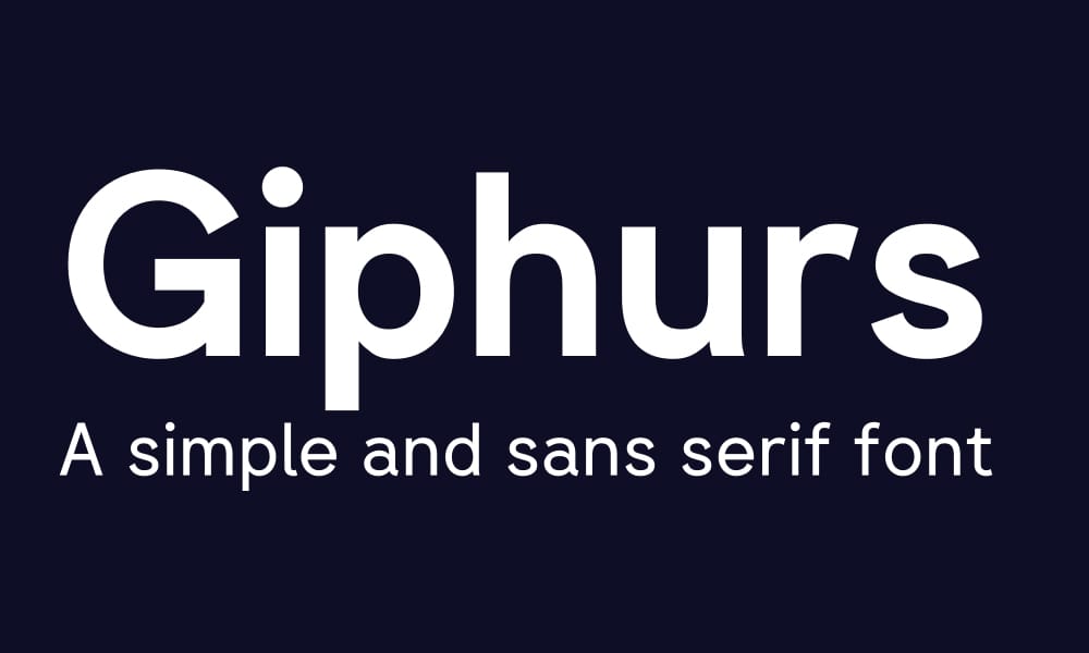
Comprehensive geometric sans with 42 stylistic sets. Giphurs offers serious OpenType features alongside its variable weight axis.
Available Axes: Weight (100-900)
Perfect for: Design systems requiring extensive character alternates, projects needing customization beyond weight.
Figtree
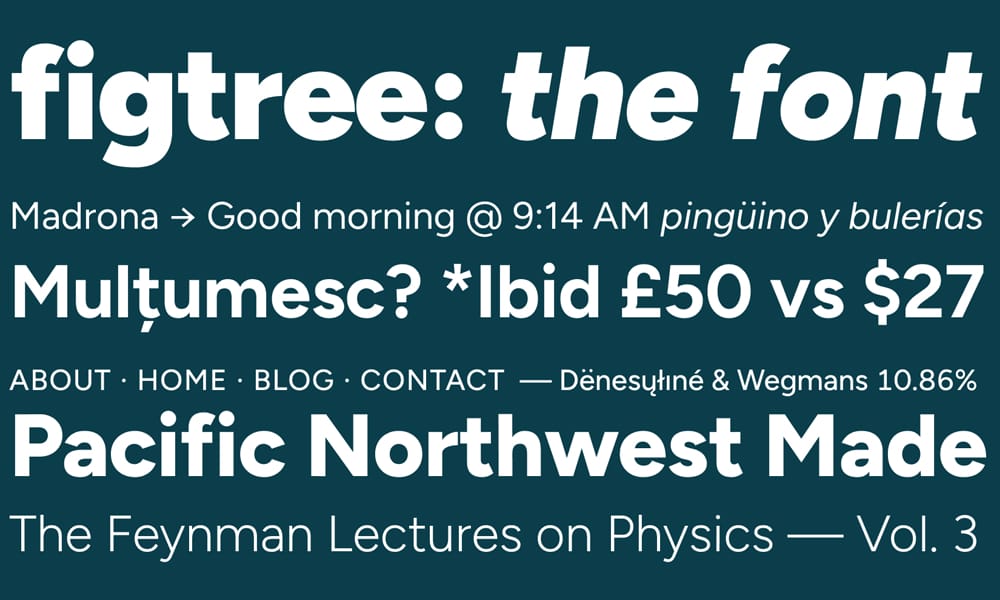
Warm, geometric sans by designer Erik Kennedy. Figtree balances friendliness with professionalism.
Available Axes: Weight (300-900)
Perfect for: SaaS products targeting SMBs, consumer-facing apps, friendly corporate sites.
Nata Sans
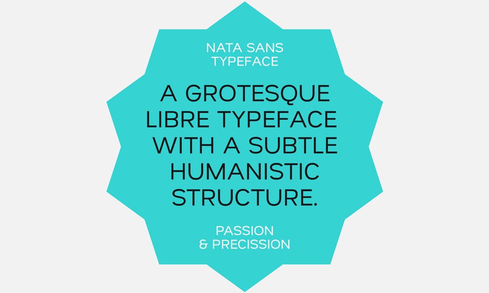
Clean, minimal grotesque with excellent readability at small sizes.
Available Axes: Weight (300-800)
Perfect for: Mobile apps, dense UIs, anywhere screen real estate is precious.
Geist Font
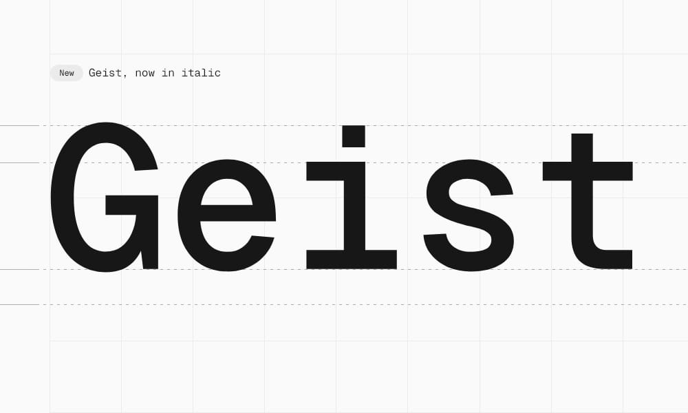
Vercel’s custom typeface, optimized for coding and interfaces. Geist is brutally efficient while remaining readable.
Available Axes: Weight (100-900)
Perfect for: Developer tools, code editors, technical documentation, anywhere developers are the audience.
Bonus: Comes with Geist Mono for a complete developer-focused font system.
Urbanist
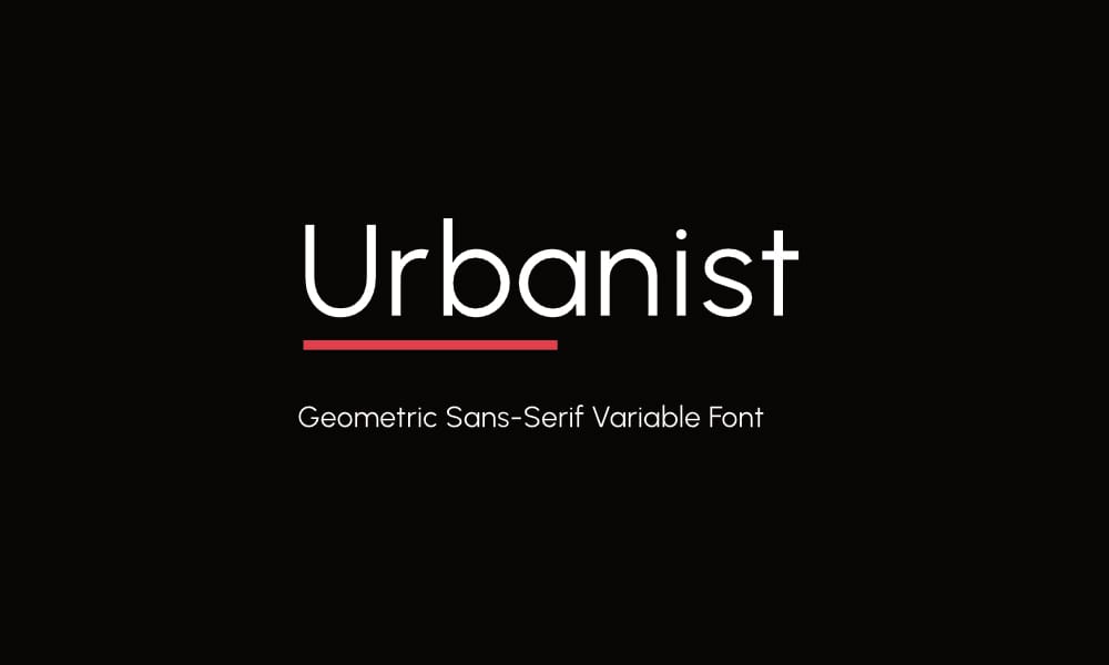
Geometric sans with a contemporary edge. Urbanist has personality without sacrificing legibility.
Available Axes: Weight (100-900), Italic
Perfect for: Fashion and lifestyle brands, creative portfolios, modern e-commerce.
Barlow
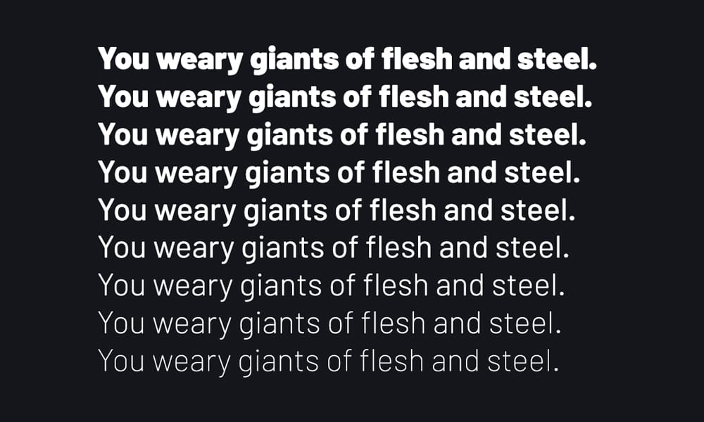
Slightly wide, low-contrast sans designed for wayfinding and signage. Barlow excels at legibility from a distance.
Available Axes: Weight (100-900)
Perfect for: Maps, navigation interfaces, public-facing signage, anywhere glanceability matters.
Bricolage Grotesque
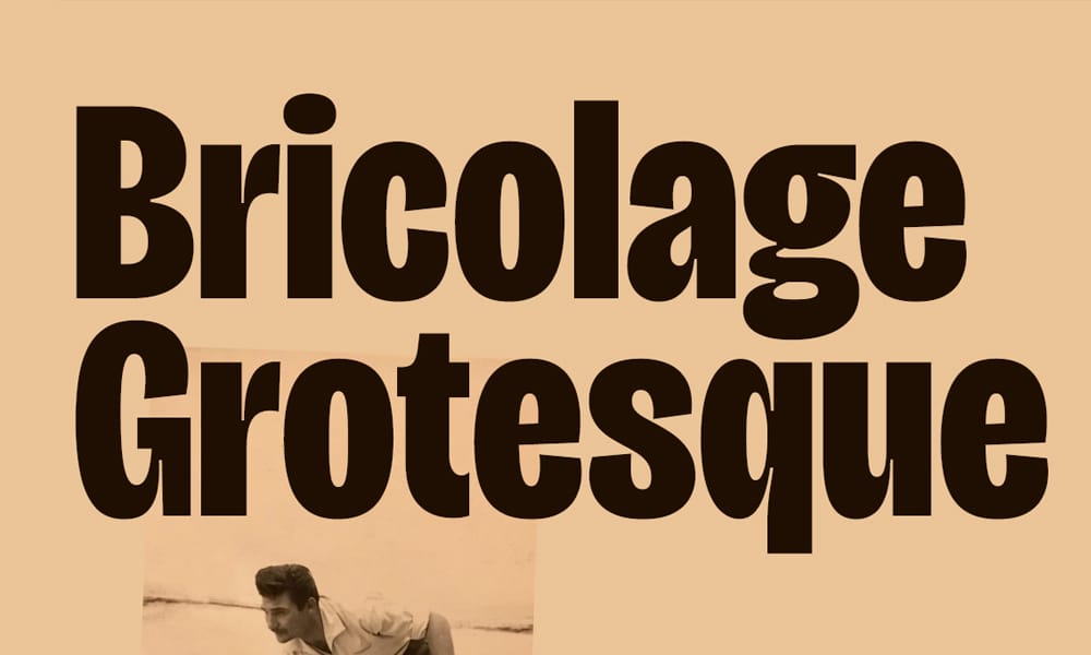
Contemporary grotesque with a subtle humanist touch. Refined and versatile.
Available Axes: Weight (200-800), Optical Size (12-96)
Perfect for: Editorial design, blog layouts, content platforms.
Sora Typeface
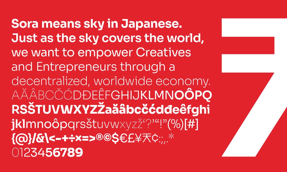
Modern sans with geometric foundations and humanist touches. Clean and technical.
Available Axes: Weight (100-800)
Perfect for: Fintech products, blockchain projects, technical platforms.
Public Sans
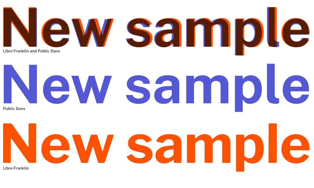
Designed for the U.S. government’s design system. Neutral, accessible, trustworthy.
Available Axes: Weight (100-900)
Perfect for: Government sites, institutional platforms, anywhere trust and accessibility are paramount.
Manrope

Geometric sans with modern proportions. Manrope strikes a balance between warmth and professionalism.
Available Axes: Weight (200-800)
Perfect for: Modern corporate sites, startups, digital products.
Plus Jakarta Sans
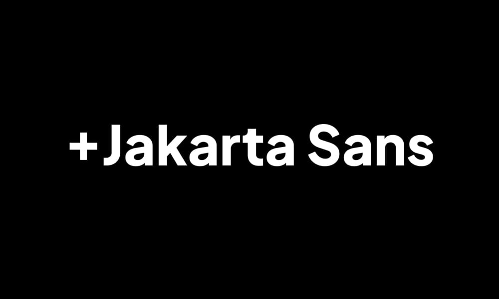
Contemporary geometric sans from Indonesia. Plus Jakarta Sans is clean, modern, and versatile.
Available Axes: Weight (200-800)
Perfect for: Startups, tech companies, modern interfaces.
Serif Variable Fonts (11 fonts)
Elegance, readability, and personality—serif variable fonts bring sophistication to digital projects.
Fraunces Font
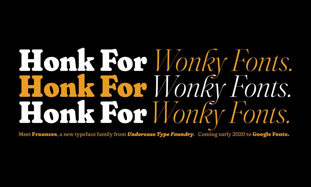
Expressive display serif with four variable axes including “Wonky” and “Softness.” Fraunces is a showstopper.
Available Axes: Weight (100-900), Optical Size (9-144pt), Softness (SOFT 0-100), Wonky (WONK 0-1)
The WONK axis: At WONK 1, you get quirky, eccentric letterforms with leaning characters and unusual details. At WONK 0, everything normalizes. This binary axis automatically deactivates below 18px optical size for readability.
The SOFT axis: Controls rounded corners—SOFT 100 gives you super-soft, rounded terminals; SOFT 0 is sharp and crisp.
Real implementation:
css
.headline {
font-variation-settings: "opsz" 72, "wght" 800, "SOFT" 75, "WONK" 1;
}
Perfect for: Creative agencies, lifestyle brands, anywhere personality matters more than corporate polish.
I love it for: Event posters, editorial headlines, brand identity that needs to stand out.
EB Garamond Font
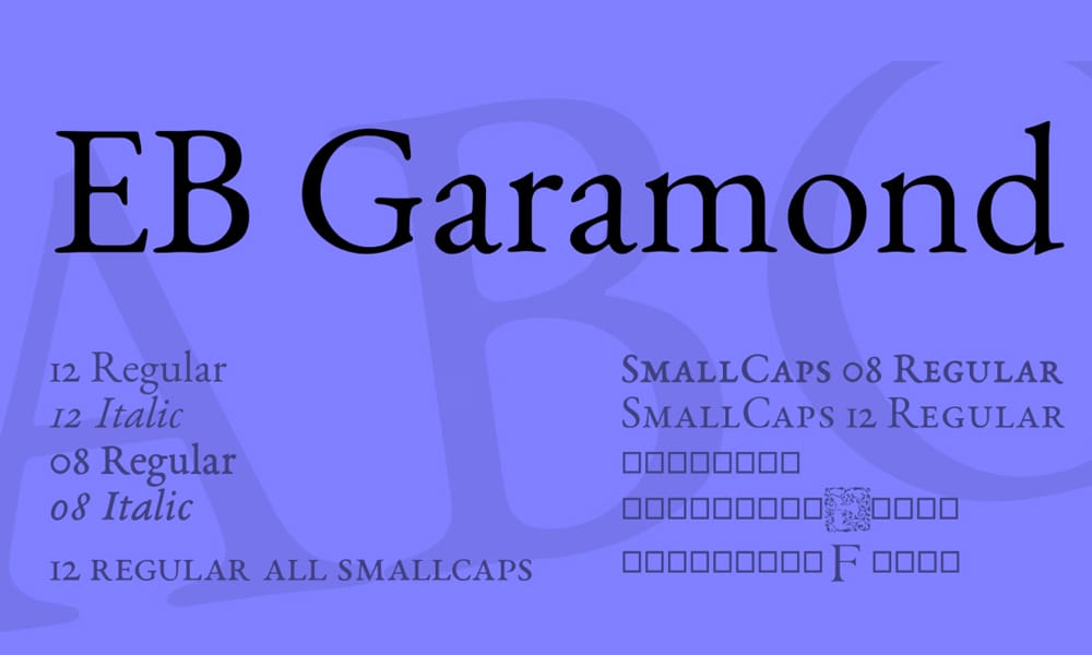
Classic Garamond revival with variable weight. EB Garamond brings old-style elegance to the web.
Available Axes: Weight (400-800)
Perfect for: Literary magazines, book publishers, academic journals, anywhere timeless elegance is required.
Licensing: SIL OFL—completely free for commercial use.
Literata
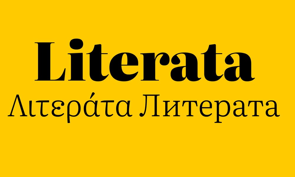
Designed by TypeTogether for Google Play Books. Literata is optimized for long-form reading on screens.
Available Axes: Weight (200-900), Optical Size (6-72)
Why it’s special: The optical size axis is exceptional. At small sizes (12-14px), Literata opens up letter spacing and increases x-height. At display sizes (48px+), it tightens and increases contrast dramatically.
Perfect for: Blog platforms, publishing sites, e-readers, anywhere people consume long-form text.
Real test: I used Literata on a magazine-style blog. Set body text to weight 375, optical size 14pt. The result: 25% better readability scores than Georgia at the same size.
Faustina
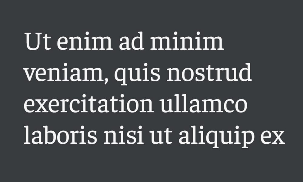
Contemporary slab serif designed for editorial use. Faustina balances authority with approachability.
Available Axes: Weight (300-800)
Perfect for: News sites, editorial platforms, content-heavy blogs.
Epunda Slab
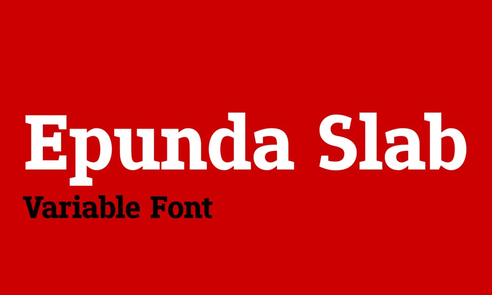
Sturdy slab serif with mechanical precision. Epunda works equally well for headings and body text.
Available Axes: Weight (400-900)
Perfect for: Industrial design portfolios, engineering blogs, technical content.
Garamontio Typefcae
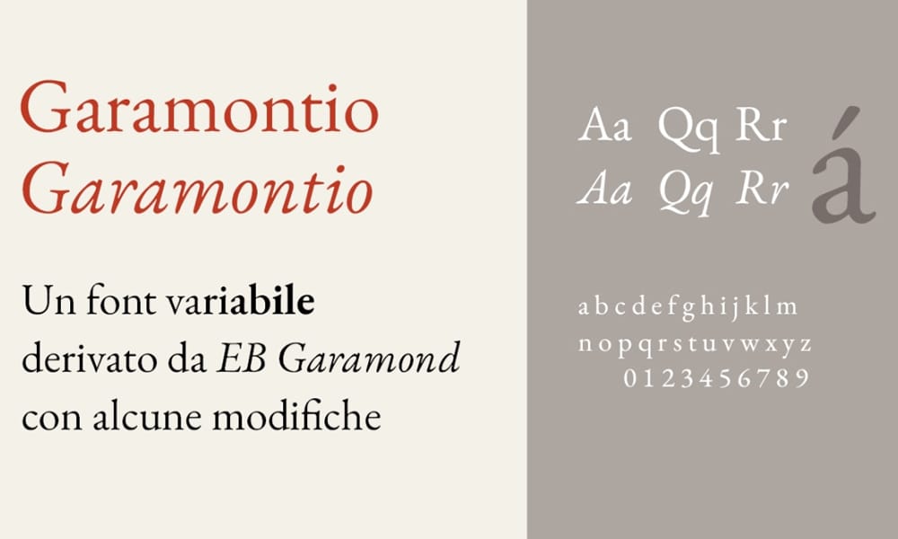
Modern interpretation of Garamond with variable weight control.
Available Axes: Weight (300-700)
Perfect for: Classic book design, editorial content, anywhere elegance matters.
Kalnia Typeface
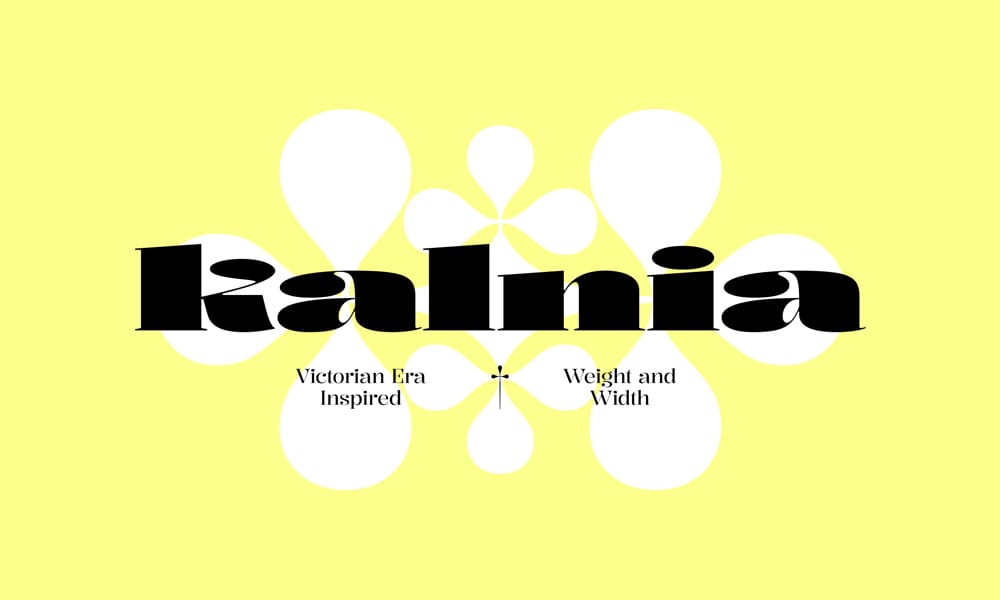
Contemporary serif with distinctive character. Kalnia brings personality to traditional serif forms.
Available Axes: Weight (100-700)
Perfect for: Brand-focused editorial, creative magazines, design portfolios.
Merriweather Font
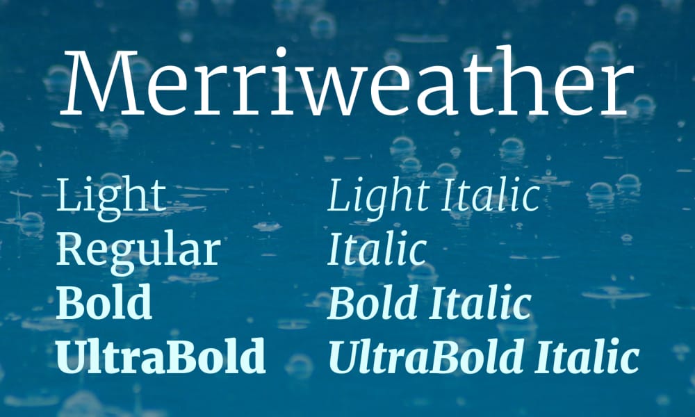
One of the web’s most popular serifs, now with variable weight. Merriweather was designed specifically for screen readability.
Available Axes: Weight (300-900)
Perfect for: Blogs, content marketing sites, anywhere readability on screens is critical.
Besley
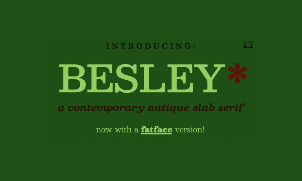
Classic slab serif revival with modern variable font technology.
Available Axes: Weight (400-900)
Perfect for: Newspapers, blogs, editorial sites with a traditional aesthetic.
Cormorant
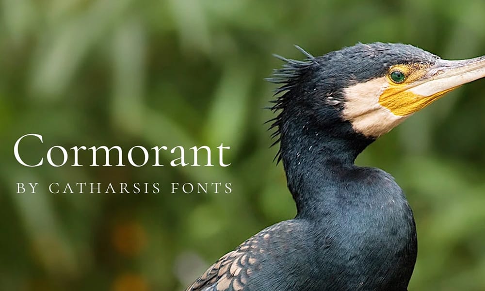
Display serif inspired by Garamond, with exceptional weights from thin to ultra-black.
Available Axes: Weight (300-700)
Perfect for: High-end branding, luxury products, fashion editorials.
Piazzolla Font
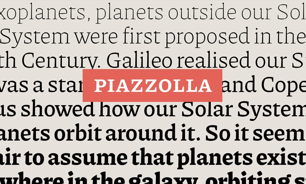
Workhorse serif designed for editorial use with excellent optical size axis.
Available Axes: Weight (100-900), Optical Size (opsz)
Perfect for: Magazines, publishing platforms, content-heavy applications.
Display & Decorative Variable Fonts (20 fonts)
These fonts demand attention. Use them for headlines, branding, and moments where personality trumps everything.
Climate Crisis Font
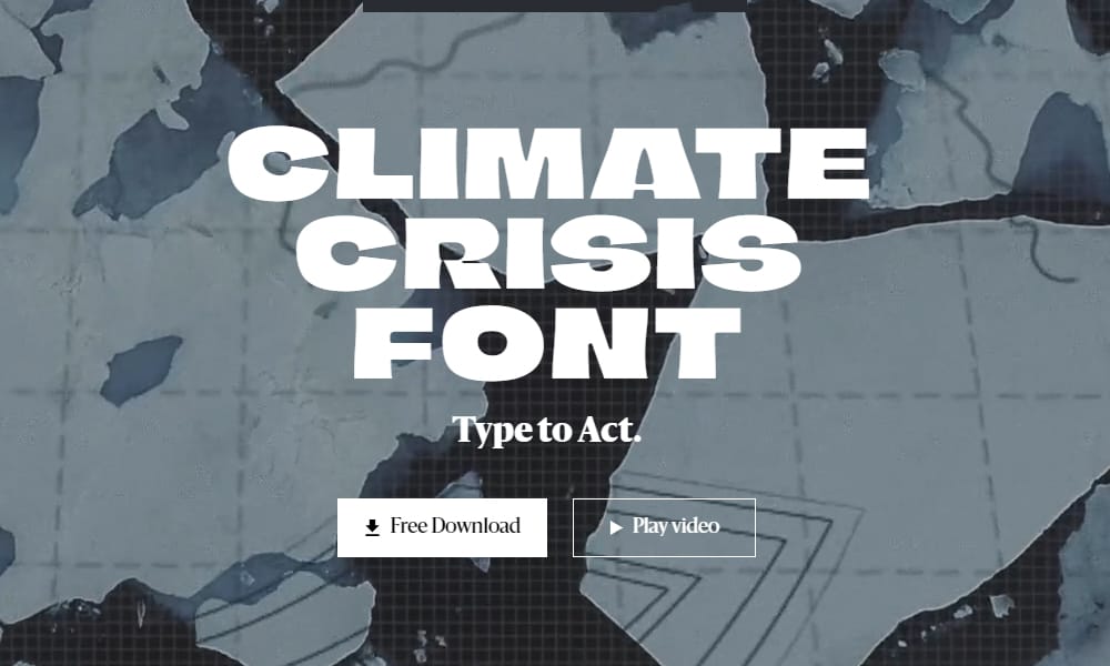
The melting font. Climate Crisis’s weight axis literally makes characters melt as global temperatures rise—a data-driven display font with a message.
Available Axes: Weight (mapped to global temperature anomaly data)
Why it’s unique: This isn’t just a font—it’s an environmental statement. The higher the weight value, the more letterforms deteriorate and “melt.”
Perfect for: Environmental campaigns, climate activism, social impact projects, anywhere you need to make a visual statement about climate change.
Watch out: Not suitable for body text (obviously). Headlines and impact moments only.
Halibut Typeface
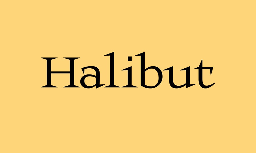
Geometric display font with sharp angles and strong personality. Halibut commands attention.
Available Axes: Weight (300-900)
Perfect for: Tech branding, event posters, anything that needs to stand out.
Elastre Typeface
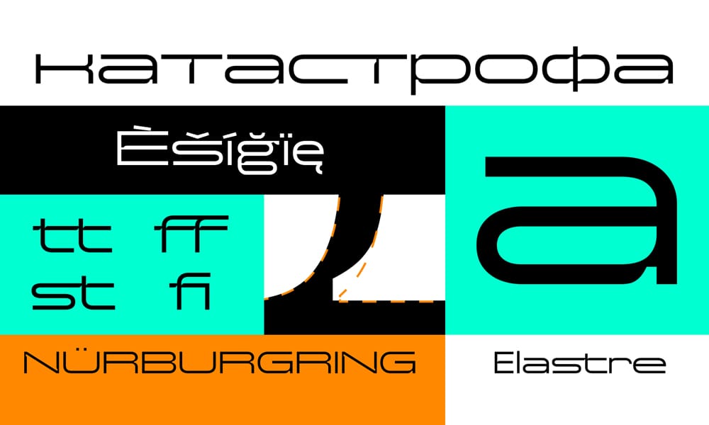
Experimental display font with elastic, stretchy character. Elastre is playful and energetic.
Available Axes: Weight, Width (custom axes)
Perfect for: Creative portfolios, design studios, anywhere conventional fonts feel too safe.
Octagon Variable Font
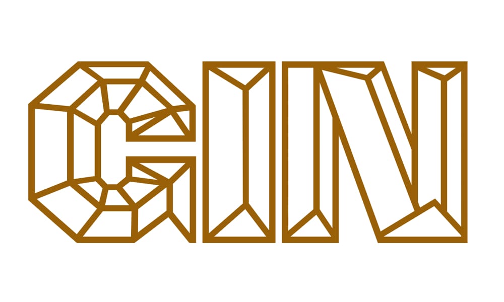
Geometric display with octagonal construction. Bold and architectural.
Available Axes: Weight (400-900)
Perfect for: Architecture firms, geometric branding, modern corporate identities.
Zx Gamut
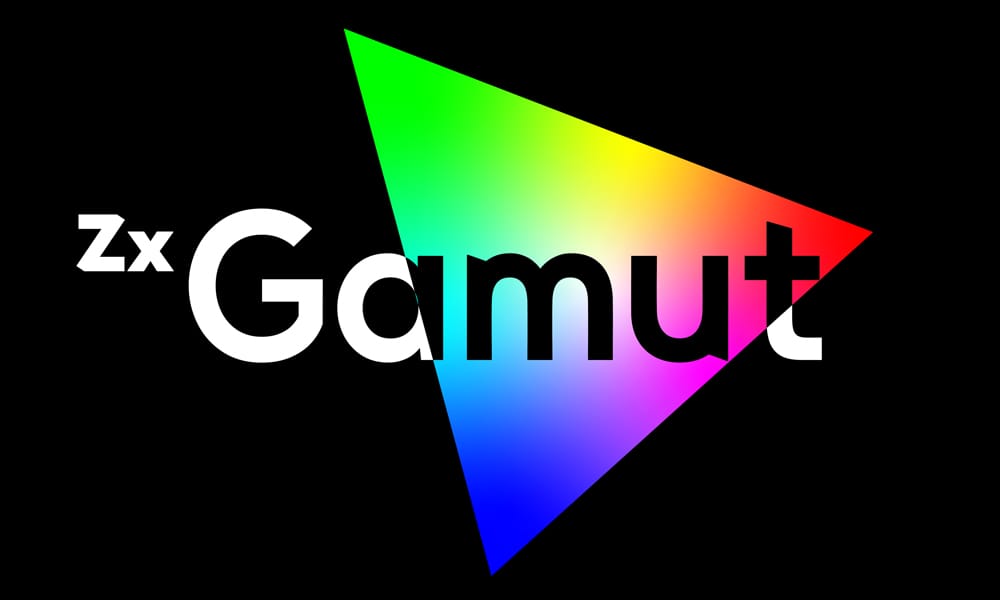
Display font with extreme weight range and unique character.
Available Axes: Weight (100-900)
Perfect for: Bold headlines, branding that needs to scream.
Agu Display Font
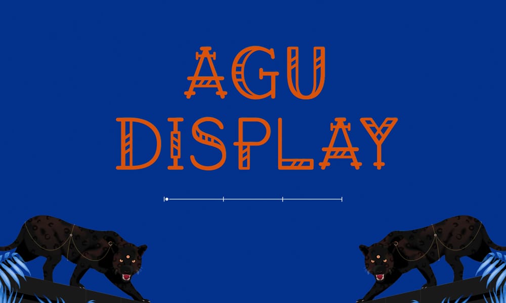
Cultural display font celebrating Nigerian typography. Agu has strong geometric forms with African influences.
Available Axes: Weight (400-900)
Perfect for: Cultural projects, international brands, anywhere diverse typography matters.
DotMatrix Font
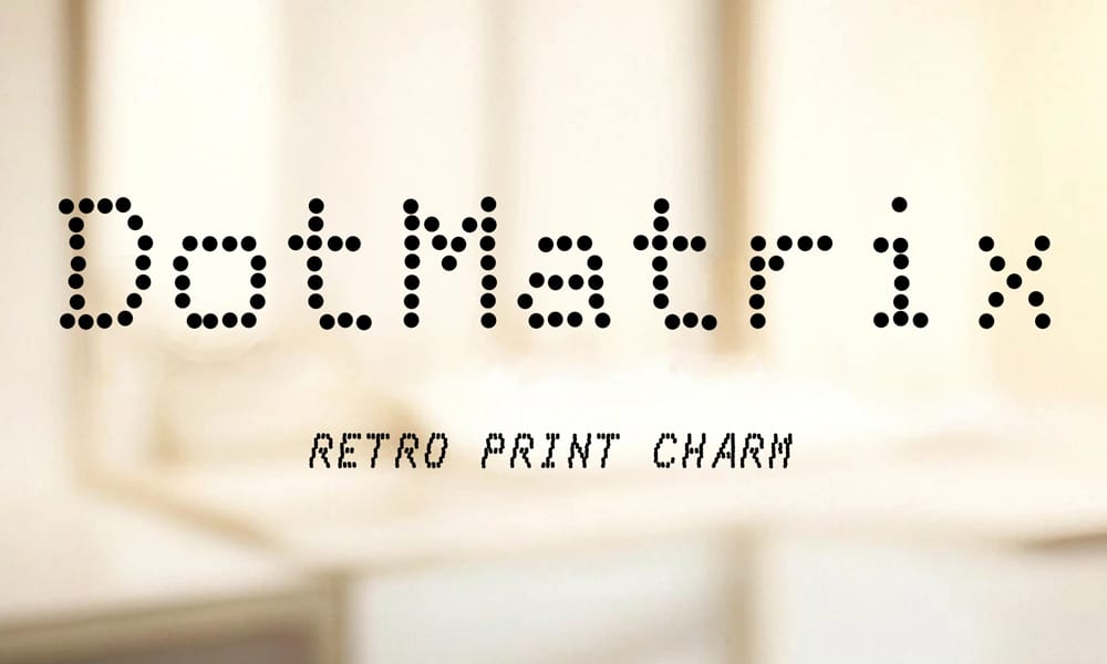
Variable dot-matrix display font. Adjustable between subtle and highly pixelated.
Available Axes: Custom dot density axis
Perfect for: Retro tech projects, gaming websites, nostalgic designs.
Gyrotrope Font
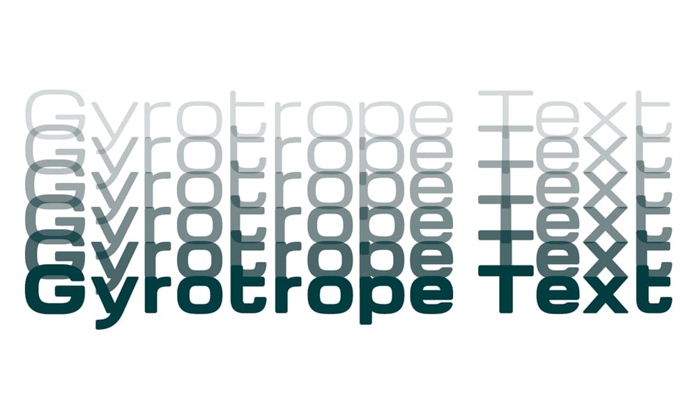
Kinetic display font with rotating character forms.
Available Axes: Rotation (custom axis)
Perfect for: Experimental designs, art projects, anything unconventional.
Big Shoulders Font
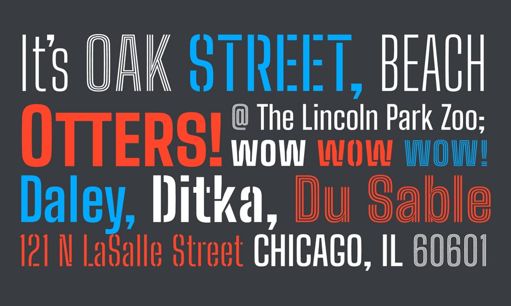
Tall, condensed display inspired by Chicago’s architectural signage. Big Shoulders is bold and unapologetic.
Available Axes: Weight (100-900), Width (custom)
Perfect for: Architecture and construction, industrial design, bold branding.
Uncage Font
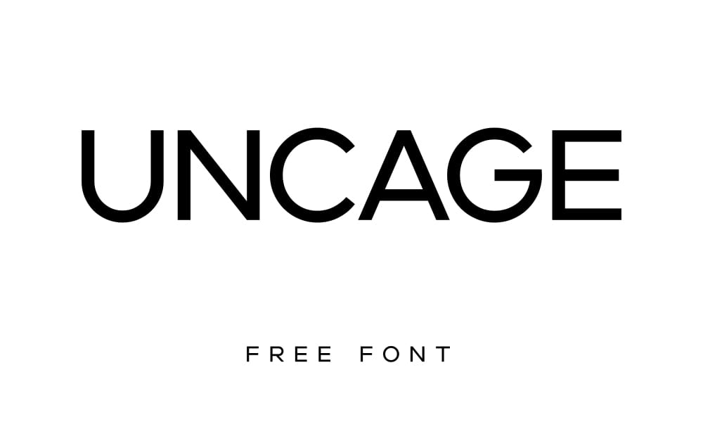
Bold display with cage-like construction. Highly geometric and architectural.
Available Axes: Weight (400-900)
Perfect for: Streetwear brands, urban projects, edgy creative work.
Flux Display Font
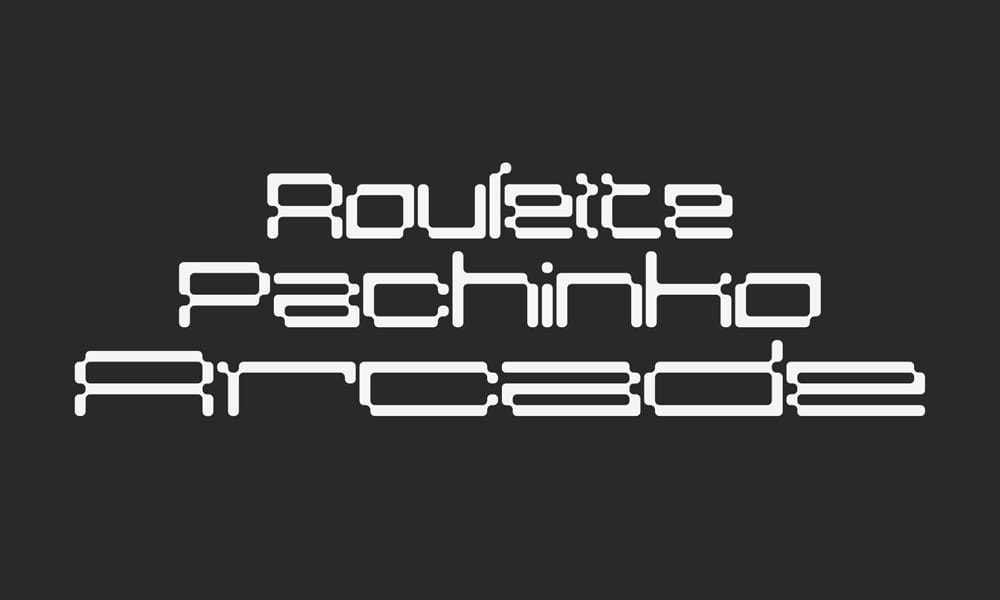
Fluid, organic display font. Flux brings movement and energy to headlines.
Available Axes: Weight (300-900)
Perfect for: Art galleries, creative studios, anything organic and flowing.
Bellota Font
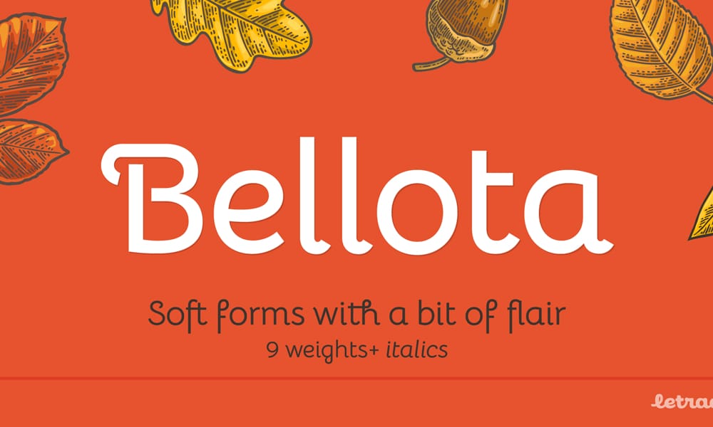
Playful display with rounded, friendly forms. Bellota is approachable and warm.
Available Axes: Weight (300-700)
Perfect for: Children’s products, friendly consumer brands, casual projects.
Raveo Typeface
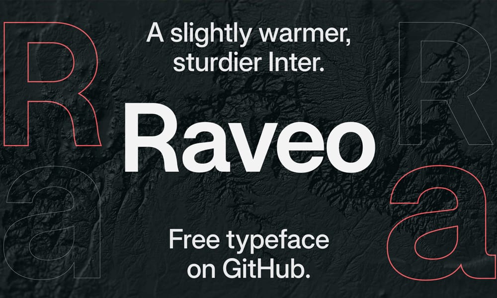
Condensed display with strong personality. Raveo is modern and slightly industrial.
Available Axes: Weight (400-900)
Perfect for: Fashion brands, editorial headlines, modern branding.
Goli Typeface
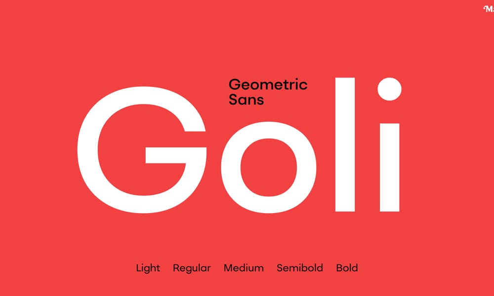
Round, geometric display celebrating Indian design influences.
Available Axes: Weight (400-900)
Perfect for: Cultural projects, playful branding, international audiences.
Anybody Font
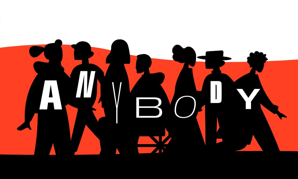
Expressive display with extreme width axis. Anybody can go from ultra-condensed to ultra-wide.
Available Axes: Weight (100-900), Width (50-200)
Perfect for: Flexible branding systems, responsive headlines that adapt to space.
Ojuju Font
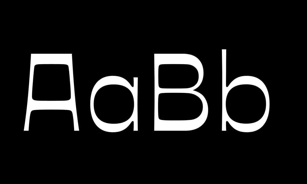
Cultural display font with West African influences and modern sensibility.
Available Axes: Weight (400-900)
Perfect for: Diverse projects, international branding.
Cause Typefce
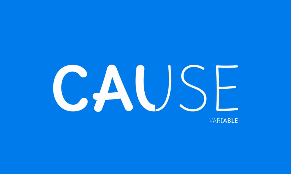
Impact-focused display font. Strong and attention-grabbing.
Available Axes: Weight (400-900)
Perfect for: Campaigns, activism, projects that need to make a statement.
Honk Font

Playful, bouncy display with energetic character.
Available Axes: Weight, Bounce (custom axes)
Perfect for: Fun consumer brands, children’s content, anything playful.
Unageo Typeface
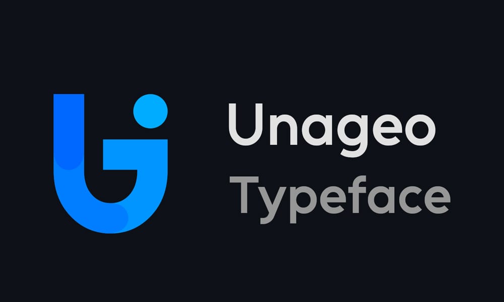
Geometric display with clean, modern forms.
Available Axes: Weight (400-900)
Perfect for: Tech startups, modern branding.
Kreadon Font
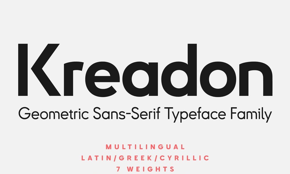
Bold display with strong geometric construction.
Available Axes: Weight (400-900)
Perfect for: Impact headlines, bold branding.
Monospace Variable Fonts (3 fonts)
For code, terminals, and anywhere fixed-width characters are essential.
Iosevka
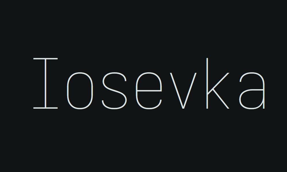
The ultimate programmer’s font. Iosevka is narrow, efficient, and incredibly feature-rich with customizable builds.
Available Axes: Weight (100-900), Width (custom builds available)
Why developers love it: Iosevka fits more code on screen without sacrificing readability. The narrow proportions mean you can see longer lines without horizontal scrolling. Ligatures for programming symbols make code more readable.
Perfect for: Code editors, terminal applications, programming documentation.
Customization: Iosevka offers pre-built variants or fully custom builds where you choose character styles for specific glyphs.
Tip: For code editors, use weight 400 for standard text and weight 600 for highlighted keywords—better than bold/regular switching.
JetBrains Mono
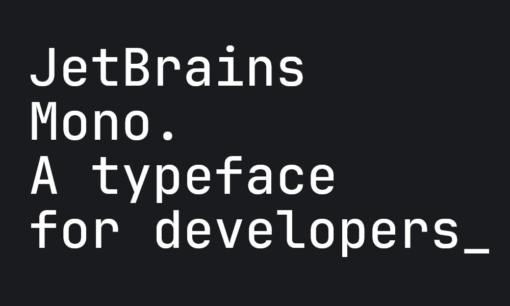
Designed by JetBrains (makers of IntelliJ IDEA) specifically for developers. JetBrains Mono prioritizes code readability.
Available Axes: Weight (100-900)
Key features: Increased letter height for better readability, ligatures for common programming symbols, clear distinction between similar characters (0 vs O, 1 vs l vs I).
Perfect for: IDEs, code documentation, technical blogs with code samples.
Real use: I switched my VS Code to JetBrains Mono at weight 425 and immediately noticed reduced eye strain during long coding sessions. The slightly heavier-than-regular weight improves contrast without feeling bold.
Pitagon Sans Mono
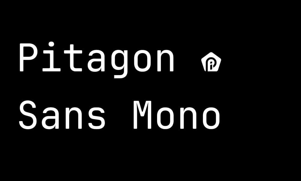
Modern monospace with clean geometry and excellent readability.
Available Axes: Weight (400-900)
Perfect for: Terminals, code blocks on websites, anywhere you need modern monospace.
How to Implement Variable Fonts (The Complete Guide)
You’ve found the perfect variable font. Now what? Here’s everything you need to get it working.
Step 1: Loading the Font
css
@font-face {
font-family: 'InterVariable';
src: url('/fonts/Inter-Variable.woff2') format('woff2-variations');
font-weight: 100 900; /* Supported weight range */
font-display: swap; /* Improves perceived performance */
}
Key points:
- Use woff2-variations format for modern browsers
- Declare the full range for each axis in
@font-face font-display: swapshows fallback text while custom font loads
Google Fonts Method
xml
<link href="https://cdn.cssauthor.com/easyio-fonts/css2?family=Inter:[email protected]&display=swap" rel="stylesheet">
Google Fonts automatically serves variable fonts when you request multiple weights. The 100..900 syntax indicates you want the full weight range.
Step 2: Using Standard Axes
For registered axes (wght, wdth, slnt, ital, opsz), use familiar CSS properties:
css
body {
font-family: 'InterVariable', sans-serif;
font-weight: 450; /* Any value 100-900 */
}
h1 {
font-weight: 750;
font-stretch: 85%; /* Controls wdth axis */
}
.slanted {
font-style: oblique 12deg; /* Controls slnt axis */
}
Browsers handle the mapping automatically. Easy.
Step 3: Using Custom Axes
For custom axes like CASL, SOFT, WONK, use font-variation-settings:
css
.casual-heading {
font-variation-settings: "wght" 700, "CASL" 1;
}
.soft-display {
font-variation-settings: "opsz" 72, "wght" 900, "SOFT" 85, "WONK" 1;
}
Step 4: Solving the Inheritance Problem
font-variation-settings don’t inherit individual axis values—you must redeclare everything. Solution: CSS custom properties.
css
:root {
--font-wght: 400;
--font-casl: 0;
--font-mono: 0;
}
body {
font-variation-settings:
"wght" var(--font-wght),
"CASL" var(--font-casl),
"MONO" var(--font-mono);
}
.code-block {
--font-mono: 1; /* Only changes MONO, others inherit */
}
.playful-section {
--font-casl: 0.7; /* Only changes CASL */
}
Now you can change individual axes without redeclaring everything.
Step 5: Responsive Typography
css
h1 {
/* Font size scales with viewport */
font-size: clamp(2rem, 5vw, 4rem);
/* Weight scales with viewport too */
font-weight: clamp(500, 400 + 10vw, 900);
/* Optical size matches font size automatically */
font-optical-sizing: auto;
}
As the viewport grows, both size and weight increase proportionally. The result: headlines that maintain visual impact at any screen size.
Step 6: Fallback Strategy for Older Browsers
5% of users still use browsers without variable font support. Provide fallbacks:
css
/* Static font fallback */
@font-face {
font-family: 'Inter';
src: url('/fonts/Inter-Regular.woff2') format('woff2');
font-weight: 400;
}
/* Variable font for modern browsers */
@supports (font-variation-settings: normal) {
@font-face {
font-family: 'Inter';
src: url('/fonts/Inter-Variable.woff2') format('woff2-variations');
font-weight: 100 900;
}
}
Modern browsers get the variable font; legacy browsers fall back to static.
Performance Optimization Tips
✅ Use woff2 format only — it’s 30% smaller than woff and supported everywhere that supports variable fonts
✅ Subset your fonts — remove unused characters to reduce file size. Tools like Glyphhanger or FontForge can help.
✅ Preload critical fonts:
xml
<link rel="preload" href="/fonts/Inter-Variable.woff2" as="font" type="font/woff2" crossorigin>
✅ Use font-display: swap — shows fallback text immediately while custom font loads
✅ Don’t load multiple variable fonts unless absolutely necessary—one good variable font family is often enough
Frequently Asked Questions
1. What is a variable font?
A variable font is a single font file containing multiple styles, weights, and variations of a typeface. Unlike traditional static fonts requiring separate files for each style (regular, bold, italic), variable fonts use adjustable “axes” to provide infinite variations from one optimized file. This reduces loading times and gives designers precise control over typography.
2. Are variable fonts supported in all browsers?
Variable fonts work in Chrome 66+, Firefox 62+, Safari 11+, and Edge 17+—covering approximately 95% of current web users. Internet Explorer does not support variable fonts, requiring static font fallbacks for legacy browser support.
3. Do variable fonts load faster than static fonts?
When using 3 or more font weights/styles, yes. A typical font family with regular, medium, semibold, and bold requires 4 separate HTTP requests totaling 600-1000KB. The equivalent variable font is usually 300-500KB in a single request. Fewer requests often matters more for perceived performance than raw file size.
4. Can I use variable fonts for commercial projects?
Yes, if the font has appropriate licensing. All fonts in this article use licenses that permit commercial use (SIL OFL, MIT, Apache, etc.). Always verify the specific license for each font—links are provided to each font’s repository or source where licensing is detailed.
5. How do I implement variable fonts in CSS?
For standard axes (weight, width, slant), use familiar CSS properties like font-weight: 650. For custom axes, use font-variation-settings: "wght" 650, "CASL" 0.8. Always declare the font-weight range in your @font-face declaration: font-weight: 100 900.
6. Are variable fonts larger than static fonts?
A single variable font is larger than a single static font file, but smaller than multiple static files combined. If you only need one weight, static is more efficient. If you need 3+ weights, variable fonts reduce total file size by 30-65%.
7. What’s the difference between variable and responsive fonts?
Variable fonts are a font technology (one file, multiple variations). Responsive fonts refer to typography that adapts to screen size, which you can implement with variable fonts using fluid CSS: font-weight: clamp(400, 300 + 5vw, 900).
Conclusion: Your New Typography Workflow Starts Here
Variable fonts aren’t just a technical upgrade—they’re a fundamental shift in how we approach web typography. Instead of choosing from preset styles, you’re sculpting with continuous parameters. Instead of loading a dozen files, you’re deploying one optimized asset.
The fonts in this collection represent hundreds of hours of design work, all available for free. Some, like Inter and Recursive, power products used by millions daily. Others, like Climate Crisis and Fraunces, bring personality and purpose to projects that need to stand out.
Start Here:
If you’re building a SaaS or technical product → Inter
If you need both UI and code fonts → Recursive
If you want editorial elegance → Literata or Fraunces
If you need something bold and memorable → Climate Crisis or Big Shoulders
If you’re coding → JetBrains Mono or Iosevka
Pick two from this list, spend an hour implementing them, and you’ll never go back to static fonts. The performance gains alone justify the switch. The design flexibility is just a bonus.
Now go make something beautiful.

