

25 Free Chunky Fonts That Will Make Your Designs Unforgettable (2025)
Ever spend hours scrolling through font libraries looking for something that actually has personality? You need a typeface with weight, confidence, and the power to stop the scroll, but most options feel either too thin or too cliché. Finding high-quality free chunky fonts that look professional and not like a school project can be a real challenge for any designer.
That’s why this list is different. I’ve sifted through the noise to curate a collection of 25 seriously impressive free thick fonts that deliver on impact. These aren’t just random fat fonts; they are designer-approved typefaces that work for everything from bold logos and branding to eye-catching social media posts. Each one has been chosen for its unique character, readability, and versatility. Let’s dive in.
See also
The Only List of Free Chunky Fonts You’ll Need
Better Hobby – Free Display Font
 1")
Better Hobby feels like digging up a vintage vinyl record. Its playful, layered style is perfect for designs that need a touch of retro charm. What makes it stand out is its authentic, slightly imperfect texture, which gives it a warm, handcrafted feel. While it’s incredibly stylish, its complexity means it’s best used for headlines rather than long paragraphs.
Perfect for: ’70s-inspired posters, album art, and quirky branding.
Grenze Typeface
 2")
On the opposite end of the spectrum, Grenze is a classic, bold serif that commands attention with quiet confidence. It’s a workhorse font that blends historical elegance with modern weight, making it surprisingly versatile. I’ve found it works wonders for editorial headlines that need to feel authoritative yet stylish. Its only limitation is that it can feel a bit formal for very playful brands.
Perfect for: Editorial headlines, sophisticated logos, and high-end packaging.
Chunky Font
 3")
As the name suggests, Chunky is all about fun. This is a free-spirited, hand-drawn font that looks like it was pulled straight from a comic book. Its bubbly, rounded letterforms are incredibly friendly and approachable. It’s not trying to be serious, and that’s its greatest strength.
Perfect for: YouTube thumbnails, children’s book titles, and sticker designs.
Blocks Font
 4")
Blocks is a heavy hitter—literally. The font is constructed from uneven, blocky shapes that give it an artistic, almost brutalist feel. This is the kind of typeface you use when you want your message to feel solid and unshakeable. It’s incredibly stylized, so it’s best reserved for short, impactful statements.
Perfect for: Protest posters, experimental art zines, and bold event titles.
Borsok Font
 5")
If you’re looking for a clean yet friendly fat font, Borsok is a fantastic choice. It’s a sans-serif with soft, rounded corners and a uniform thickness that makes it feel modern and clean. It’s like the friendly giant of fonts—bold, but not intimidating.
Perfect for: App logos, tech startups, and modern social media graphics.
Hyrax Font
 6")
Hyrax is pure sci-fi energy. This display font has a futuristic vibe with its sharp angles and unique character shapes. It’s the kind of font you’d see on the side of a spaceship or in a video game interface. It shines brightest when you let its unique personality take center stage.
Perfect for: Gaming channels, electronic music posters, and tech-forward branding.
Pop Core Font
 7")
Think of Pop Core as the font equivalent of bubble gum. It’s bouncy, cheerful, and impossible to ignore. The ultra-rounded, soft letters make it perfect for brands that want to feel fun, youthful, and full of energy. Use it for anything that needs a dose of pure joy.
Perfect for: Candy packaging, kids’ brands, and vibrant social media quotes.
Slackey Font
 8")
Slackey has a laid-back, cartoonish charm. The letters have a slight wobble and inconsistent thickness that gives them a hand-drawn quality. It’s bold without being aggressive, making it a great choice for projects that need a casual, approachable headline.
Perfect for: Comic strips, cafe menus, and playful event flyers.
Point Guard Font
 9")
This font has a classic, athletic vibe that feels both nostalgic and powerful. Point Guard is a slab serif with a textured, distressed finish that gives it a vintage sportswear look. I’ve used fonts like this for gym logos and event posters, and they always bring an unmatched level of energy and grit.
Perfect for: Sports branding, motivational quotes, and apparel design.
Chinook Display Font
 10")
Chinook is groovy and elegant all at once. It’s a heavy display font with soft, flowing curves that call to mind ’70s album covers and funky branding. Its letterforms are incredibly thick, making it a fantastic free fat font for single-word statements or bold logos.
Perfect for: Retro logos, Instagram aesthetics, and boutique packaging.
Olegos Typeface
 11")
Olegos is where chunky meets chic. It’s a high-fashion display font with beautiful, unexpected cutouts and ligatures that make it feel incredibly artistic. This isn’t your everyday headline font; it’s a statement piece for when you need to convey luxury and creativity.
Perfect for: Fashion magazine headlines, premium branding, and wedding invitations.
Westfalia Font
 12")
If you hate stock photo vibes, you’ll love Westfalia. This hand-painted brush sans has an adventurous, outdoorsy feel. The authentic texture and uneven strokes make it perfect for brands that want to feel grounded and organic. It’s one of my go-to free thick fonts for travel blogs or eco-friendly product packaging.
Perfect for: Travel content, artisanal product labels, and nature-inspired branding.
Overmuch Font
 13")
Overmuch lives up to its name with its incredibly bold and bubbly letterforms. It’s so rounded and fat that the letters almost touch, creating a cohesive, playful block of text. This font is pure fun and is designed to make people smile.
Perfect for: Social media memes, fun branding, and children’s products.
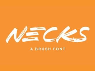
Blow Brush Font
 14")
This isn’t a delicate script font; Blow Brush is all about high-energy impact. The thick, fast strokes have a raw, street-art feel that’s perfect for designs that need to shout. The texture feels authentic, like it was painted yesterday. I recommend using it in all caps for maximum effect.
Perfect for: Action movie posters, streetwear brands, and high-energy marketing campaigns.
Chlorinar Font
 15")
Chlorinar has a grungy, slightly spooky vibe. The letterforms look like they’re melting or made of slime, which gives it a distinct, edgy character. This is the font you choose for a Halloween party flyer or a heavy metal band’s logo. It’s niche, but for the right project, it’s perfect.
Perfect for: Halloween designs, alternative music events, and graffiti-themed art.
Banaue Handwritten Font
 16")
Banaue is a handwritten font with a beautiful, natural feel. The slightly irregular, tall letterforms give it an organic and adventurous spirit. It’s clean enough to be legible but rustic enough to feel personal and authentic.
Perfect for: Travel blogs, inspirational quotes, and branding for handmade goods.
Holtwood One SC Font
 17")
Inspired by old woodblock printing, Holtwood One SC is a heavy slab serif that feels both historic and strong. It was designed to be legible even at smaller sizes, which is a rare trait for such a fat font. This makes it a practical choice for a wide range of uses, from web headers to print.
Perfect for: Western-themed designs, brewery labels, and impactful headlines.
Mosk Typeface
 18")
Mosk is a clean, geometric sans-serif that comes in a range of weights. The bold and black weights are fantastic examples of minimalist, chunky design. It’s incredibly clean and legible, making it a go-to for corporate branding that wants to feel modern and strong without being overly decorative.
Perfect for: Tech companies, minimalist posters, and corporate branding.
Some Time Later Font
 19")
You probably recognize this one. Inspired by the title cards from SpongeBob SquarePants, this font is instantly nostalgic and fun. It’s quirky, uneven, and perfect for any design that needs a touch of humor or pop culture relevance.
Perfect for: Memes, YouTube content, and fun, informal event flyers.
Arco Font
 20")
Arco is a charming, decorative font that’s as cute as it gets. The thick, rounded letters are adorned with little flowers, giving it a sweet, storybook quality. It’s an excellent choice for any project aimed at a younger audience or one that needs a whimsical touch.
Perfect for: Children’s invitations, boutique branding, and cheerful packaging.
Boa Construktor Font
 21")
This font is an architectural marvel. Boa Construktor is an ultra-heavy, modular font that feels like it was built, not written. Its extreme weight and geometric construction make it a powerful tool for creating bold, modern typography that feels almost like a structure itself.
Perfect for: Architectural posters, modern art exhibitions, and impactful titles.
Louis George Cafe Font
 22")
While its lighter weights are delicate, the bold and black versions of Louis George Cafe are beautifully chunky. It’s a geometric sans-serif with perfect circles and clean lines, giving it an air of modern elegance. It’s one of the most versatile free thick fonts, working just as well for a coffee shop as for a tech startup.
Perfect for: Cafe menus, lifestyle blogs, and minimalist branding.
Hensa Brush Script Font
 23")
Hensa is a brush script with a lighthearted, feminine touch. The watercolor texture and gentle loops give it a handmade, artistic feel. It’s perfect for designs that need to feel personal and creative without the aggressive energy of a font like Blow Brush.
Perfect for: Wedding invitations, inspirational social media posts, and signature logos.
ChunkFive Font
 24")
A modern classic in the world of free fonts, ChunkFive is an ultra-bold slab serif that takes inspiration from old American Western woodcuts. It’s unapologetically heavy and confident. For years, I’ve seen it used for everything from newspaper headlines to rock concert posters, and it never fails to make an impact.
Perfect for: Headlines, posters, and any design needing a strong, reliable slab serif.
Lemon Milk Font
 25")
Lemon/Milk is a clean, geometric sans-serif with a modern edge. The bold weight is incredibly satisfying—it’s thick and uniform, with sharp corners and a professional finish. This is a fantastic all-arounder for when you need a chunky font that is bold but still feels sleek and contemporary.
Perfect for: Logos, headers, and modern branding projects.
How to Choose the Right Chunky Font
Feeling overwhelmed by the options? Here’s a quick cheat sheet to help you decide:
- For a Logo or Brand Identity: You need something unique and readable. Consider Mosk for a clean look, Point Guard for a sporty vibe, or Olegos for a touch of luxury.
- For a Social Media Post: You need to stop the scroll. Go for something with maximum personality, like Better Hobby, Pop Core, or Blow Brush.
- For a Poster or Flyer: Readability from a distance is key. A solid choice like ChunkFive, Holtwood One SC, or Borsok will ensure your message gets seen.
- For a Website Headline (H1/H2): Choose a font that is bold but won’t slow down your site. Web-safe options from Google Fonts like Grenze or Slackey are excellent.
Conclusion
The right typeface can completely transform a design, and you don’t need an expensive subscription to find one with personality. These 25 free chunky fonts prove that you can achieve a bold, professional, and unforgettable look without spending a dime.
So go ahead and give your designs the weight they deserve. Try two or three of these today—I promise you’ll find a new favorite you’ll never want to design without again.
Frequently Asked Questions
1. Are these free chunky fonts safe to use for commercial projects?
Most fonts listed here are free for both personal and commercial use, but licensing can change. It is crucial to always check the license on the download page before using a font in a commercial project. Some may require attribution or be limited to non-profit work.
2. How do I install these fonts on my computer?
Once you download the font file (usually a .zip), you’ll need to extract it. Inside, you’ll find .TTF or .OTF files. On Windows, right-click the file and select “Install.” On a Mac, double-click the file and click “Install Font” in the Font Book window that appears.
3. What’s a good way to pair a chunky font?
The key to pairing a bold font is balance. Since your chunky font is the star of the show, pair it with a simple, neutral font for body text. A clean sans-serif like Lato, Open Sans, or Roboto works beautifully with almost any decorative headline font and won’t compete for attention.

