Best Free Slab Serif Fonts for Designers (2025)
Ever feel like your designs are missing a backbone? You’ve got the layout, the colors are perfect, but the typography just feels… weak. Finding a font that’s both strong and stylish without costing a fortune can be a huge headache. That’s where a great slab serif comes in. To save you the endless searching, we’ve curated a definitive list of the best free slab serif fonts available today. These aren’t just random typefaces; they’re powerful, versatile, and chosen by designers for their ability to add character and authority to any project.
To make it easier to find what you need, we’ve grouped them by their ideal use case.
See also
The Workhorses: Best Slab Serifs for Readability & Body Text
These fonts are built for clarity and comfort, making them perfect for long-form reading on screen or in print.
Roboto Slab
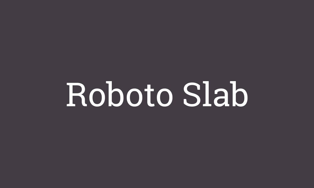
As the slab serif counterpart to the wildly popular Roboto, Roboto Slab is a workhorse font that delivers incredible readability on screen. It has a geometric skeleton but features open curves that make it feel friendly and natural.
- Best For: UI & Web Body Text
- Vibe: Modern, Friendly, Reliable
- Pairs Well With: Roboto, Open Sans, Lato
Merriweather Typeface
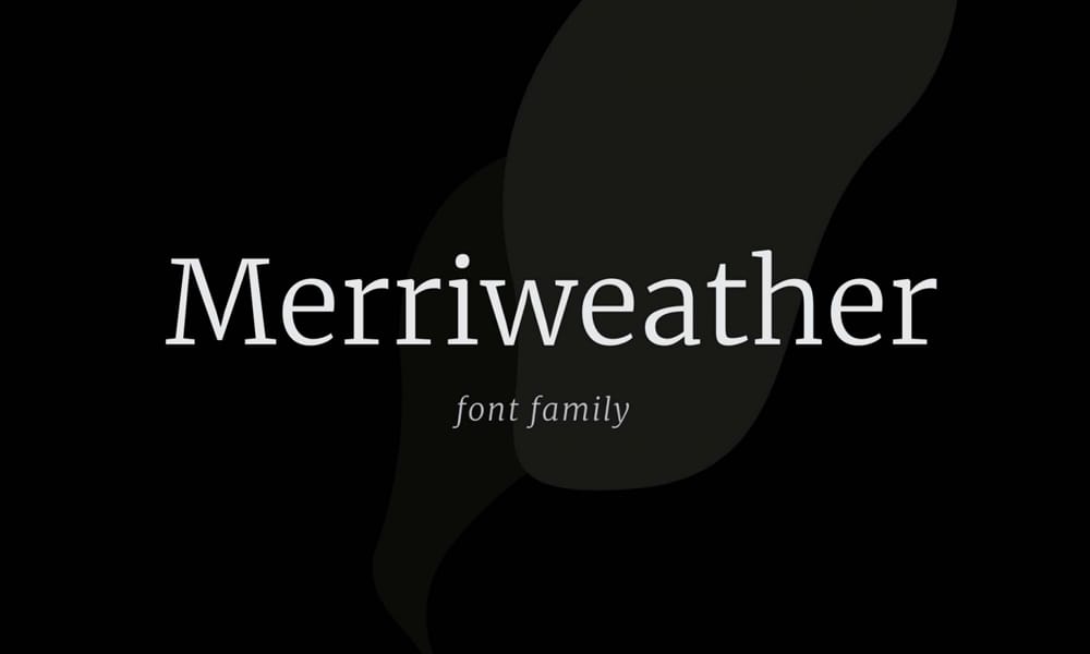
Another excellent font designed for on-screen reading, Merriweather has a classic, elegant feel. Its letterforms are condensed, allowing for more text to fit on a line without sacrificing clarity.
- Best For: Long-form Articles, E-books
- Vibe: Classic, Readable, Elegant
- Pairs Well With: Merriweather Sans, PT Sans
Bitter ht
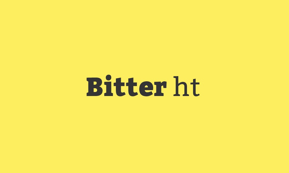
Designed specifically for comfortable reading on any device, Bitter ht has a generous x-height and subtle, thick serifs that help anchor the eye, reducing fatigue during long reading sessions.
- Best For: Digital Publications, Blogs
- Vibe: Sturdy, Approachable, Clear
- Pairs Well With: Source Sans Pro, Open Sans
Vollkorn Typeface
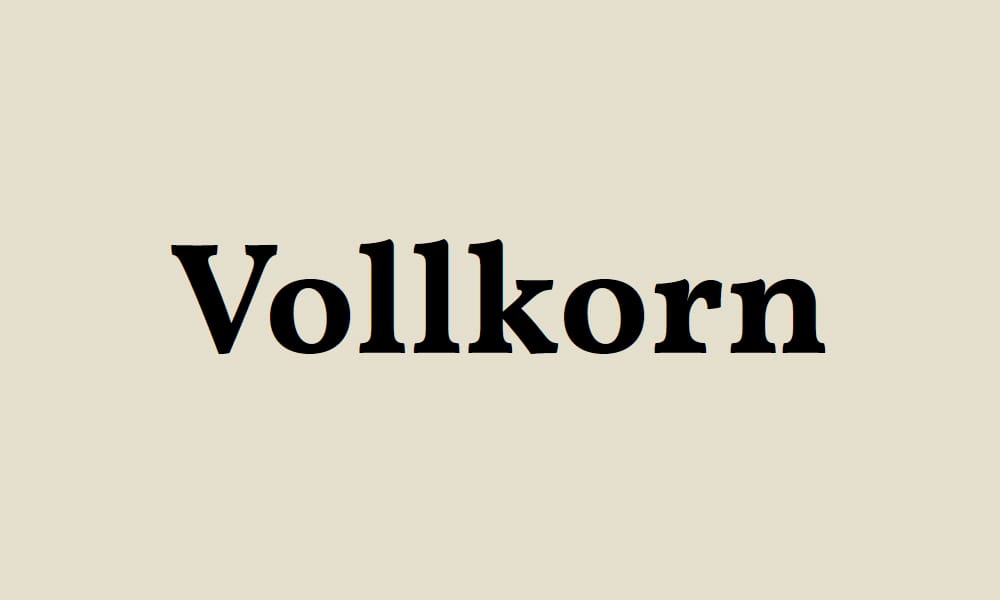
Vollkorn is a quiet and modest slab serif designed to be a reliable workhorse for body text. It’s unassuming yet confident, making it perfect for conveying information clearly and effectively.
- Best For: Body Text, Print
- Vibe: Classic, Modest, Authoritative
- Pairs Well With: Cabin, PT Sans
The Headliners: Best Bold Slab Serif Fonts for Impact
When you need to grab attention, these are the fonts you turn to. They are perfect for logos, headlines, and posters.
Chunk Five
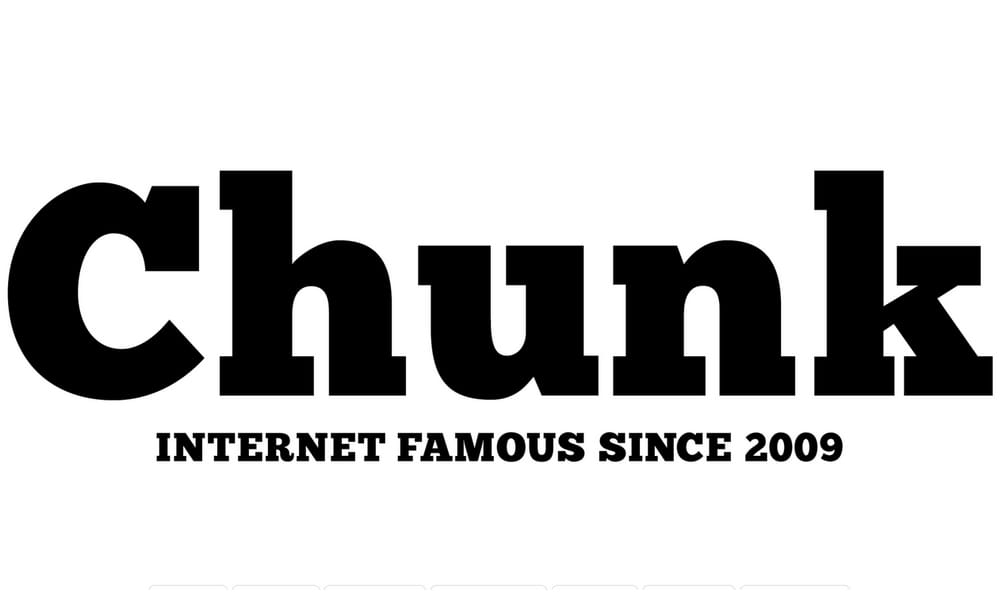
If you need a font with undeniable presence, Chunk Five is your go-to. This font doesn’t whisper; it shouts from a vintage American Western newspaper headline.
- Best For: Headlines, Logos, Posters
- Vibe: Retro, Bold, Industrial
- Pairs Well With: League Gothic, Bebas Neue
Ansley Display Font
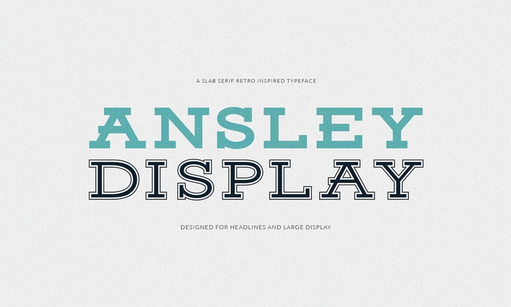
Inspired by retro typography, Ansley Display is designed specifically for headlines and large displays. It has a strong, condensed form and inline detailing in some of its styles.
- Best For: Display, Logos, Apparel
- Vibe: Vintage, Confident, Strong
- Pairs Well With: Montserrat, Raleway
Montagu Slab
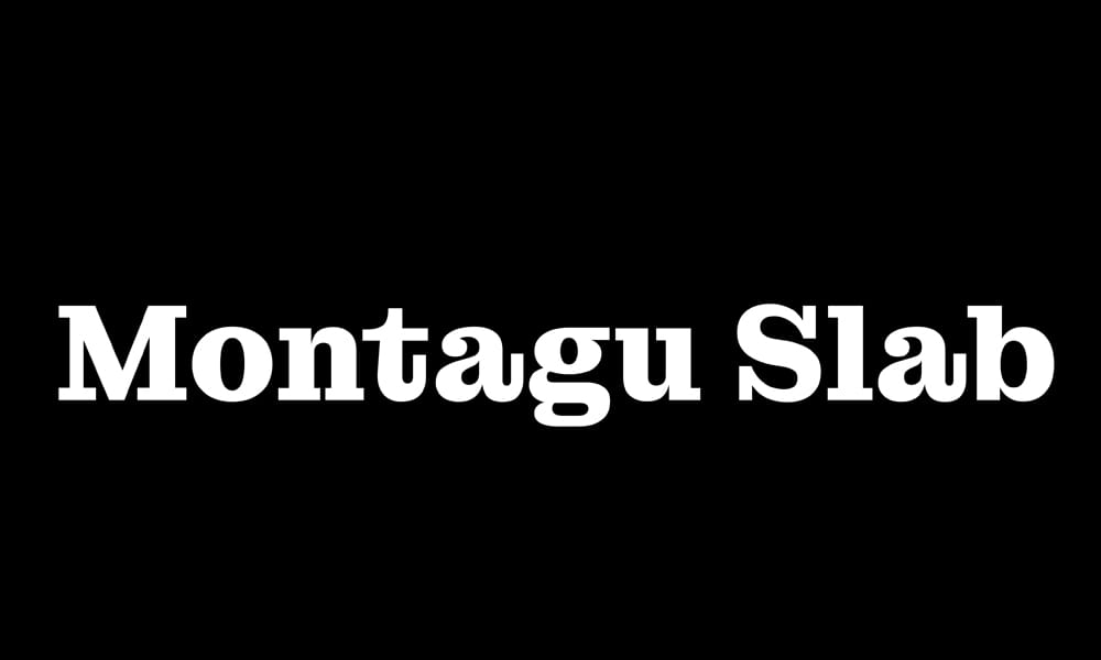
Montagu Slab offers a contemporary and sharp look. Its clean lines and balanced proportions make it a sophisticated choice for headings, particularly in digital design.
- Best For: Editorial Headlines, Web Headings
- Vibe: Sharp, Modern, Sophisticated
- Pairs Well With: Inter, Work Sans
BioRhyme Slab Serif Fonts
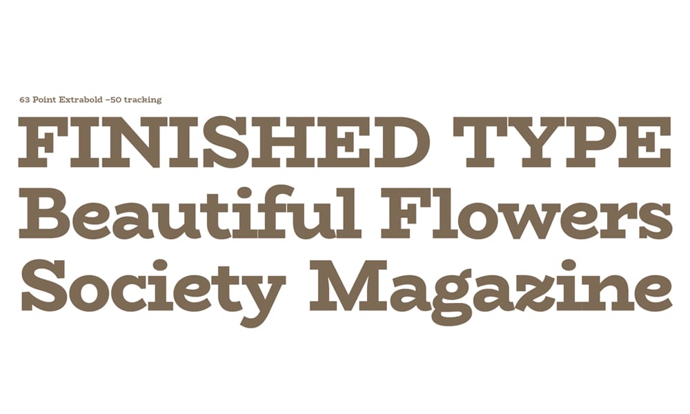
BioRhyme is a wide, chunky slab serif. Its extended forms give it a unique, almost playful rhythm, making it perfect for attention-grabbing displays.
- Best For: Creative Branding, Packaging
- Vibe: Playful, Quirky, Wide
- Pairs Well With: Poppins, Nunito Sans
The Modernists: Clean & Versatile Fonts for Web & UI
These fonts balance personality with professionalism, making them ideal for modern websites, apps, and corporate branding.
Zilla Slab Font
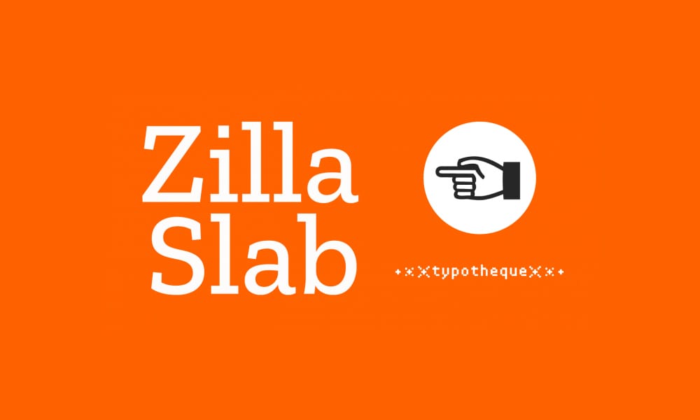
As Mozilla’s signature typeface, Zilla Slab is industrial, clean, and highly functional. It was designed to have a smooth rhythm and performs exceptionally well in user interfaces.
- Best For: UI/UX, Tech Branding
- Vibe: Industrial, Modern, Clean
- Pairs Well With: Fira Sans, Inter
Aleo – Free Slab Fonts
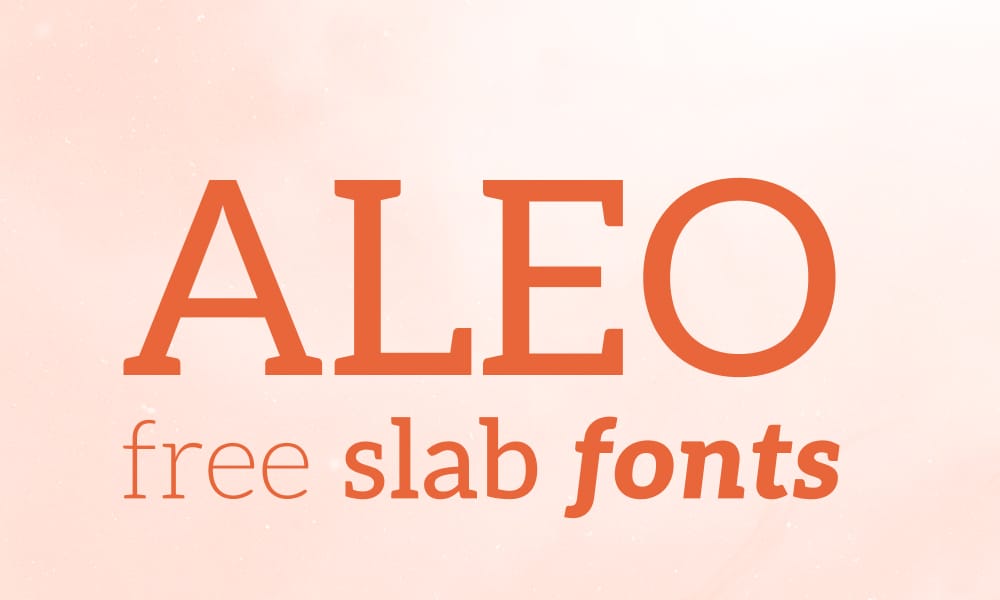
Aleo has a sleek, contemporary feel with semi-rounded details that give it a soft and approachable personality. It’s a great companion to the popular sans-serif Lato.
- Best For: Web Headings, Lifestyle Brands
- Vibe: Sleek, Approachable, Contemporary
- Pairs Well With: Lato, Open Sans
Arvo Font
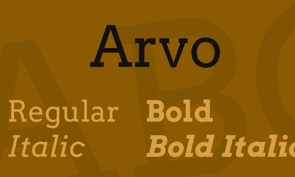
Arvo is a geometric slab-serif known for its clarity and stability. It’s a highly versatile font that works well in both print and on screen.
- Best For: Web & Print, General Use
- Vibe: Geometric, Stable, Versatile
- Pairs Well With: Poppins, Montserrat
Besley – Free Slab Serif Font
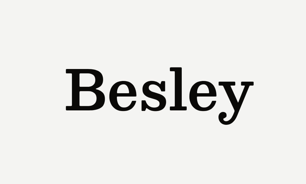
Besley is a fantastic all-rounder. It has a classic warmth that feels both trustworthy and modern, making it incredibly versatile for both headlines and body text.
- Best For: Branding, Editorial Design
- Vibe: Warm, Trustworthy, Modern
- Pairs Well With: IBM Plex Sans, Karla
The Stylists: Fonts with Unique & Elegant Personality
When you need a touch of class or a dash of quirk, these fonts deliver a memorable character.
Josefin Slab
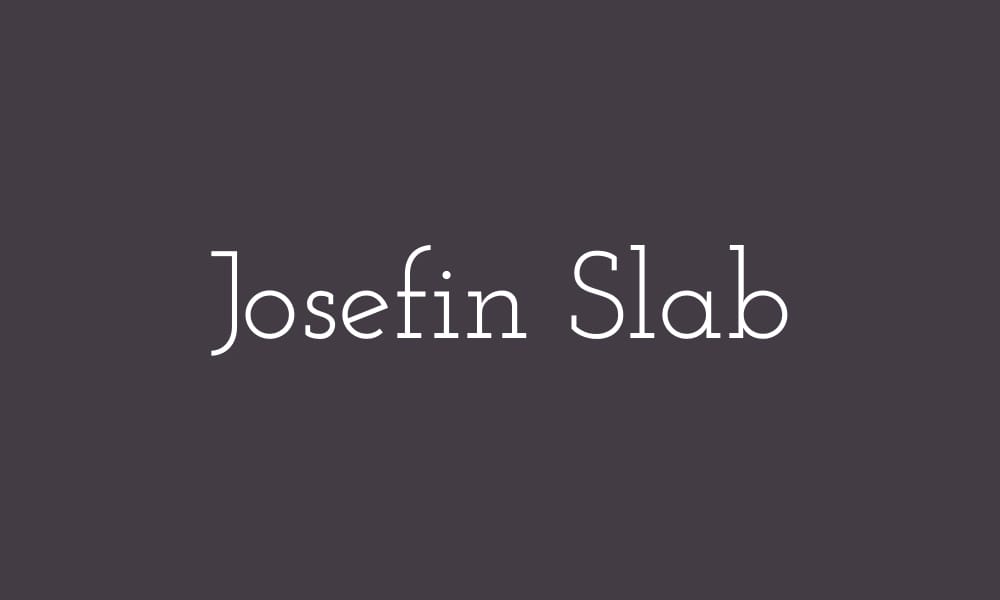
For a touch of elegance, Josefin Slab is a wonderful choice. It’s a Scandinavian-style geometric slab serif with thin, delicate proportions.
- Best For: Elegant Headlines, Logos
- Vibe: Elegant, Vintage, Delicate
- Pairs Well With: Josefin Sans, Raleway
Crete Round
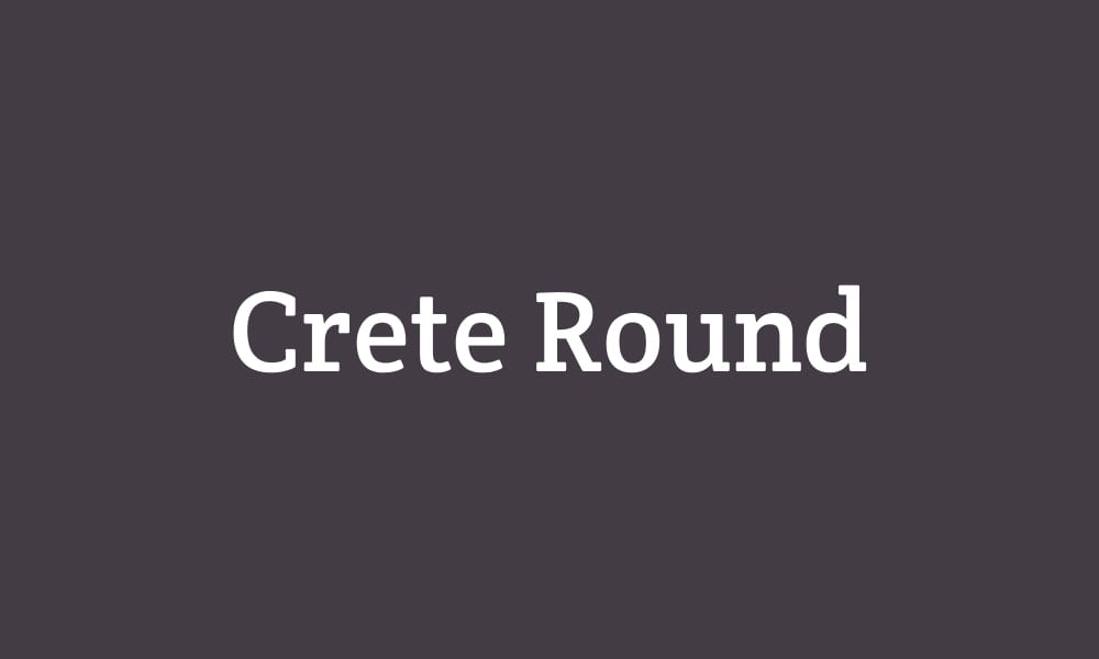
Crete Round offers a unique blend of sharp serifs and soft, rounded letterforms. This combination gives it a gentle yet structured personality.
- Best For: Friendly Headlines, Branding
- Vibe: Gentle, Structured, Approachable
- Pairs Well With: Exo, Nunito
Saros Font
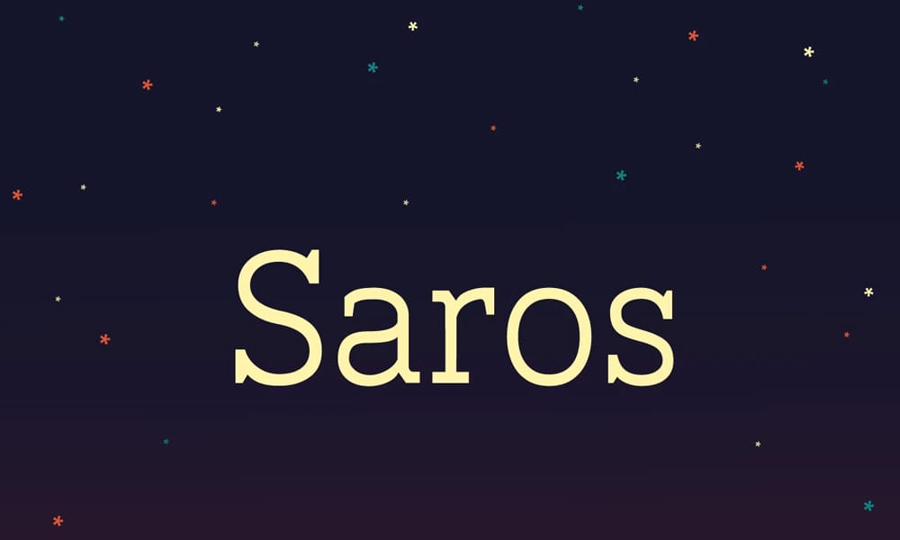
Saros has a unique, almost quirky personality with its soft serifs and slightly unconventional letterforms. It feels warm and friendly.
- Best For: Creative Projects, Children’s Books
- Vibe: Quirky, Warm, Unique
- Pairs Well With: Quicksand, Comfortaa
Andada ht
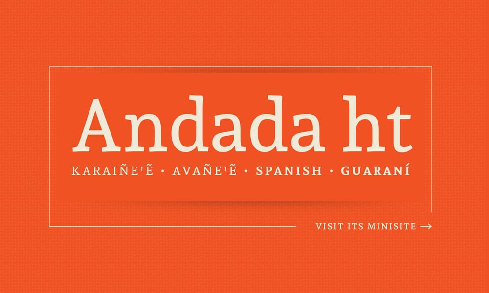
Andada ht is a hybrid slab with a humanist touch, giving it an organic and friendly feel that builds trust without feeling stuffy.
- Best For: Medium-length Text, Branding
- Vibe: Organic, Friendly, Professional
- Pairs Well With: Fira Sans, Rubik
The Chameleons: Flexible Fonts for Any Job
These font families offer a wide range of weights or styles, making them incredibly adaptable to any design challenge.
Hepta Slab
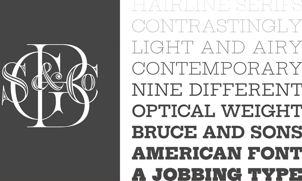
Hepta Slab is a contemporary typeface that offers a vast range of optical weights, from hairline thin to extra bold, making it incredibly flexible.
- Best For: Display, Editorial, Branding
- Vibe: Flexible, Contemporary, Airy
- Pairs Well With: Inter, Manrope
Epunda Slab
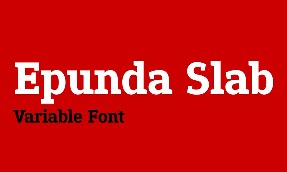
Epunda Slab is a modern variable font, meaning you can get a wide range of weights from a single file. Its design is clean and utilitarian.
- Best For: Web Design, Corporate Reports
- Vibe: Utilitarian, Modern, Flexible
- Pairs Well With: System UI fonts, Roboto
PT Serif Font
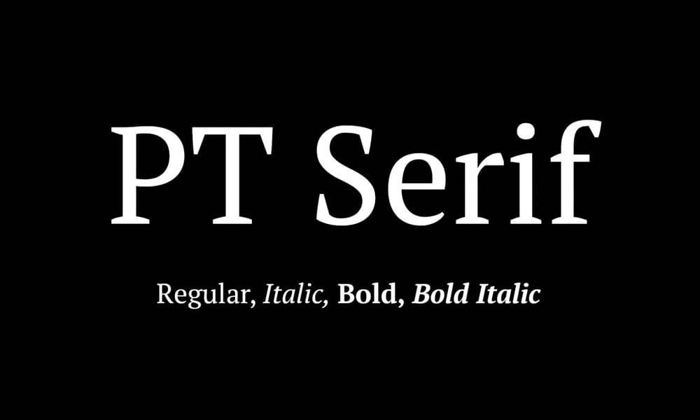
PT Serif is a transitional serif typeface with a humanistic touch. It includes characters for both Western and Cyrillic languages and is a classic, authoritative choice.
- Best For: Corporate Websites, Documents
- Vibe: Classic, Authoritative, Reliable
- Pairs Well With: PT Sans, Open Sans
How to Choose the Right Slab Serif
Feeling overwhelmed? Here’s a quick cheat sheet based on our categories:
- For Long-Form Text: Stick with a Workhorse like Roboto Slab or Merriweather.
- For Bold Logos & Headlines: Grab a Headliner like Chunk Five or Ansley Display.
- For Clean Web & UI Design: A Modernist like Zilla Slab or Aleo is your best bet.
- For a Unique, Classy Vibe: Choose a Stylist like Josefin Slab or Saros.
Conclusion
You don’t need a huge budget to access powerful, professional typography. The right free slab serif font can bring structure, personality, and authority to your work instantly. Stop settling for default fonts and give your next project the character it deserves. Try downloading two or three from this list today—you might just find your new favorite.
FAQs
1. Are all these slab serif fonts really free for commercial use?
Most of the fonts listed, especially those from Google Fonts like Roboto Slab and Merriweather, are under open-source licenses that permit commercial use. However, you should always double-check the license file included with the download before using it in a commercial project.
2. What’s the main difference between a slab serif and a regular serif?
The key difference is the serifs themselves (the small feet at the end of the strokes). In traditional serifs (like Times New Roman), the serifs are bracketed and vary in thickness. In slab serifs, the serifs are thick, block-like, and typically unbracketed, giving them a bolder, more structured appearance.
3. What sans-serif font pairs well with a modern slab serif like Zilla Slab?
To complement Zilla Slab’s modern, techy feel, a clean and geometric sans-serif like Montserrat

