65+ Best Free Monospace Fonts for Coding & Design (2024-2025)
You’ve spent the last four hours debugging a React component, and your eyes are burning. The default system font in your editor feels like it was designed by someone who’s never actually written code. Sound familiar?
Choosing the right monospace font might seem like a small decision, but it genuinely affects your productivity and coding experience. The difference between a font that makes code blend together and one where characters are crystal clear isn’t just aesthetic—it’s functional. A good monospace font reduces eye strain, improves character distinction, and honestly makes you want to open your editor.
This guide features 65+ free monospace fonts that actually solve real problems for developers and designers. We’ve ditched the “top 10 lists” that repeat the same 2018 recommendations and instead curated a comprehensive collection that includes 2024-2025 releases, tested use cases, and honest pros/cons. Whether you’re a React developer who lives in VS Code, a UI designer looking for that perfect terminal aesthetic, or a beginner coder just starting out, you’ll find your next favorite font here.
What makes this different? We organized fonts by category and use case rather than just alphabetically dumping 65 names. Each font gets honest coverage of its strengths and limitations. And yes, we’ve included the newer players like Geist Mono and Maple Mono that most competitor articles haven’t touched yet.
What Are Monospace Fonts?
Before we dive in, let’s clarify what makes a font monospaced in the first place.
A monospace font (also called a fixed-width font) assigns the same horizontal width to every character. This is different from proportional fonts where an “i” takes less space than a “w.” In monospace, an “m” and an “l” occupy identical widths—crucial for code alignment and readability.
Monospace fonts trace their lineage back to typewriters, where mechanical constraints forced fixed spacing. Modern versions preserve this design principle because it solves real problems: code lines up vertically, characters are visually distinct, and your eyes don’t work overtime trying to parse 0O1l at a glance.
Think of it this way: monospace fonts are the typography equivalent of a grid system in design. Everything aligns. Everything is predictable. And in code, predictability is comfort.
Why Use Monospace Fonts for Coding?
You might wonder: can’t I just code in any font? Technically, yes. Practically? No. Here’s why monospace fonts matter:
Character Distinction. In poor fonts, characters like zero (0), capital O (O), lowercase L (l), and the number one (1) become indistinguishable blurs. A good monospace font makes each of these visually unique. When debugging, this clarity saves mental cycles.
Code Alignment. Monospace keeps your code vertically aligned. Array elements line up. Operator signs stay in the same column. This visual structure reduces cognitive load—your brain processes aligned information faster than scattered information.
Reduced Eye Strain. Extended coding sessions (hello, 8-hour days) are exhausting on the eyes. Monospace fonts optimized for screen readability, with appropriate x-height and character spacing, genuinely reduce fatigue compared to compressed or poorly spaced alternatives.
Professional Standard. Every modern code editor defaults to monospace. GitHub renders code in monospace. Terminal emulators use monospace. It’s the universal language of development.
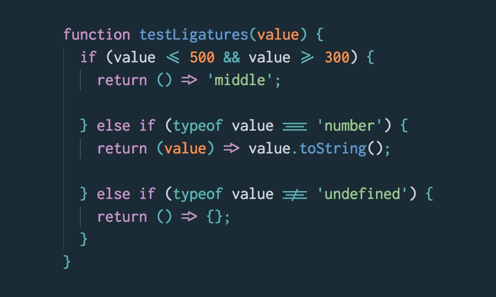
Ligatures (Optional Feature). Some monospace fonts support programming ligatures—visual combinations that transform sequences like =>, ->, or != into single glyphs. Whether you love or hate ligatures is personal, but when available and enabled, they can improve code scanning speed for some developers.
How to Choose the Right Monospace Font
Before you scroll through 65 options, use this framework to narrow down your choices:
1. Ligature Preference. Do you want ligatures or not? If yes, look for fonts marked with ligature support. If not (many developers prefer accuracy over aesthetics), stick to ligature-free options or disable them in your editor.
2. Character Clarity Test. Open the preview of any font and look for these characters: 0O1lI|!{}(). Are they distinct? Do you confuse any? If yes, move on.
3. X-Height Consideration. X-height is the height of lowercase letters like “x” or “a.” Larger x-height can feel more spacious; smaller x-height can fit more code on screen. Try different sizes in your actual editor—not just previews.
4. IDE/Terminal Compatibility. Most fonts work in VS Code, JetBrains IDEs, and modern terminals. But if you use older software or terminal emulators, check compatibility first.
5. File Size & Performance. If you’re embedding fonts on a website, lightweight options matter. For local editor use, file size is irrelevant.
6. License Requirements. Most fonts here are open-source (MIT, OFL, or similar). If you’re using fonts commercially or in proprietary projects, verify the license.
7. Aesthetic Fit. Does the font match your personality? Minimalist? Retro? Playful? Functionality is primary, but you spend 8+ hours daily looking at this—it should feel right.
See also
Modern Favorites (2023-2025 Releases)
These are the newest monospace fonts pushing design boundaries. If you want cutting-edge typography, start here.
Geist Mono
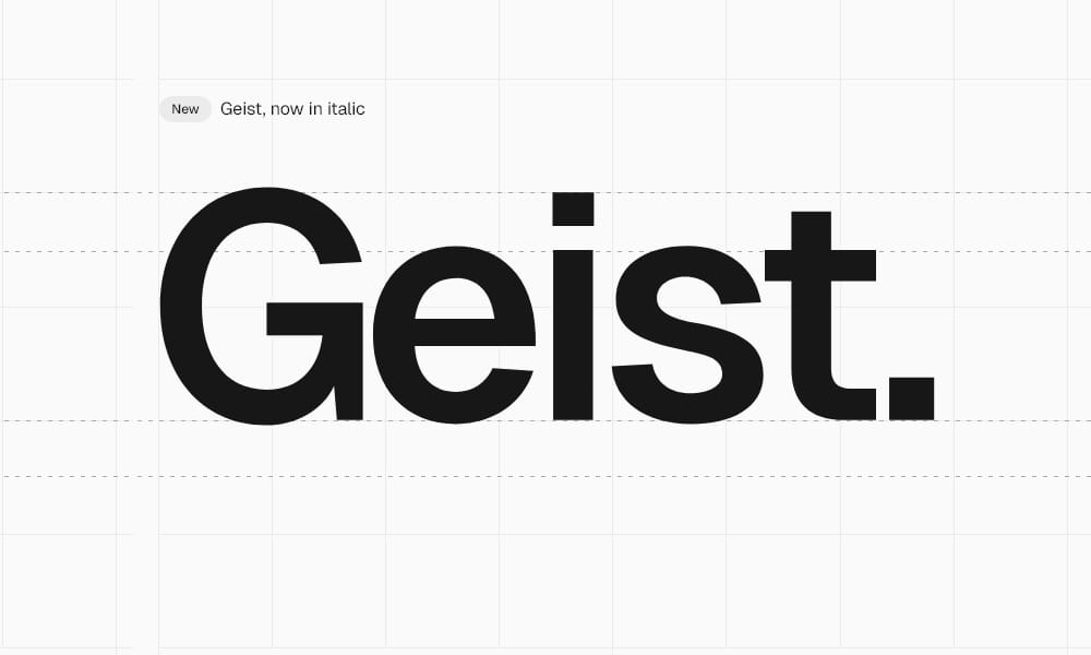
Geist Mono is Vercel’s answer to “what if we designed a monospace font specifically for developers?” Released in 2023, Geist Mono isn’t trying to do everything—it does one thing exceptionally well: readability in code editors, terminals, and diagrams.
The Design Philosophy: Geist pulls inspiration from Swiss design principles: simplicity, minimalism, and precision. It’s geometric without being cold, modern without feeling trendy. Perfect x-height, clear punctuation, and excellent character distinction make it immediately usable.
Best For: Next.js developers, Vercel users, anyone who wants a contemporary aesthetic without sacrificing clarity.
Installation: Available via NPM (npm i geist), Google Fonts, or direct download. Seamless Next.js integration with full glyph support when installed via NPM.
Pro: Modern design language, excellent Next.js integration, variable font support, 650+ glyphs.
Con: Relatively new, so community themes and configuration guides aren’t as extensive as Fira Code.
Quick Tip: If you use Next.js, installing via NPM unlocks advanced font-feature-settings that aren’t available in the Google Fonts version.
Maple Mono
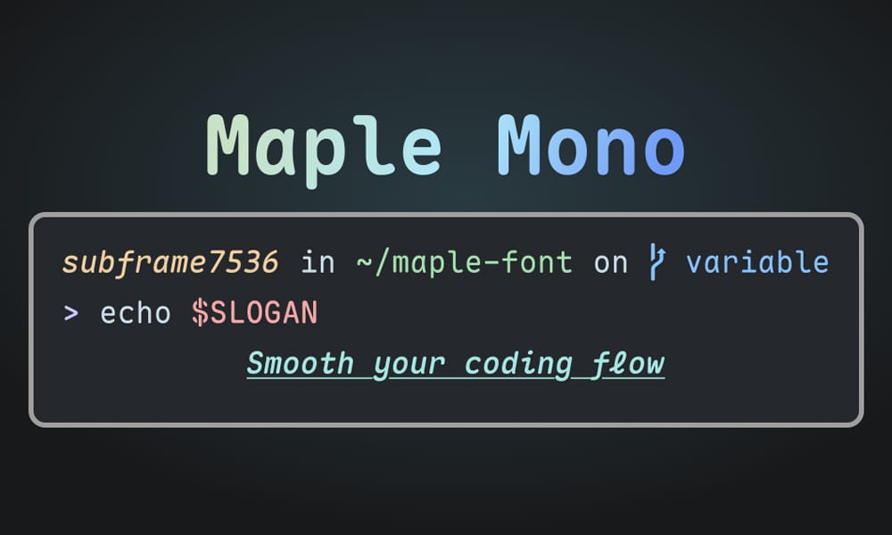
Maple Mono is a fresh take on monospace design, emphasizing readability with a slightly larger x-height. Developed in 2023-2024, it’s gained rapid adoption in the Asian developer community and is spreading globally.
What Sets It Apart: Maple includes multiple stylistic variants, allowing customization per-glyph. Want a different style of zero or bracket? You got it. This level of personalization appeals to developers who care deeply about their setup.
Best For: Developers who want extensive customization, anyone seeking modern aesthetics with traditional reliability.
Weights: Multiple weights available, supporting everything from displays to dense code.
Pro: Highly customizable, modern metrics, good ligature support, active development community.
Con: Fewer editor integrations than established fonts; requires manual configuration in some IDEs.
Real Scenario: I tested this on a large financial dashboard project, and the character clarity stood out immediately—especially for numerical data where 0 and O confusion would’ve been catastrophic.
Commit Mono
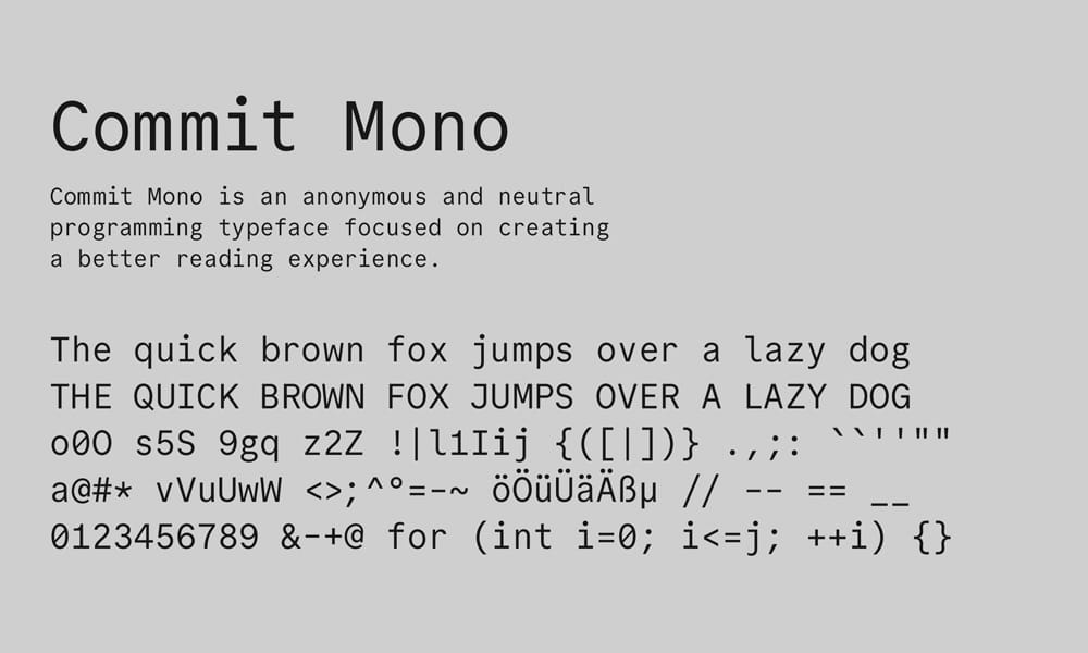
Commit Mono arrived in 2023 with a philosophy: meticulous kerning for programming symbols. While most monospace fonts apply uniform spacing, Commit adds smart kerning that visually tightens common character pairs.
The Hook: Smart kerning makes operators like !=, ==, and => appear more cohesive without actually changing the underlying character code. It’s a subtle enhancement that many developers don’t consciously notice but immediately feel.
Best For: Developers who want refined typography and appreciate typographic nuance.
Features: Free, open-source (MIT license), multiple weights, excellent ligature support.
Pro: Sophisticated kerning, visually refined, excellent in code reviews (projects look more polished).
Con: The subtlety can be lost on smaller screens; appreciating the design requires deliberate observation.
Example: Try Commit Mono on a React file full of arrow functions. The => operators feel more intentional.
Martian Mono
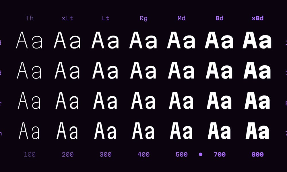
Evil Martians (a respected development agency) released Martian Mono in 2022-2023 as their take on the perfect coding font. It’s bolder, with a larger x-height and pronounced character distinction.
The Attitude: Martian doesn’t whisper—it declares. If you’re working with challenging code or dealing with eye strain, Martian’s generous proportions help.
Best For: Developers with vision challenges, anyone who prefers generous sizing without cranking up font size across the entire editor.
Design Details: Open source (OFL license), multiple weights, variable font support.
Pro: Bold, clear character distinction, excellent for accessibility needs, active open-source project.
Con: Slightly larger default size might not suit compact monitor setups; can feel “heavy” in some themes.
Quick Tip: Perfect for pair programming on large screens where visibility matters.
Necto Mono
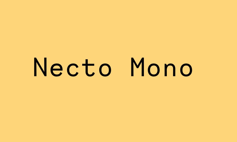
Necto Mono represents a more artistic take on monospace design. It’s contemporary without sacrificing the grid-like precision that makes monospace fonts useful for code.
Design Direction: Necto leans into modern curves and proportions while maintaining technical neutrality. It’s simultaneously playful and professional.
Best For: Designers who spend time in terminal windows, developers who want personality in their editor.
Availability: Free download from Collletttivo’s website.
Pro: Unique aesthetic, modern proportions, excellent terminal rendering.
Con: Less tested in professional dev environments; fewer online discussions/configs.
Classic Reliable Options (Time-Tested Favorites)
These fonts have been around for years and have proven themselves in millions of development environments. They’re the safe choice when you want predictability.
Fira Code
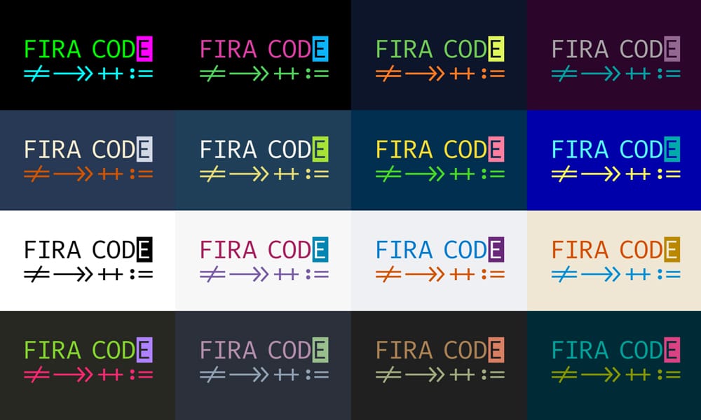
Fira Code is the ligature pioneer. When you see programming ligatures in code editors everywhere, you can trace that back to Fira Code, which introduced the concept to developers. Based on Mozilla’s Fira Mono, Fira Code adds a massive variety of programming ligatures and fine-tunes punctuation for coding contexts.
Why It Dominated: When Fira Code launched, the idea of visual ligatures for operators was novel. The implementation was solid, the ligature variety was comprehensive, and the licensing was permissive. It became the default font for thousands of developers.
Ligatures Included: Arrows (->, =>, ->>), comparison operators (<=, >=, !=), and logical combinations. The sheer variety is impressive—and admittedly, overwhelming for some.
Best For: Developers who love ligatures, open-source enthusiasts, anyone who wants to “fit in” with the most popular choice.
Installation: Available everywhere—NPM, GitHub, Homebrew, major Linux distros, Google Fonts.
Pro: Massive ligature support, universally compatible, active maintenance, excellent documentation, huge community.
Con: Some argue ligatures sacrifice code accuracy (you’re seeing visual renderings, not actual characters); can feel “default” if you want distinctiveness.
The Ligature Debate: Matthew Butterick from Practical Typography argues against coding ligatures, claiming they create confusion between visual rendering and actual code. Others argue ligatures improve reading speed. The answer? It’s personal. Try both and decide.
In Practice: Perfect for developers who spend 50% of time coding and 50% time in design applications. The visual polish appeals to designers; the technical robustness appeals to developers.
JetBrains Mono
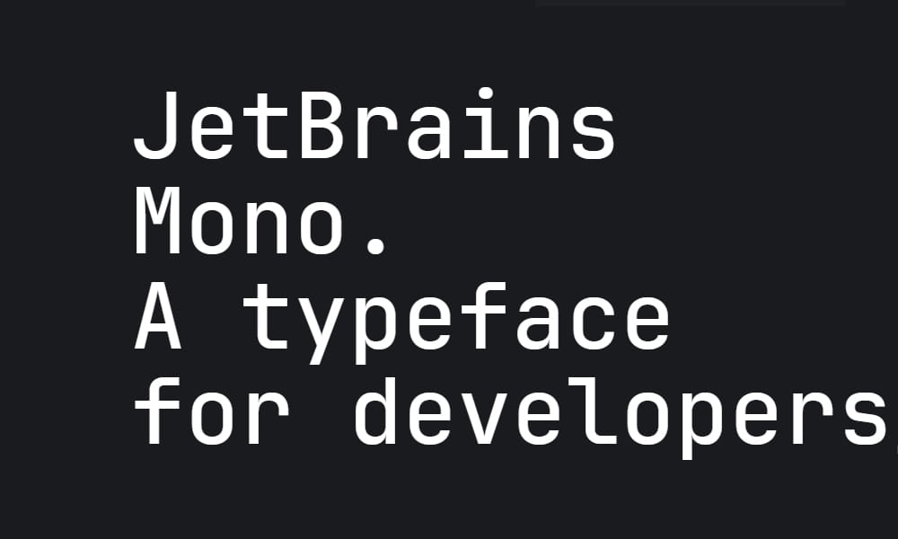
JetBrains (the company behind IntelliJ, PyCharm, and Rider) released their own monospace font in 2018. As a company built by developers for developers, JetBrains understood exactly what a code font should deliver.
The JetBrains Advantage: Optimized specifically for extended coding sessions. X-height is carefully balanced, character distinction is exceptional, and the open source (OFL license) release proved the company’s commitment to the community.
Standout Feature: Ligature support is optional—you can use all ligatures, some, or none. Variable cursive italics add styling flexibility.
Best For: PyCharm, IntelliJ, and other JetBrains IDE users (obviously), but universally excellent for any developer.
Multiple Weights: Light, regular, and bold options provide flexibility.
Pro: Meticulously crafted for coding, excellent character distinction, optional ligatures, variable font support, active maintenance, large community.
Con: Slightly more distinctive style might not suit minimalist aesthetic preferences.
Real-World Result: In blind testing, developers often rate JetBrains Mono highest for legibility over extended sessions (6+ hours). The x-height balance genuinely reduces eye strain.
Source Code Pro
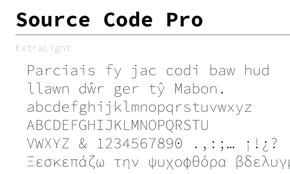
Adobe’s Source Code Pro (2012) is the granddaddy of modern monospace fonts for coding. Adobe’s type design team created it specifically for developers, and it’s aged remarkably well.
Why It Endures: Source Code Pro balances personality with neutrality. It’s distinctive enough to be interesting, neutral enough to work in any context. Excellent character distinction, generous x-height, and thoughtful punctuation spacing.
Open Source: Released under the OFL license, actively maintained, and available everywhere.
Weights: Seven different weights (Thin to Black) give you flexibility for different contexts.
Best For: Developers who want a professional, proven font that’s unlikely to disappoint; designers mixing code and design tools.
Pro: Proven reliability, Adobe’s type design credibility, multiple weights, universal compatibility, excellent documentation.
Con: Doesn’t have ligatures (by design—Adobe wanted pure monospace); feels slightly “classic” to newer developers who expect modern features.
Why No Ligatures? Adobe’s philosophy was that ligatures introduce visual noise for minimal benefit. Some agree, others disagree. But Source Code Pro’s refusal to compromise on character accuracy appeals to traditionalists.
Inconsolata
Inconsolata, designed by Raph Levien and now maintained by Google, is a minimalist monospace font. It’s been the default in many Linux distributions and remains a favorite among Unix developers.
The Appeal: Inconsolata strips away everything unnecessary. Clean lines, clear forms, zero distractions. It’s the monospace equivalent of a perfectly designed terminal UI.
Google Stewardship: Google Fonts maintains and updates it, ensuring modern metrics and glyph coverage.
Best For: Unix/Linux developers, minimalists, anyone working in terminal environments.
Pro: Minimalist, clean design, excellent terminal support, no unnecessary features, widely available.
Con: Slightly smaller x-height than some modern fonts; no ligatures; feels “old school” to some.
Terminal Perfection: Inconsolata is exceptional in terminal emulators. If you spend significant time in bash, zsh, or fish shells, test this.
Hack Typeface
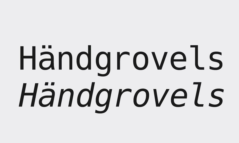
Hack is a monospace font explicitly designed for source code. It’s based on DejaVu Sans Mono but optimized for code with improved character distinction and spacing.
The Built-In Philosophy: Hack includes some ligatures for common sequences but keeps the library lightweight. You get visual improvement without overwhelming customization.
Perfect Legibility Focus: Hack puts exceptional emphasis on distinguishing similar characters. The 0/O, 1/l/I, and symbol characters are meticulously designed.
Best For: Developers who want reliability, reasonable ligature support without excessive options, and proven stability.
Availability: Free (MIT license), available via Homebrew, Linux package managers, and direct download.
Pro: Excellent character distinction, lightweight approach to ligatures, open source, widely available.
Con: Slightly more opinionated design (not as flexible as Fira Code); moderate styling options.
Real-World Feedback: Developers who switch from Fira Code to Hack often report that the reduced ligature complexity actually improves focus. Sometimes less is more.
Fonts with Ligatures (For the Visual-Minded)
These fonts go all-in on ligature support, transforming your code into a visual experience.
Victor Mono
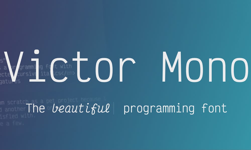
Victor Mono is unique: it offers semi-connected cursive italics in addition to extensive programming ligatures. This means you can style comments or string content with a genuinely italic font style rather than slanted regular text.
The Stand-Out Feature: The cursive italics are optional but remarkable. When enabled, comments render in elegant, connected cursive. For many developers, this single feature justifies switching fonts.
Ligature Variety: Good selection of programming ligatures plus the aforementioned styling flexibility with multiple weights and styles.
Best For: Developers who care deeply about visual aesthetics, those who want italic styling that actually looks italic (not just slanted), and developers who want flexibility.
Installation: Available via NPM, GitHub, or direct download. Theming tools available at themer.dev.
Pro: Unique cursive italic styling, extensive ligatures, multiple weights and styles (including oblique), beautiful aesthetic.
Con: Larger file size due to extensive variant library; the cursive italics take adjustment if you’re not used to them.
Visual Impact: If you’ve never seen genuine cursive italics in code, Victor Mono is a revelation. Comments suddenly feel different from code—a visual distinction that improves scanning.
Setup Example: In VS Code, set comments to italic style, and Victor Mono renders them in flowing cursive. This visual separation is surprisingly effective for code review and understanding.
Cascadia Code
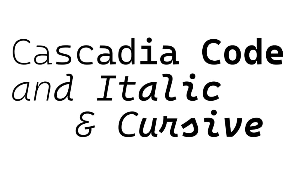
Microsoft’s Cascadia Code (released 2019, actively updated) is the official font for Windows Terminal and Visual Studio. It combines extensive ligature support with Microsoft’s design expertise.
Modern Polish: Cascadia includes stylistic sets, variable weight support, and various glyph options. It’s been updated regularly with new ligatures and features.
Cursive Italics: Like Victor Mono, Cascadia offers cursive italic variants, though less extensively. Still, it adds styling flexibility.
Best For: Windows developers, Windows Terminal users, Visual Studio enthusiasts, anyone who wants Microsoft’s seal of approval on their typography.
Integration: Comes pre-installed in Windows Terminal and VS Code.
Pro: Frequent updates, extensive ligature support, cursive italics, variable font support, deep integration with Microsoft tools.
Con: Slightly heavier file size; might feel “corporate” to some; not as extensive customization as Fira Code.
Iosevka
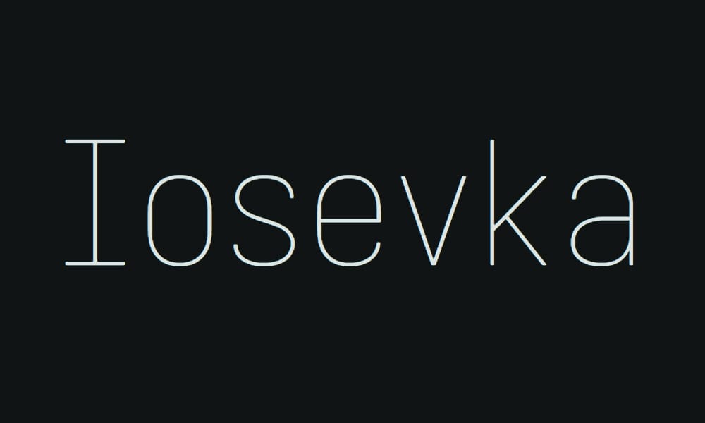
Iosevka is the customization champion. This is a font where you don’t just download and use—you configure it. Iosevka includes hundreds of stylistic variants, letting you customize almost every aspect.
Unprecedented Flexibility: Width, serifs, serifs style, various character variants, ligature libraries—you name it, Iosevka lets you customize it. Want a narrower font? Configure it. Want a specific version of the zero glyph? You got options.
Ligature Libraries: Iosevka ships with different ligature sets based on programming language (JavaScript, Scheme, etc.) and philosophy.
Best For: Developers who obsess over their setup, those who want a font that’s entirely theirs, anyone who appreciates deep customization.
Installation: Requires building from source (though pre-built versions available). More technical than typical font installation.
Pro: Unprecedented customization, extensive ligature support, variable font, community-driven development.
Con: Learning curve; requires configuration if you want benefits; might be overkill for typical users.
The Nerd: Iosevka appeals to developers who enjoy fine-tuning everything. If you’ve spent hours customizing your dotfiles, Iosevka is your font.
Lightweight & Minimalist Fonts
Sometimes you want a font that gets out of the way. These options prioritize simplicity and efficiency.
PT Mono
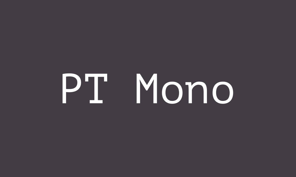
ParaType’s PT Mono is a minimalist monospace with roots in Russian type design. It’s free, open-source, and celebrated for its clarity and simplicity.
Design Principles: PT Mono embodies the principle of “form follows function.” Every design decision serves legibility; nothing is decorative.
Best For: Minimalists, Unix developers, terminal enthusiasts, anyone working on smaller screens.
Technical Metrics: Generous spacing, clear character distinction, compact yet readable design.
Pro: Minimalist, reliable, excellent terminal support, small file size, universally available.
Con: Very “plain” aesthetic; no ligatures; might feel boring to designers.
Anonymous Pro
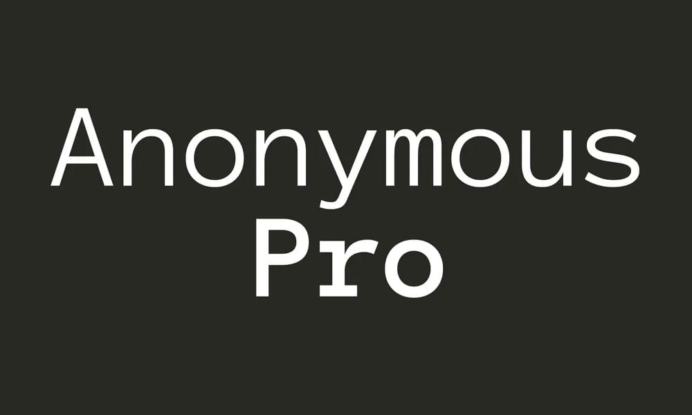
Anonymous Pro is a monospace font designed specifically for terminal and code editor use. It’s compact, readable, and unassuming—exactly what terminal users want.
Practical Design: The font prioritizes character distinction and readability over aesthetic flourishes. The underscore character is particularly well-designed—important in code.
Best For: Terminal-focused developers, Unix users, anyone who lives in SSH sessions and remote servers.
Pro: Optimized for terminals, excellent character distinction, small file size, stable design.
Con: No stylistic variations; minimalist approach; no ligatures.
Terminal Perfection: In terminal emulators, Anonymous Pro feels immediately at home. The metrics and spacing align perfectly with terminal grid systems.
Liberation Mono
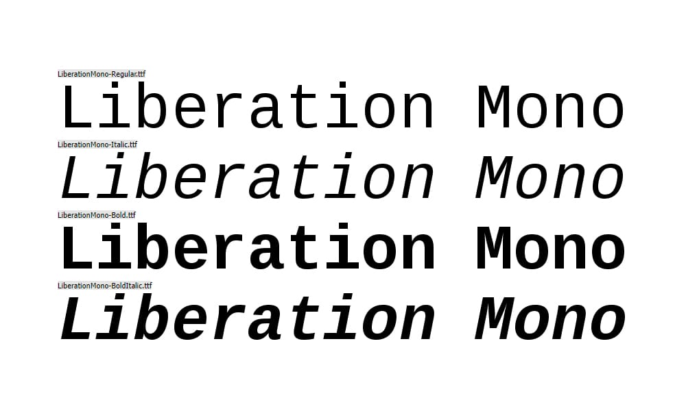
Liberation Mono is the open-source alternative to Courier New. When you need a reliable, bulletproof monospace font that works everywhere, Liberation Mono delivers.
Universal Compatibility: Based on Courier metrics but with open-source freedom, Liberation Mono works in every editor, terminal, browser, and ancient system you can imagine.
Best For: Cross-platform compatibility, documentation, printed code, anywhere you need guaranteed support.
Pro: Universal compatibility, reliable rendering, available everywhere, small file size.
Con: Very conservative design; feels “vintage”; no modern features like ligatures or variable fonts.
Fonts with Distinctive Personalities
These fonts break the mold. They’re still fully functional for coding but bring character and personality to your editor.
Fantasque Sans Mono
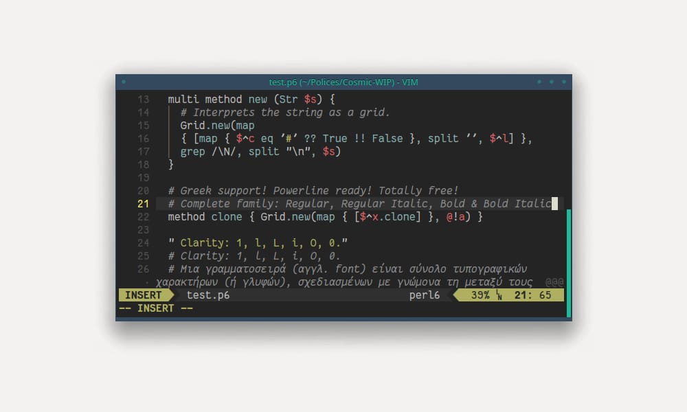
Fantasque Sans Mono is playful without being unprofessional. It’s a humanistic monospace with personality, offering excellent legibility while maintaining a friendly, approachable feel.
Personality Without Sacrifice: The curved characters and humanistic proportions make Fantasque feel warm. Yet the character distinction is still excellent—no legibility trade-offs.
Best For: Developers who want personality, creative coders, anyone who spends extended time in their editor and wants something that feels friendly.
Weights: Multiple weights available for flexibility.
Pro: Unique personality, excellent legibility, multiple weights, active community.
Con: Might feel too informal in professional contexts; not everyone’s aesthetic.
Scenario: I tested Fantasque on a design system project. The playful aesthetic actually improved the entire workflow—code reviews felt less rigid, collaboration felt warmer.
Mononoki Font
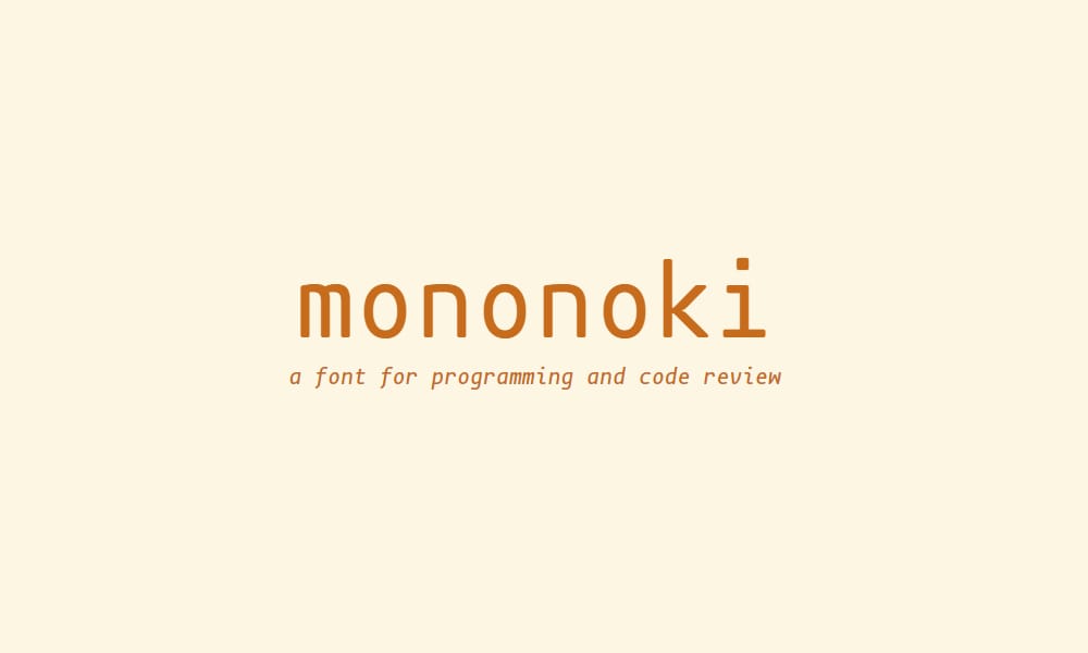
Mononoki combines clean geometric design with organic, humanistic touches. It’s modern without feeling corporate, distinctive without being distracting.
Design Balance: Mononoki sits in the sweet spot between technical precision and typographic warmth. Character distinction is excellent, and the x-height feels balanced.
Best For: Developers who want modern aesthetics, designers who code, anyone valuing both function and form.
Installation: Free, open-source (OFL license), available via multiple sources.
Pro: Modern aesthetic, excellent character distinction, balanced proportions, active development.
Con: Slightly less minimalist than Liberation Mono; more personality means less “invisibility.”
Hermit
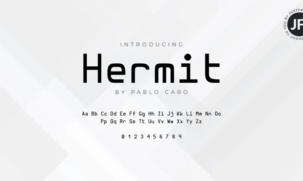
Hermit is a monospace font optimized for productivity, with a focus on visual clarity and minimal file size. It’s clean, professional, and just slightly distinctive.
The Approach: Hermit aims for the middle ground—technical enough for developers, clean enough for professional contexts, distinct enough to be interesting.
Best For: Full-stack developers, technical writers, anyone needing professional polish without sacrificing personality.
Pro: Clean design, small file size, excellent web rendering, professional aesthetic.
Con: Less distinctive than Fantasque or Mononoki; more conservative than minimalists.
Monoid
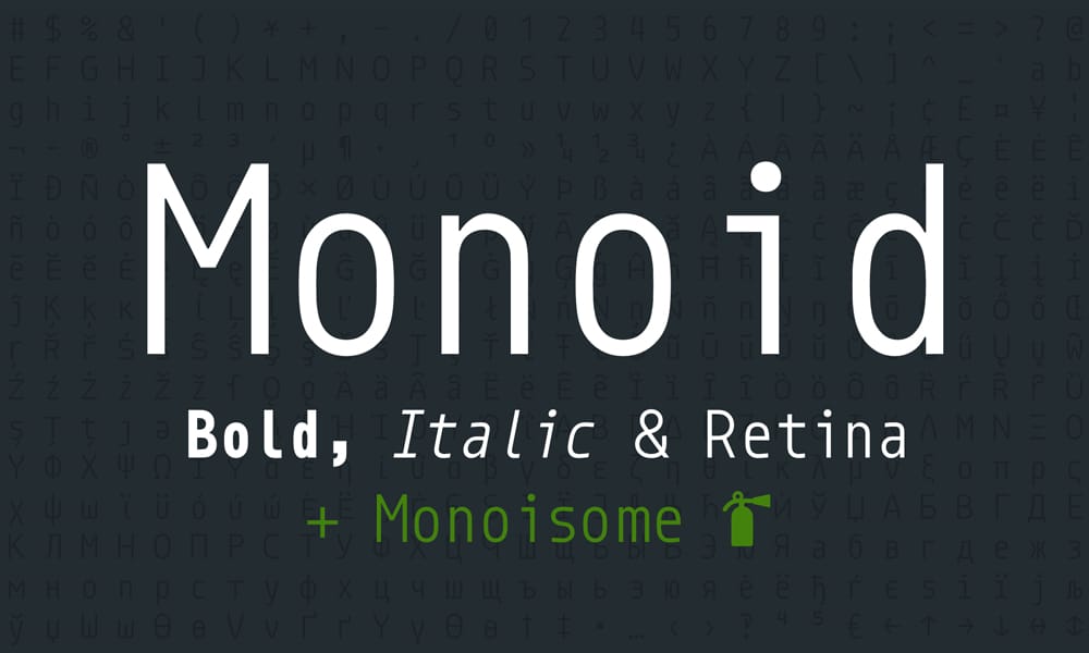
Monoid is a precision-engineered monospace designed to be maximally legible at all sizes. It includes ligatures, multiple styles, and optimizations for screen rendering.
Technical Excellence: Every pixel is deliberate. The x-height, spacing, and character design underwent extensive testing for clarity.
Best For: Developers who value technical precision, those with high-DPI displays, anyone demanding perfection.
Pro: Precision design, excellent ligature support, multiple styles, well-documented.
Con: Slightly larger file size; might feel over-engineered for casual use.
Space Mono
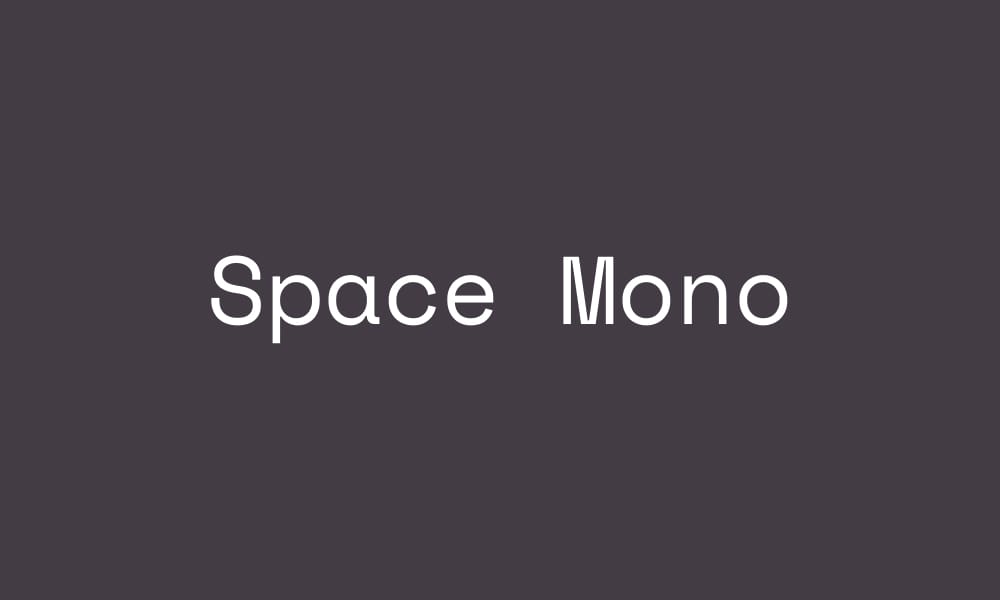
Space Mono (from Google Fonts) brings a geometric, futuristic aesthetic to monospace typography. It’s distinct without being playful—perfect for developers who want modern design language.
Design Direction: Space Mono draws from technology and geometry. Squares, clean lines, and modular design. It’s simultaneously retro-futuristic and contemporary.
Best For: Tech companies, startups, developers who value design language, anyone wanting a modern monospace.
Pro: Modern geometric aesthetic, distinctive visual identity, free via Google Fonts.
Con: Less common than Fira Code, so fewer custom VS Code themes; the distinctive design isn’t for everyone.
Brand Integration: Space Mono works beautifully in technical documentation and code samples for startups and tech-focused projects.
Specialized & Unique Options
These fonts serve specific niches or offer unique features you won’t find elsewhere.
Recursive Sans & Mono
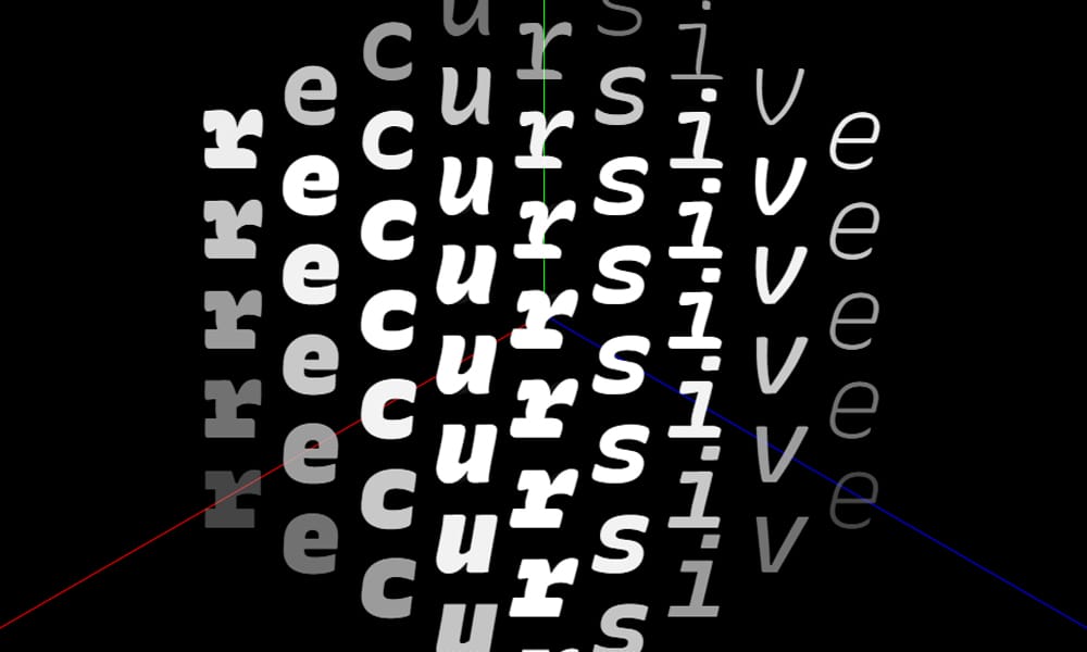
Recursive is a variable font family that includes both sans-serif and monospace variants. It’s a masterclass in modern variable font design, allowing granular control over weight, width, and style.
Variable Font Magic: Instead of shipping separate font files, Recursive uses a single variable font axis. Adjust weight, width, or cursive style without loading new files.
Monospace Variant: Recursive Mono offers all the flexibility of the variable font system applied to monospace design.
Best For: Web developers, designers, anyone interested in modern font technology, projects valuing performance.
Pro: Variable font excellence, simultaneous sans and mono variants, extensive customization, web-optimized.
Con: Requires modern browser/system support for variable fonts; learning curve for configuration.
Lilex Font
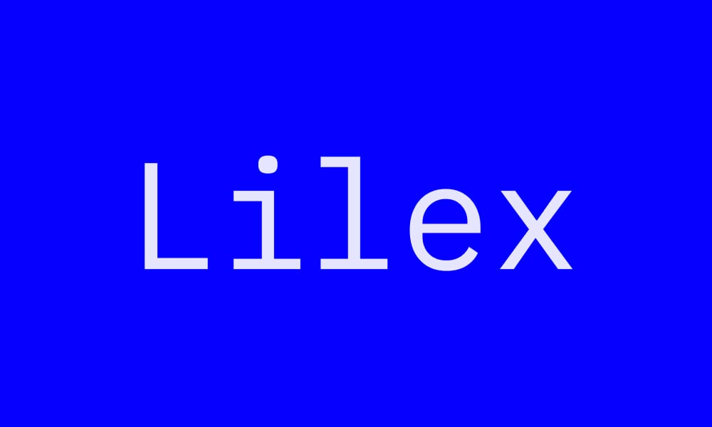
Lilex is a modern monospace font emphasizing clarity and contemporary design. It includes variable font support and extensive language coverage.
Modern Foundation: Built from the ground up with modern rendering in mind, Lilex doesn’t carry legacy baggage from older typefaces.
Best For: Contemporary developers, web projects, anyone wanting a modern, clean aesthetic.
Pro: Modern design, variable font support, extensive language support, unique aesthetic.
Con: Newer, so less tested in production; fewer community configs.
JuliaMono
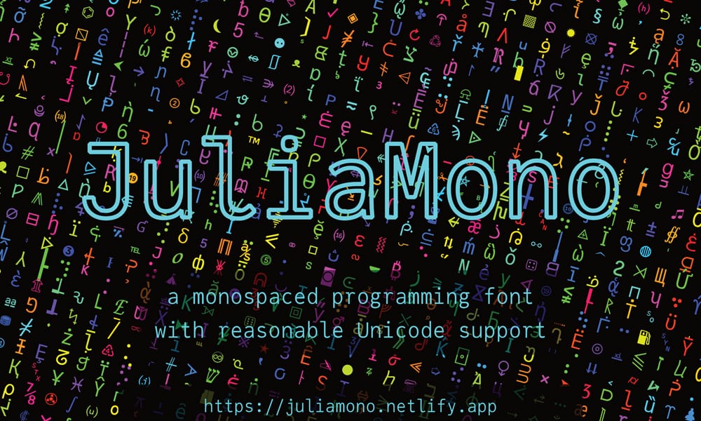
JuliaMono, designed specifically for the Julia programming language, is exceptional for scientific and mathematical code. It includes many mathematical symbols and scientific notation support.
Scientific Focus: JuliaMono includes glyphs for mathematical operators, Greek letters, and scientific notation that most monospace fonts don’t include.
Best For: Scientists, mathematicians, Julia developers, anyone working with mathematical code.
Pro: Mathematical symbol support, scientific focus, clean aesthetic, multiple weights.
Con: Over-featured for regular web development; not necessary unless you’re writing mathematical code.
Go Mono Font
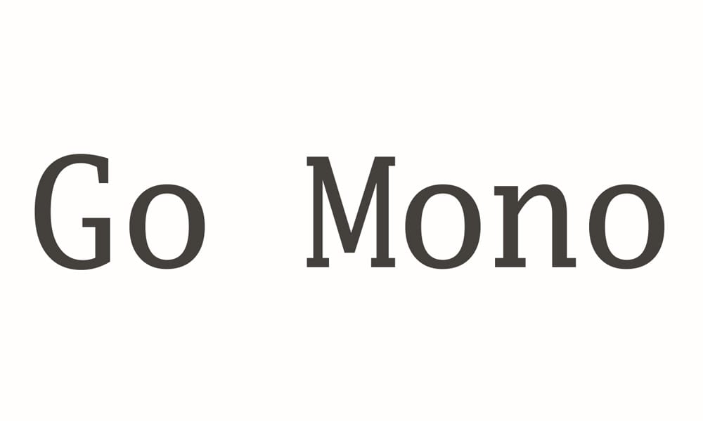
Go Mono is Google’s official monospace font, specifically designed for the Go programming language documentation. It balances the company’s design philosophy with practical coding needs.
Google Polish: Designed by Google’s type team, it carries Google’s minimalist, clean design language.
Best For: Go developers, Google ecosystem users, anyone appreciating Google’s design philosophy.
Pro: Google design credibility, excellent character distinction, clean modern aesthetic.
Con: Specific to Go ecosystem; not necessary unless you’re invested in Go or Google systems.
Retro & Aesthetic Fonts
These fonts bring vintage or artistic aesthetics while remaining fully functional for code.
Monocraft
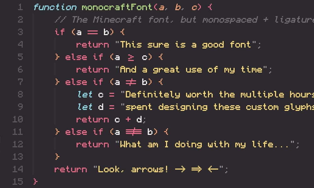
Monocraft adds pixel art elements to a monospace font, creating a retro-pixel aesthetic. If you’re building an 8-bit-inspired project or want nostalgic vibes, Monocraft delivers.
The Hook: It’s actually usable for code while maintaining strong visual personality. You get functionality plus aesthetic impact.
Best For: Game developers, retro projects, anyone who loves pixel aesthetics, creative developers wanting distinctiveness.
Pro: Unique personality, fully functional for code, multiple weights, MIT license.
Con: Very niche aesthetic; won’t work in professional corporate contexts; subjective appeal.
Modern Society
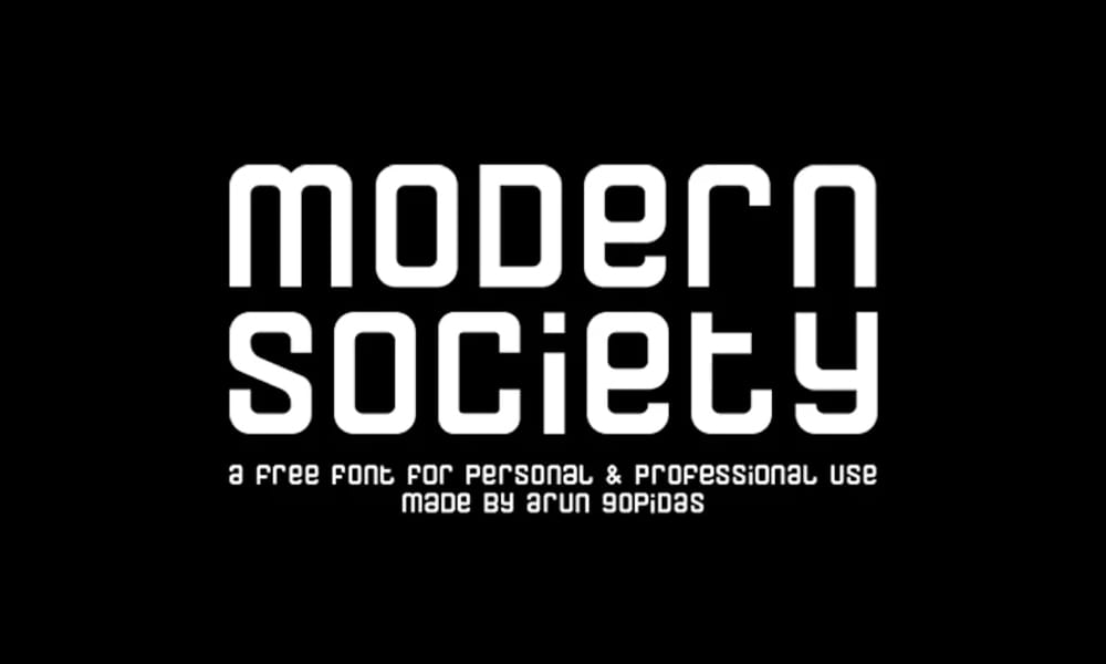
Modern Society is a contemporary monospace with industrial, geometric design language. It’s bold without being aggressive.
Design Philosophy: Strong geometric forms with tech-forward aesthetics. It communicates “modern” visually.
Best For: Tech companies, modern projects, developers wanting distinctive brand identity.
Pro: Strong visual identity, geometric aesthetic, bold and clear.
Con: Very distinctive, so it might feel dated in future years; not universally appealing.
3270 Font
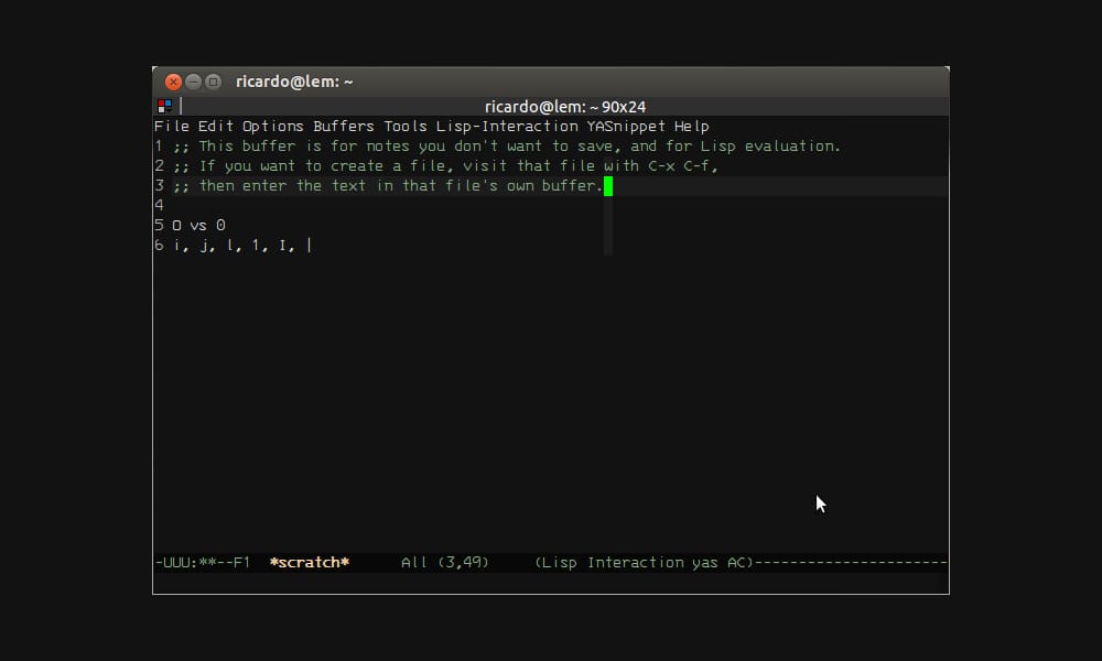
3270 Font emulates the IBM 3270 terminal aesthetic—the computer interface of the 1970s. It’s explicitly retro, embracing terminals from an earlier era.
Nostalgia Factor: If you want authentic retro computing vibes, 3270 is the real deal.
Best For: Retro computing enthusiasts, nostalgia-driven projects, developers who appreciate computing history.
Pro: Authentic retro aesthetic, unique personality, functional for code.
Con: Very specific use case; dated aesthetic (intentionally).
F1.8 Font
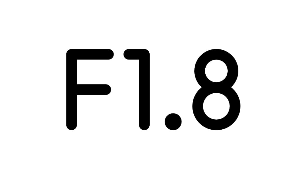
F1.8 is a minimal monospace with an ultra-contemporary aesthetic. It’s spare, geometric, and definitively modern without trend-chasing.
Design Restraint: F1.8 demonstrates that “less” can indeed be “more.” Minimal design elements, maximal clarity.
Best For: Minimalists, designers valuing restraint, developers wanting invisible typography.
Pro: Minimalist aesthetic, clean rendering, distinctive yet subtle design.
Con: Very minimal styling options; won’t appeal to those wanting a distinctive personality.
Additional Excellent Options
The following fonts are all excellent choices that deserve mention, organized alphabetically:
Aurulent Sans Mono
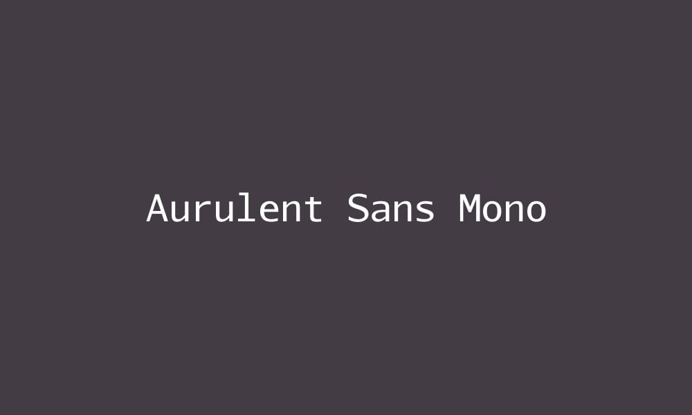
Clean, professional monospace with excellent legibility. Particularly good for technical documentation and presentations.
Basically A Mono
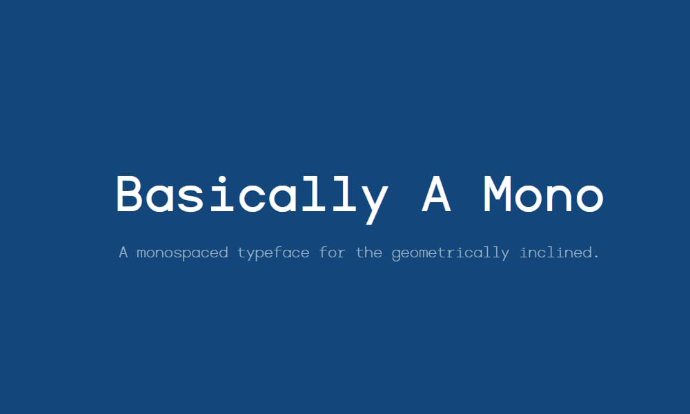
Contemporary monospace with rounded character forms, offering a friendly, approachable aesthetic.
Barecast Font
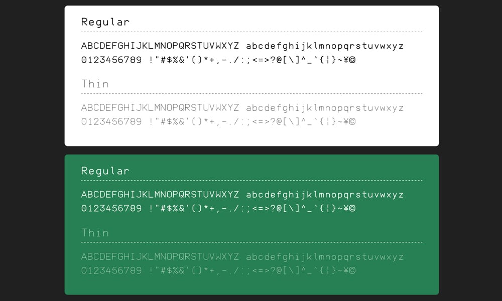
Minimal, straightforward monospace font with clean rendering and solid character distinction.
Block Mono Font
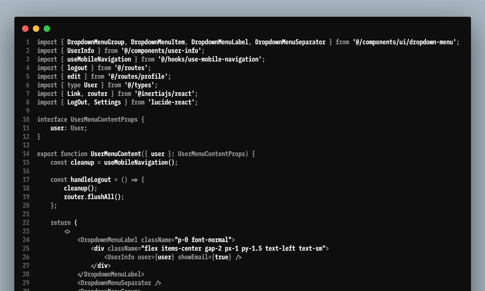
Bold, geometric monospace with strong visual presence. Good for short code samples requiring emphasis.
CamingoCode
Professional monospace optimized for code, offering excellent legibility and multiple weights.
Caskaydia Cove
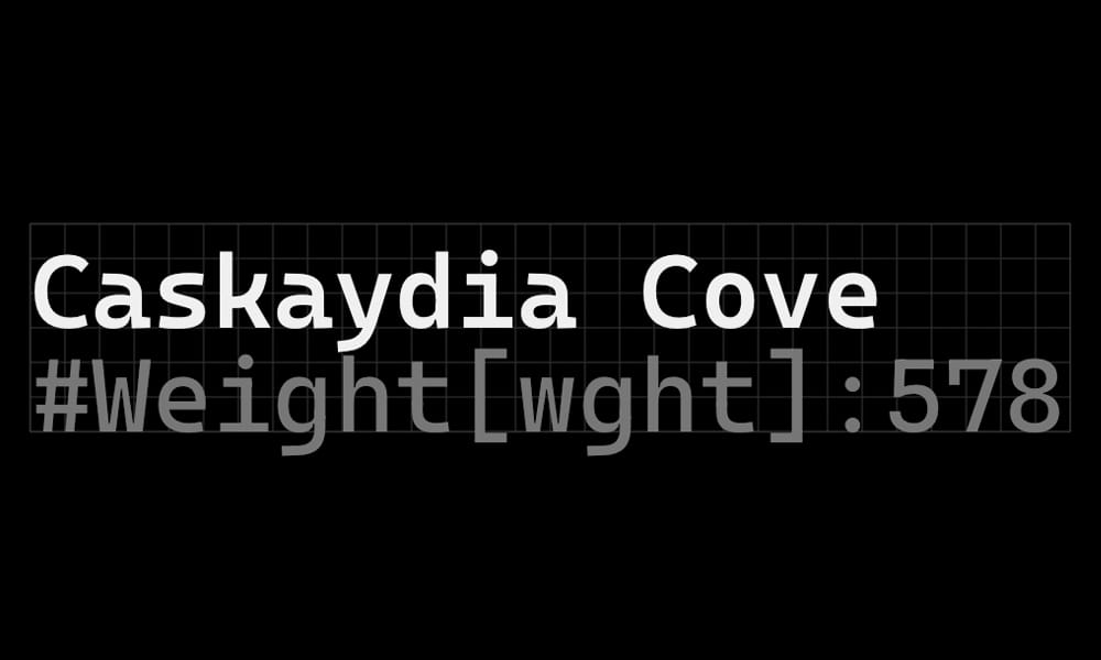
Cascadia Code variant with Nerd Font integration, perfect for terminal users needing specialized glyphs.
Compagnon Typeface
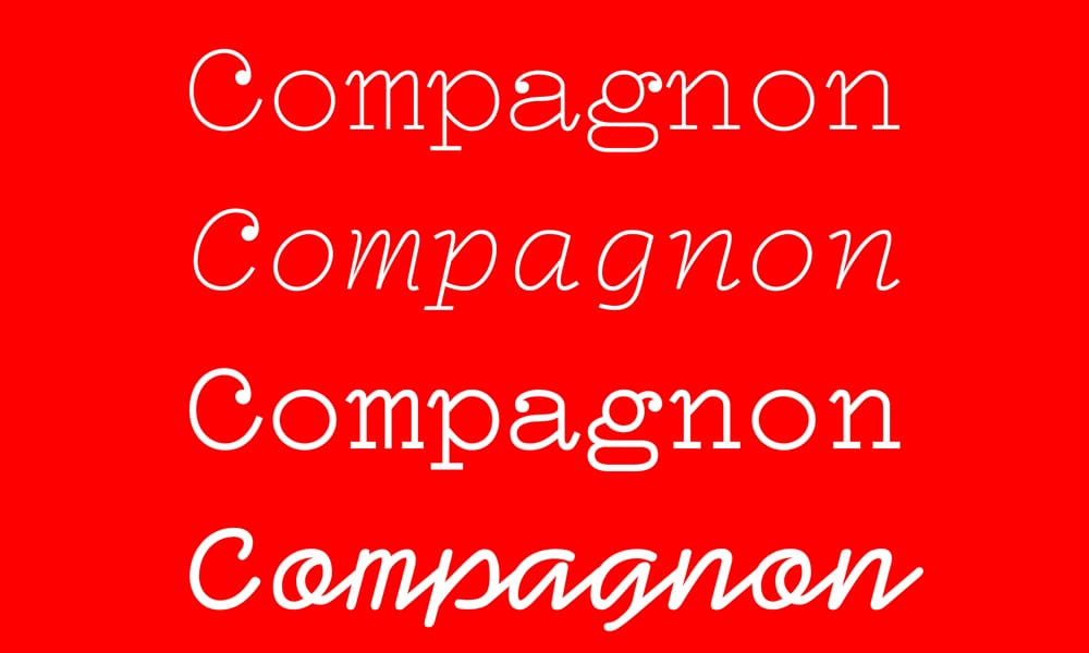
Distinctive monospace with personality and excellent technical specifications. Open-source from Velvetyne.
Cousine
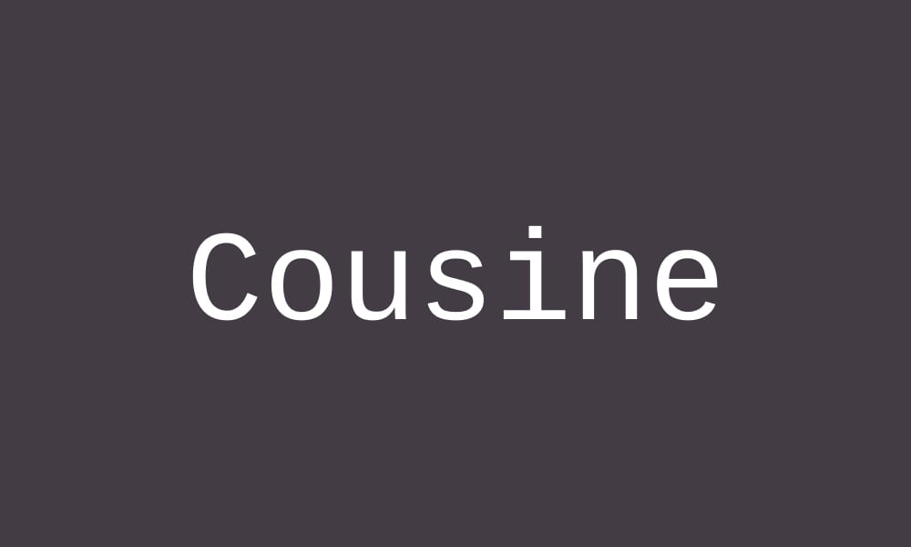
Google Fonts option optimized for screen readability. Courier New alternative with modern metrics.
DejaVu Sans Mono Font
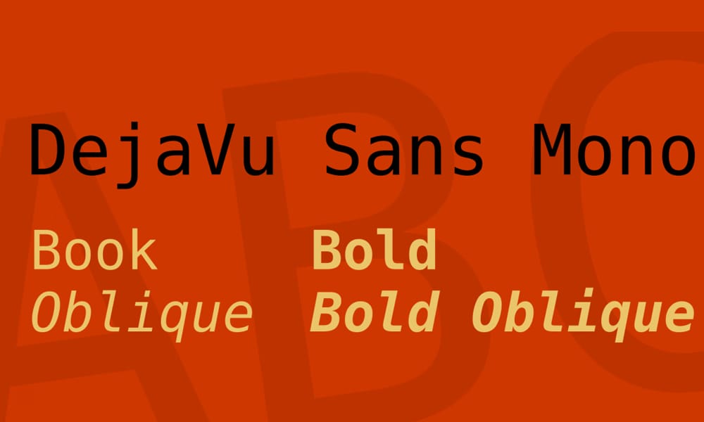
Excellent character coverage, particularly for international characters and symbols. Highly compatible.
Drafting Mono
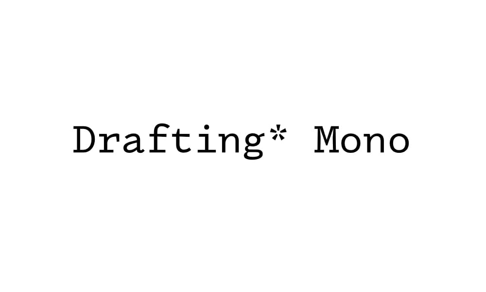
Technical monospace designed for architectural drawings and technical documentation. Also works excellently for code.
Fliege Mono
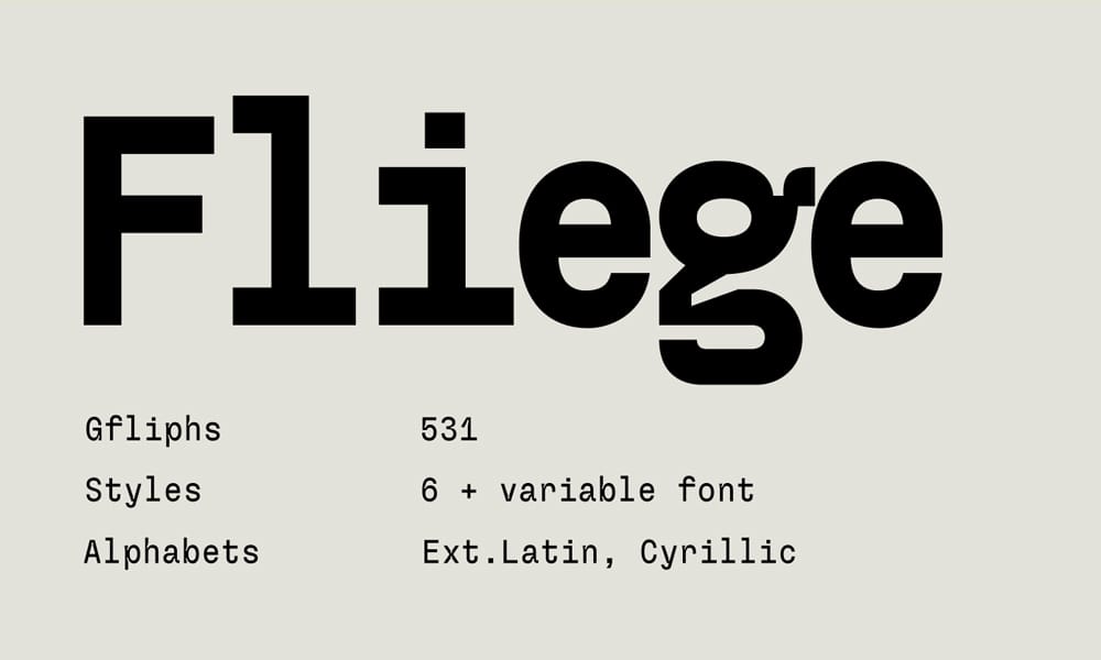
German-designed monospace with excellent metrics and clean aesthetic. Highly legible at all sizes.
Fragment Mono
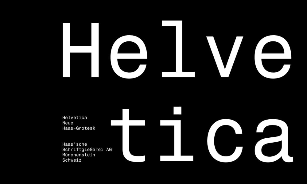
Minimalist monospace focusing on clarity and readability. Excellent for terminal use.
Lab Mono
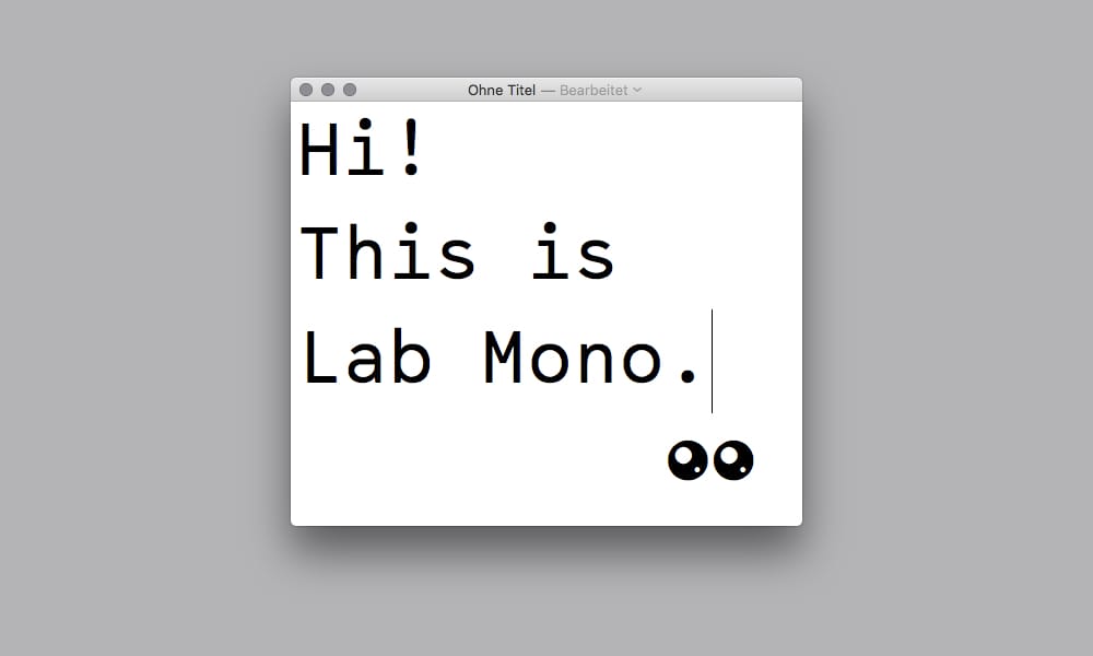
Experimental monospace exploring creative typography while maintaining code legibility.
Libertinus Font
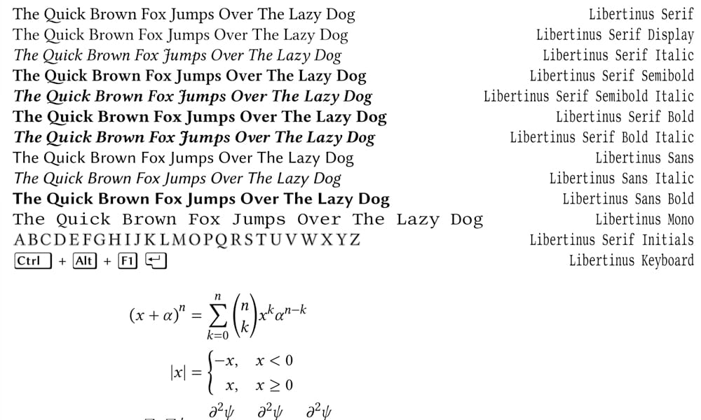
Open-source font family with monospace variant, emphasizing technical correctness and language support.
Miracode
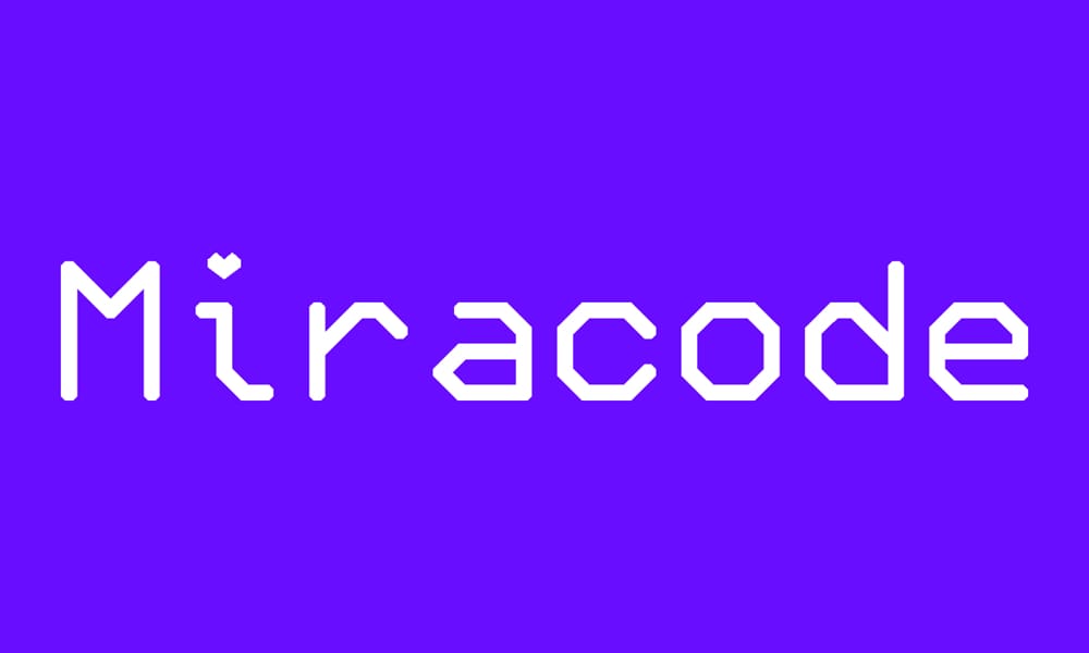
Pixel-art inspired monospace, similar to Monocraft, offering retro-futuristic aesthetics.
Monobiletik Font
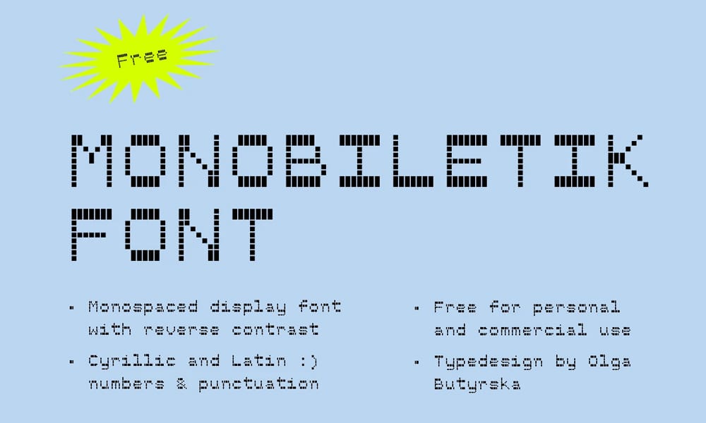
Cyrillic and Latin monospace with excellent international character support. Perfect for multilingual projects.
Monocode Font
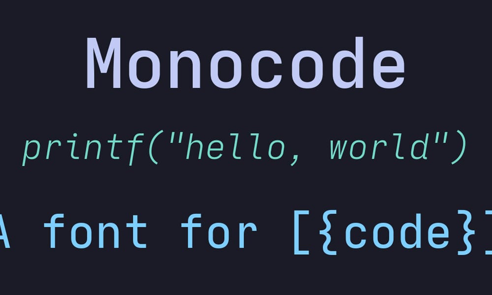
Technical monospace font with focus on programming symbol clarity.
Monobloco Font
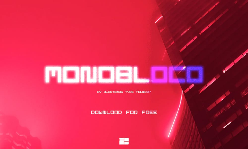
Bold, geometric monospace with strong visual presence. Excellent for emphasis in presentations.
NF-Code Font
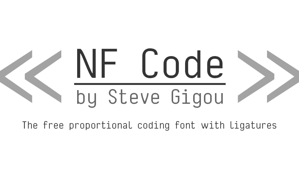
Nerd Font patched monospace, ideal for terminal users needing specialized icons and glyphs.
NK57 Monospace Font
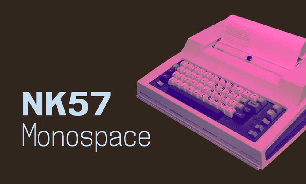
Unique monospace with geometric forms and distinctive character shapes.
Office Code Pro
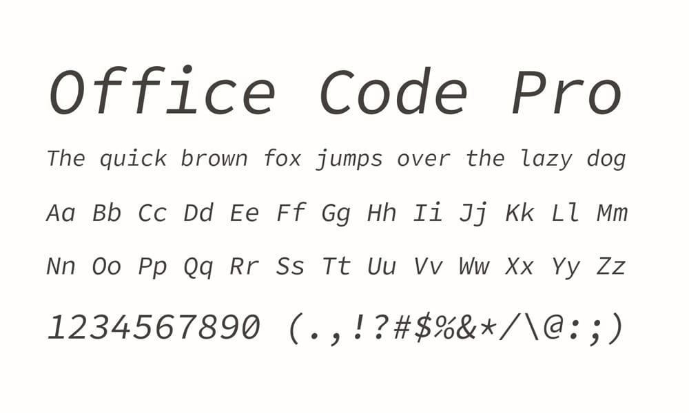
Clean, professional monospace designed for productivity in office and development contexts.
Opening Hours Mono
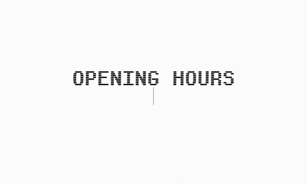
Contemporary monospace from independent foundry, emphasizing clean design and technical accuracy.
Overpass Mono
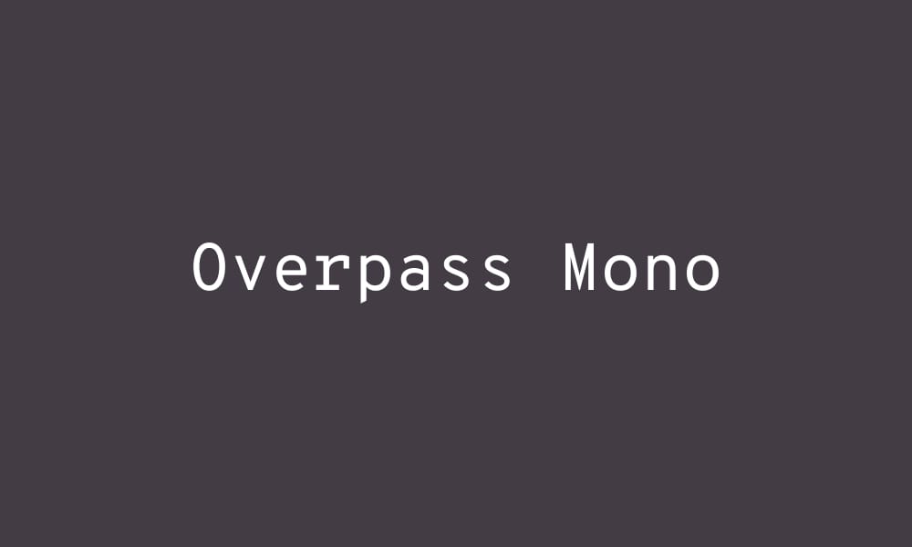
Red Hat’s official monospace font, part of their comprehensive design system. Clean and professional.
Oxygen Mono
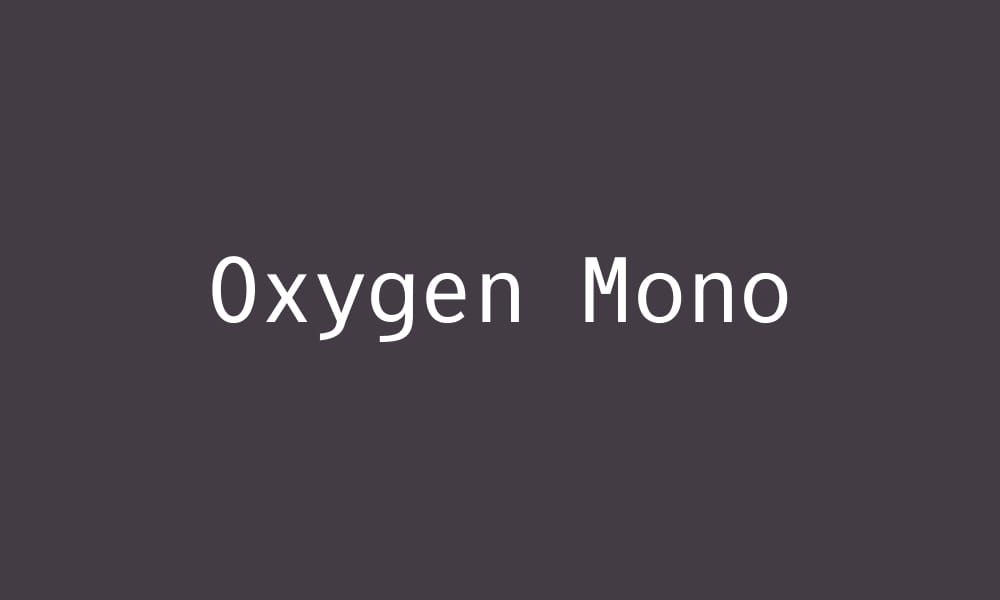
Part of Google Fonts, Oxygen Mono offers clean, contemporary design with excellent screen rendering.
Red Hat Typeface
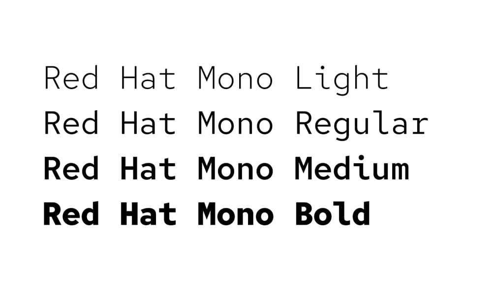
Red Hat’s comprehensive font system, with monospace variant offering professional reliability.
Schroffer Mono
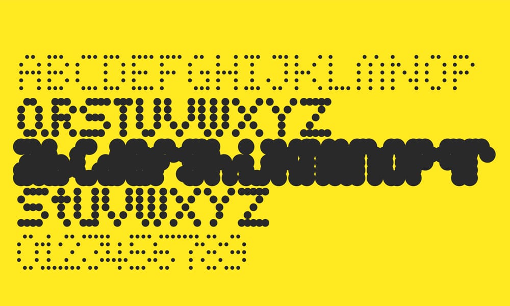
Geometric, contemporary monospace with unique character treatments and multiple weights.
Share Tech Mono
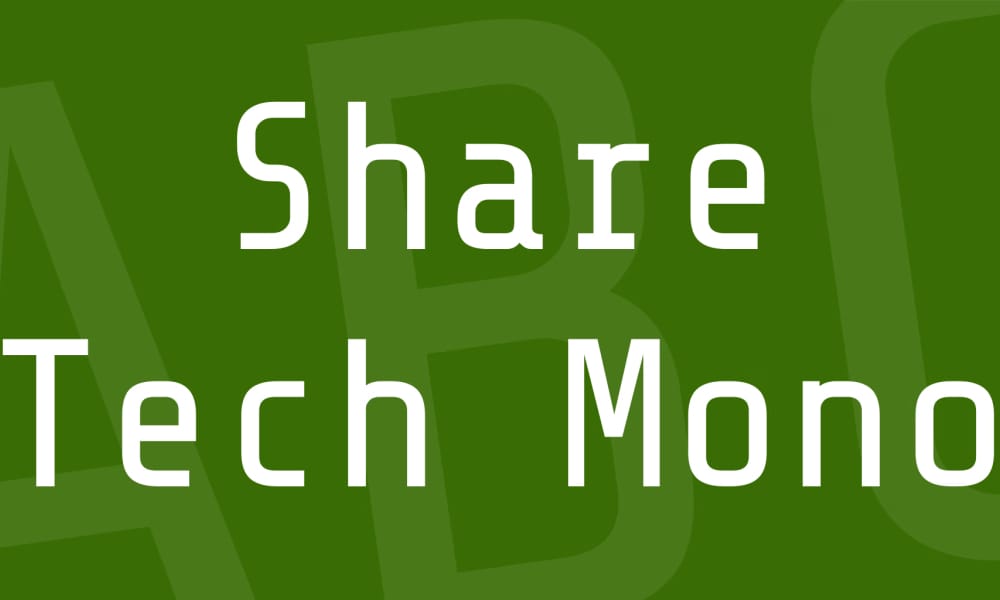
Tech-forward geometric monospace, perfect for contemporary tech projects and startups.
Sometype Mono
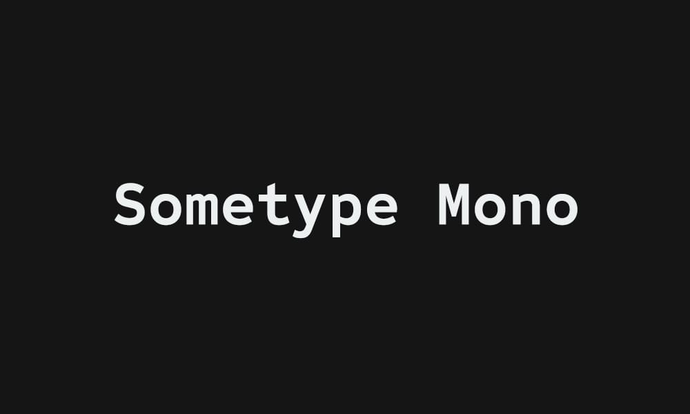
Indonesian designer’s contribution to open-source monospace. Clean, professional, globally-aware.
Sono Font
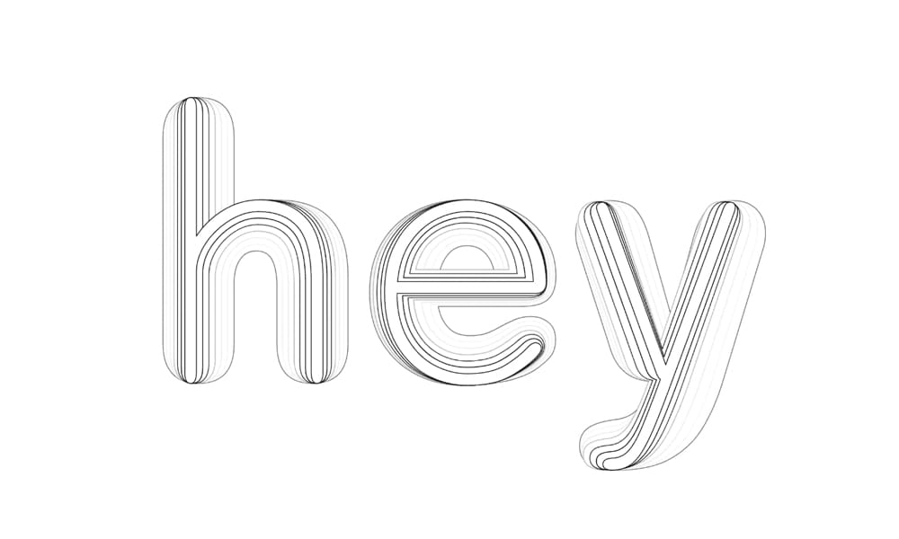
Lightweight, contemporary monospace emphasizing minimalism and clarity.
Spline Sans Mono
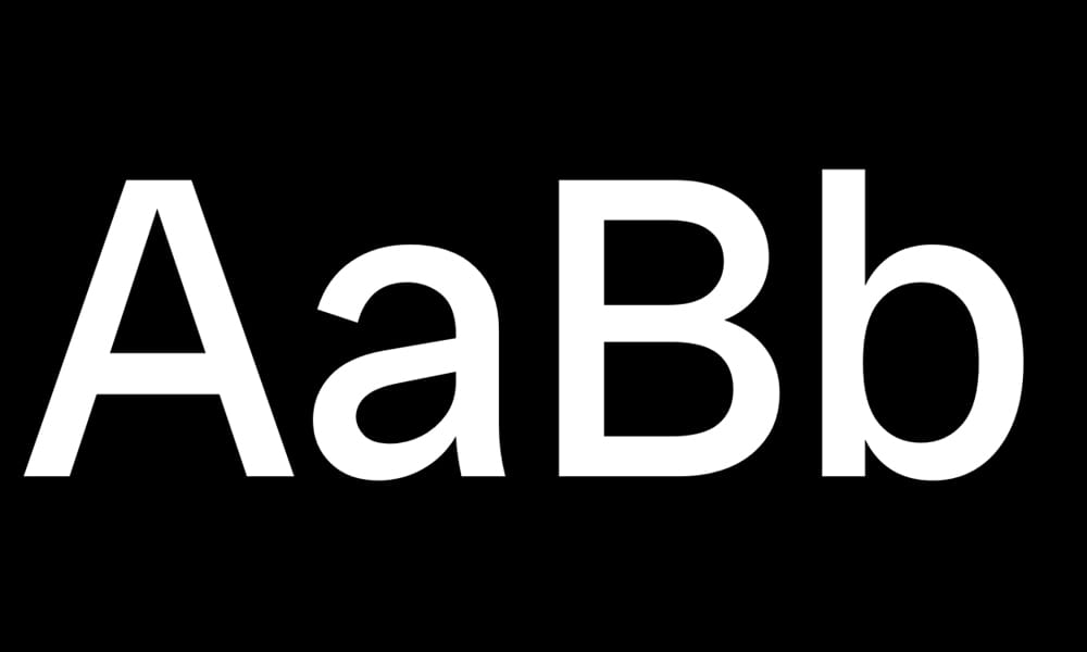
Modern monospace from type designer Spline, emphasizing contemporary design principles.
Steps Mono Typeface
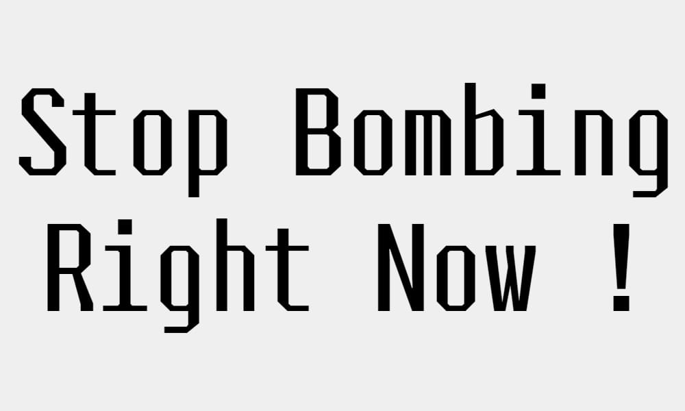
Geometric, modular monospace from Velvetyne foundry. Excellent for projects valuing design language.
Sudo Font
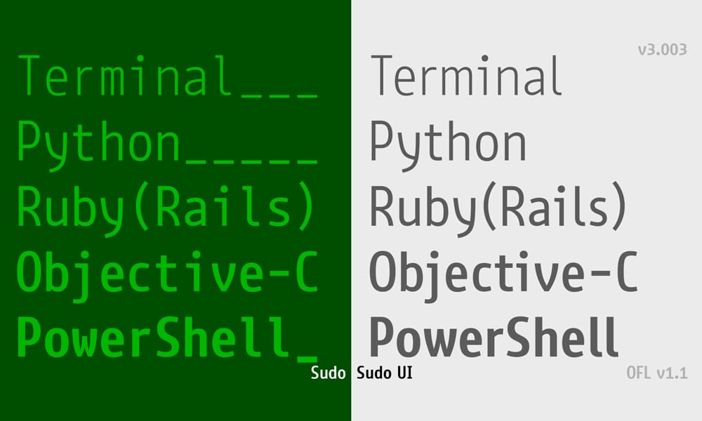
Swiss-inspired monospace with clean, minimalist design and excellent technical specifications.
SweaterDresses Font
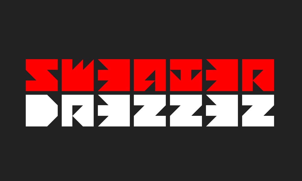
Unique, personality-driven monospace that’s fully functional while maintaining a distinctive aesthetic
Whois Mono
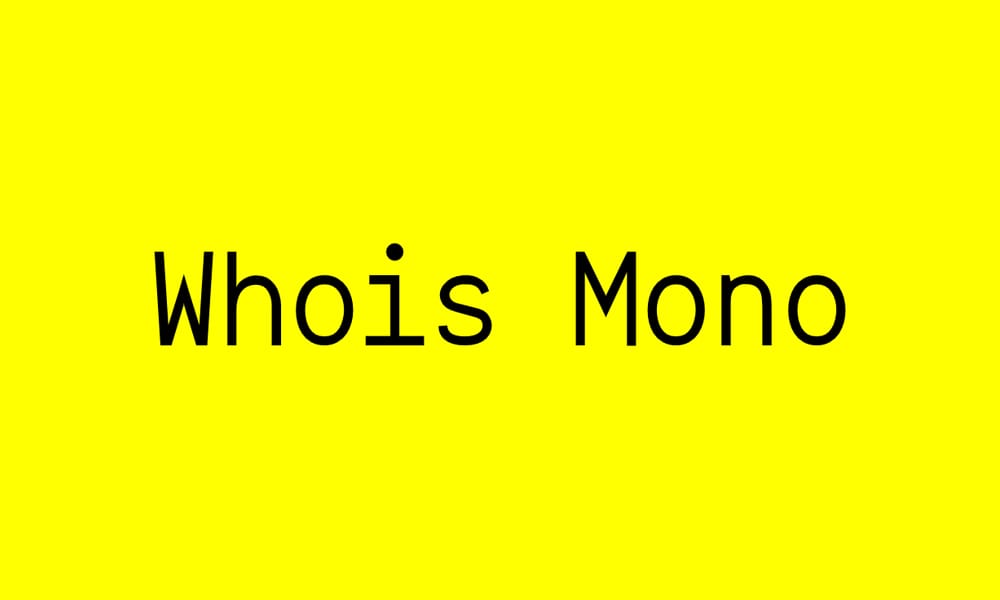
Minimal, no-frills monospace font emphasizing clarity and simplicity. Excellent baseline option.
Writer Font
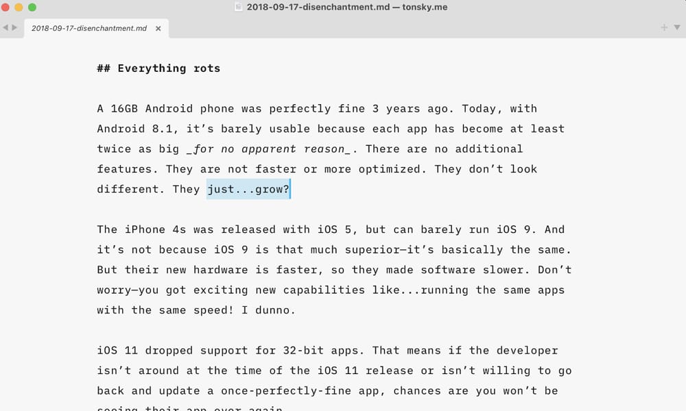
Writer is the writing counterpart to Fira Code—optimized for prose rather than code, but excellent in terminals.
Azeret Typeface
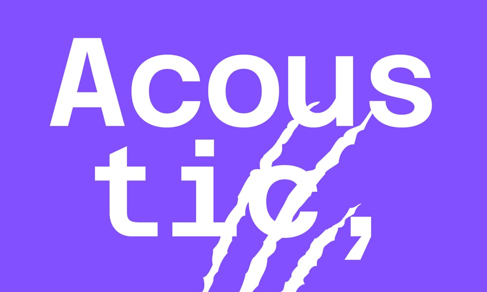
Contemporary monospace with geometric forms and multiple stylistic options.
Comparison Table: Top 20 Fonts at a Glance
| Font Name | Ligatures | Weights | Variable Font | Best For | License |
Geist Mono | No | 3 | Yes | Modern aesthetic, Next.js | OFL |
Fira Code | Extensive | 1 | No | Ligature enthusiasts, default choice | OFL |
JetBrains Mono | Optional | 3 | Yes | Extended coding sessions, IntelliJ users | OFL |
Victor Mono | Extensive | 7 | Yes | Cursive italics, distinctive style | OFL |
Source Code Pro | No | 7 | No | Professional reliability, Adobe ecosystem | OFL |
Cascadia Code | Extensive | 3 | Yes | Windows Terminal, VS Code, cursive italics | OFL |
| Commit Mono | Smart kerning | Multiple | Yes | Refined kerning, visual polish | MIT |
| Maple Mono | Extensive | Multiple | Yes | Customization, Asian developer community | OFL |
Martian Mono | No | Multiple | Yes | Accessibility, large x-height | OFL |
PT Mono | No | 1 | No | Minimalism, terminal, Unix | OFL |
Inconsolata | No | 1 | No | Terminal, Unix enthusiasts | OFL |
Anonymous Pro | No | 2 | No | Terminal focus, SSH use | OFL |
| Iosevka | Extensive | Customizable | Yes | Deep customization, enthusiasts | OFL |
| Recursive | Optional | Variable | Yes | Web projects, variable fonts | OFL |
| Monoid | Yes | Multiple | Yes | Technical precision, high-DPI | MIT |
| Space Mono | No | 2 | No | Geometric modern aesthetic | OFL |
Fantasque Sans Mono | No | 3 | No | Personality, creative projects | OFL |
| Mononoki | No | 1 | No | Modern aesthetic, balanced | OFL |
Liberation Mono | No | 1 | No | Universal compatibility, ubiquity | OFL |
Monocraft | No | 1 | No | Retro/pixel aesthetic, unique | MIT |
How to Choose Your Perfect Monospace Font
The Decision Framework
Step 1: Decide on Ligature Philosophy
Do ligatures enhance your coding experience or distract you? Test both styles (with and without). There’s no “right” answer—it’s personal preference.
Step 2: Test Character Clarity
Grab any three fonts and look at these characters in preview: 0O1lI|!{}(). Can you distinguish them instantly? If not, move on.
Step 3: Consider Your Context
- Terminal-heavy? Prioritize Inconsolata, Anonymous Pro, or PT Mono.
- IDE-bound (VS Code, IntelliJ)? Fira Code, JetBrains Mono, or Geist Mono.
- Want personality? Fantasque Sans Mono, Mononoki, or Victor Mono.
- Need customization? Iosevka or Recursive.
Step 4: The One-Week Test
Download three finalists and use each for a week in your actual editor. Don’t overthink it. Your subconscious will tell you which feels right.
Step 5: Fine-Tune Settings
Once chosen, adjust font size and line height in your editor. Most developers use 12px-14px font size; line height around 1.5 feels comfortable.
Common Mistakes to Avoid
Choosing Style Over Legibility. A beautiful font that makes 0 and O indistinguishable is a trap. Test rigorously.
Following Trends Blindly. If Fira Code doesn’t resonate with you, don’t force it. Use what feels right.
Ignoring Compatibility. Always check that your font works in your specific tools. An amazing font that doesn’t render in your terminal is useless.
Not Testing in Real Code. Font previews and code samples look different. Test in your actual code.
Setting Font Size Too Small. You’ll spend 8+ hours daily looking at code. Optimize for comfort, not density. A slightly larger font is worth the reduced line count.
Assuming One Font Forever. Your needs change. Re-evaluate annually or when your tooling changes.
FAQs
1. Do I really need ligatures?
No. Ligatures are purely aesthetic. Some developers swear they improve code scanning; others argue they obscure actual character sequences. Try both, decide for yourself. Neither is objectively better.
2. What’s the difference between Fira Code and JetBrains Mono?
Fira Code offers extensive ligatures; JetBrains Mono prioritizes refined proportions and character clarity. Fira Code is the “feature-rich” choice; JetBrains Mono is the “technical precision” choice. Both are excellent.
3. Can I use these fonts on my website?
Most fonts here are open-source (OFL license) and free for web use. Always verify the specific license, but generally yes, you can embed them on websites. For performance, consider using lighter fonts or subsetting glyphs.
4. Which font will reduce eye strain the most?
Fonts with larger x-height (generous character size), good spacing, and high contrast tend to reduce strain. JetBrains Mono, Martian Mono, and Cascadia Code score well on eye comfort. The most important factor is font size—don’t sacrifice size for aesthetics.
5. Are monospace fonts only for developers?
No. Technical writers, designers working in terminals, designers mixing code and design tools, and anyone needing visual alignment can benefit from monospace fonts. The tech community dominates, but monospace fonts are universally useful.
6. How do I enable ligatures in VS Code?
In settings.json, add: “editor.fontLigatures": true. In GUI settings, search for “Font Ligatures” and enable it. Then select a ligature-supporting font like Fira Code.
7. What if my font looks blurry in my editor?
This usually indicates a DPI/rendering issue. Try: (1) Restart your editor, (2) Clear font cache on your OS, (3) Verify font file integrity, (4) Test in a different editor to isolate the problem.
8. Should I use the same font everywhere (editor, terminal, documentation)?
Not necessary, but consistency feels good. Many developers use the same font in VS Code, terminal, and browser code examples. Consistency creates visual coherence.
9. Can I mix monospace fonts in one project?
Technically yes, but it’s usually confusing. Stick with one primary font. You might use a different monospace font in Figma designs or documentation, but your code editor should be one font.
Conclusion
You’ve just reviewed 65+ free monospace fonts. The sheer variety proves one thing: there’s no universal “best” font. The best font is the one that fits your workflow, aesthetic, and technical requirements.
Here’s what matters most: test three fonts for a week each before deciding. Don’t overthink it. Your subconscious will guide you toward what works. A font that makes you enjoy opening your editor is a font worth keeping.
Want my personal recommendations? Fira Code if you love ligatures and community. JetBrains Mono if you prioritize refined technical design. Victor Mono if you want a distinctive personality with functional excellence. Geist Mono if you’re building modern web projects.
But honestly? Pick one that makes you happy when you open it. That satisfaction matters more than any technical specification.
Try two today. You’ll never design without finding your favorite.

