Best UI Libraries for React Server Components in 2026

Picking a UI library for a Next.js App Router project is no longer about features or theming — it’s about how much of the library has to ship to the browser. The best UI libraries for React Server Components let you keep static parts on the server and surgically opt into “use client” only where you need interactivity. The 21 libraries below are evaluated on exactly that.
Best Picks at a Glance
| Pick | Best For | Cost |
| Shadcn/ui | Full ownership of components in an RSC app | Free |
| Radix UI | Headless primitives behind your own design system | Free |
| Base UI | Migrating off MUI without rewriting everything | Free |
| Tailwind UI | Marketing pages and dashboards with zero client JS | Paid |
| React Aria Components | Accessibility-critical apps | Free |
| Magic UI | Marketing landing pages with motion | Free |
| Park UI | Ark UI–based design system across React, Vue, Solid | Free |
| HeroUI | Modern Tailwind-first component set | Free |
Who This Is For / Who Should Skip It
If you’re building a Next.js 14+ or 15 app with the App Router and you care about how much JavaScript ends up in the user’s browser, this guide will save you a weekend of trial and error. It’s also useful if you’re auditing a library before committing — every entry below tells you what breaks in a server component and what doesn’t.
Skip this if you’re on Pages Router, Vite, or React Router with no plans to adopt RSC. Most of these libraries work fine outside RSC; the analysis here is specifically about server-component compatibility, and you’ll be optimizing for the wrong constraint. Also skip if you’re building a heavily interactive app like a CRM or data tool — at that point, almost everything is a client component anyway, and RSC compatibility stops being the deciding factor.
See also
The 21 UI Libraries
Shadcn/ui
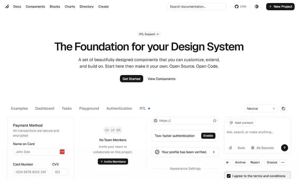
Shadcn/ui isn’t a library in the traditional sense — there’s no npm package shipping components. You run a CLI, it copies the source for each component into your repo, and from then on it’s your code. For React Server Components, this is a bigger deal than it first appears. You can read every component’s “use client” boundary, change it, split it, or remove parts entirely. No vendor decides for you.
The components are built on Radix primitives with Tailwind for styling. Most of the interactive ones (Dialog, Dropdown, Popover, Select) ship with “use client” at the top because they wrap stateful Radix logic. Static ones — Card, Badge, Separator, Avatar — render fine on the server with no changes. The split is clean and predictable.
What makes it actually fit RSC well is the same thing that makes some teams hesitate: you own the code. If a component’s client boundary is too coarse, you can refactor it. If you want to remove forwardRef because you’re on React 19, you can. There’s no maintainer to wait on. The tradeoff is that updates aren’t automatic — you re-run the CLI per component to pull the latest version, and you’ll see merge conflicts if you’ve customized.
Key Features:
- Components copied directly into your codebase, not installed as a dependency
- Built on Radix UI primitives, styled with Tailwind CSS
- CLI-based component installation and updates
- Full source-level control over “
use client” boundaries
Best For: Teams on the Next.js App Router who want a starting point but refuse to be locked into someone else’s component decisions.
Pricing: Free
Real-World Note: The “you own the code” pitch is a real maintenance cost on large teams — you’ll want a documented update process or you’ll end up with twelve slightly different versions of the Button component across your apps.
Magic UI
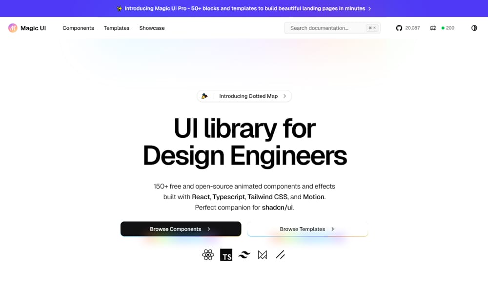
Magic UI is shadcn-compatible and follows the same copy-paste philosophy, but its focus is animated marketing components — animated beams, marquees, gradient text, particle backgrounds, hero sections with motion. It pairs naturally with Shadcn/ui: use Shadcn for the application UI, Magic UI for the landing page.
For RSC, the static layout components work on the server, but anything animated requires “use client” because Framer Motion and intersection observers need browser APIs. That’s expected and fine — landing page sections are usually leaf client components inside a server-rendered page anyway, so the bundle cost is contained.
The component quality is high for what it is, but you’re paying for that in bundle size if you go heavy on motion. A page with five Magic UI animations and a Shadcn header can easily ship 80–120kb of client JS before your own code.
Key Features:
- 50+ animated components for landing and marketing pages
- Copy-paste install, same flow as Shadcn/ui
- Built on Framer Motion and Tailwind CSS
- Designed to compose with Shadcn/ui in the same project
Best For: Marketing sites and product landing pages where motion is a deliberate design choice, not decoration.
Pricing: Free
Real-World Note: Audit your motion components in production with the Network tab — Framer Motion adds ~50kb gzipped, and using it for a single shimmer effect is hard to justify when CSS keyframes do the same job.
Park UI
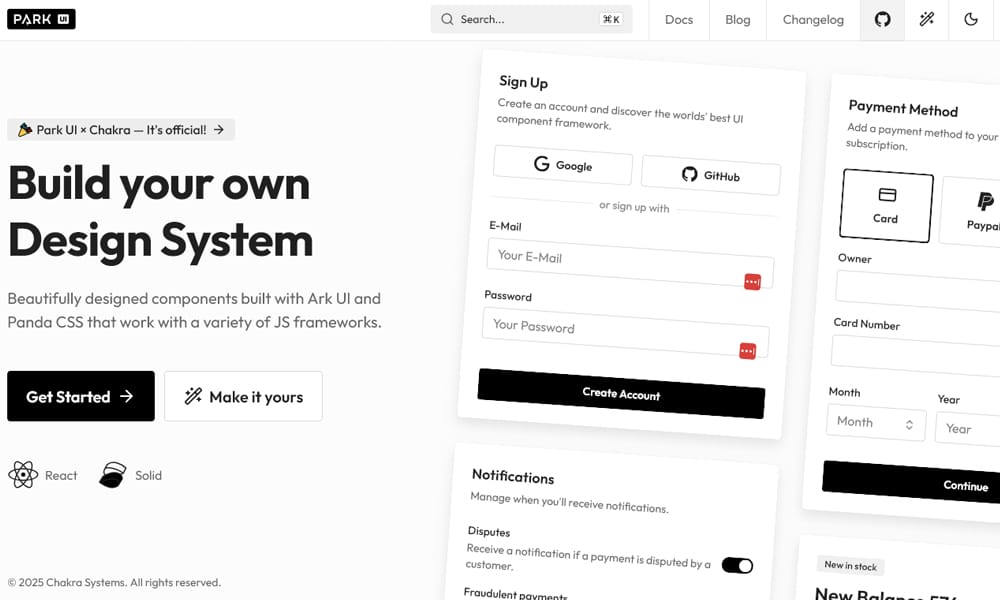
Park UI is a design system built on Ark UI — a headless library from the Chakra team that provides framework-agnostic state machines for components. The interesting part for RSC isn’t Park UI itself, it’s the architecture: because Ark UI primitives are framework-aware but logic-pure, the React adapter knows where the client boundary needs to go.
In practice, you install Park UI’s CLI (similar pattern to Shadcn) and pick between Panda CSS or Tailwind for styling. Components arrive in your repo with appropriate “use client” directives already set. Static parts — Card surfaces, typography, layout primitives — stay on the server.
It’s a younger project than Shadcn and the ecosystem is smaller, but the cross-framework story is genuinely useful if your team also ships Vue or Solid apps. You get consistent component logic across stacks.
Key Features:
- Built on Ark UI’s framework-agnostic state machines
- Choice of Panda CSS or Tailwind for styling
- Components copied into your codebase via CLI
- Same component API across React, Vue, and Solid
Best For: Teams shipping multiple frontend stacks who want one design system to span them.
Pricing: Free
Real-World Note: Panda CSS adoption inside Park UI projects is still niche — if your team isn’t already using it, expect a real onboarding cost.
Tailwind UI
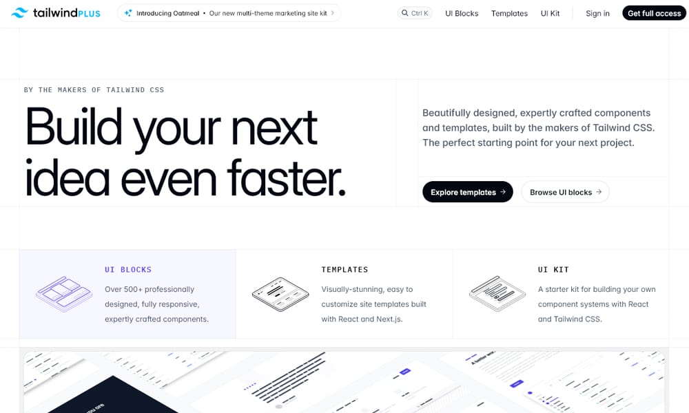
Tailwind UI (now Tailwind Plus) sells you HTML, JSX, and Vue templates rather than a runtime library. That’s an advantage for RSC — most of what you copy is just markup with classes. There’s no component shipping a state machine, no hooks, no context providers. You drop the JSX into a server component and it renders on the server with zero client cost.
Where it does need client behavior — mobile menus, comboboxes, modals — the templates use Headless UI under the hood, which means a small “use client” island for the interactive piece and static markup everywhere else. This is the cleanest possible RSC story: the framework gets out of the way.
The catch is it’s not a component library. There’s no <Button> you import. You’re copying styled markup, which means refactoring across pages later is on you. For teams that want consistency enforced by code, this isn’t the right tool.
Key Features:
- Pre-built marketing, application, and ecommerce section templates
- HTML, React, and Vue versions of every section
- Uses Headless UI for interactive pieces
- Mostly static markup, zero runtime by default
Best For: Teams shipping a marketing site or admin dashboard fast where each page can stand on its own.
Pricing: Paid
Real-World Note: Without enforced abstraction you’ll see drift within months — schedule periodic refactor passes or you’ll end up with three slightly different button styles across your app.
HeroUI
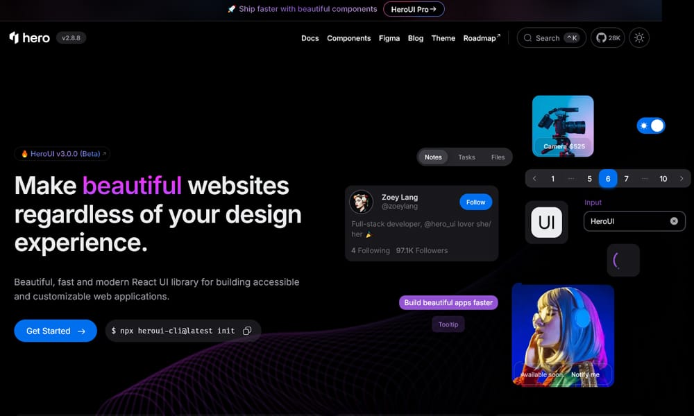
HeroUI (formerly NextUI) is a Tailwind-first React component library with a polished default theme. Most components ship as client components because of the underlying Framer Motion animations and React Aria hooks. That doesn’t make it RSC-incompatible, but it does mean you’re shipping more JavaScript than with a copy-paste library where you control the boundaries.
The components themselves are well-built — the form controls feel responsive, the date picker is one of the better ones in this list, and accessibility is solid because of the React Aria foundation. If you want a pre-styled library that “just works” without making “use client” decisions yourself, this is a reasonable pick.
Key Features:
- 60+ pre-styled components with consistent theming
- Built on React Aria and Framer Motion
- Tailwind-first styling with variant API
- Strong default theme with dark mode
Best For: Apps where you want batteries-included components and don’t want to debate client/server boundaries per component.
Pricing: Free
Real-World Note: The Framer Motion dependency is non-negotiable — if bundle size matters more than animation polish, look at Radix or Base UI instead.
Mantine
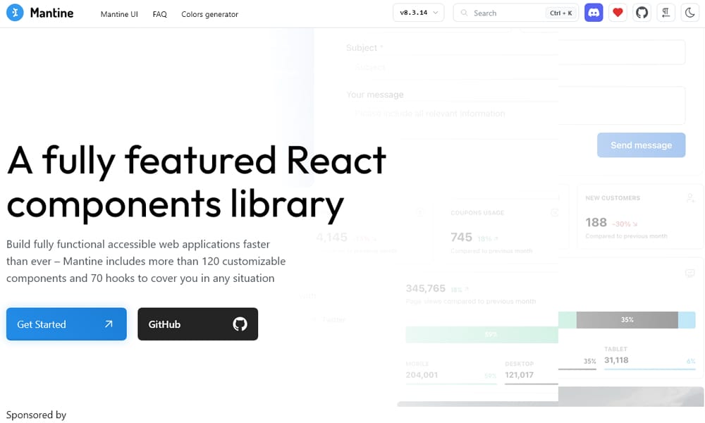
Mantine is a comprehensive component set with strong form handling, a real date picker, charts, rich text editor, and a notifications system. Almost every component requires “use client” because the library is built around hooks and a context-driven theme provider. For an admin dashboard or internal tool where most of the page is interactive, this barely matters — you’d have client components anyway.
For a public-facing site with mixed server and client work, Mantine is a heavier choice. The theme provider sits at the root, which pushes the client boundary up. You can work around this with careful component composition, but you’re fighting the library’s defaults.
What Mantine genuinely gets right is the breadth — useForm, useDisclosure, modals, date pickers, autocomplete, all coherent and well-documented. If your app is application-shaped, the productivity wins matter.
Key Features:
- 100+ components covering forms, dates, charts, and editors
- Hook-based utilities like useForm and useDisclosure
- Themed via a root context provider
- Built-in dark mode and color scheme management
Best For: Internal tools, admin panels, and dashboards where most of the page is interactive.
Pricing: Free
Real-World Note: The context-based theming pushes most rendering to the client — fine for apps, suboptimal for content sites.
DaisyUI
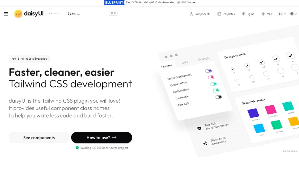
DaisyUI is unique in this list: it’s a Tailwind plugin that adds component class names. There are no JavaScript components at all — <button class="btn btn-primary"> and you have a styled button. For RSC, this is the lightest possible footprint. Everything renders on the server because there’s nothing to render on the client.
The interactive components rely on CSS-only patterns (checkbox-driven dropdowns, <details> elements for accordions). That works for simple cases but breaks down for anything needing real focus management or keyboard accessibility. Modals and dialogs in particular are usable but not great by accessibility standards.
If you’re building a content-heavy site or marketing page and you want fast styling without managing components, this fits. For an application UI, you’ll outgrow it.
Key Features:
- Tailwind plugin — pure CSS, zero JavaScript
- Class-based component styling, no React imports
- 40+ themes including dark and light variants
- Works in any framework that uses Tailwind
Best For: Content sites, blogs, and marketing pages where you want Tailwind productivity without component overhead.
Pricing: Free
Real-World Note: The CSS-only modals and dropdowns are a real accessibility shortcut — fine for marketing, problematic for anything ADA-sensitive.
MUI
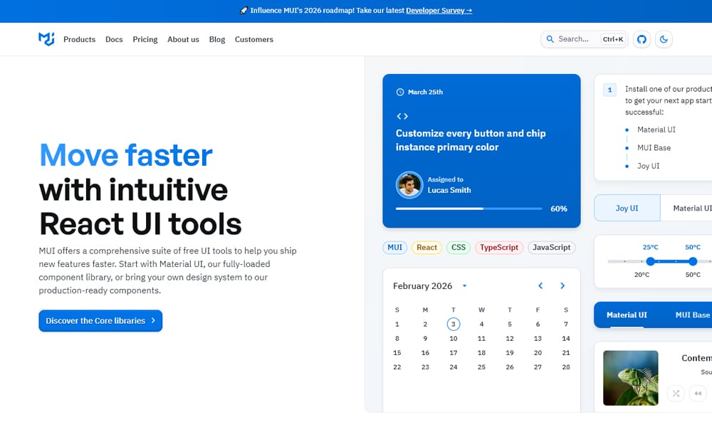
MUI is the long-standing default for React component libraries, but its RSC story has been complicated. Material UI v5 was built around emotion, which meant the theme provider had to wrap the entire app as a client component. v6 introduced an Experimental_CssVarsProvider and improved the App Router experience. v7 has further improved server-component support, but you’ll still see most components marked as client because of how deeply the theming hooks go.
For new projects on App Router, the team’s own guidance points toward Base UI (next entry) — MUI’s RSC-aware successor — for new code, with MUI itself remaining the choice for established projects already on Material Design.
Key Features:
- Material Design system with 100+ components
- Mature ecosystem, extensive documentation
- Joy UI variant for non-Material design
- CSS variable–based theming in v6+
Best For: Existing MUI projects upgrading their stack, not greenfield RSC work.
Pricing: Free + Pro (free plan covers all core components; Pro and Premium unlock advanced data grid features)
Real-World Note: For new App Router apps, treat MUI as a legacy decision — Base UI is where the same team is putting the RSC-native effort.
Ant Design
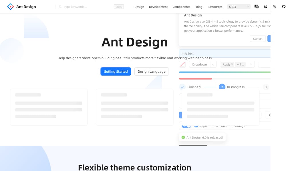
Ant Design is the enterprise default in much of Asia and a common pick for B2B dashboards globally. It’s component-dense — table, form, tree, transfer, statistic — with mature behaviors most other libraries don’t ship. For RSC, the picture is the same as MUI: it works, but most components push the client boundary because of theme context, internal state, and locale providers.
The team has been adding App Router support, and the static parts (Typography, layout primitives) will server-render. But the meat of the library — Form, Table, Select — is client-side. If you’re building an enterprise dashboard, that’s not a problem; if you’re building a marketing site, this isn’t the library you want.
Key Features:
- 60+ components built for enterprise applications
- Mature Form and Table components with deep features
- Built-in i18n and locale support
- Pro version with templates for admin UIs
Best For: Internal enterprise dashboards where component depth matters more than bundle size.
Pricing: Free + Pro (free plan includes all core components; Pro adds dashboard templates and design assets)
Real-World Note: The bundle size is heavy — without aggressive tree-shaking and dynamic imports, expect 200kb+ on first load.
Headless UI
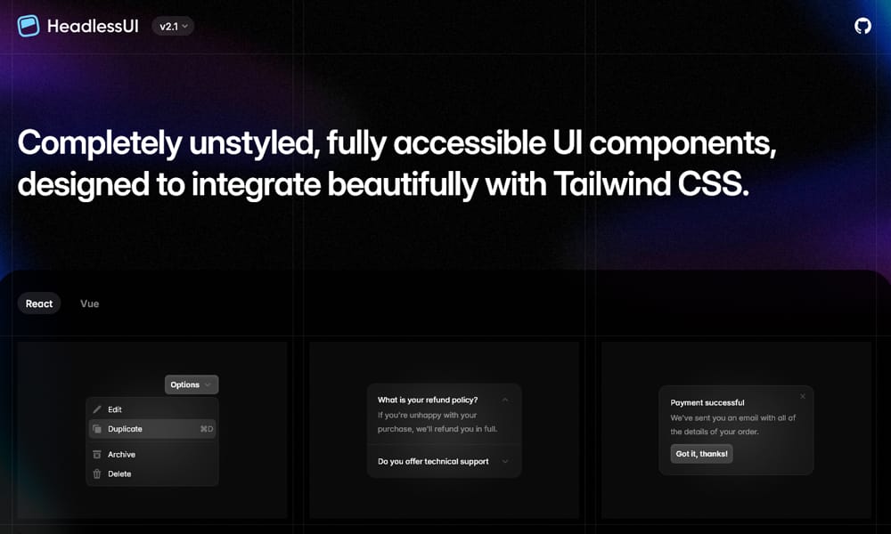
Headless UI is Tailwind Labs’ set of unstyled, accessible primitives — Dialog, Listbox, Combobox, Menu, Tabs. It’s the engine under most Tailwind UI templates. For RSC, every Headless UI component is a client component because they’re all stateful. That’s fine — they’re meant to be small interactive islands inside server-rendered pages.
The library is intentionally narrow: ten or so components, each focused on a single interactive pattern. There’s no Button, no Card, no layout. You bring your own styling and structural components. Pairs naturally with Tailwind UI or your own design system.
Key Features:
- Unstyled, accessibility-focused interactive primitives
- Designed to pair with Tailwind CSS
- Small API surface, focused scope
- Used internally by Tailwind UI
Best For: Teams who want accessible interactive primitives without opinions about styling.
Pricing: Free
Real-World Note: Useful but not a full library — pairing with Radix UI for the patterns Headless UI doesn’t cover (Popover, Tooltip, Slider) is common.
Chakra UI
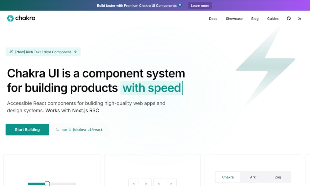
Chakra has historically been one of the more developer-friendly libraries because of its style props API — <Box mt={4} bg="gray.100"> instead of writing CSS. The v3 rewrite shifted Chakra onto Ark UI primitives (the same ones powering Park UI) and made the library more amenable to RSC, though most components still need “use client” because of the theme system.
The API is approachable and the component set is solid for application UIs. Where it loses ground to Mantine is in the depth of form and date components; where it gains is the style prop ergonomics.
Key Features:
- Style props API for inline styling
- Built on Ark UI primitives in v3
- Theme tokens with semantic color modes
- Solid accessibility defaults
Best For: Teams who prefer style props over Tailwind utility classes.
Pricing: Free + Pro (free plan covers all components; Pro adds figma kits, blocks, and templates)
Real-World Note: The v2-to-v3 migration is non-trivial — if you’re on v2, plan a real chunk of time before adopting v3 patterns.
PrimeReact
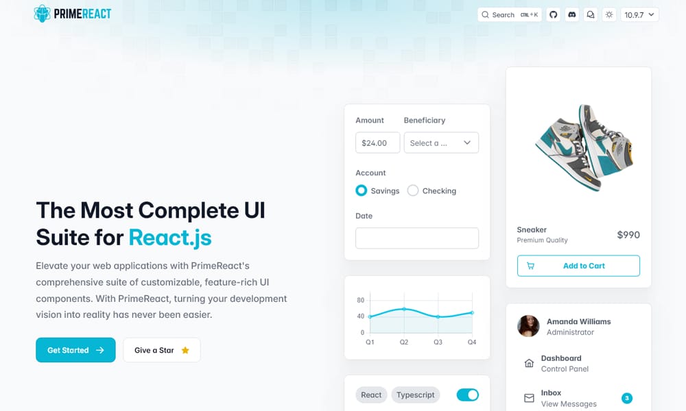
PrimeReact has the largest component count in this list — 90+ components including calendars, tree tables, organization charts, and gauges. It’s the kind of library you reach for when you need a specific component (Org Chart, MultiSelect with virtual scrolling, full-featured DataTable) and don’t want to build it.
For RSC, the answer is what you’d expect from a library this dense: most components are client components, theme provider wraps the app, but you can server-render structural pieces. The tradeoff is breadth versus elegance — PrimeReact components feel less polished than Mantine or Chakra, but they exist when you need them.
Key Features:
- 90+ components, the broadest set in this list
- Strong DataTable with virtual scrolling, lazy loading
- Multiple themes including Material and Bootstrap variants
- Sibling libraries for Vue, Angular, and plain JS
Best For: Internal tools and dashboards where you need a specific niche component out of the box.
Pricing: Free
Real-World Note: The visual polish is uneven across components — budget design time to get it looking consistent.
Radix UI
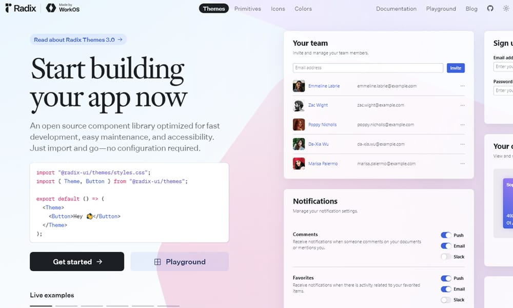
Radix is the foundation almost every modern React component library is built on, including Shadcn/ui. It provides unstyled, accessibility-correct primitives — Dialog, Popover, Tooltip, Select, Tabs, Accordion — that handle focus management, keyboard navigation, and ARIA correctly. For RSC, every Radix primitive is a client component, but they’re scoped — you import only what you need, where you need it.
What Radix gets right is composition. Each primitive is split into Root, Trigger, Content, and so on, which means you wrap exactly the parts that need client behavior. Pair it with server-rendered layout and content, and you have small, surgical client islands.
Key Features:
- Unstyled, accessible primitives for 25+ patterns
- Composable API — Root/Trigger/Content split
- Industry-standard accessibility implementation
- Used as the foundation for Shadcn/ui and many others
Best For: Building your own design system on top of accessible primitives.
Pricing: Free
Real-World Note: “Unstyled” is literal — budget real CSS time, or use Shadcn/ui to skip ahead.
React Aria Components
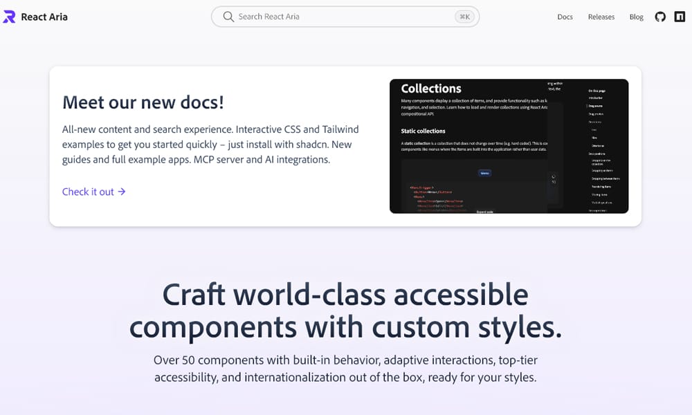
React Aria Components is Adobe’s accessibility-first component library — a higher-level companion to the React Aria hooks they’ve shipped for years. It’s similar in spirit to Radix but with deeper internationalization and more nuanced interaction patterns (drag and drop, tables, complex selection states). For RSC, it’s the same story as Radix — client components with surgical scope, paired with whatever styling you bring.
Where it edges out Radix is for apps where accessibility is actually audited — government, healthcare, education. Adobe has dogfooded this in production for years and the rough edges have been filed down.
Key Features:
- Accessibility-first headless components
- Stronger i18n support than alternatives
- Backed by Adobe’s accessibility team
- Deeper interaction patterns (DnD, complex tables)
Best For: Apps where accessibility passes are part of the release process, not an afterthought.
Pricing: Free
Real-World Note: The API is denser than Radix — expect a real learning curve before you’re productive.
Tremor
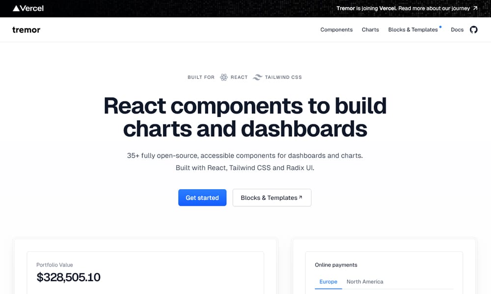
Tremor is a focused dashboard library — charts, KPI cards, data tables, area and bar charts — built on Recharts and Tailwind. For analytics and admin dashboards, it cuts the time-to-first-chart from a day to an hour. Most components are client because charts need browser APIs, but the layout primitives (Card, Grid, Flex) work as server components.
The library was acquired and the open-source version remains active under a Tremor Raw distribution that follows the Shadcn copy-paste model. Worth checking the current packaging before committing.
Key Features:
- Pre-built dashboard components — KPI cards, charts, tables
- Built on Recharts for visualizations
- Tailwind-styled, follows Shadcn-style ownership patterns in Tremor Raw
- Designed for analytics and admin UIs
Best For: Dashboards and analytics views where you want pre-built chart components, not chart-from-scratch.
Pricing: Free
Real-World Note: The packaging changed in 2024 — confirm whether you’re using the npm package or Tremor Raw before investing in patterns.
Tamagui
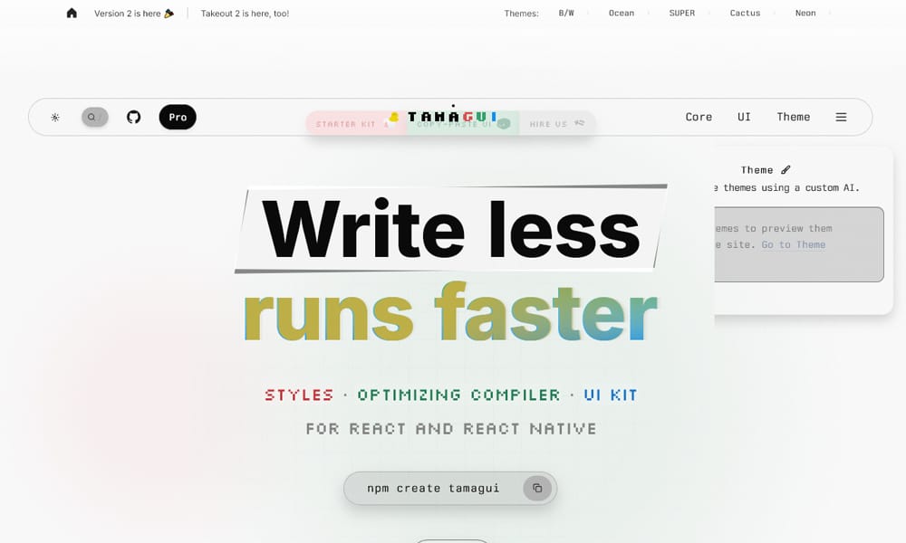
Tamagui’s pitch is universal components — write once, render on web and React Native. The compiler optimizes styles at build time, which is genuinely impressive for performance. For RSC, it works but with caveats: the compiler is happy, but the runtime still leans on client-side logic for theme switching and platform detection.
If you’re shipping a web app and a React Native app from the same codebase, Tamagui is one of the better options in 2026. If you’re web-only, the compiler complexity is a cost you’re paying for value you won’t use.
Key Features:
- Universal components for React Native and web
- Build-time CSS extraction via custom compiler
- Strong theming with cross-platform tokens
- Handles platform-specific code paths automatically
Best For: Teams shipping a React Native app and a web app from one codebase.
Pricing: Free + Pro (free plan includes core library and components; Pro adds Tamagui Studio, additional themes, and starter templates)
Real-World Note: The compiler setup is the longest configuration step of any library here — budget a real day for first-time integration.
React Admin
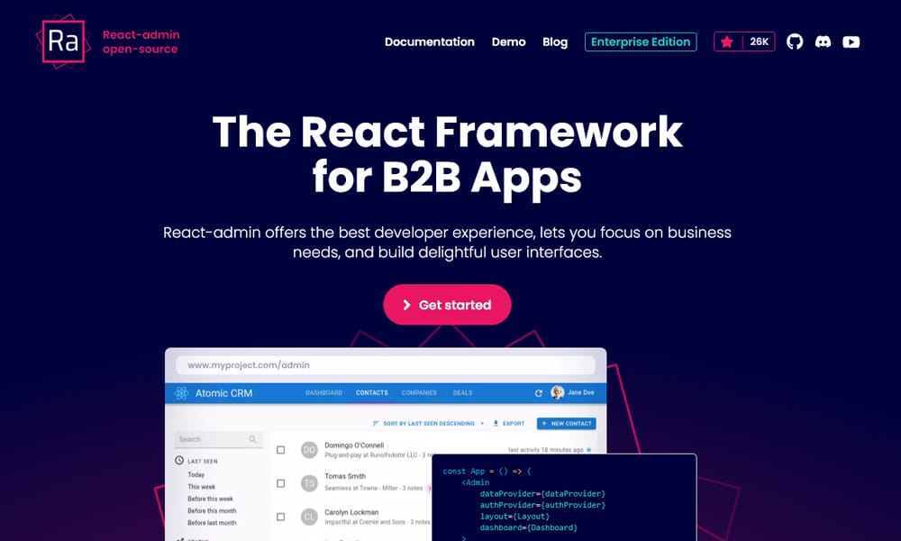
React Admin is a different category — it’s a frontend framework for building admin UIs against any REST or GraphQL backend, not a generic component library. It scaffolds CRUD views, list filters, edit forms, and authentication flows from a data provider. RSC compatibility is largely beside the point: admin apps are inherently interactive, and React Admin is built around client-side data fetching.
If you’re building an internal tool where the requirement is “give the operations team a UI for this database,” nothing in this list will save you more time. If you’re building anything customer-facing, this isn’t the library you want.
Key Features:
- Framework for admin and back-office UIs
- Data provider abstraction for REST, GraphQL, and custom APIs
- Built-in list, edit, create, and show views
- Authentication and authorization patterns
Best For: Internal CRUD tools and back-office admin panels.
Pricing: Free + Pro (free plan covers core admin functionality; Enterprise Edition adds advanced modules like real-time, audit logs, and dedicated support)
Real-World Note: Don’t try to use this for customer-facing UIs — the patterns optimize for internal-tool ergonomics, not branded experiences.
React Suite
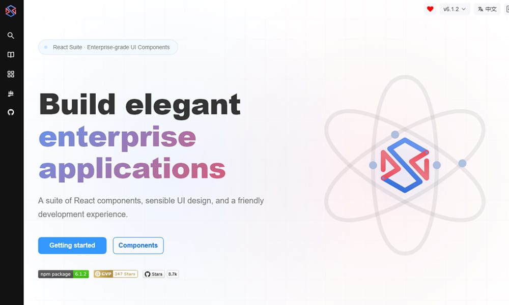
React Suite is an enterprise-leaning component library with strong form components and one of the better date range pickers. It overlaps significantly with Ant Design in audience but is less dense and arguably easier to style. RSC support follows the same pattern as the rest — most components client, layout pieces server.
It’s a credible alternative to Ant Design for teams that want enterprise component depth without Ant’s visual heaviness.
Key Features:
- 70+ enterprise-focused components
- Strong date and form pickers
- Less visually heavy than Ant Design
- Good documentation with live examples
Best For: B2B apps that want Ant Design’s coverage without Ant Design’s visual weight.
Pricing: Free
Real-World Note: Smaller community than Ant Design or MUI — fewer Stack Overflow answers when you hit edge cases.
React Bootstrap
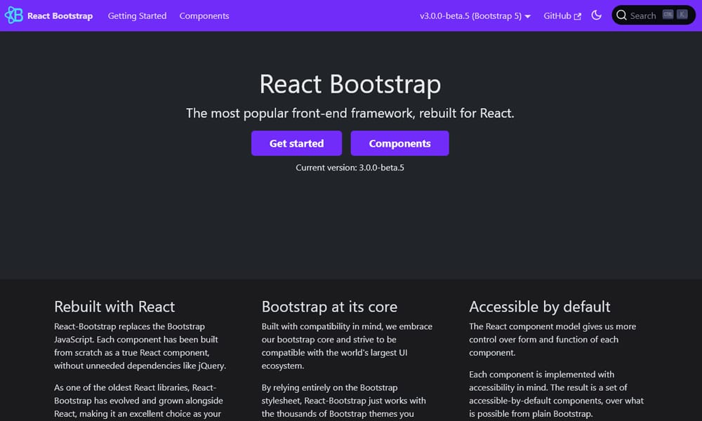
React Bootstrap is exactly what it sounds like — Bootstrap components rebuilt as proper React components without jQuery. It’s still actively maintained, but in 2026 it’s a niche pick. RSC works for static markup; interactive components like Modal, Dropdown, and Toast require client rendering.
The reason to pick it is consistency with an existing Bootstrap codebase or a team that already knows Bootstrap classes. Otherwise, the design feels dated next to Tailwind-based libraries.
Key Features:
- React components matching Bootstrap markup and classes
- No jQuery dependency
- Works with any Bootstrap theme
- Familiar API for teams coming from Bootstrap
Best For: Existing Bootstrap projects migrating to React.
Pricing: Free
Real-World Note: New projects in 2026 are better served by Shadcn/ui or HeroUI — Bootstrap’s visual language is showing its age.
Semantic UI React
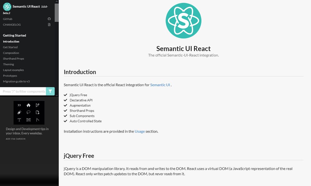
Semantic UI React is the official React wrapper around Semantic UI’s CSS framework. The original Semantic UI project went into maintenance mode years ago, and while a community fork (Fomantic UI) is still active, the React wrapper hasn’t kept pace with modern React patterns. It works, but you’re picking it for legacy reasons.
For new RSC work in 2026, this isn’t a serious option. It’s listed for completeness because it still appears in some legacy codebases.
Key Features:
- React components for Semantic UI CSS framework
- Descriptive class-based theming
- Large component set
- Works with Fomantic UI for active CSS development
Best For: Maintaining existing Semantic UI codebases.
Pricing: Free
Real-World Note: The original Semantic UI is no longer maintained — check Fomantic UI compatibility before any new commitment.
Base UI
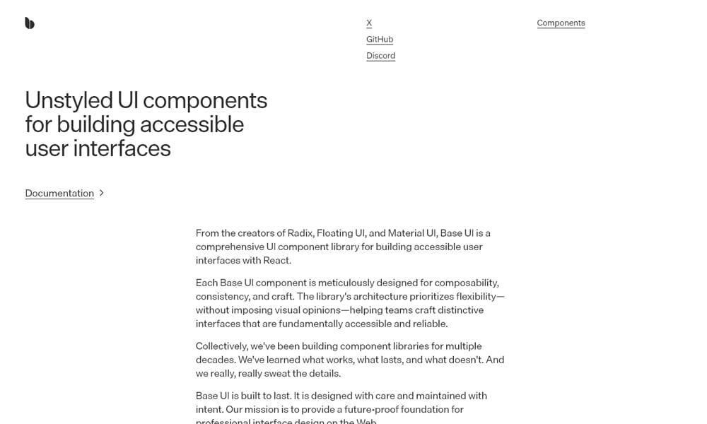
Base UI is the MUI team’s response to where component libraries are heading: unstyled primitives, RSC-aware, designed for the App Router from day one. It’s effectively MUI’s bet on the post-emotion future. Components ship with explicit “use client” boundaries scoped to interactive parts, layout primitives stay server-rendered, and the API is closer to Radix than Material UI.
For new App Router projects in 2026 that want the polish of the MUI team but without MUI’s legacy weight, this is the obvious pick. It’s still maturing — fewer components than Radix today, smaller community than Shadcn — but it’s the direction the team is investing in.
Key Features:
- Unstyled, accessible primitives from the MUI team
- Designed for Next.js App Router from the start
- Composable API similar to Radix
- Replaces MUI’s legacy theming layer
Best For: New RSC projects that want unstyled primitives backed by an established team.
Pricing: Free
Real-World Note: Component coverage is still catching up — for a missing primitive, fall back to Radix in the same project.
How to Choose the Right UI Library for RSC
Three questions decide most of this. First: how interactive is your app? Marketing sites and content-heavy pages reward libraries that maximize server rendering — Shadcn/ui, Tailwind UI, DaisyUI, Base UI. Heavily interactive admin tools barely care about RSC because everything is a client component anyway — Mantine, Ant Design, and React Admin make more sense.
Second: how much do you want to own? Copy-paste libraries (Shadcn, Magic UI, Park UI, Tremor Raw) put the source in your repo and demand more maintenance discipline. Traditional libraries (Mantine, MUI, HeroUI) are dependencies you upgrade. Both are valid; the choice depends on team size and how often you’d customize.
Third: what’s your accessibility bar? If real audits happen — React Aria Components and Radix are the floor. If you want accessibility “by default” without thinking about it, both libraries (and the things built on them, like Shadcn) are the safe pick.
Frequently Asked Questions
Which UI libraries work best with React Server Components?
Libraries that scope client behavior tightly to interactive primitives work best — Shadcn/ui, Radix UI, Base UI, React Aria Components, and Tailwind UI are the strongest fits. They let you keep layout, content, and static elements on the server while opting into “use client” only where stateful behavior is needed.
Is Shadcn/ui a real component library?
Not in the traditional sense. There’s no npm package shipping components — the CLI copies source files into your project and you own them from that point. This makes updates manual but gives you full control over “use client” boundaries, which is why it pairs well with the App Router.
What’s the difference between Radix UI and Headless UI?
Both are unstyled, accessible primitive libraries. Radix has a wider scope (25+ patterns including Tooltip, Slider, Select) and a more composable Root/Trigger/Content API. Headless UI is narrower (about ten components) and pairs more naturally with Tailwind UI and Tailwind CSS.
Do I need RSC-specific libraries, or do existing libraries work?
Existing libraries mostly work — the question is how much JavaScript ends up in the browser. Older libraries built around context-heavy theme providers (MUI v5, Chakra v2) push the client boundary high; newer ones (Base UI, Shadcn, Park UI) keep it scoped. You can use any library in an RSC project; you’ll just ship more or less JS.
Conclusion
For most new App Router projects, Shadcn/ui is the best starting point — you get a curated component set built on Radix, you own the code, and the “use client” boundaries are visible and editable. Base UI is the strongest alternative if you want unstyled primitives from an established team and intend to build your own design system on top. For accessibility-critical work — government, healthcare, regulated industries — React Aria Components is the experienced pick, with deeper i18n and interaction patterns than the alternatives.
Bookmark this for the next time you’re starting a project, and try Radix or Shadcn free in a small spike before committing your team to anything paid.