Websites Using Beautiful Typography
Whether website viewers realize or not, typography is one of the strongest communication tools in web design, both in the literal sense of conveying the written word – as well as in the subtle power of emphasizing a message through its style and design. A lot of thought, experimentation and trials go into type design; for a successful and cohesive web design, the principles of typography are important to understand. This is a guide to help you get started in learning the different aspects of type design, and a showcase of websites using beautiful typography.
Getting Started
Associated Meaning
Before you start experimenting with typefaces and styles in your web design, consider the message that your site is sending – and how your type usage will reinforce that meaning. For example, a professional website needs to feature professional-looking typography, rather than a mixture of your favorite festive fonts. When choosing a typeface, think about how often it’s used and what viewers are likely to associate it with, which can either weaken or support the message you’re attempting to send.
Emotional Response
Much like other elements of design, like color and layout, typography can evoke emotional responses in viewers. Shape, weight, edges, uniformity, ornamentation and spacing can all affect the way a viewer feels or thinks about a site. For an effective design, these likely responses should line up with your site’s intended message and impact.
Legibility
Type can be a bit more difficult to read on a computer screen than on print, so it’s important to think about layout and the way different styles and fonts will complement each other. Display type is the style you’ll use for headers, titles and navigational elements. It’s typically a bigger and bolder style, as its purpose is to attract attention and direct users. Text type is used as body copy and larger amounts of text, and is smaller than display type. The two styles should work off each other by providing a natural path for the viewer’s eye to follow.
The actual spacing in type is also important for legibility. Leading, kerning and tracking refers to the space between letters, words and lines of text. By adjusting these spaces, you can create a more legible layout of text, as well as emphasize your site’s style and message.
Lessons and Tutorials
As you learn the ins and outs of type design, getting started and continuing to learn through online lessons and tutorials can be very helpful. There are endless online tools that can help you in understanding important principles, choosing styles and even designing your own letterforms and layouts.
Sites With Beautiful Typography
Caava Design
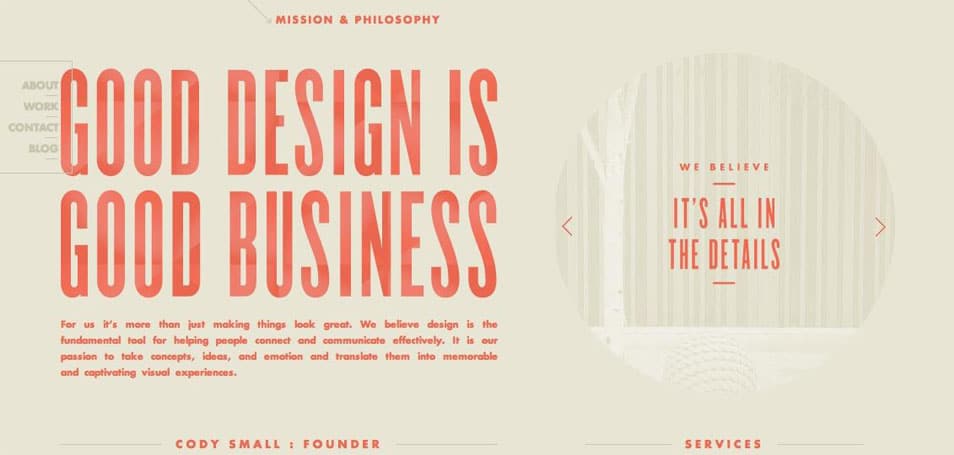
The smooth sans serif type used in this site develops a clean aesthetic that allows the reader to enjoy the content without being distracted by it and pulled away from the portfolio pieces.
Cyril Masson
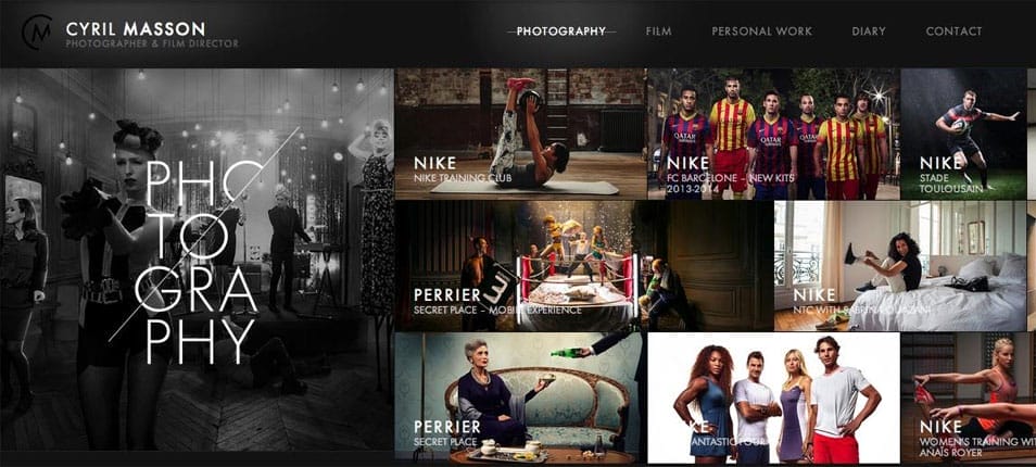
This distinctive type style is carried throughout this site, from the logo to the navigation. Its thin, hard-edged style reflects the solid professionalism and crisp quality of the photographer’s work.
La Jungle

This homepage shows how type design can act on its own to make a statement. The fancy logo is offset by a less stylistic, yet strong navigational typeface.
Theme Trust

For a site that claims to offer beauty and function, its type design is effective in enforcing this message. The bold, soft edges and contrast in weight in this type usage reflects the brand’s image of being trustworthy and of high quality.
Your Turn
Take these examples as inspiration in your own design work, and take advantage of the vast resources available to help you learn and grow in your skills.

