Fashion, Color & Web Design
Web designers and fashion designers alike have personal styles, sources for inspiration, and changing trends to keep up with. So it’s no surprise that web designers often look to fashion for inspiration, and vise versa. The most obvious and easiest trends to borrow from when creating a fashion are those that involve color. Color blocking, wild patterns and neons have all transitioned from the runway to websites in the last year, but, keep in mind, just because something is on-trend doesn’t mean it works for your site.
High fashion has a reputation for being over the top, which is fine for the runway, but needs to be fully thought out before being implemented elsewhere. The most important thing to remember when designing a fashion website is to make sure that it is useable above all else (although beautiful photography helps as well). The consumer needs to recognize the style and easily be able to obtain the product, for which you can rely on e-commerce software to provide the support you need.
See also : Spam Protection – Regain Control over Your Inbox
Online fashion stores with excellent design and functionality
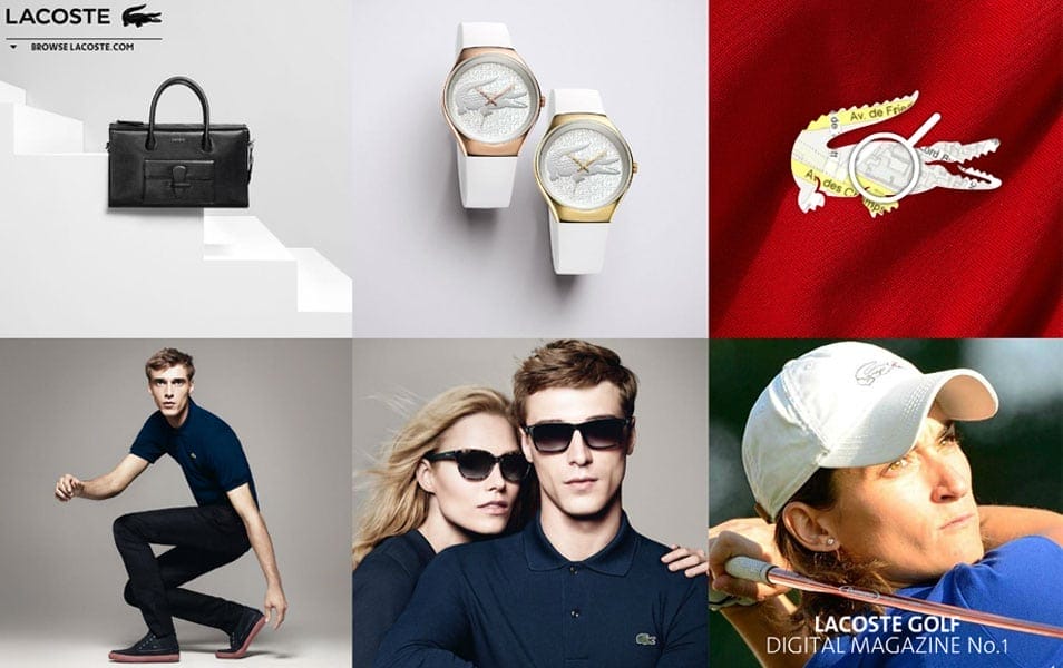
Lacoste clearly knows their market well. Fresh blues give it a classic feel, but the bold reds and pinks on light backgrounds make it feel young and exciting while drawing the viewer’s eye to important links.
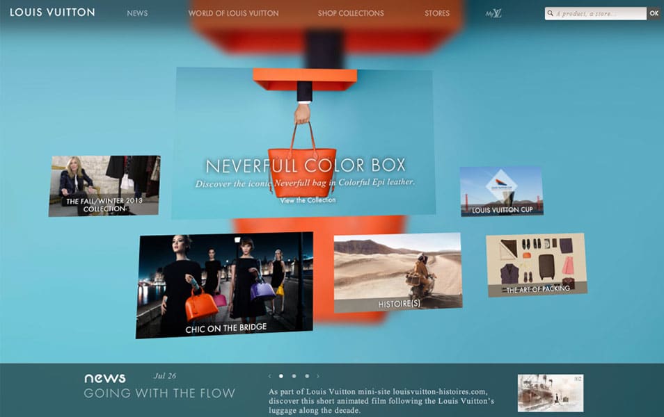
Just hearing the name Louis Vuitton brings to mind lavishness and class, and that is exactly the style they bring to their site. Rich jewel tones of red and gold exude luxury, and having the images react to the movement of the cursor keeps the visitor focused on what’s important.
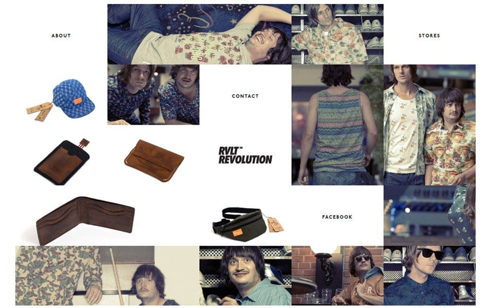
Hipsters are the target market for RVLT, and they have created the perfect site to attract them. Unconventional models with long hair and mustaches present products in overexposed snapshots taken in the everyday setting of a bowling alley. Hipsters don’t want anything to do with high fashion, so this site makes them feel right at home.
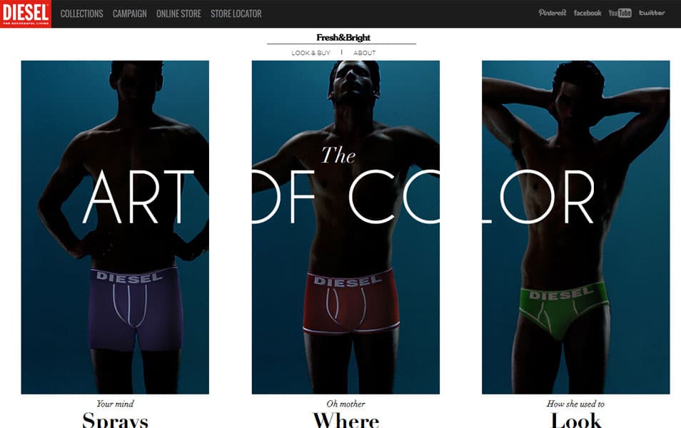
To the outsider, everything in the fashion world is perfection, with never a hair nor hemline out of place. Diesel showcases this image of flawlessness with darkened models in muted shades of red, purple and green, and then exposes the natural setting with the movement of the cursor. They let the viewer know they are in on the secrets of fashion and can share it with the consumer.
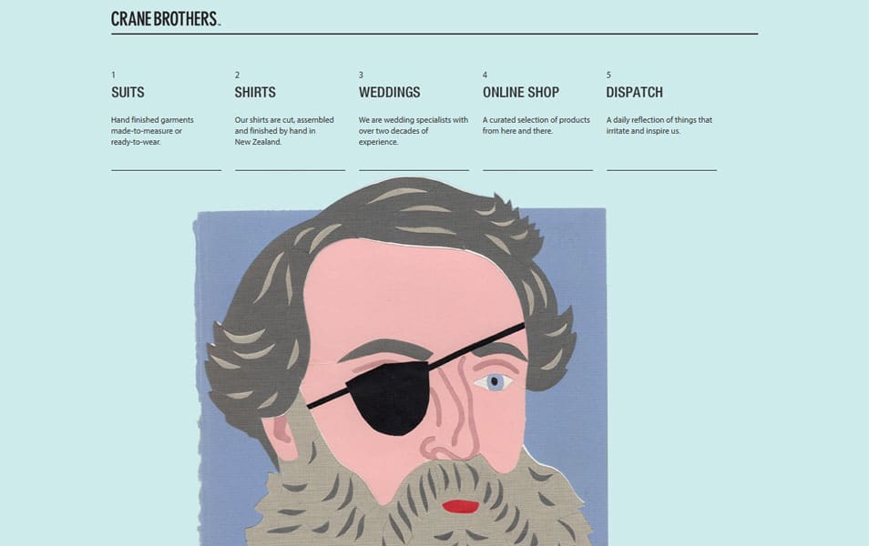
Crane Brothers uses a vintage color palette of greens, blues and grays to give their site a classic but fresh feel. The quirkiness and wonder created by the man with an eye patch gives the viewer a taste of the kind of man who dons their clothes.
Creating a fashion site doesn’t have to be difficult, you just need to make sure the trends you borrow make sense with your brand. Take something that’s on-trend and make it work for you, whether you choose the latest color, cut or just work to harness the attitude of a popular style. And while fashion trends tend to be more wild and free with their color palettes, some toned-down version of the biggest trends always manage to find their way on to the web, so take a risk and have fun with it.

