Inspiring Product Pages that Will Help Your Ecommerce in 2014
If you look at a lot of eCommerce sites at once, you might notice an unfortunate trend: while many companies invest in creative and beautiful graphics on their home and category pages, they often default to the same old looks when it comes to their product pages. It’s a pity, because the few sites that do something thoughtful and interesting with their product pages make a great impression. Just take a look at a few of the more inspirational sites out there:
See also : How to Optimise Your Site to Improve User Experience
1. Unusual Treatments Suit Unusual Products
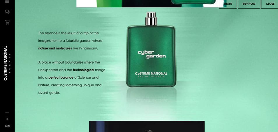
While most of the products being sold on eCommerce sites are suited to a fairly standard layout and description, there are some items for which these defaults makes less sense. Take perfumes, for example; the only product purveyed by Costume National Scents. A purchase of perfume is all about the scent; there’s only so far you can go when selling it online. So instead of just showing a picture of the bottle, the company has decided to frame its product pages like a story, letting the viewer scroll down through poetic descriptions of the fragrance.
2. Give a Personality to Your Products
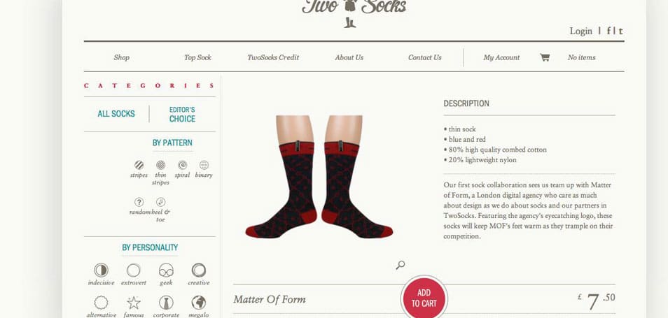
Just as your site design as a whole should be customized to cater to your target audience, so should the way that you display you individual products. Use bold neon color blocking for snowboarding gear, or sophisticated phrasing for a wine store, and your customers will be better able to identify themselves in your products. A site like Two Socks is a good example; their socks are obviously quirky and fun, so the page design mirrors that: the descriptions are playful (“These socks will keep MOF’s feet warm as the trample on the competition”), and the option to search by personality is also a great touch.
3. Make Your Products Feel Covetable
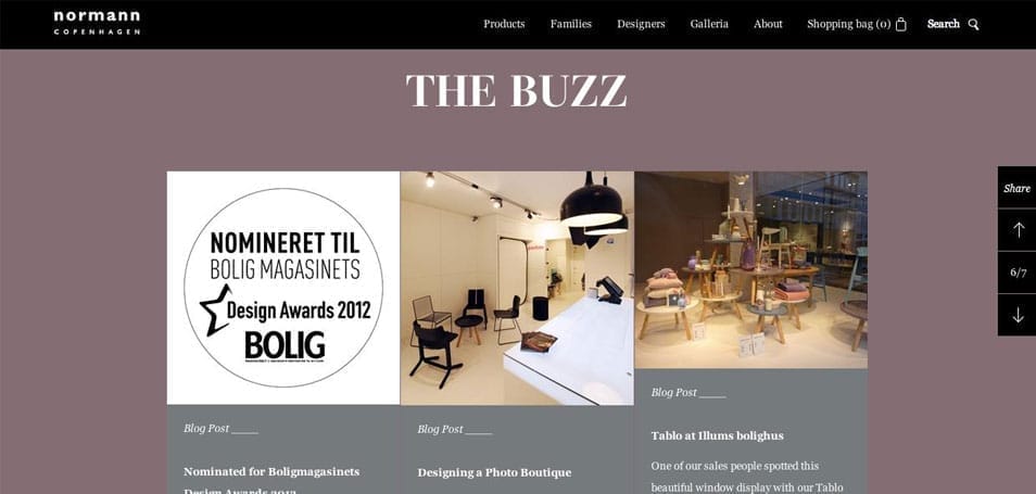
Don’t be shy about including popularity markers on your product pages. A lot of sites curate categories of their most popular items, or feature testimonials from satisfied customers. Some fashion retailers post images of celebrities wearing their goods. Normann Copenhagen has a section in its product pages that highlights awards their furniture has won.
4. Product Pages Should Fit the Scale of the Site
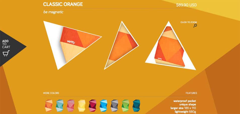
Of course, it’s all well and good to point out all the slick treatments that you can use to embellish your product pages. But for eCommerce sites that have a very simple, narrow range of products, that doesn’t make very much sense. For example, Vertty sells nothing but its line of geometrically angled towels; the only difference between each product is the colorway. But while there’s not much to say about each item individually, that doesn’t mean that the site can’t look fun and unique. In fact, because their product line is so straightforward, the company can afford to use a site design that might be a little too funky and overwhelming for a retailer with tons of products that require a lot of additional information.
5. Reducing Visual Clutter Helps the Product Stand Out
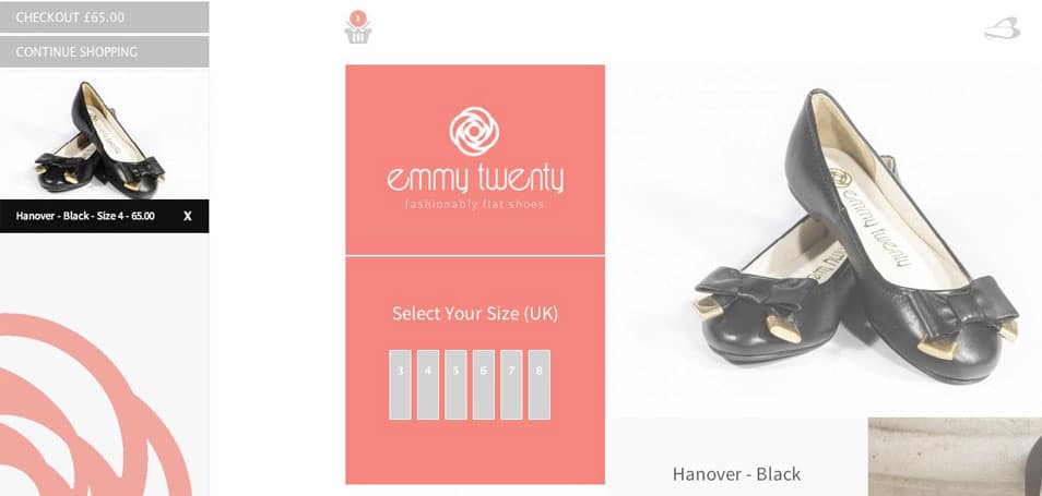
A comprehensive product page usually includes so much information that it can be difficult to make your layout look clean. One of the most common ways to do this is to move a lot of the information below the fold, but that’s really not ideal as it moves customers away from the product photography and the purchase button. In contrast, Emmy Twenty’s layout has much to admire: the icons along the top do away with a traditional navigation bar, instead opening up in dynamic, vertical panels when they’re clicked. This makes the presentation immeasurably cleaner, and keeps almost all the information above the fold.
6. Small Hints Make a Big Difference
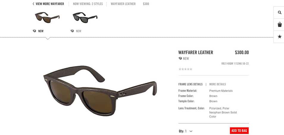
Icons are a great way to reduce visual clutter, but sometimes designers go too far and assume that users know what a cryptic image means. While a shopping cart icon is easily understood, something more abstract might pose a problem for your average shopper. Ray-Ban provides a great example of how to deal with this in its right-hand navigation. As you scroll down a new product page, each icon shows a pop-up describing its function, leaving the three simple icons in their wake (rolling over them shows the description again, should you need a reminder). It’s a clever, subtle way of keeping the page as clean as possible while keeping its functionality clear.
7. Direct Your Viewers’ Attention
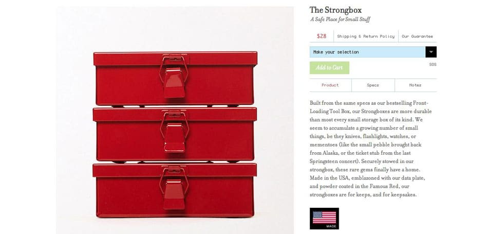
Sometimes site designers get a little carried away with creative layouts, and forget to address basic page flow. Everyone has experienced that twinge of irritation when a webpage doesn’t work the way they expect it to, but you can eliminate the issue by emulating Best Made Co.. Their product pages subtly guide the eye with color to hint that you must make a size selection before you’re allowed to put an item in your cart.
8. Encourage Reviews or Ratings
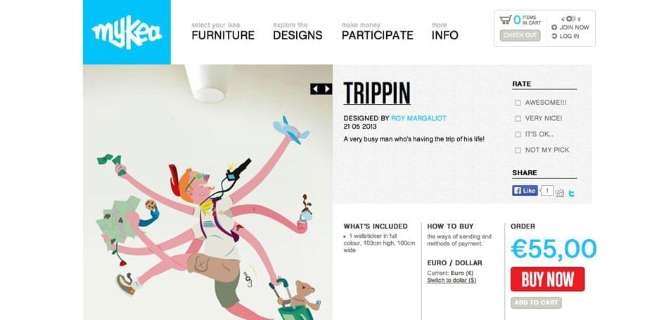
Now more than ever, people expect to see user feedback on eCommerce sites. But it’s difficult to get such a complicated addition up and running. For some kinds of sites, like Mykea, it’s a good option to add in a ratings system that isn’t restricted to purchasers.
9. Don’t Underestimate Simplicity
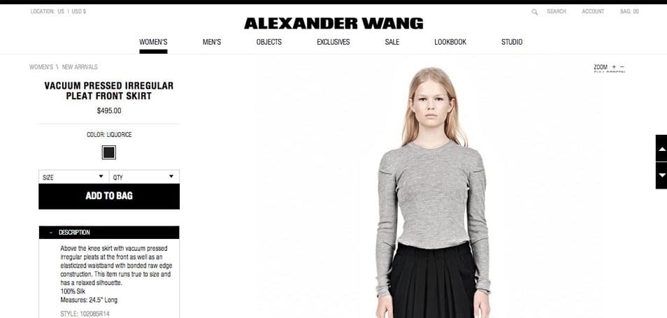
When it’s done right, a perfectly organized and easy to use product page can be just as attractive as one with lots of gadgets. When you look at Alexander Wang’s monochromatic site, it feels sophisticated and restrained. If your target audience prefers polished over flashy, this is an effective way to appeal to them.
10. Clever Navigation Should be Balanced By Site Speed
Ayr seems to solve the problem of hidden information discussed above; you can scroll through five different views of their jeans as it describes various features, while their selection details and cart button remain intact along the bottom of the page.
There’s no doubt that the site has some wonderfully fun navigation. But on the other hand, the page is so complicated that the site takes an unusually long time to load. One can only imagine how difficult it would be to navigate on a mobile device. And at a time when web users are increasingly more irritated by slow loading times, it’s probably wiser to stick with less impressive features in order to gain greater speeds.
While 2014 will likely bring a crop of new and exciting improvements, it’s clear that there’s still much to learn from when it comes to current eCommerce sites. Make sure to take a look at other ecommerce showcases for more inspiration.

