Important Guidelines for Building a Mobile Website
The smart phone has, by the admission of the web design industry in general, taken everyone by surprise. The way more people own and use smart phones than were forecast to do so at this point in the technology’s evolution and this has meant that a lot of brands have been caught napping.
People who were using a smart phone as recently as a year ago will vouch for the uselessness of many mobile phone-adapted websites even from some of the biggest online names. Mobile sites were either poorly-designed placeholders, which made it virtually impossible for users to find the same kind of information or experience they were used to from the site’s laptop and PC equivalent; or they were essentially just squashed versions of the original site, which took forever to load and couldn’t be operated on such a small screen.
See also : Take Your Mobile Strategy to the Next Level
2013 is touted to be the year of the smart phone site. So now seems like a good time to investigate the design mores most pertinent to building a mobile website.
The first, naturally enough, has to do with size. A mobile phone doesn’t have a 15 inch screen. So sites that have been doing perfectly well for years on PCs and laptops may have a problem. Too much information on a little screen means no one can read it, and therefore no one is likely to use it; this becomes a real problem if brand competitors have worked out how to display the same kind of information in a much more user friendly way.
This is a real threat for any brand with an online presence. If a smart phone becomes the most popular way to view and use brand’s sites, then the prevalence of a brand within a marketplace could be challenged by another, whose designers have done the work and built the site that really works on a mobile phone. Lackadaisical brands may be forced into reactive design by enterprising competitors getting ahead of the curve.
Touch screen technology is clearly another huge consideration for mobile site design. The touch screen doesn’t work the same way as a mouse and pointer – it allows for a much more intuitive and complex series of interactions with the data and information presented. Sites traditionally designed for working with mice will, over time, be replaced by sites that are designed to work with the physical nature of the hardware.
Interestingly enough, this could conceivably have a knock-n effect for device design. If smart phones become the device of choice for browsing the web, then websites are likely to move towards working with touch screens in mind. If this happens beyond a certain point, it seems likely that all future laptops and PCs will have touch screens as well.
Data transfer is important for all site design. Mobile sites must use much smaller levels of data if they are to load and work properly while using the uneven connection of a phone network. As such, site design moves towards a cleaner, smaller and simpler overall aesthetic as it aims to retain speed of use despite potential connection issues.
Some Good Examples of Mobile Websites
Invision App

Peapod Studios

United Pixelworkers

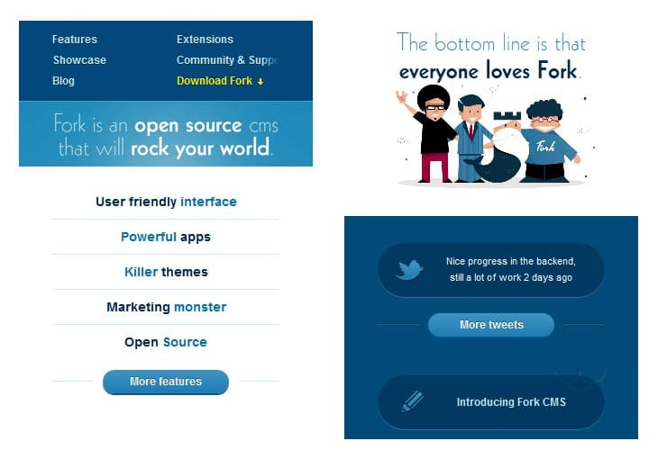
Fork CMS

Tripobox

Oliver Russell

Grey Goose

Heathlife

Gravitate

Sparkbox

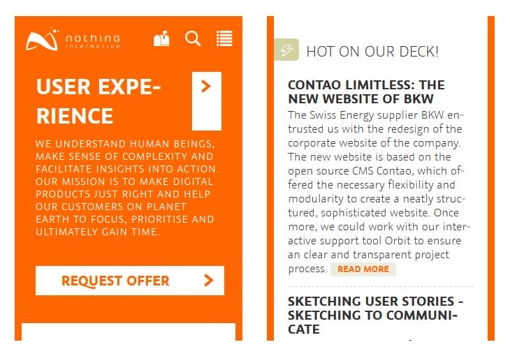
Nothing Interactive

Stephen Caver

Knock Knock Factory


