Send a Message With Your Color Scheme
Of all the websites you see in a day, how many really stand out and make you want to pause and browse the content? How many truly represent the brand and product? Choosing stock colors may help your site go live faster, but it’s not going to work for you in terms of communicating with your audience.
Understanding the psychology behind the colors you chose to represent your brand is vital. Research shows that color increases brand recognition by up to 80 percent, and 92 percent of people agree that visual factors are most important when purchasing a product.
See also : Is Responsive Web Design Really The Future?
Color can also evoke emotions and stimulate the body to respond accordingly. Studies show that athletes who wear red win more often because they are “perceived as more dominant and threatening.” And many restaurants paint their interior in warm-toned hues like orange and yellow because it’s been shown to increase appetite.
Looking at some of Amazon Webstore’s partners as examples, it is easy to find some websites that have chosen smart color combinations.
Lesser Evil snacks sells healthy, organic snacks free of GMOs, which the green and yellow tones reflect nicely on the light-blue background. They avoid any dark or heavy shades that would imply a decadent product and instead opt for light, angelic colors that convey guilt-free snacking.
Rodd and Gunn clearly knows how to convey an image of elegance and class. The khaki-colored name and navigation elements stand out against the rich brown background, conveying a sense of richness, warmth, and elegance that comes with an upscale country club membership.
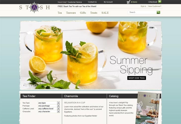
Stash Tea uses vibrant pinks and greens in their summery color scheme. The pink focal points are set off by the use a cool, light teal background, which gives the site an overall refreshing feel—perfect for a company selling summer teas.
Pipeista knows that they provide a superior product and let the vibrant colors of the clothes stand out against a white background. They use a shade of gray that contrasts without seeming jarring against the stark white. Their choice of background portrays the classic and elegant look they know their customers want to emulate.
Tools to help you create a great color scheme for your site
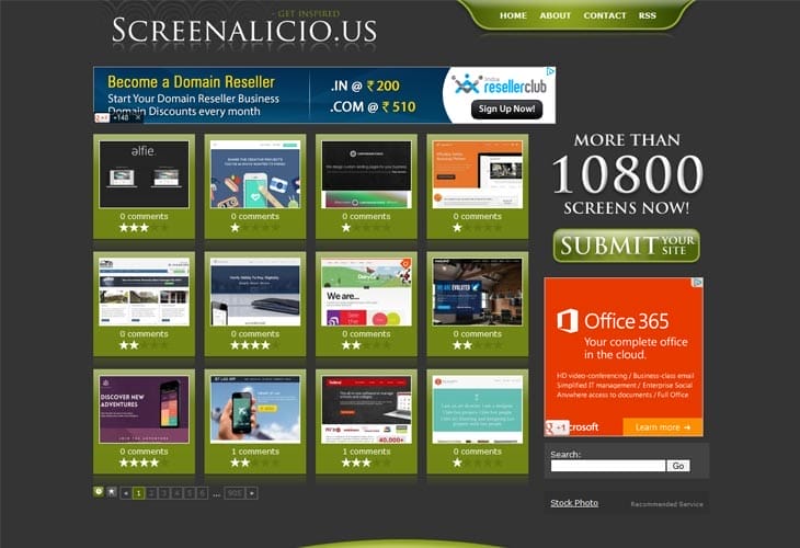
Peruse a gallery like Screenalicio.us, a showcase of innovative websites, to get inspiration for color schemes. Ask yourself if each sites matches the product and invite you to go further, or are you immediately looking for the next site? Are navigational elements easy to find or will they be lost in the background? What colors draw your attention immediately?
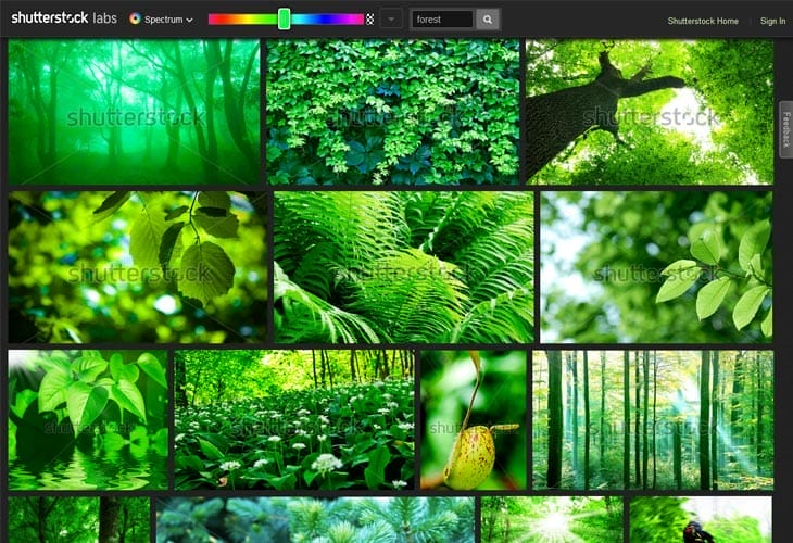
To get an idea of what color scheme would best represent your brand, check out Shutterstock Color Spectrum. This tool allows you to combine any color with different objects then generates images combining your choices. You could go classic with by choosing “yellow” and “bananas”, or you could challenge it with “blue” and “monkey” to see what comes up. It inspires creativity and could help you conjure up combos you have never thought previously.
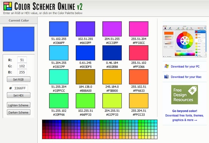
Color Schemer allows the user to either choose a color from their display or enter a RGB or HEX value to generate a pallet for you, complete with all the numbers to allow for easy duplication.
Colors have a history and life of their own and need to be seriously considered while creating your site. The wrong shade of green for your upscale boutique may conjure up thoughts of John Deere instead of Tory Burch. Color alone could make a consumer unknowingly establish feelings they will forever associate with your product, so choosing the right ones could mean retaining a customer for life or losing them forever.

