Function Over Form… or Vice Versa

Designing a web page is often thought of, from the outside, as either a task that requires a creative artist, or tidy-minded planner. The truth is, it is both.
See also : Choose Your Website Design Wisely
A website needs to be aesthetically pleasing, but functional, and a lot of first-time web designers often fall into the trap of being too much of one and not enough of the other. Their websites either look amazing, but are almost unusable, or are usability incarnate, but make your eyes hurt. It’s not difficult to establish which of these you might be in danger of being. If you like to start designing your web page in Notepad, with nothing more than a blank page and your HTML/CSS knowledge, you may find your design suffering. If you prefer to start in GIMP, or Photoshop, and code later, you may be in danger of putting too much emphasis on design, and not enough on usability. Both methods are fine, of course; it’s whatever works for you. But, if you know your weakness, you can make sure it doesn’t ruin your work.
Finding the Balance
The right balance will depend on the purpose of your website, of course. It may be beneficial to put the design before the usability in some cases, but a site should never be so difficult to use that visitors just give up and leave.
It’s usually a safe bet to aim for simplicity. This works both for the look and usability of the site. The simpler a site is, the easier it will be to navigate, and simplistic art styles are often more attractive than cluttered (or “messy”) ones. Lots of colours, crowded images, and difficult to distinguish navigation menus are all signs that you can expect your landing page to be more like a bouncing page.
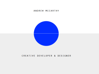
Sticking with the simplicity angle, don’t be afraid of white space. White space can often give emphasis to parts of your site in a way that a border, line, or image wouldn’t. Also, white space in bodies of text, such as between paragraphs, can really make the text more readable. That said, try not to go crazy. A white screen with one paragraph of text in the middle can look just as bad as page crammed with so much text it makes your eyes hurt.
Stay Focused
It’s important to keep the ultimate goal of the website in mind. If you or your client is looking to move product, that means different design choices to, say, a website that is designed to be informative only. A sales site will need a means to buy whatever product is being sold to be clear and easily reached from any part of the site. You don’t want potential customers to have to work to give you their money. On the other hand, a site that is about the content – articles, blogs, information – should have definite emphasis on said content. Don’t draw attention away from the important text with flashy design features, or unnecessary reams of text crowding around it.
A common mistake among web designers who are more into the design aspect of the job is that of not paying enough attention to the performance of the sight. Remember, web pages are effectively uncompiled code, and your browser is rendering that code on the fly. It doesn’t take a particularly slow machine to struggle with some of the more code-heavy websites. Avoiding sloppy and inefficient coding can help prevent your site from being bogged down, or becoming slow and unresponsive. Especially where flashy scripting is used for those nice effects.
Responsive Design
On the subject of responsiveness, responsive web design is a must in todays world of varying devices. You can never be sure if a visitor to your site will be surfing there on a thirteen inch laptop, a twenty one inch monitor, or a four inch phone. And there’s tablet PCs, televisions, and a whole host of sizes in between. Make sure your web sites can cope with these differences in screen size.
Try to remember your audience. If you are designing a website for a corporate entity, or some other professional business, like a freelance lawyer, or dentist, don’t stray too far from convention. Things like left-hanging sidebars, and header navigation may seem tired and overused, but they’re overused for a reason – because people are comfortable with them. There will be times when the conventions can be played with, but don’t try to reinvent the web page when the client just wants a usable website.
Choose Your Colours Carefully
Finally, and, possibly most importantly from an artistic design point of view; choose your colour scheme carefully. You need contrast, otherwise your site will be unreadable, but you don’t want your design and text to “glare” at your visitors. Avoid combinations of basic yellow and green, for example, because they look terrible, but don’t put a dark grey font over a light grey background, because a lot of people will struggle to read it, and inducing eyestrain is a quick way to lose a visitor to your website.
Always Test Your Website
When you think you’re done with your masterpiece, be sure to get a second opinion. This is especially important on projects that have taken a long time to complete; when you’ve been staring at a project for some time, it can be difficult to see problems with the design or function. If possible, usability testing should be employed to ensure that your site is as user-friendly as possible. Obviously, that won’t always be possible, especially in cases of lone, freelance web designers, but, at the very least, you should be subjecting your site to the critical eyes of friends or family who are as close to the target audience of the website as possible.
One of the great things about designing for the web over, say, the medium of print, is that you can always revise your work. Websites can evolve over time as problems present themselves. Of course, you want to be as close to perfect as possible at the start, but don’t let the quest for perfection paralyse you into never making your site live.


