Choose Your Website Design Wisely

One way that a business can succeed or fall to its demise is by the design of its web page. Every business needs a web page to promote their products and service, even if they don’t own a retail store. Web pages advertise what products or services the business can provide, how to get more information on what they do and ways to contact them if they can be of service. The right kind of design will draw people in again and again to use and reuse what you advertise on the site. The wrong kind of web page layout can turn people away before they even figure out what the purpose of the business is. What considerations should be taken when designing a website from the ground up in order to ensure you have one attracting people and not repelling them?
See also : Function Over Form… or Vice Versa
Follow Normal Color Schemes

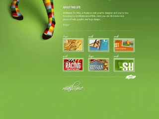
The trendy new style that mixes fluorescent and animal print might be really cool on a shirt or bedding but as background to a web page– not so much! Normal color schemes, as boring as they may seem, work best when setting up a page. Colors like beige, pastels and even small prints on those colors could work with dark text set against them. Normal colors can make it easier to read the text and to see the tabs that are laid out across the top to navigate through. Having potential customers be able to easily read your web page and attract more to it is your ultimate goal, not looking hip and trendy by using an offensive to the eye color combination. Boring is better, especially if it translates in to dollars in your pockets because of the design you created.
Make the Design Easy on the Eyes

Once the colors are picked out and are normal, make sure the page is laid out in an easy to understand way. Using templates already created that can be plugged in to a site are the easiest, and best route to follow for novices. Website templates are ones that are popular and easy to use for the end user once they are installed. There will be lots of options for sites that include pictures, places for videos, a blog and even if an e-commerce site needs to be set up. Choose the template that looks good but contains all of the elements needed for your business.
The design should also be easy to navigate through. There should be a few tabs that describe the basics of what a person might want to learn about the business that they can click on. Some examples would include their mission, about them, how to contact them, their history, a description of products or service or a page with bios of the staff. Depending on what the business is, not all of those tabs would be necessary. Create tabs that make sense for the business and explain it within that first tab so the customer doesn’t to click through to get more information unless they want to.


