

20 Awesome Responsive Web Design Tools For Designers and Developers

If we observe the stats and analytics report, it can be said that the adoption of mobile devices is skyrocketing along with the increasing diversity of smart devices including Smartphones, iPad, tablets, etc. This multi-device market is bolstering the mindshare for responsive web designs.
The responsive approach offers amazing benefits in the long run and helps create a successful online presence while saving time, efforts and money. If you are interested in creating a responsive website, here is a list of 20 best designing tools that can facilitate you to accomplish your task with utmost proficiency and ease.
See also : Drive User Engagement by Opting for Infinite Scrolling

1. Multi Device Layout Patterns

Get rid of all the confusions while sketching your responsive web design. The designer Luke Wroblewski offers an overwhelming list of layouts from which you can easily choose the best one for your site. It features numerous examples that epitomize how the existing content can be integrated in a responsive layout.
3. Skeleton

Pure CSS based framework, the Skeleton is quite popular among the web designers and developers as it doesn’t require hardcore JavaScript. This impressive tool allows developers and designers to efficiently develop a responsive web design by implementing its simple yet proficient functions.
4. Adaptive Images

Combine the Adaptive Images by integrating Fluid Image techniques. It doesn’t need any markup changes and proficiently rescales your website images according to the targeted device’s screen. This tool first analyzes the visitor’s screen size and delivers the embedded HTML image accordingly.
5. Webflow- Responsive Web Design Tools

If you are looking for a tool for developing a custom website without coding, the Webflow offers a brilliant solution. Simply drag and drop the desirable elements and get a professional website. It automatically generates the requisite code on the basis of the chosen designing elements. Moreover, it facilitates powerful HTML and CSS, so that you can blend your design in a desirable fashion.For businesses seeking scalable and advanced solutions, partnering with a Webflow enterprise agency can provide additional expertise and support for creating complex, customised projects.
6. Adobe Edge Reflow

Reap the benefits of this amazing tool and get into the nitty-gritty and coding components while designing your responsive website. The Adobe Edge Reflow not only accentuates the graphics editing, but also allows designers to handle responsive layouts with utmost precision. It is created to help you with grid systems, advanced CSS layouts, and media query handling.
7. Style Prototype

The Style Prototype is inspired from the Style Tiles curated by designer Samantha Warren. It allows one to represent a gist of colors, animations, typography, etc., that the website will boast via a static mockup. This will help you ensure your client satisfaction over the design in the very beginning of the project. And thus, you can avoid modifications that may demand a heck lot of efforts in the future.
8. Gridless

Implement Gridless boilerplate and develop a cross-browser site, which is responsive in nature and boasts astonishing typography. It is ideal to be used while beginning the website designing. This tool offers instant and efficient responsive web design as it supports dynamic project development approach.
9. Seamless Responsive Photo Grid

For an uncluttered, well-organized web design, the Seamless Responsive Photo Grid tool offers a great solution. With this tool you can showcase a bunch of images edge-to-edge without leaving any gaps in between the images on the browser. It will resize the image to fit the photo grids while maintaining the aspect ratio of each image.
10. Froont

With the Froont, you can easily design within the browser by simply dragging and dropping the requisite web elements. Thus, this tool allows one to visualize the website visual appearance while designing it.
11. Blueberry

It is a great responsive web designing tool that facilitates a jQuery image slider. The Blueberry tool is basically curated to nudge developers to think of more mobile-friendly designs and contribute to the responsive web development.
12. Pears

This open source theme from the massive WordPress repository allows one to create their own front-end style guide. So that, you can conveniently perform testing, create a shared vocabulary, establish an efficient workflow and a lot more. With Pears, designers can establish a consistent design system while contributing to a shared pattern library.
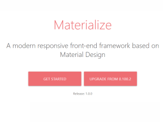
13. Bootstrap

Accomplish your responsive web development task with this sleek and intuitive front-end framework. The Bootstrap is created by Jacob Thornton and Mark Otto, and facilitates an amazing set of layouts, JavaScript tools and UI elements. You can use this tool in your project and create a desirable web design with ease; it is available for free.
14. Gridpak

Work more efficiently and improve your productivity by using Gridpak while designing the responsive website layout. It helps generate CSS, JavaScript and PNGs as per the requirements.
15. FitVids

Designed by Chris Coyier and Paravel, the FitVids offers a brilliant solution for embedding videos while adapting to the integrated fluid website designs. This latest tool uses CSS and JavaScript magic and delivers beautiful results.
16. Foresight.js

The Foresight.js is a proficient web design tool that determines the device’s screen-size and loads the hi-resolution assets only if the network connectivity is strong. Developers and designers can use this tool smartly to create an innovative and intriguing web design.
17. Flurid

Without hiding the pixels into the margins, the Flurid offers an easy-to-use CSS grid framework. It facilitates cross-browser solutions and permits grids up to 16 columns.
18. ProtoFluid

This is an amazing tool that allows effortless testing for responsive designs. With the ProtoFluid, you can instantly create a prototype for fluid layouts, responsive web designs and adaptive CSS.
19. Responsive Wireframes

James Meller has created this experimental tool by integrating CSS and HTML. The Responsive Wireframes provides visuals of your responsive web design and shows how it will appear on the live browsers on several mobile devices and desktops.
20. Responsinator

Look how your design page will load and look on various screen sizes of different mobile devices by simply entering your URL, using the Responsinator tool. It offers both landscape and portrait views.
These are a few of the wonderful responsive web design tools that can help both developers and designers to develop an innovative, trendy and effective web design. You can use any of the above mentioned tools and accomplish your task with utmost proficiency.


