A Guide to Create Minimalist Color Themes
Minimalism is a major trend among web designers, because it offers a clean aesthetic that allows users to enjoy the functionality of a website without being overwhelmed by unnecessary elements. In minimalist design, every aspect is important and must play a role in achieving the goal of the site or providing a positive user experience. This means every part of a web design should be thought out and created with intention. Color is a key factor in strategically directing users to your site’s purpose. Here are some different ways to develop effective, minimalist color themes.
Say More With Less
Color is a powerful tool in conveying a message or emotion. Consider the principles of color theory, and how certain hues have different psychological and emotional effects on viewers. For instance, blue is often used to instill a sense of security in users, and red builds up a sense of urgency and heightened senses. Decide which colors best reflect your brand’s message, and use them to convey that message effectively.
You can do this by placing color in important areas of the page, like on calls-to-action or copy to emphasize content. Using bright color sparingly can also guide users’ eyes to areas you want them to immediately notice; you improve their experience in this way, because they don’t have to work to find the important elements of the page that help them achieve their goal.
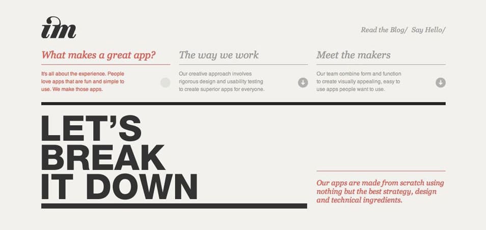
Image Mechanics has a very simple color theme that uses a noticeable color to attract attention to the content. Lots of white space allows for the eye to travel smoothly to the pops of color.

Strategic dabbles of color throughout this site unites the design and draws attention to important areas, content, and buttons.
Use Bright Colors
Bright colors can often take the place of navigational elements, because of their ability to communicate a message. This works especially well in conjunction with minimalistic imagery like icons and illustrations. Vivid color immediately commands attention and says something about the website. This doesn’t mean you should use several bright colors, but one that fills a space is a minimal and exciting design that creates interest for viewers.
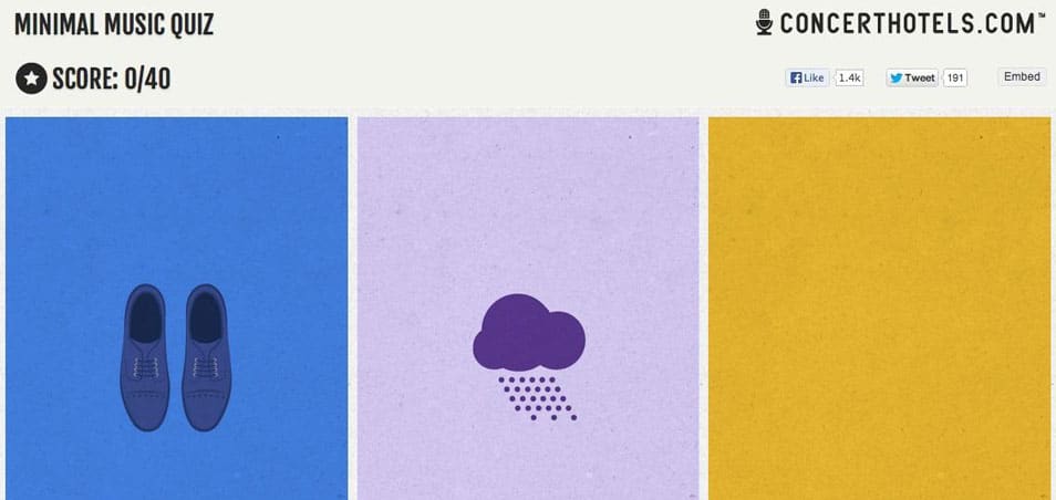
This minimal music quiz combines bright colors with simple imagery to create an engaging and charismatic user interaction.

This simple yet eye-catching color scheme instantly draws the viewer in to learn more about the brand.
Create Complementary Themes
Using color theory to create combinations is also an effective way to create a solid scheme. The formula that combines two hues that oppose each other on the color wheel is called a complementary theme. This particular combination creates an interest and contrast that might not be created with another type of scheme. At the same time – if chosen well – the two opposing colors create a balance and harmony that satisfies the user’s eye and keeps them engaged.
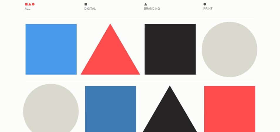
This minimal design uses geometric shapes and complementary colors to balance the page and keep the viewer’s eye moving.

This design shows that you don’t have to overuse complementary colors in order for them to balance each other; strategic placement makes their emphases effective.
Whichever direction you take in developing your minimal color scheme, remember to consider your audience, your site’s goals and the message you’re sending. Use color to your advantage by placing it with intention and functional purpose in mind.


