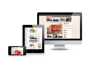
Trends to Focus on When Designing a Tablet Friendly Website
Why is a tablet-friendly design a necessity for a website? Initially, it was just Apple’s iPad. But with time the market has been inundated by an array of new tablet devices. Amazon Kindle, Google Nexus 7, Microsoft Surface and the list just goes on!
Don’t make a mistake; the tablet isn’t replacing the Smartphone. While many Smartphone users have tablets as well, there is a marked difference in the way individuals use these two mobile devices.
In such a circumstance, thinking in terms of a PC website won’t be adequate for a designer. You need to go beyond that. Certain mobile web design tactics may suit tablet devices. But is such a design adequate for tablets? No, it isn’t.
You may not need to create an independent tablet strategy, but you do need to come up with a website design compatible to tablet devices. But before you take a step in this regard, you need to understand the way these devices are used.
See also : G2VALID › An Easy PHP Form Validation Class
How do individuals use tablets? Tablet owners across the globe prefer to use their devices to access content and accumulate information. Users watch videos, get updates, read news and do a myriad other things on the devices.
The first thing to do is to make content consumption easy and effective.
The readers are used to the rich graphics and detailed visuals available from the assortment of apps. They expect the websites to have the same smart reading experience on their tablet devices.
Here are the trends that may help you when Designing a Tablet Friendly Website.
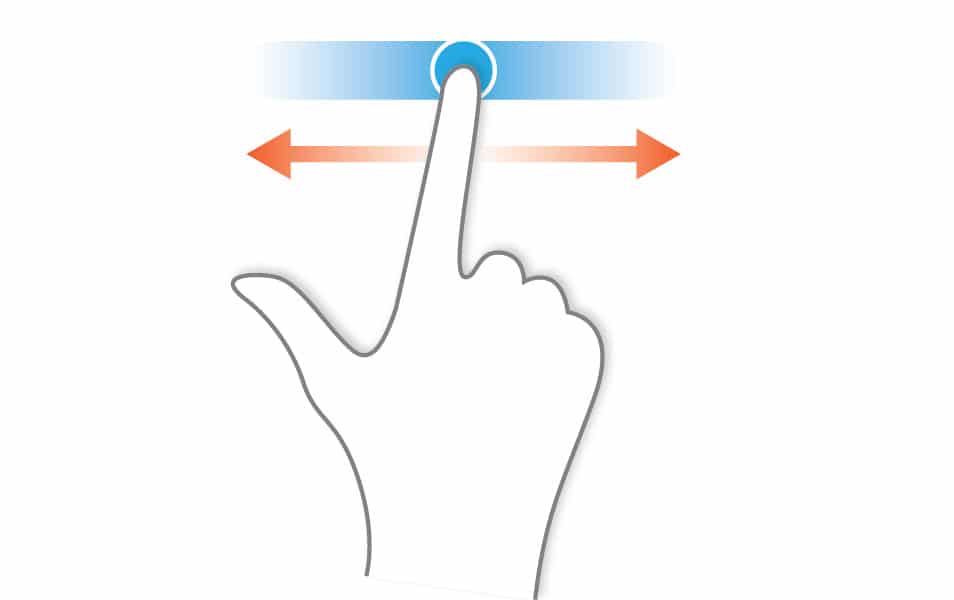
Trend 1: Use swipe and flick navigation

The vertical scroll formats and layouts suitable for PC websites aren’t appropriate for tablets. It is necessary to create a more personal website experience with a focus on interactive approach.
Why is it necessary? The outdated scroll and click navigation doesn’t provide a suitable experience for tablet users. It’s a good idea to opt for a simple navigation option instead. A good example is a layout that imitates a magazine where users flip through the pages.
How do you do it? It isn’t a tough task to recreate the magic of a well-planned magazine on the tablet-friendly web design. You can use HTML5 and CSS3 to achieve the well-formatted structure you desire for the website.
Trend 2: Work on the human interface

The touch interface redefines the way users interact with computers. It isn’t difficult to optimize the reading experience on tablets (just place the minimum text size at 14 pixels). But it gets its input from fingers.
Why is it necessary? It’s important to make the behavior and controls of the web design predictable and intuitive to make sure users don’t find it too difficult to navigate the site. This is achievable only when the human interface is compatible to tablet devices.
How do you do it? iOS Human Interface Guidelines from Apple may be a great place to start. Enhance the line-spacing between the sentences to make sure there is no clash. Also, add to text padding to ensure a bit of area around hyperlinked text.
Trend 3: Focus on orientation
You never know whether a tablet user sees your website in a landscape or a portrait view. It’s important that the content, text and images, fit both these orientations with ease and efficacy.
Why is it necessary? If the website content doesn’t fit either the landscape or portrait orientations, the tablet users may not have a great experience. It’s essential that the text is readable and the images retain their quality.
How do you do it? Make sure you choose only premium quality, high resolution images for the design. And make sure they resize as per the orientation. A simple way to do this is to use the 16:9 aspect ratio.
Stay away from Flash. Even the market leader Apple iPad isn’t build for it. Also, make less use of animations based on JavaScript. Instead, it is a better choice to use HTML5 to build a better experience similar in functionality to popular apps.


