15+ Free Lightroom Presets for Instagram (2025 Designer’s Guide)
Let’s be honest for a second. Most “free Lightroom preset” packs are garbage. They’re either a bait-and-switch for a paid bundle, or they’re so over-the-top they make your photos look like a cartoon parody from 2014. As a designer, your eye is trained for nuance, for balance, for an aesthetic that communicates something. Slapping a garish, one-size-fits-all filter on your work just feels… wrong.
But here’s the thing: a good preset isn’t a filter. It’s a workflow. It’s a starting point. It’s a way to reclaim hours of your life while maintaining the visual consistency you pour into every other project. The problem is finding the good ones. The ones made with a scalpel, not a sledgehammer.
So, I did the dirty work. I waded through the sea of junk to find the gems. This isn’t another endless list of 100+ mediocre options. This is a curated, opinionated collection of the best free presets for creative professionals in 2025. The ones you’ll actually use.
See also
The Collection: Presets That Get It
I’ve broken these down into categories that make sense for a designer’s workflow. No fluff, just functional aesthetics. Every single one works on both Lightroom Desktop and the free Mobile app.
Moody & Cinematic
This is for when you need to create a vibe. An atmosphere. These presets add depth and a narrative quality that’s perfect for storytelling, be it for a brand or your own portfolio.
Orange and Teal
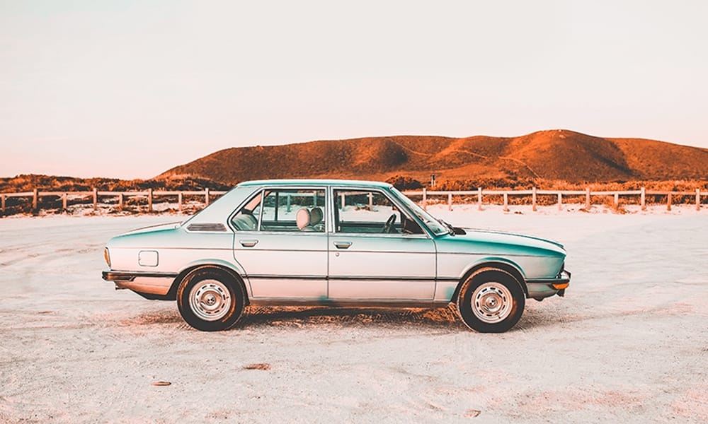
Look, I know. Orange and Teal can be a cliché. But when it’s done right, it just works. This isn’t the over-saturated version you see everywhere. It’s a subtle, cinematic grade that pushes skin tones to a pleasant warmth and cools down the shadows and skies. It’s versatile as hell—great for travel, lifestyle, even some product shots. The trick is that it creates an immediate color harmony that the human eye just loves.
- My Take : Use this when you have a good mix of warm and cool tones in your original shot. If your subject’s skin looks a little too orange, just pull back the Orange Saturation in the HSL panel a tiny bit. Problem solved.
Blood Brothers
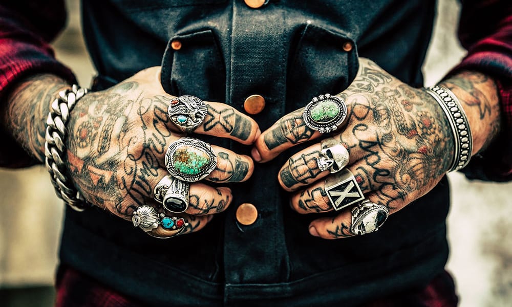
This one is a statement. It’s not for every photo, but when you need impact, this is your tool. It creates these deep, almost-crushed blacks and pushes the reds into a rich, blood-orange hue. It feels intense, passionate, and a little bit dangerous. I’ve used it on urban photography and dramatic portraits to incredible effect. It’s a bold choice, but sometimes bold is exactly what’s needed.
- My Take : This preset needs contrast to work its magic. If your original photo is a bit flat, the effect will be underwhelming. You might need to bump the main Exposure slider up a notch on darker images to keep the shadows from turning into a black hole.
Moody Lightroom Presets for Mobile and Desktop
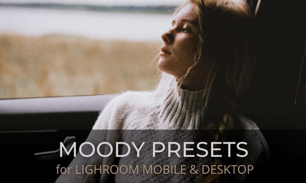
This is less a single look and more a toolkit for atmosphere. It excels at desaturating greens and yellows while deepening the shadows, creating that sought-after introspective and contemplative feel. It’s the perfect foundation for a consistent, professional blog aesthetic or a portfolio that feels curated and thoughtful without screaming “I used a filter!”
- My Take : Moody presets live and die by the Tone Curve. After applying this, pop open the Tone Curve panel. Try creating a very gentle “S” curve to add back a touch of contrast, or lift the bottom-left point slightly for a faded, matte-black effect.
Cinematic Lightroom Presets
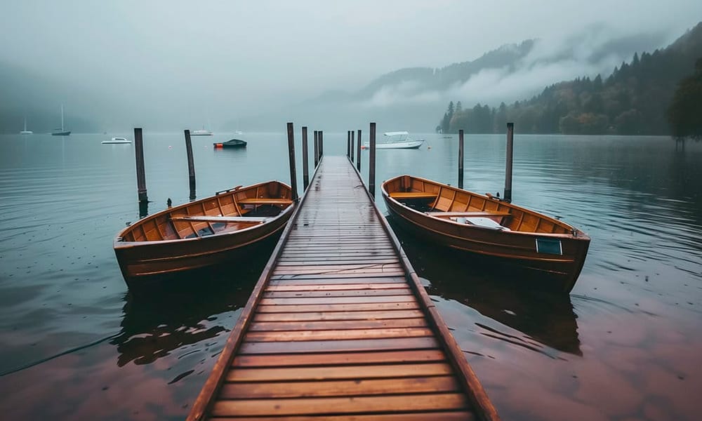
This preset is all about emulating the color grade of a modern film. It focuses on creating a wide dynamic range, ensuring you have detail in both the bright highlights and the deep shadows. It often achieves its look through split toning—adding a subtle cool tone (like blue or teal) to the shadows and a complementary warm tone to the highlights.
- My Take : To really sell the cinematic look, think about composition. After applying the preset, try cropping your image to a wider aspect ratio like 16:9 or even 2.35:1. It’s a simple trick that forces a more filmic perspective.
Clean & Professional
This is your day-to-day toolkit. For when you need photos to look bright, sharp, and polished without a heavy stylistic overlay. Think client work, professional headshots, or a clean, minimalist brand feed.
Insta Blogger Lightroom Preset

Don’t let the name fool you. This is the “make it look expensive” preset. It creates a bright, airy feel by lifting the shadows and slightly softening the highlights. The result is a dreamy, high-end look that’s perfect for fashion, interior design, or any brand that wants to feel approachable yet aspirational. It’s incredibly flattering on skin tones, too.
- My Take : The “bright and airy” style can sometimes blow out the highlights, especially in the sky. If your clouds disappear into a white void, just pull the “Highlights” slider down. You’ll be amazed at the detail that comes rushing back.
Food Photography
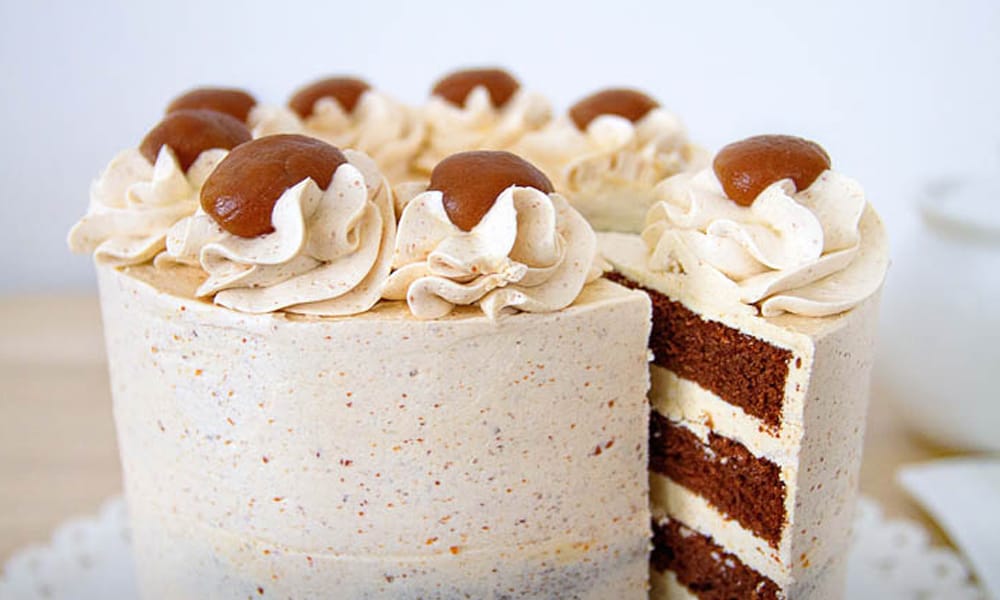
Photographing food is a special kind of hell. Making it look appetizing on screen is even harder. This preset is specifically engineered for that task. It doesn’t just boost saturation; it enhances clarity and texture, making every detail pop. It adds a clean, bright exposure that makes the food look fresh and delicious, not radioactive. A must-have if you ever do work for restaurant or CPG brands.
- My Take : Texture is everything with food. After you apply this, play with the “Clarity” and “Texture” sliders. A little bump can be the difference between a photo of food and a photo that makes you hungry.
Insta Style Instagram Lightroom Preset
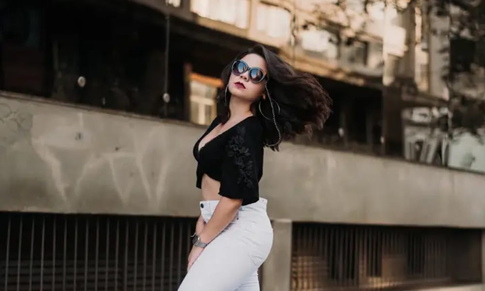
This preset delivers a modern, high-fashion look. The key here is the combination of slightly desaturated colors with a strong, clean contrast curve. It makes your feed look intentional, chic, and curated. It’s an excellent choice for product flatlays, minimalist architecture, and fashion-forward portraits where the structure and form are the main focus.
- My Take : This style often benefits from a subtle vignette. After applying, head to the “Effects” panel and add a slight, feathered vignette. It’s a classic trick to pull the viewer’s eye to the center of the frame and add a touch of polish.
Analog & Imperfect
For when “too perfect” is the problem. These presets embrace the beautiful flaws of film photography—the grain, the faded colors, the nostalgic feel. They add a layer of soul and authenticity that digital can sometimes lack.
Retro Instagram Blogger

This is my go-to for instant nostalgia. It nails the look of a faded photograph from the 70s or 80s. It warms up the image, slightly desaturates the colors, and adds a really convincing film grain. It’s not just a filter; it’s a time machine. Perfect for creating a cohesive, story-driven feed that feels personal and handcrafted.
- My Take : Grain is personal. This preset has a nice, subtle grain built-in, but don’t be afraid to customize it. In Lightroom’s “Effects” panel, you can control the amount, size, and roughness of the grain to get it just right for your taste.
The All-Rounders
Sometimes you don’t need a heavy-handed “look.” You just need your photo to look better. These are workhorse presets designed as clean, balanced starting points that work on almost any kind of photo.
Insta Look – Free Lightroom Preset
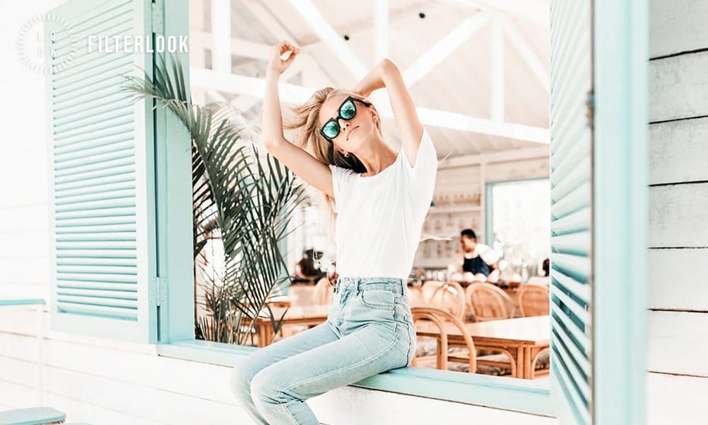
This is your quintessential “Instagram-ready” edit. It provides a clean, polished look that brightens the overall image, sharpens key details, and adds just enough vibrancy to make colors pop on a small screen. It’s a fantastic all-rounder for daily posts when you just need a quick, reliable enhancement.
- My Take : This preset works best on photos that are already well-lit. On a darker, underexposed photo, try increasing the main Exposure before you apply the preset to get a cleaner, less noisy result.
Free Instagram Lightroom Presets

This one is specifically tuned for the quirks of smartphone cameras. Phone photos can often be a bit flat or have weird color casts. This preset is designed to correct that, adding back in some needed contrast and sharpness while balancing the colors for a more professional, less “shot-on-a-phone” look.
- My Take : The sharpening on this can be a bit strong for some tastes. If you find it looks crunchy, just go to the “Detail” panel and pull back the “Sharpening” amount.
Free Lightroom Presets for Social Media
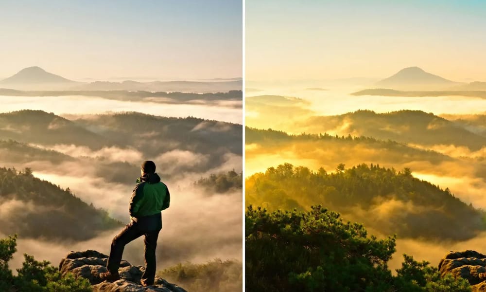
Think of this as a foundational preset. It’s a workhorse designed for maximum compatibility. It provides a very clean, subtle edit that enhances your image without applying a heavy, noticeable effect. It’s the perfect choice when you want your photo to look like a better version of itself, not like an edited photo.
- My Take : This is the perfect preset to build your own style on top of. Apply it, then make your own creative adjustments to the colors and tone, and save that as a new preset. Now you have a custom look based on a solid foundation.
Free Instagram Presets for Adobe Lightroom
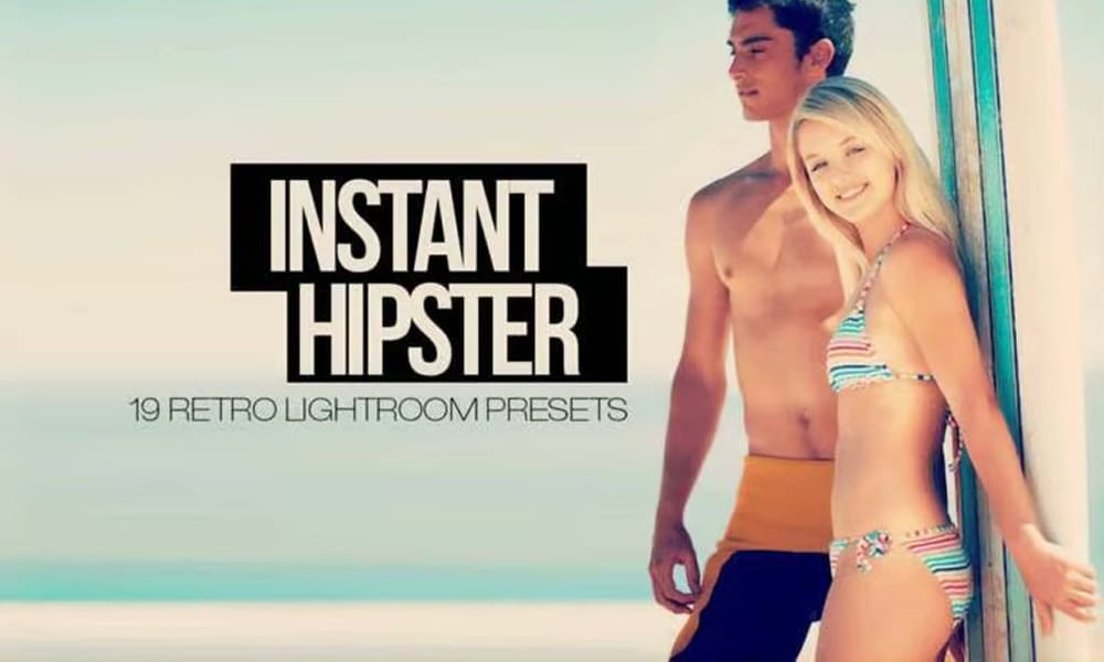
A solid, general-purpose enhancement. This preset focuses on adding a natural-looking contrast and saturation boost. It’s a perfect “daily driver” for quickly editing photos before you post them, giving them that extra bit of punch without making them look overly processed.
- My Take : After applying this, check your “Blacks” and “Whites” sliders in the Basic panel. Holding the Alt/Option key while you drag the slider will show you if you’re “clipping” (losing detail). Adjust them until just a few specs appear for a perfect contrast range
Free Lightroom Presets
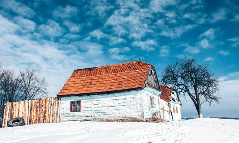
This is the most fundamental preset in the collection. It’s the base layer. The primer. It’s designed to do one thing: improve your photo’s light and color in the most balanced way possible. It’s the ideal first step before you add your own creative touch or stack another, more stylized preset on top.
- My Take : Use this to quickly see a photo’s potential. If an image feels “meh,” apply this preset. It will often reveal the best version of the photo and show you what direction you could take the edit.
Free Insta Filter Lightroom Presets
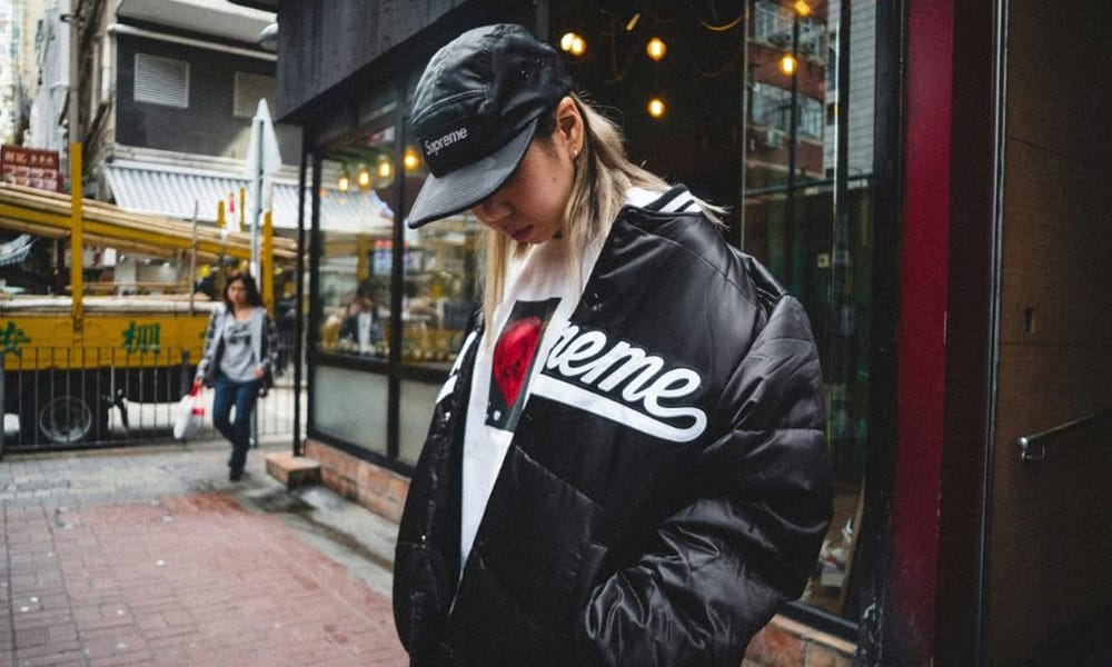
This preset gives you that classic, warm, and vibrant “Insta-filter” look, but with the full power and customizability of Lightroom. It adds a healthy dose of warmth and saturation, making it great for travel, lifestyle, and outdoor shots that you want to feel sunny and inviting.
- My Take : This preset can make warm tones (reds, oranges, yellows) very intense. If it’s too much, don’t just reduce the main Saturation slider. Go to the HSL/Color panel and specifically pull back the saturation of the individual colors for a more nuanced adjustment.
Free Lightroom Instagram Presets
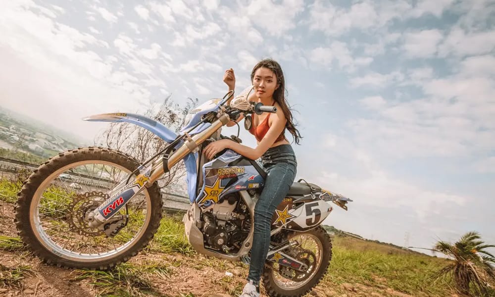
This one is named exactly what it is—a perfect baseline for Instagram. It doesn’t push any single color too far or crush the blacks into oblivion. It’s a clean, balanced starting point that brightens the scene, adds a touch of contrast, and gives a subtle boost to saturation. It’s the preset you use when you’re not sure what you want, but you know you want it to look better.
- My Take: Because this is such a balanced preset, it’s incredibly revealing of your photo’s white balance. If your photo looks too yellow or too blue after applying it, the issue is likely in the original shot. Tweak the ‘Temp’ slider first to get a neutral base before making any other changes.
A Few Final Thoughts
The goal here isn’t to make all your photos look the same. It’s to make them look consistently yours. The key to a cohesive feed is choosing one or two presets from a single category and sticking with them. Use these presets as a foundation. Tweak them. Break them. Save your own versions. Develop a visual language that is instantly recognizable. Now go make something cool.

